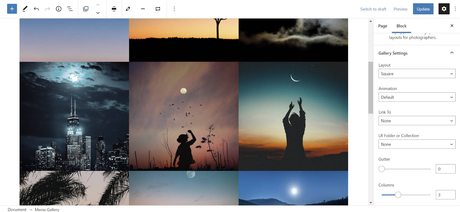
I am uncertain of how I first came across the Meow Gallery WordPress plugin. It was a pinned tab in my browser for a while, but it has recently become one of those projects that I keep coming back to. I delight in the imagery of the Meow Apps brand, created by Japan-based software developer Jordy Meow. It has the sort of fun and artistic visuals that are often missing in the WordPress business ecosystem. This creativity also comes across in the Meow Apps plugins.
The problem with WordPress gallery plugins is that I find a new one I want to use every other week. It is a bit of an obsession. There are so many different options that it is tough to grow comfortable with a solution before finding something new and shiny to tinker with.
Such is the case with Meow Gallery. From the simplicity of its options to the range of layouts that the plugin provides, it has found its way onto my ever-growing list of favorite gallery-related plugins.
I also prefer the decoupled, modular nature of what Meow Apps is doing with its plugins. Meow Gallery keeps a tight focus on the gallery layout itself. Users can select an image lightbox/overlay extension separately. Meow Lightbox is recommended, of course. However, both are developed to work alongside third-party gallery or lightbox plugins. It is the sort of building-block solution that more developers in the community should embrace, ultimately offering end-users more freedom.
Meow Gallery is straightforward to use. It works similarly to the core Gallery block. When first adding images, users can drag-and-drop them directly into it or select from their media library. From that point, the experiences begin to diverge.

Instead of selecting the number of columns, whether to crop, or the image size, the Meow Gallery block automatically handles this based on the type of layout chosen. Options may change based on the layout too. The following are available:
- Tiles
- Masonry
- Justified
- Square
- Cascade
- Carousel (pro only)
- Map (pro only)
The block also offers a handful of basic animations, link options, and more. However, the gutter setting provides more control over the output. The gutter is the horizontal and vertical space between images. Users can choose between 0 and 100. Gutter spacing is the one option from the plugin that WordPress should adopt, allowing theme authors to opt-into a default and users to customize.

The plugin also has commercial features, but they are value-added upsells instead of necessary functionality. The pro version includes extras like more layouts, new animations, and infinite scrolling for galleries with many images.
The one off-putting issue with Meow Gallery is that it creates a custom block. Having already seen solutions from other plugin authors that extend the default Gallery block, I was hoping this plugin would go in the same direction. Extending the core block makes it easier for end-users to switch gallery plugins at any point. However, users can transform Meow Gallery blocks into Gallery blocks and vice versa.
Keep in mind that the WordPress Gallery block is also undergoing drastic changes. Currently, the plan is to make it more of a container block that houses nested Image blocks. By not extending the core block, plugin users will miss out on some of the advantages this change brings. Of course, the plugin developer could follow suit and add the same features to the project.
Meow Gallery relies on the WordPress gallery shortcode. Therefore, it will continue working regardless of whether users deactivate the plugin in the future. As a fallback, it is not a perfect solution. Users of the block editor would likely rather have it revert to the core Gallery block — the shortcode and block are not remotely the same. However, it is a bit of a compromise between showing a working gallery or nothing at all.
I suspect the reliance on the shortcode is for historical reasons. Meow Gallery existed in the pre-block era. However, the developer has managed to keep up with the times, offering support for both the block and classic editor.

