Oliver Juhas recently released his sixth theme to the WordPress community for free. Michelle is a block-ready theme. However, it also supports Beaver Builder, Elementor, and other page-building plugins.
It is a multipurpose theme, which is often an immediate turn-off for me. I prefer to see a purpose-driven design with a unique take on a niche. However, it is hard not to love the personality of Michelle. Juhas did not shy away from putting his brand of styling on the project, which is evident in his past free themes.
Juhas is marketing Michelle as an accessibility-ready theme. However, it has yet to receive an accessibility review for the theme directory, which would allow it to be tagged as such. From a quick scan for common issues, everything seems to be in order. It will likely pass its review like some of his past free themes. And, “inclusive, disabilities friendly, and barrierless” are at the forefront of his branding for WebMan Design.
As has become common for block-ready themes, Michelle packages a “Content Only” template. This is a post/page template that allows end-users to use the block editor as a page builder by not displaying anything other than the post content.
The theme is yet another showcase of what is possible with the block editor. A couple of weeks after Anders Norén’s Eksell landed in the directory, Juhas has presented the community with another quality theme. The two are entirely different in style and approach, but they both make the block system shine in their own ways.
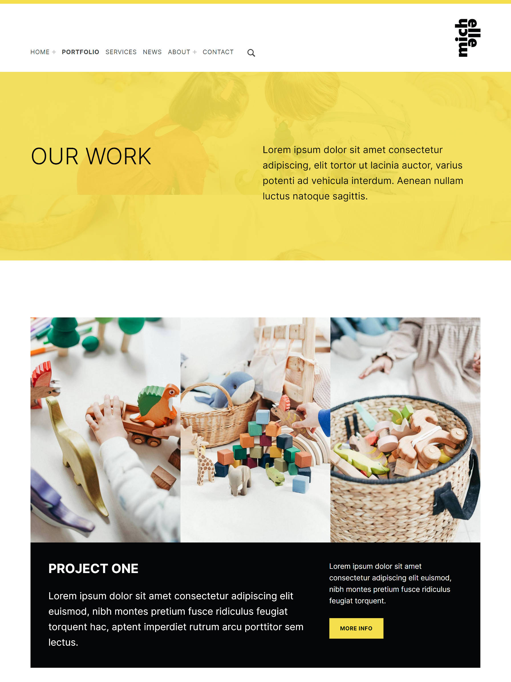
Users can read more about the theme and peruse several demos via the theme’s official page.
Block Patterns and Styles
Michelle may be the only free theme in existence with 67 patterns. And, no, you did not misread that. It literally registers 67 block patterns. Yeah, that is a lot.
It has a little bit of everything. From team galleries to logos, from hero headers to contact cards, it is hard not to find something you need. There was no way that I could realistically test all of them. However, for the dozen or so that I did try, they worked well and offered an easy one-click option for end-users.
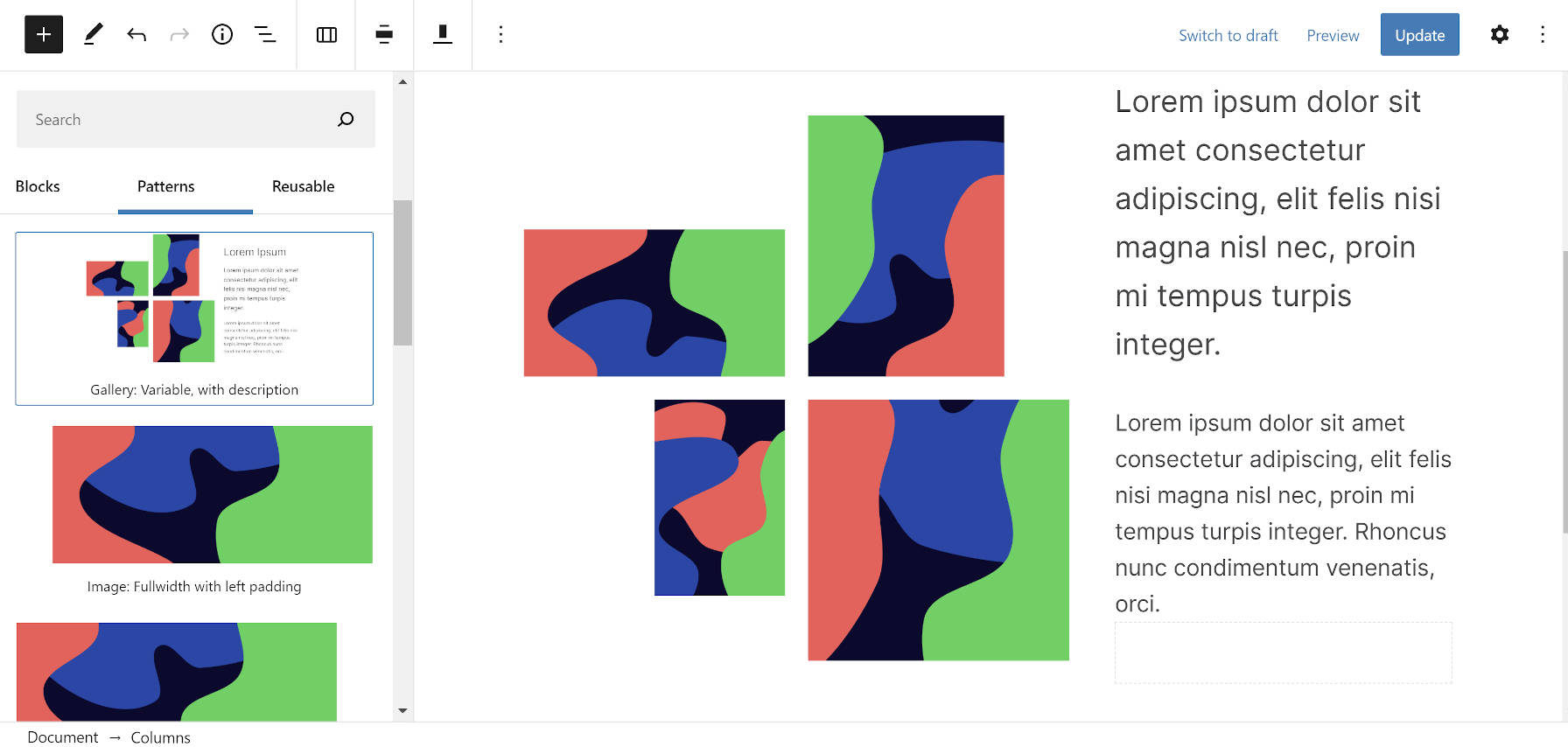
I always knew the day would come when a theme author would push the limits on the number of patterns it should offer. While 67 seems a bit excessive, I know from experience that we will see a day when patterns number in the 100s.
I hate to continue beating a dead horse, but WordPress needs to use an overlay system for block patterns, at least for desktop users. Michelle makes it more apparent than ever that a small slide-out panel will not cut it.
If the theme’s array of patterns is not enough to whet users’ appetites, its two dozen block styles just might.
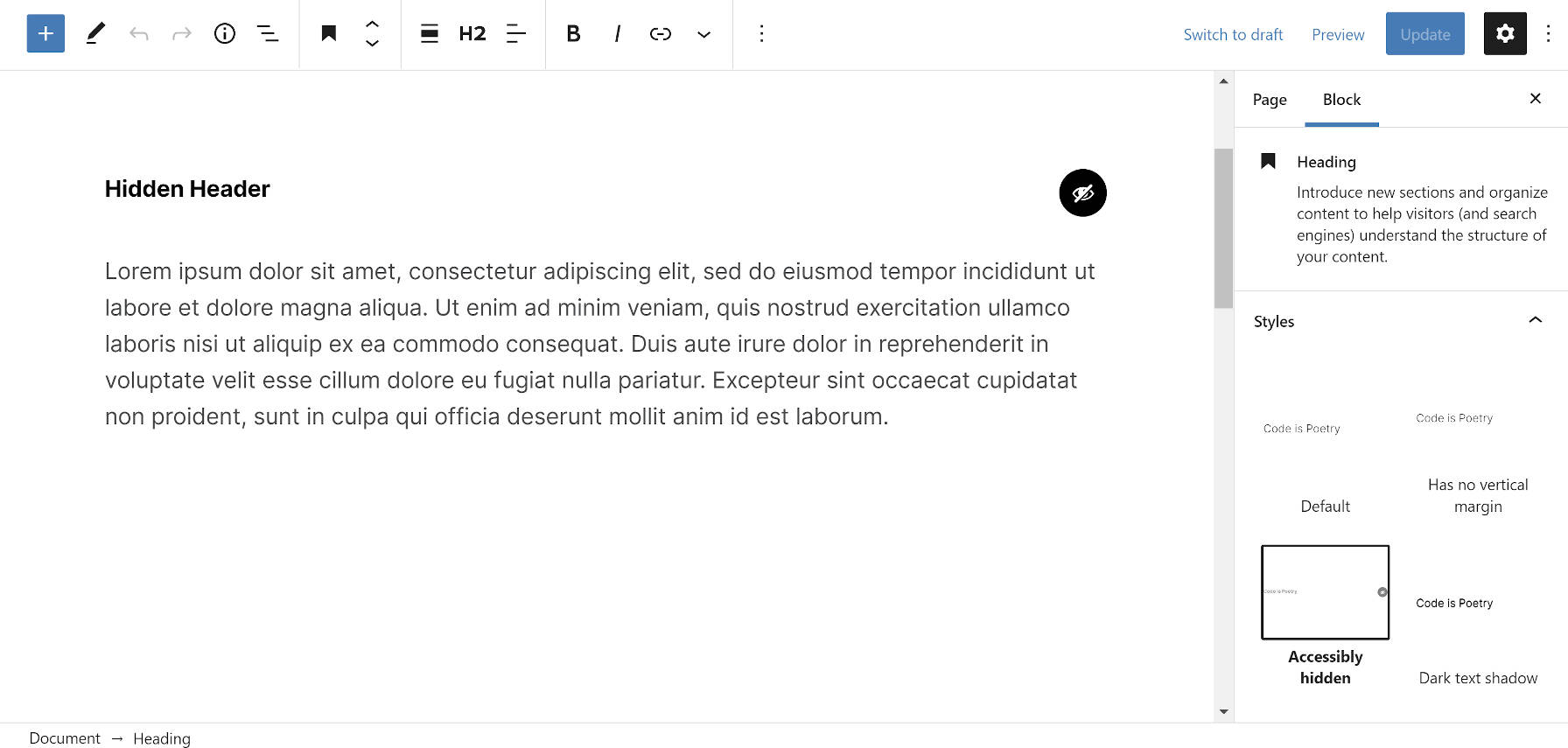
The options range from light and dark text shadows to variable galleries. It even has an “accessibly hidden” style for Heading blocks, which hides the text from the screen but makes it available to screen readers.
Block-Ready Footer and 404 Page
The theme allows end-users to build their footer and 404 error pages via the block system. Considering that the site editor is not available yet and the block editor is limited to post content, Juhas had to think outside the box a little to make this possible. He made use of the reusable blocks system. This is the sort of ingenuity that happens when theme authors are not burdened by too many rules.
In the customizer, users can select the Theme Options > Content section. From there, they are directed to pick a reusable block for their footer and 404 pages. Or they can simply opt out of it. The customizer section also links to the semi-secret admin page to create reusable blocks.
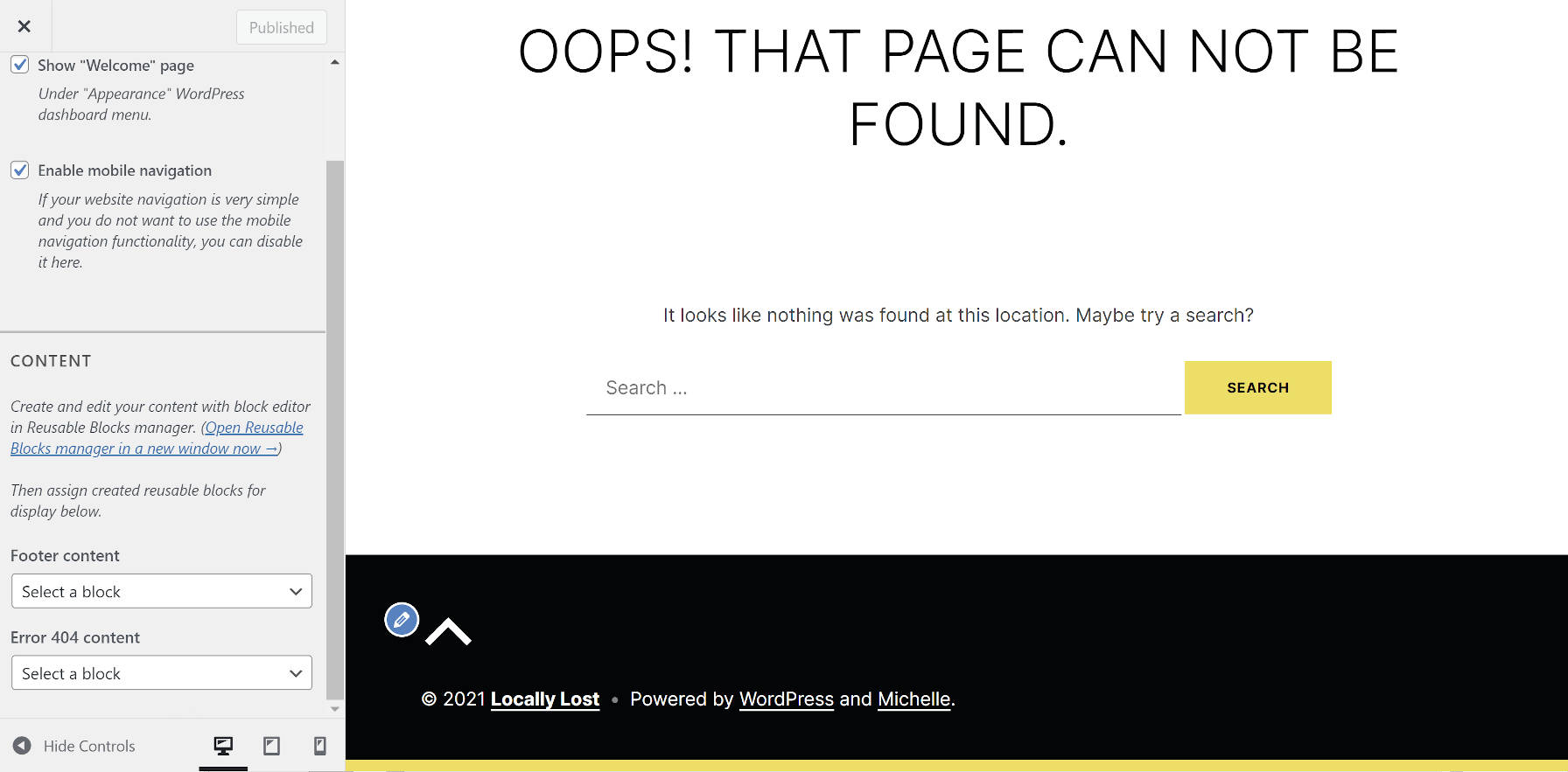
In the past, I have used a similar technique for 404 views. Instead of going the reusable block route, theme users could select a private page. Either option is acceptable for allowing users to modify content they may not have been able to customize in the past.
Starter Content
Michelle makes extensive use of the WordPress starter content feature. This allows new WordPress users to see what their site could look like with pre-loaded content. The theme creates Home, About, Blog, Services, FAQ, and Contact pages.
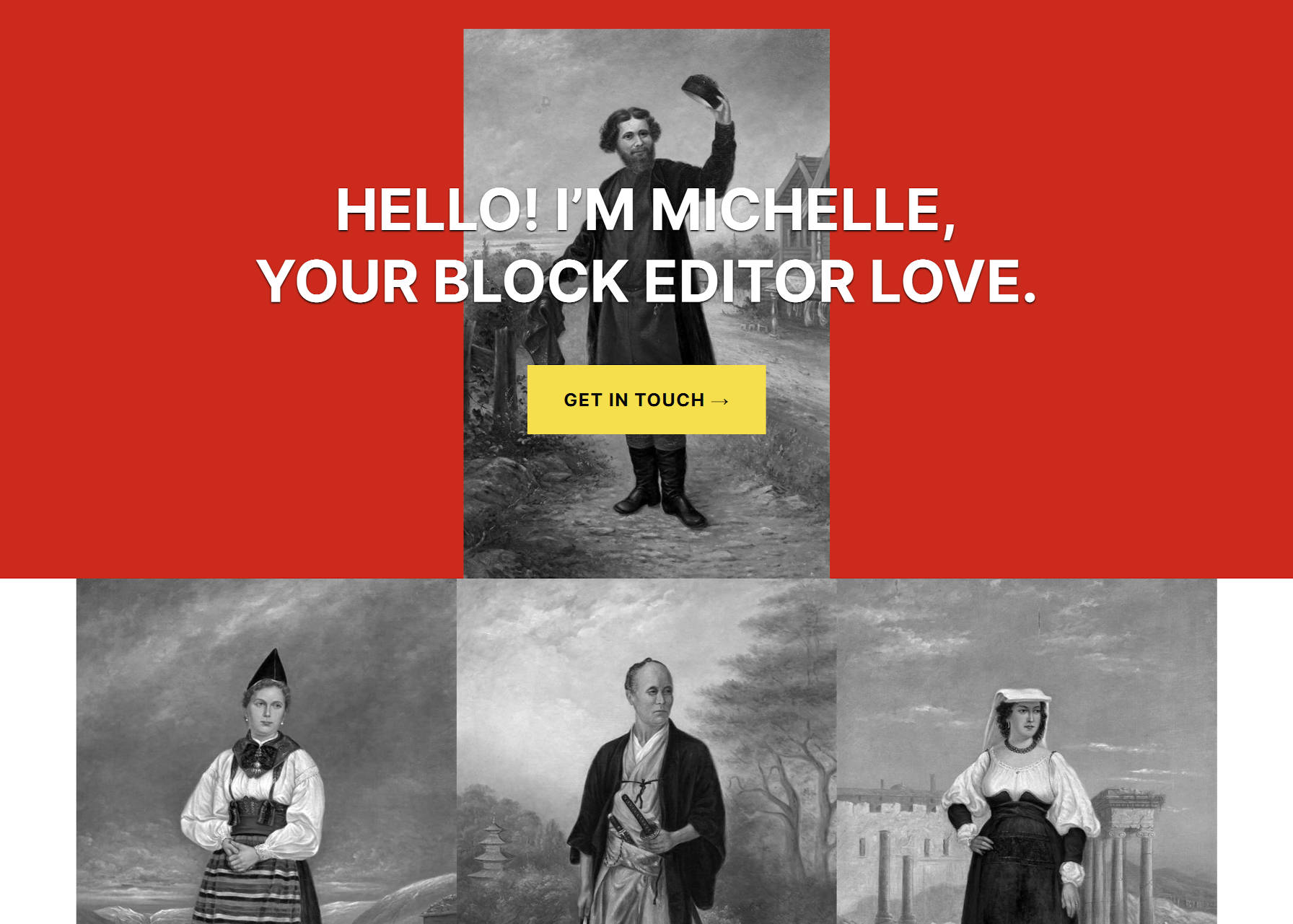
The feature has languished in recent years. Many theme authors had hoped they would eventually be able to use the feature for non-new installs too. However, Helen Hou-Sandí got the ball rolling again in November 2020, breathing new life into an old idea. WordPress.org would begin displaying theme starter content via the theme preview system. Only the Twenty Twenty-One, Twenty Twenty, and Twenty Seventeen themes received this treatment last year. It now seems that it is being rolled out for others.
This is a welcome change in the directory. Users can now get a feel of the Michelle theme without tracking down the author’s demo. It is a better experience than the old-school demo content.
One issue is that the previewer uses the first sentence of the theme description for the demo’s tagline. This can make for a long and unusual bit of text. It can also mess up a theme’s layout as it is doing with Michelle. I hope this will be addressed from WordPress’s end soon.
Other theme authors should note that starter content could factor into whether a user skips over or downloads their theme.
