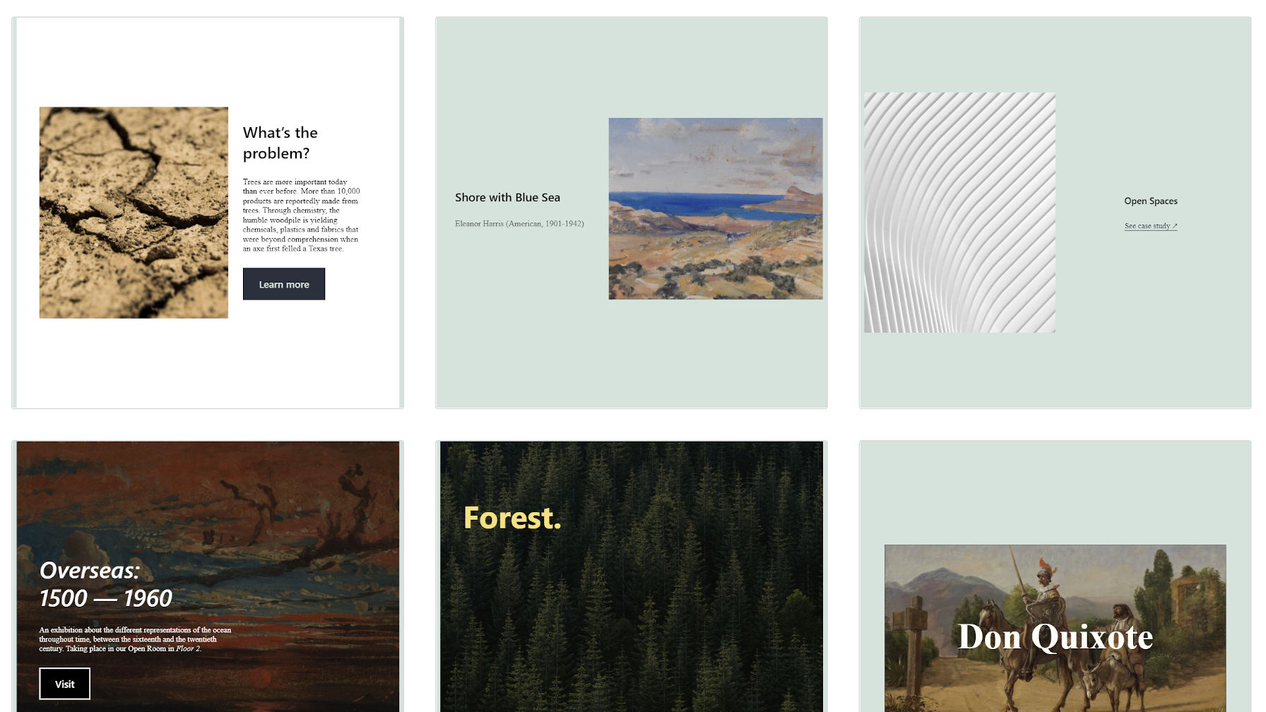
The upcoming block pattern directory is launching alongside WordPress 5.8 in July. The goal is to make several high-quality designs available for users right off the bat. However, the official submission process will not open until the directory launches. In this chicken-and-egg scenario, the Design team is asking for early contributors to submit their pattern candidates via GitHub.
“The project needs a collection of high-quality, diverse, community-designed patterns to populate it with during development,” wrote Kjell Reigstad in the announcement post. “These patterns will set the tone for quality in the repository and will make the directory useful for folks upon its launch.”
Alongside Reigstad, Beatriz Fialho and Mel Choyce-Dwan have already added several block patterns. They are available through the Gutenberg plugin now.

The trio has also submitted the majority of the 18 current potential patterns. While they have produced solid work thus far, the directory needs a more diverse set of designs from the community to launch with a bang.
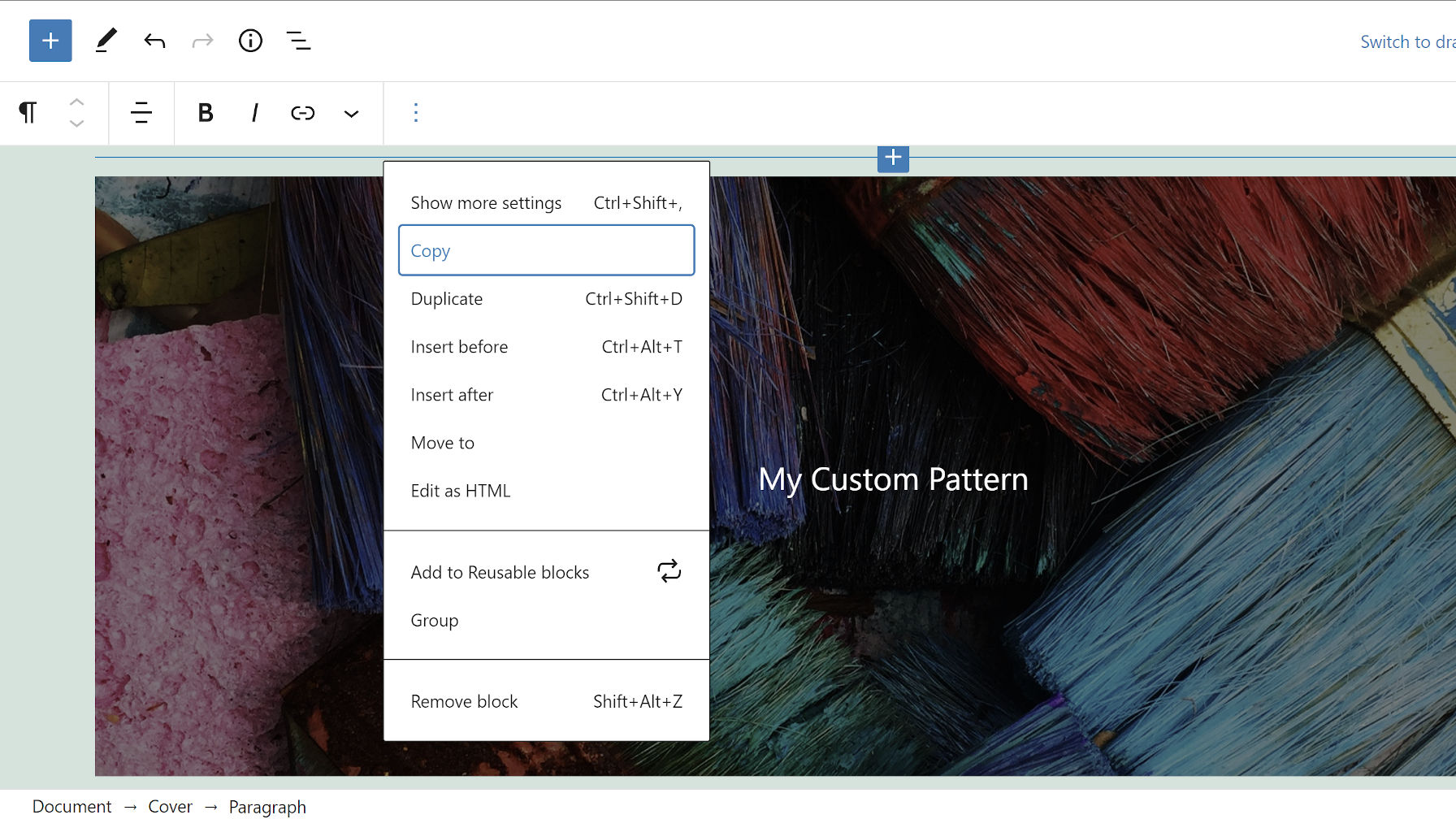
Creating a pattern requires no coding skills. It is possible directly via the block editor. Just design, copy, and submit. The team already has a GitHub template in place for submitting patterns. Be sure to use CC0 (public domain) images if they are a part of your creation.

I have somewhere between 40 and 50 patterns lying around. You could say that I have been doing a bit of dabbling in the art of block-pattern design in my free time. Many of these patterns rely on custom block styles, so they are not suitable for the directory. However, I have several that are general enough for submission.
As always, I try to pay it forward when possible. Therefore, I cleaned a couple of patterns today using the Twenty Twenty-One theme and submitted them for inclusion.
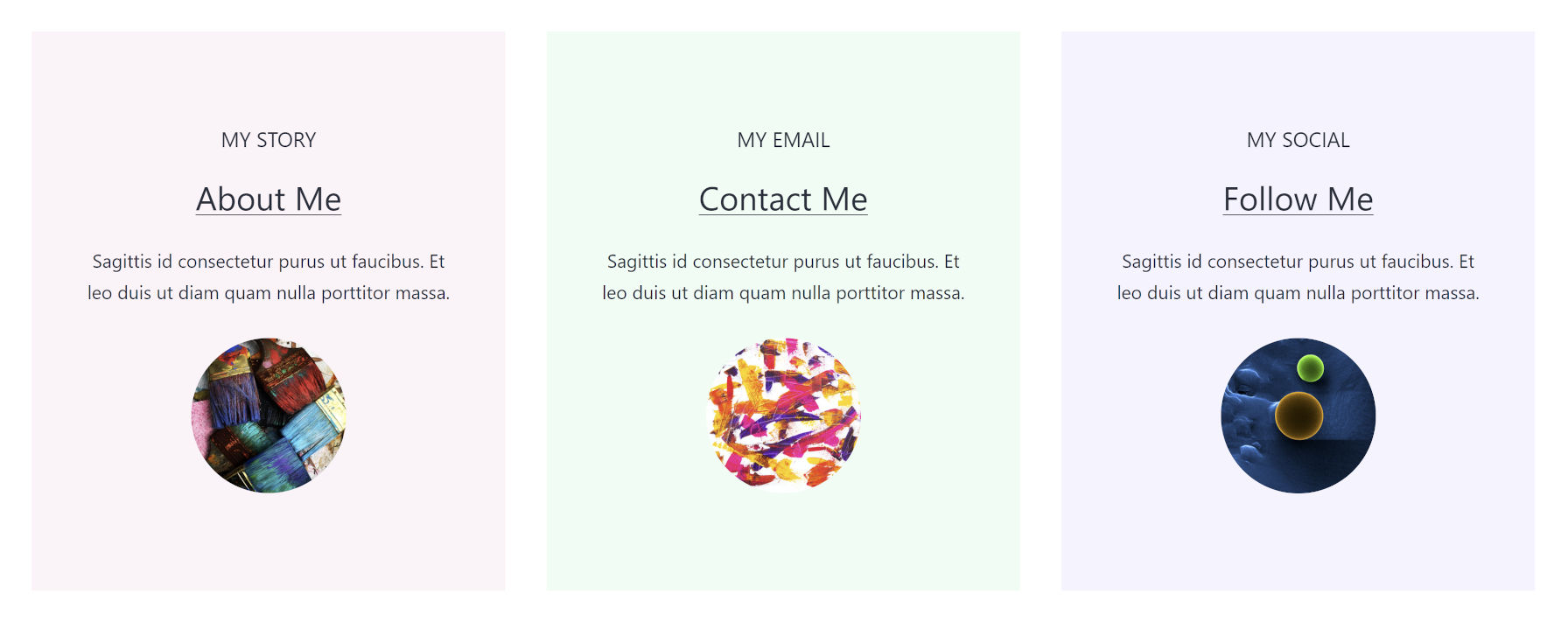
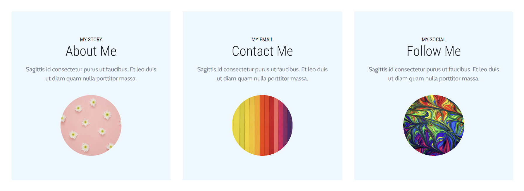
The first was a three-column section of “about me” or “connect with me” boxes. This has been one of my favorites to play around with.

It is not on par with my original design, but I like how it turned out. If you have read any of my past posts on blocks and patterns, I will sound like a broken record. However, I must say it for those who did not hear the message the first 100 times. The main limiting factor for block patterns is the lack of spacing options on almost all blocks.
Blocks like Group and Column have padding controls, which are a nice feature. However, vertical margin options are must-haves for the directory to be as successful with its goals as it intends to be.
A prime example is in my first pattern. My original mockup closes the gap between the heading and subheading. In my submission, I tightened the space by setting the line height, but I needed an option for zeroing out the vertical margin.
If you compare it to the original idea built with some features not yet available, you can see how much improved the overall layout’s spacing is.

I ran into the same issue with my second pattern, Team Social Cards, between the Image and Separator blocks. The gap there has more to do with Twenty Twenty-One’s inconsistent spacing.

I may revisit the giraffe photo, but it is growing on me. It is fun. Plus, end-users are meant to actually replace it.
I will probably submit one or two more during this early phase, and I will definitely contribute more once the pattern directory is officially open. For now, I want to see our talented design community giving a little something back to the WordPress project. This is such an easy way to contribute that has no coding requirement — just a little time.
