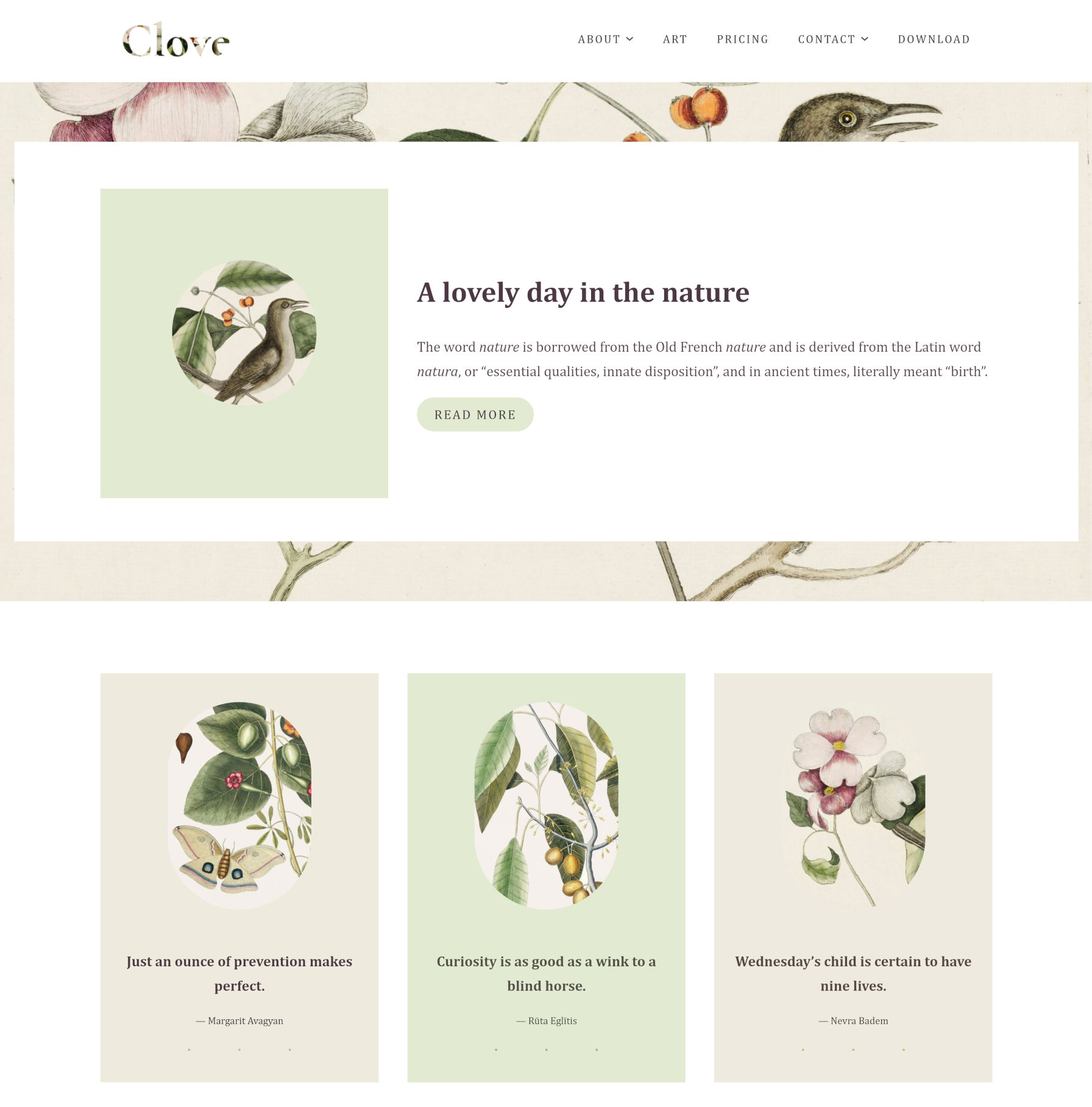
Earlier today, Ana Segota tweeted and announced via the Anariel Design blog that her company had submitted its second block-based theme to WordPress.org. Clove is a more well-rounded follow-up to her first such theme, Naledi. It is currently under review for inclusion in the official directory, but anyone can give it a test run by snagging the ZIP file from its ticket. Or, just peruse the live demo.
This should officially be the 10th block-based theme to go live in the WordPress.org theme directory (note that a couple by Automattic are not tagged). That is assuming all goes well during the review process.
It has been a long road thus far, but 10 themes with the Full Site Editing tag is a notable milestone. The Q theme by Ari Stathopoulos was the first to land in the directory back in October 2020. Now, eight months later, there is still room for other theme authors to become pioneers in the space. With almost no competition, who will design that first block theme that squeezes its way into the most popular list?
If “practice makes perfect,” Segota is now ahead of the curve by pushing her second theme to the directory. This makes her theme company only one of two with multiple block themes.
Clove is experimental, as all block themes are. It relies on the ever-shifting parts of the Gutenberg plugin, but it all comes together into a floral, nature-themed design. There are hints of inspiration from Twenty Twenty-One, but it feels more structured, less chaotic.
The design is less of a theme and more of a showcase of block patterns and styles. Even on the template level, it reuses those same elements across each of its seven templates, providing multiple entryways for users to tinker with its features.
Clove even includes pricing columns. I seem to recall writing about how theme authors could implement them via patterns just over a month ago. Maybe the Anariel Design team came to the same conclusion. Maybe they took my message and ran with it. I like to think the latter is true. Either way, the result is a beautiful, theme-specific pattern — the sort of artistry that is tough to achieve from a plugin.
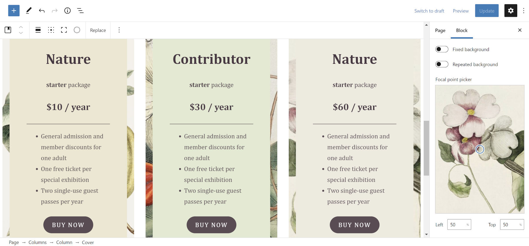
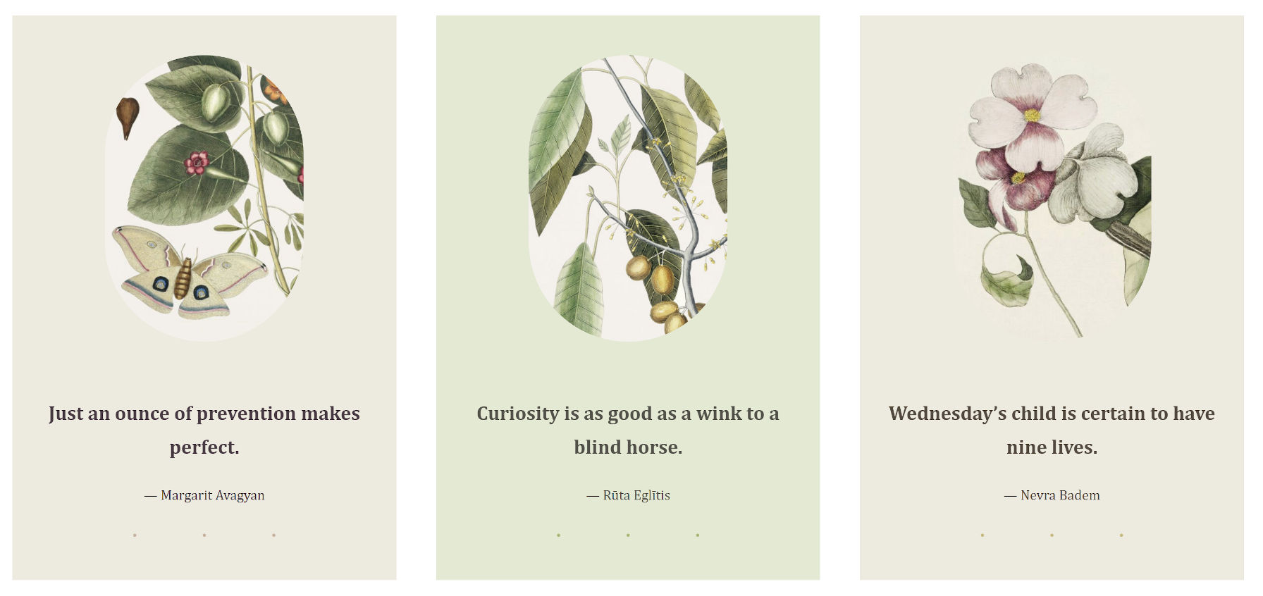
I am less of the fan of the overlapping and uneven columns in some of the designs designs, preferring some of the more-structured patterns, such as Three Quotes Images:
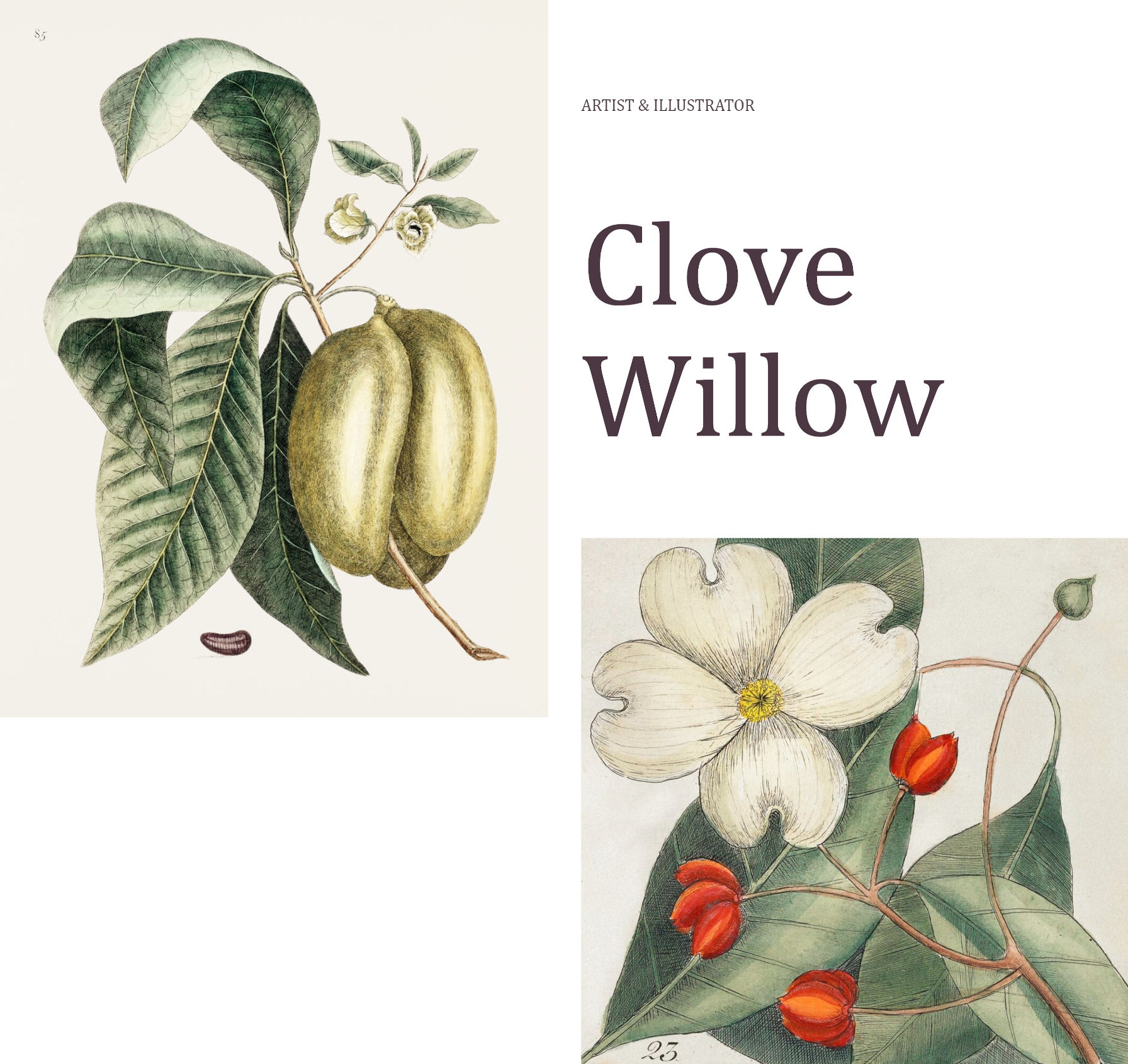
Despite my general dislike of the uneven column style, my favorite piece of the entire theme is the Illustrations page template, which leans into that design method.
The page intro section is an announcement to the world, “Hey, check out my work.”
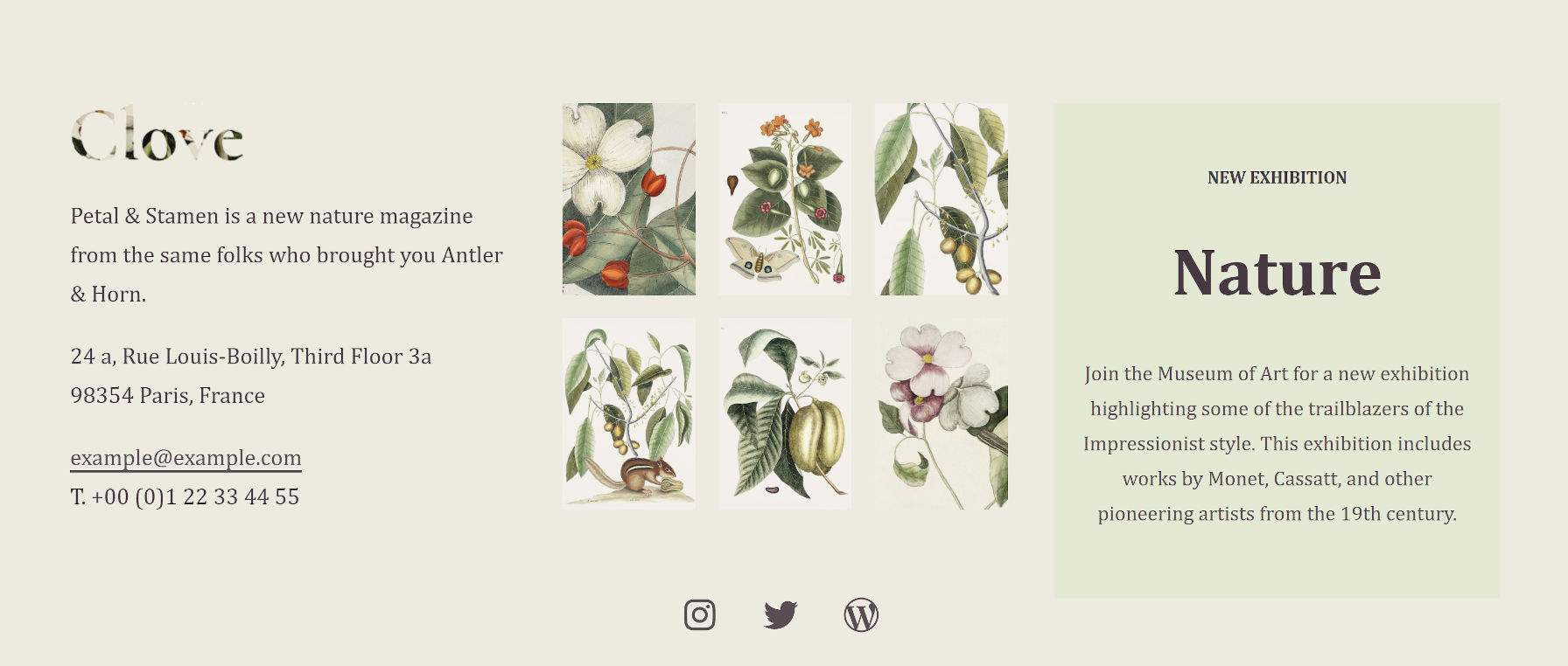
I also like the Illustrations page template’s widgets-like area in the footer. It manages to stuff several blocks in without feeling too crowded. It even showcases a box for artists to highlight their next exhibition.
The Clove theme also registers 10 block styles for users to choose from. Most of them add different types of borders or frames to various elements. Plus, there is the fun-but-kind-of-an-oddball blob “Shape” for images.
-
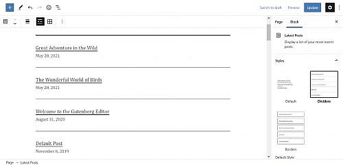
Latest Posts – Dividers -
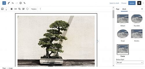
Image – Framed -

Image – Shape
Segota was one of several people to submit custom designs to the upcoming block pattern directory. There is some noticeable crossover between her current theme work and submissions, such as the Playful Gallery pattern that did not quite make the cut. Others, like her Recipe design, did. There is still an open invitation for people to contribute.
I am always like a kid in a toy store when a new block theme comes along, reaching out to grab the latest gadget. I want to see more experiments like Clove. Keep them coming, theme authors.
Side note: For people interested in the background-clipped text design used in Clove’s site logo, I opened a ticket to take us one step closer to doing it in the editor. Currently, users must create an off-site image and upload it.
