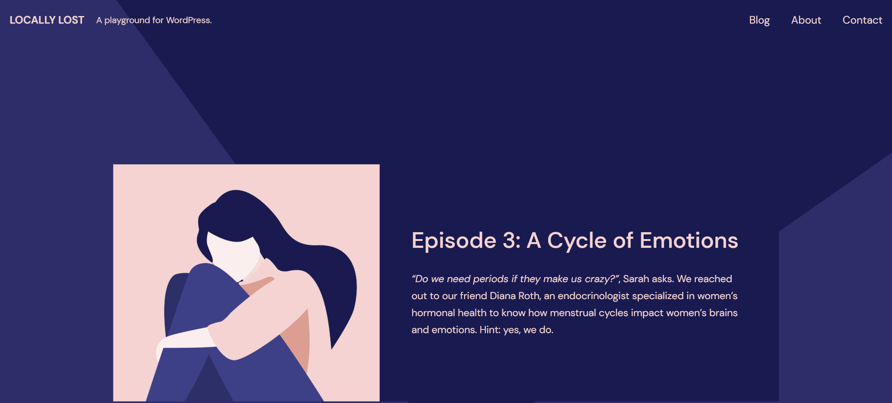
A few weeks ago, Automattic released Quadrat on the WordPress.org theme directory. It is now the company’s fourth block theme. Like its predecessors, it is a child of Blockbase, a project that serves as a foundation for the work of Automattic’s Theme Team.
After spending a couple of months diving deep into the world of block themes, I was beginning to feel a little burned out. When I wasn’t sleeping, eating, or doing yard work in my off-duty time, I was building or exploring one project or another. Soon, it all had become a blur. I knew I needed to take a small break, and I have not touched themes for a couple of weeks since, at least not outside of work.
However, Quadrat appealed to the theme developer within me. I am not sure if it was the soothing color scheme or just seeing the work the professional designers had put into it, but it offered a pathway for easing myself back into the block theme world.
Outside of the work by Anariel Design with Naledi and Clove, most block themes have felt more like proof of concepts or starting points. Quadrat can now be added to the list of those with some personality.
It does not push any particular boundaries, but it is a well-designed blogging and podcasting theme. Mostly, I am just a fan of the color scheme — sometimes you just need something other than black, white, and gray to get yourself out of a funk.
One of the other reasons I have been following the work of the Quadrat theme was because it was the first showcase of header patterns I had seen. Kjell Reigstad shared what this system would look like in June.
The goal is to include the patterns shown in the video in core WordPress, so they are not currently included in the theme. However, there is still an open ticket for header patterns in Quadrat.
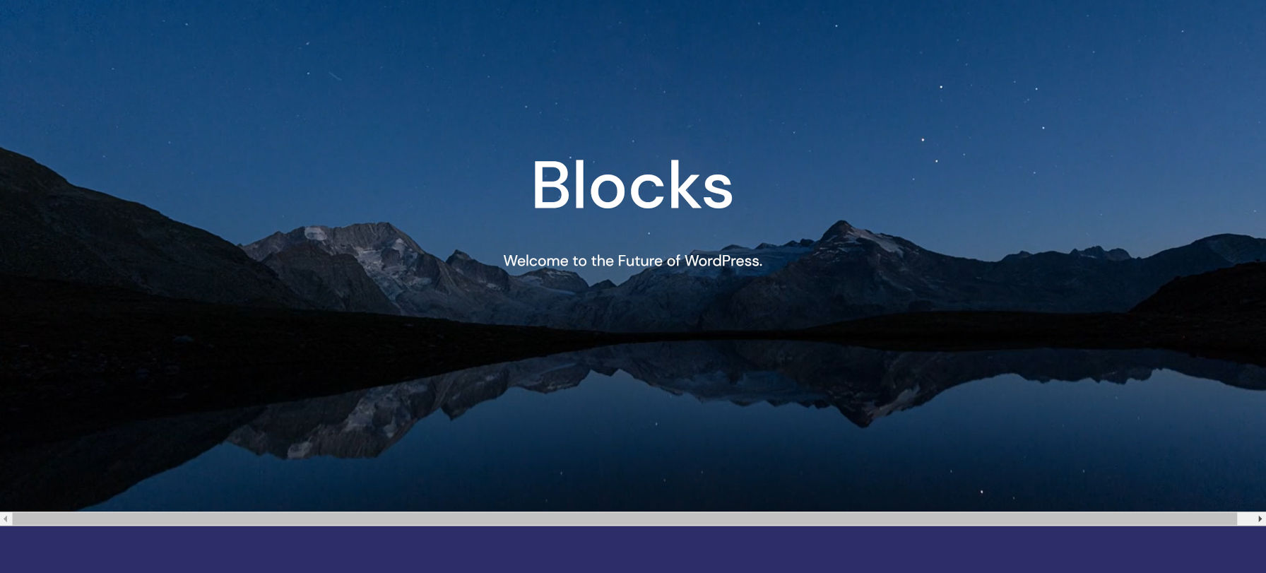
The only real trouble I ran into with the theme is with fully aligned blocks in the content. There is an overflow issue in version 1.1.1 that creates a horizontal scrollbar.

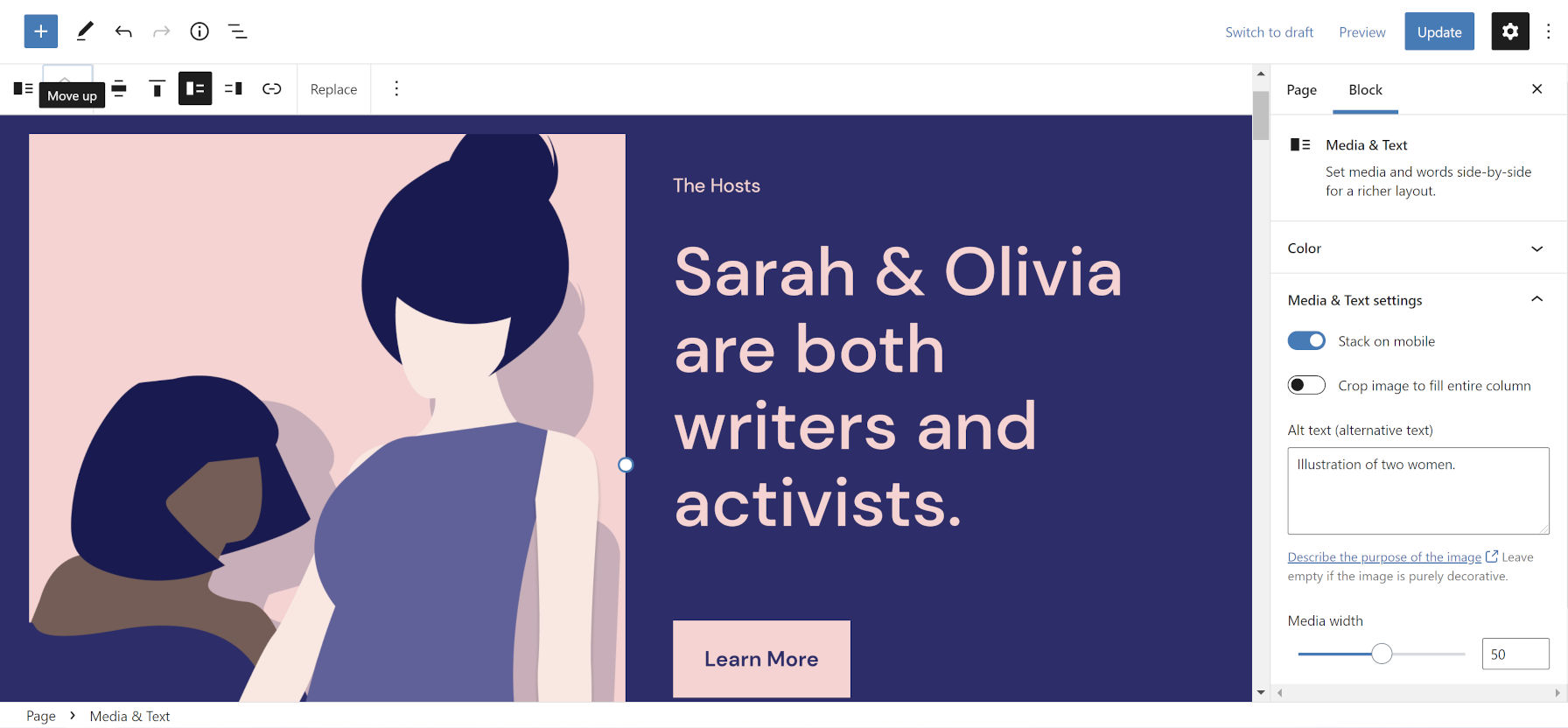
Quadrat includes nine custom patterns. The focus for most is on podcasting, but some are general-purpose enough for other use cases, such as “Media and text with button”:

The development team missed a prime opportunity with its podcast-related patterns. Instead of integrating with a podcasting solution, they are simple, static blocks from core WordPress.
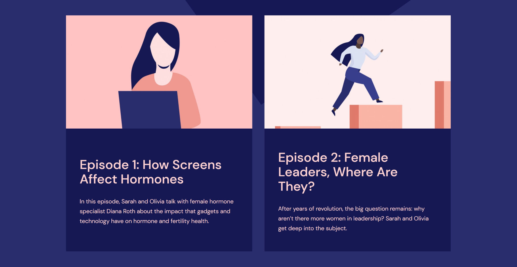
For example, the Latest Episodes pattern is a two-column layout that features Image, Heading, and Paragraph blocks. That is acceptable as a base pattern for users without a podcasting plugin. However, it may be practically useless for those with one enabled. Or, it creates unnecessary work because users must manually update their page content anytime they publish a new episode.

Given Automattic’s recent bet on Castos as part of a $756K pre-seed fundraising round, it would make sense to integrate with the podcasting company’s plugin, Seriously Simple Podcasting (SSP).
If the development team wanted to take the Latest Episodes pattern to the next level, they would create it with the Query Loop block and display the latest podcast episodes from the plugin. For users without SSP installed, simply fall back to the current pattern. Or, offer both. Right now, it is little more than eye candy and not nearly as useful as it could be for real-world use cases.
I often talk about the need for theme authors to elevate their game. Not only would such integration be beneficial to podcasters, but it would also showcase the power and flexibility of the block system.
All of this is to say: If you are going to build a podcasting theme, build a podcasting theme. Quadrat appears to be one. However, when you peek behind the curtain, it is just a well-designed blogging theme. It has the potential to be so much more.
