I have been secretly keeping tabs on Anders Norén over the past couple of weeks, awaiting the moment he pushed his first block theme to the WordPress directory. I first noticed it when he tweeted a screenshot two weeks ago. And, today was the day it happened. Tove landed in the review portal several hours ago, and I have been tinkering with it ever since.
While it is not downloadable from the directory yet, the review system moves much faster than in times past. It should be available soon. In the meantime, anyone who wants to give it a spin can grab the ZIP file from its ticket.
I called his last WordPress theme, Eksell, “the standard by which we should be judging all other” themes, and Norén has a history of releasing solid designs. Could he do for blocks what he has done for classic in years past?
The truth is that going 100% blocks has limitations. Designers can experiment and test out some new things, but the underlying system is not up to par with what is possible with traditional theming. However, some feats are much easier to accomplish. Much of it depends on the creator’s goals and how well they work with the system instead of fighting it.
At first glance, Tove was not any more impressive than most block themes I have installed and activated. It seemed pretty bare-bones, but I imagine this is what theming will look like far into the future. Many will be a wide-open canvas that allows users to build whatever type of site they want. Themes will primarily add personality.
One area where they can and will shine is with custom block patterns. And Tove has over 40 of them.
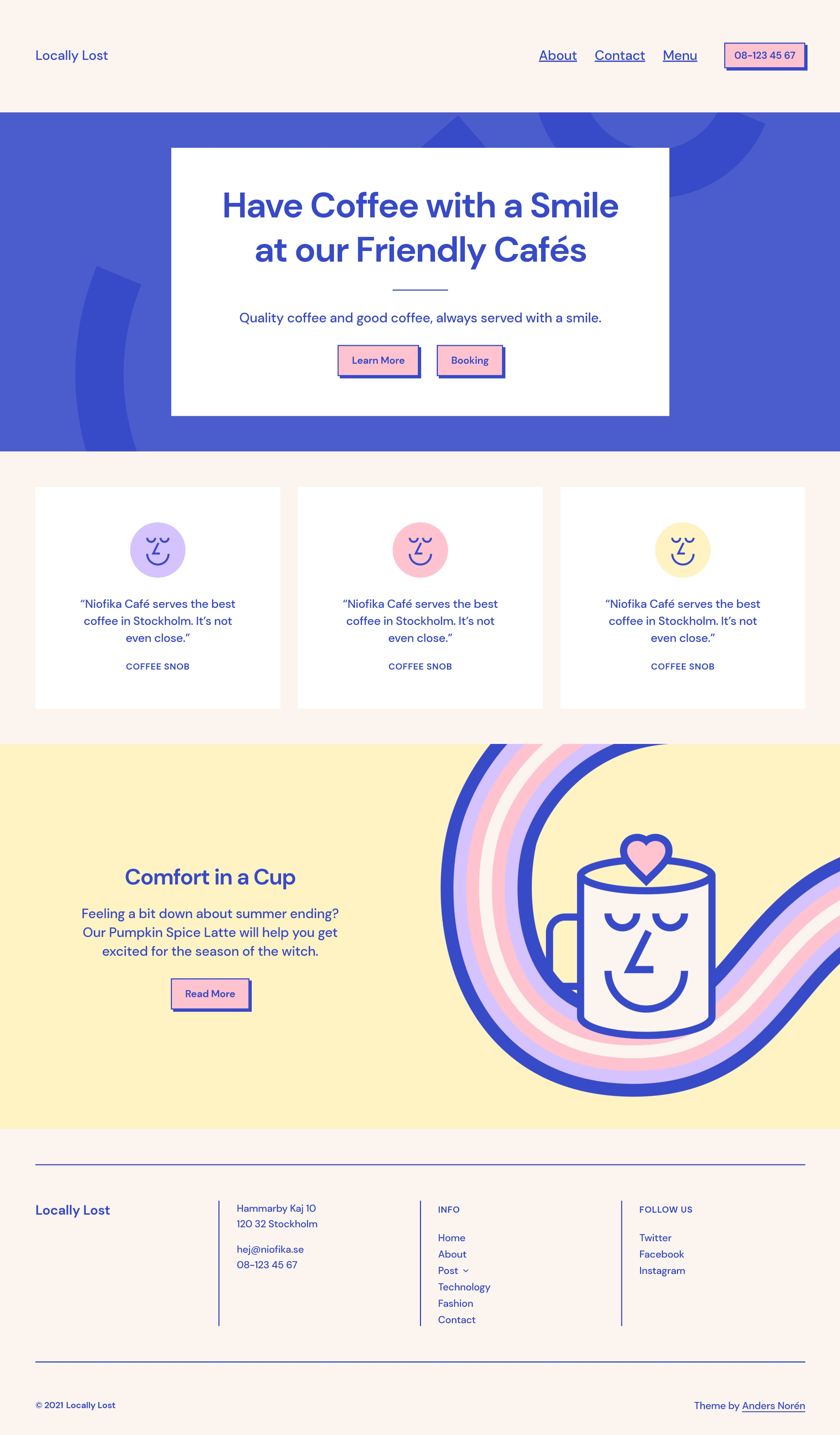
The theme is flexible enough for use with various sites, but its focus is on cafes and restaurants. Many of the patterns lean into this, such as custom menus, call-to-action-buttons, and more.
Patterns are these pre-built pieces of a design that users can mix and match to lay pages out how they want. This also opens up things for theme authors by not having to make any hardline choices on how something like the front page, for example, should look. The theme is offering some suggestions and the tools to put it together. But, ultimately, the end-user gets to decide how it all comes out.
With Tove, I had my homepage built in just minutes, as shown in the following screenshot. All I would need to do is fill it in with custom content.

It felt empowering to simply mash up just a handful of the theme’s 40+ patterns and create a layout that I was comfortable with. This is what theming should really be all about: handing the keys over to users and letting them take the wheel. The theme’s job is just letting them drive in style.
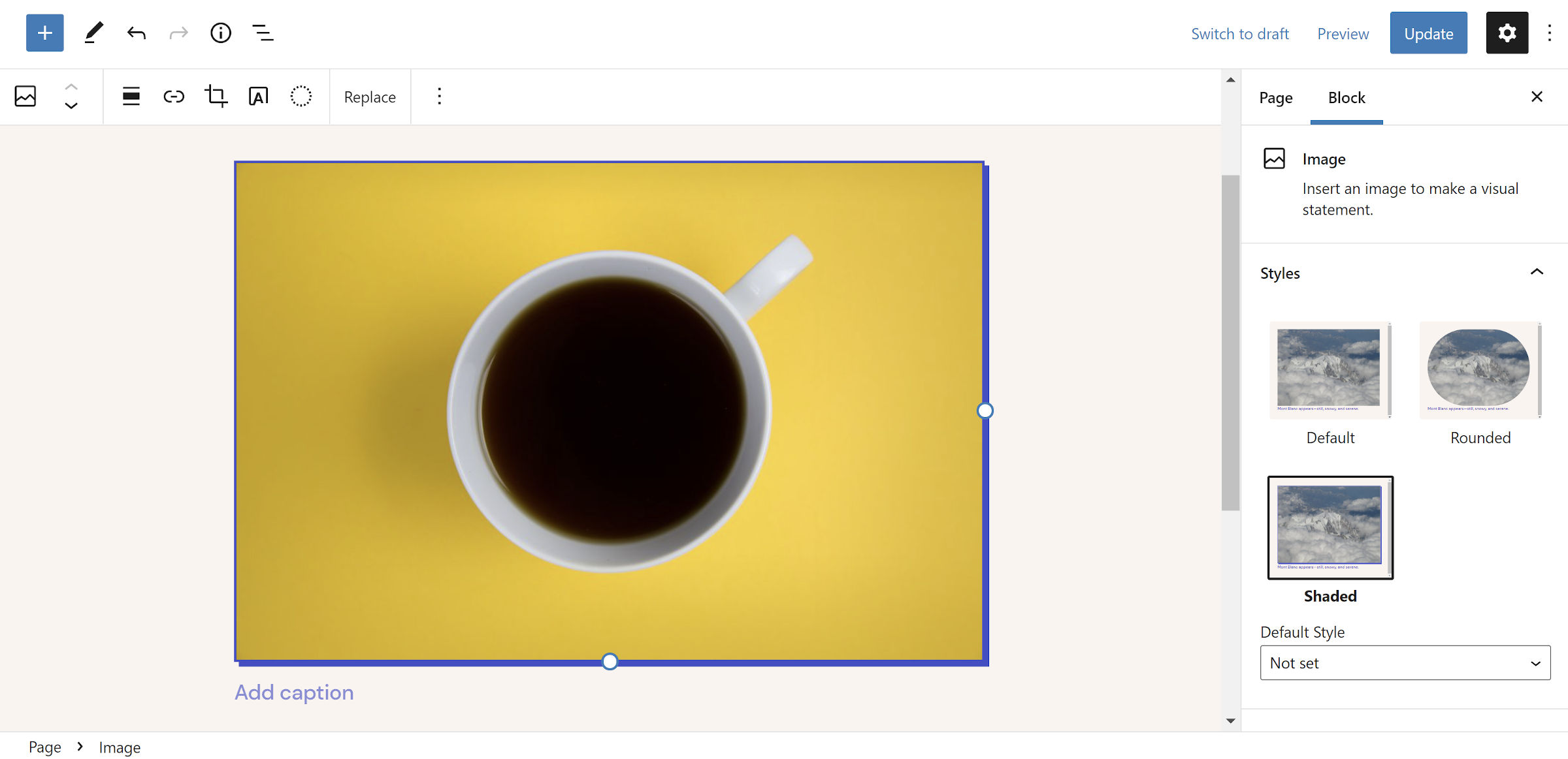
There are other things to love about Tove too. It has several custom user-selectable styles, such as horizontal separators for the Columns block. However, my favorite is the shaded style for adding a blue drop-shadow to several blocks.

The theme is not for everybody. The color palette is a bit on the flashier side and will not fit all sites. Few designers could pull off Tove’s scheme, which is why I think I love it so much. As Norén said in another tweet, it’s “like a plateful of macarons.” Some can work with pretty much anything. The rest of us are just fans.
I would not call Tove revolutionary, but it has no need to be. It is built on top of an experimental system that still has many kinks to work out. However, it is nice to see what one of the WordPress community’s best designers can do with a limited toolset. Norén has definitely pushed the boundaries, which should elevate the block theme development space.
I cannot wait until all the pieces of full site editing are in place, and we can open this thing up.


