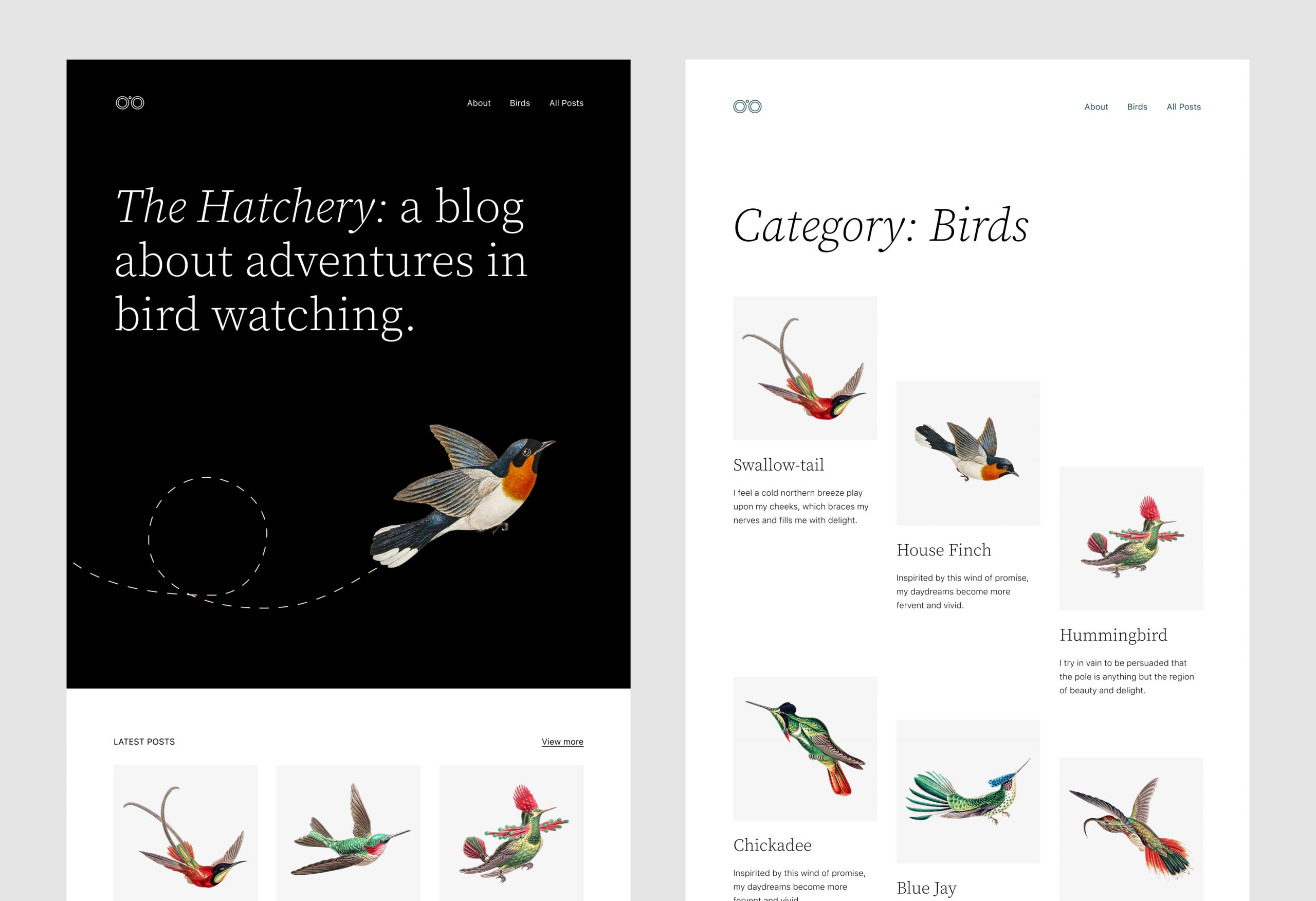
Twenty Twenty-Two, the new default theme coming in WordPress 5.9, was unveiled today on WordPress.org. The design goes full steam ahead in support of full site editing and new customization capabilities.
Like its predecessor, Twenty Twenty-One, the new default theme makes some bold design choices wrapped around a central theme. In this case it’s bird illustrations, complemented by Source Serif Pro for headlines, and a delicious array of patterns for limitless combinations.

The theme will be developed on GitHub until it’s ready to be merged into core. Kjell Reigstad, an Automattic sponsored full-time design contributor to WordPress.org, is leading the design with Jeff Ong leading development. In the announcement he sets expectations high for users to be able to make the theme their own.
“With the advent of Full Site Editing and Global Styles, themes are changing structurally and functionally to enable far more avenues for customization than users have come to expect in the past,” Reigstad said. “To take advantage of these new abilities, Twenty Twenty-Two has been designed to be the most flexible default theme ever created for WordPress.”
In addition to the wide variety of patterns expected to ship with this theme, Twenty Twenty-Two will offer a lively selection of six pre-designed color palettes. Reigstad shared a video preview of how they instantly change the character of the theme. (see below) Combine this with the promise of being able to manipulate every aspect of the theme’s appearance through global styles, and users are in for a treat with WordPress 5.9.
“Twenty Twenty-Two will take advantage of a wide network of page templates, headers, footers, and other patterns so that users can easily make the theme their own,” Reigstad said. “In another nod to the behavior of birds everywhere, these will offer a balance between fun and utility: some are irregular and unpredictable, while others are straightforward and traditional. Together, these patterns will act as a window into all of the possibilities that the theme enables.”
The design preview for Twenty Twenty-Two has received overwhelming positive feedback on Twitter and in the comments of the announcement. Many users were excited to see a default theme that can be quickly transformed for so many applications. Too many default themes have only been applicable to a narrow set of use cases. In the past, users had little hope of being able to change things around to make the design work for their needs. Unrelenting progress on the block editor and full site editing has made it possible for Twenty Twenty-Two to become the most user-empowering default theme in WordPress’ history.
Reigstad said the theme will be “built for Full Site Editing first,” with as little CSS as possible, and all theme styles configurable through theme.json wherever possible, so users can edit them through Global Styles.
“Twenty Twenty-Two is designed with the acknowledgement that its default appearance is not most people’s endpoint,” Reigstad said. “Everyone deserves a truly unique website, built on a solid, well-designed foundation, and Twenty Twenty-Two aims to help them achieve that.”
