No sooner than I said the floodgates of block theme development would be open, a couple of more FSE-capable themes landed in the WordPress.org directory. I checked the review system, and three more were queued up.
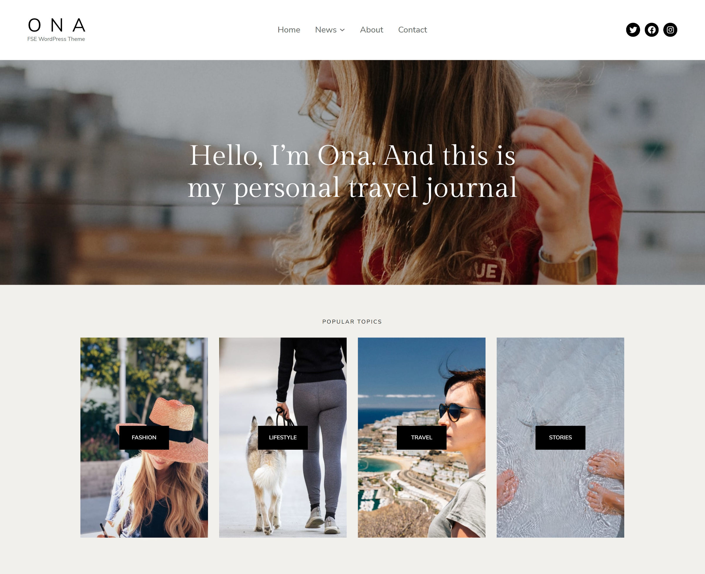
It took mere days for me to find another favorite: Ona by DeoThemes. When the author mentioned it, I checked the source code to ensure it was a 100% block theme. It was hard to believe at first glance.
The theme has been approved for the directory, but it has not yet been set live. It should be available soon, but anyone can grab the ZIP file from its ticket if they want to give it a spin.
We are now at a point where the block system can nearly match traditional theming in features. There are still some kinks to work out and a few missing pieces, but Ona embraces block templating and global styles like few have before. It is modern, almost minimalist, yet packed with potential for a site owner who wants to share their content in style.
Of the free block themes available, less than a handful could be named its equal. But let’s give it a few weeks and see what else lands. I could be eating my own words shortly.
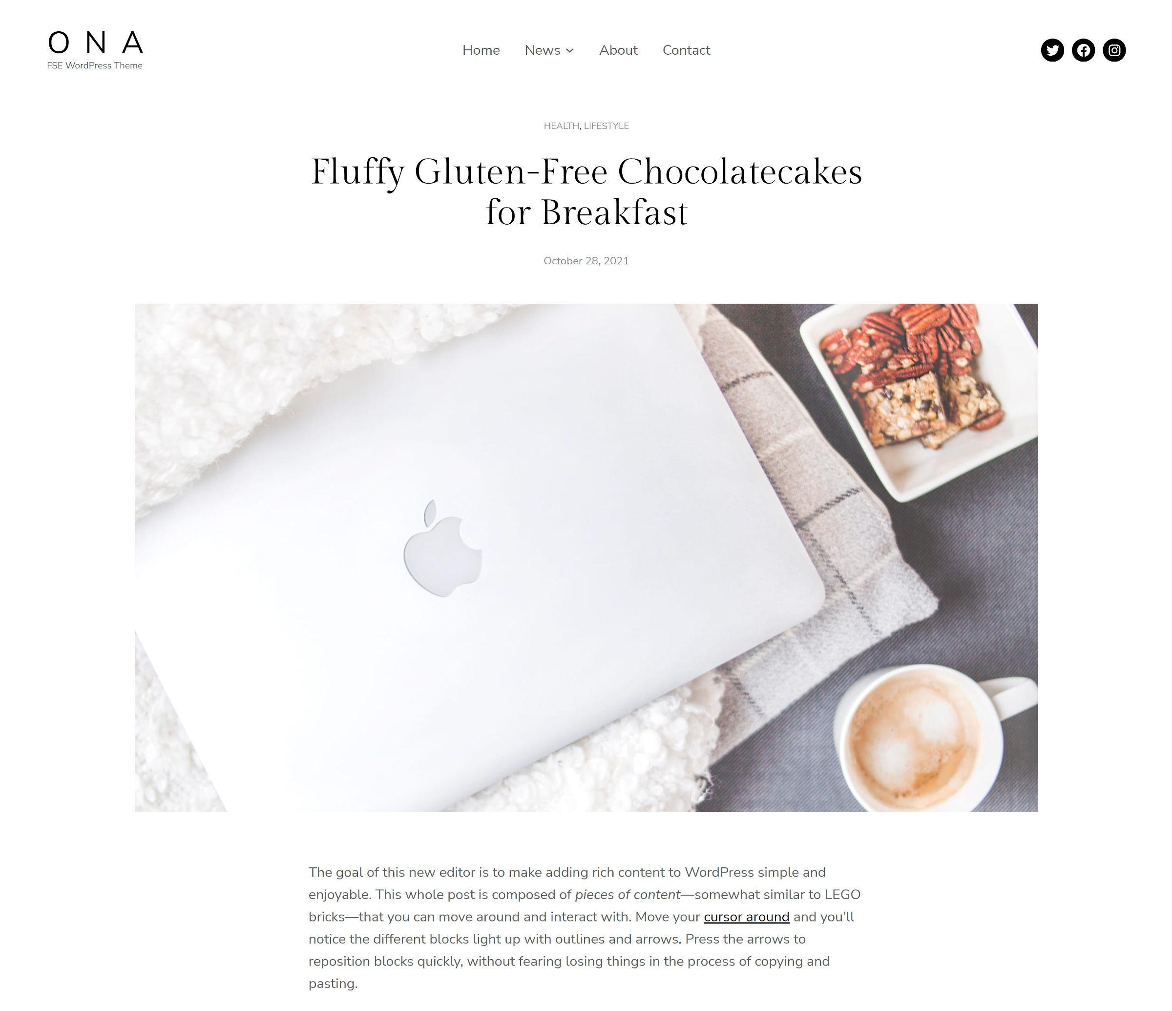
Ona’s design leans heavily toward modern-day fashion, lifestyle, and travel blogs. However, that is not a hard requirement. It is balanced enough for use on a range of sites. It works well as a blog, but small businesses could get a lot out of it with block-built landing pages. It does lend itself well to storytelling with a mix of large, in-content images.

The change that users will need to make out of the gates is with the site branding. The default 18px of letter-spacing for the site title does not work well for more than a few characters. This is easy to adjust in the site editor.
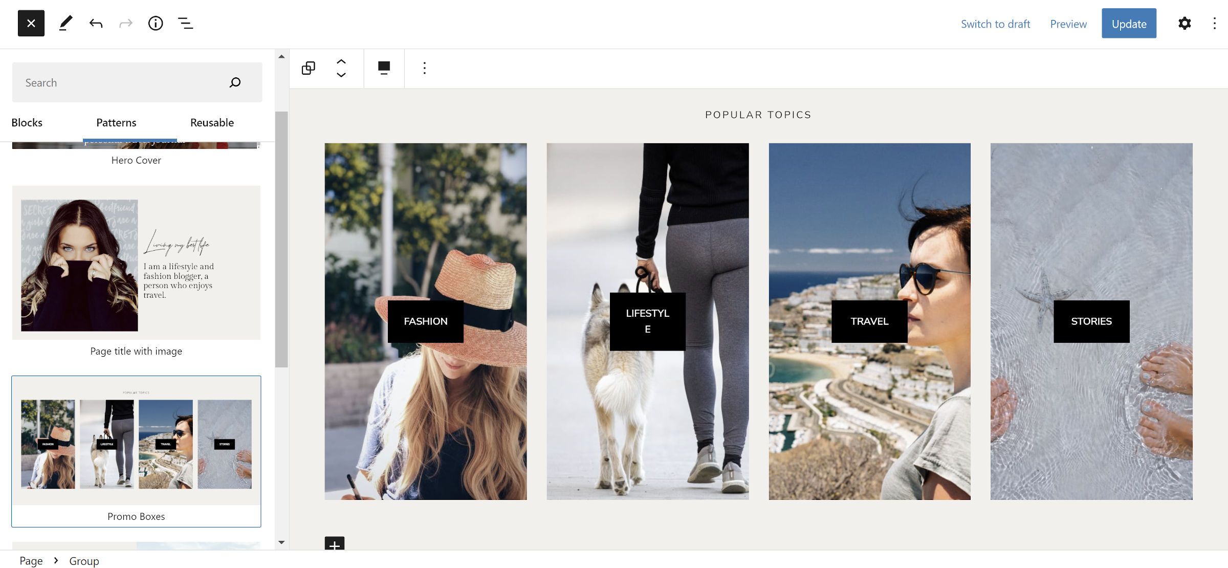
Ona does not have a lot of patterns, but it makes up for it with a well-rounded set. It ships with two headers, one footer, and five for general usage. Most of them are in use on the demo’s homepage.

Looking through the theme’s source code, I noticed a couple of additional registered pattern categories titled “Ona Pages” and “Ona Posts.” There are no block patterns defined for them, so they do not appear in the inserter. The author may have forgotten to remove them or has plans for a more extensive set in the future.
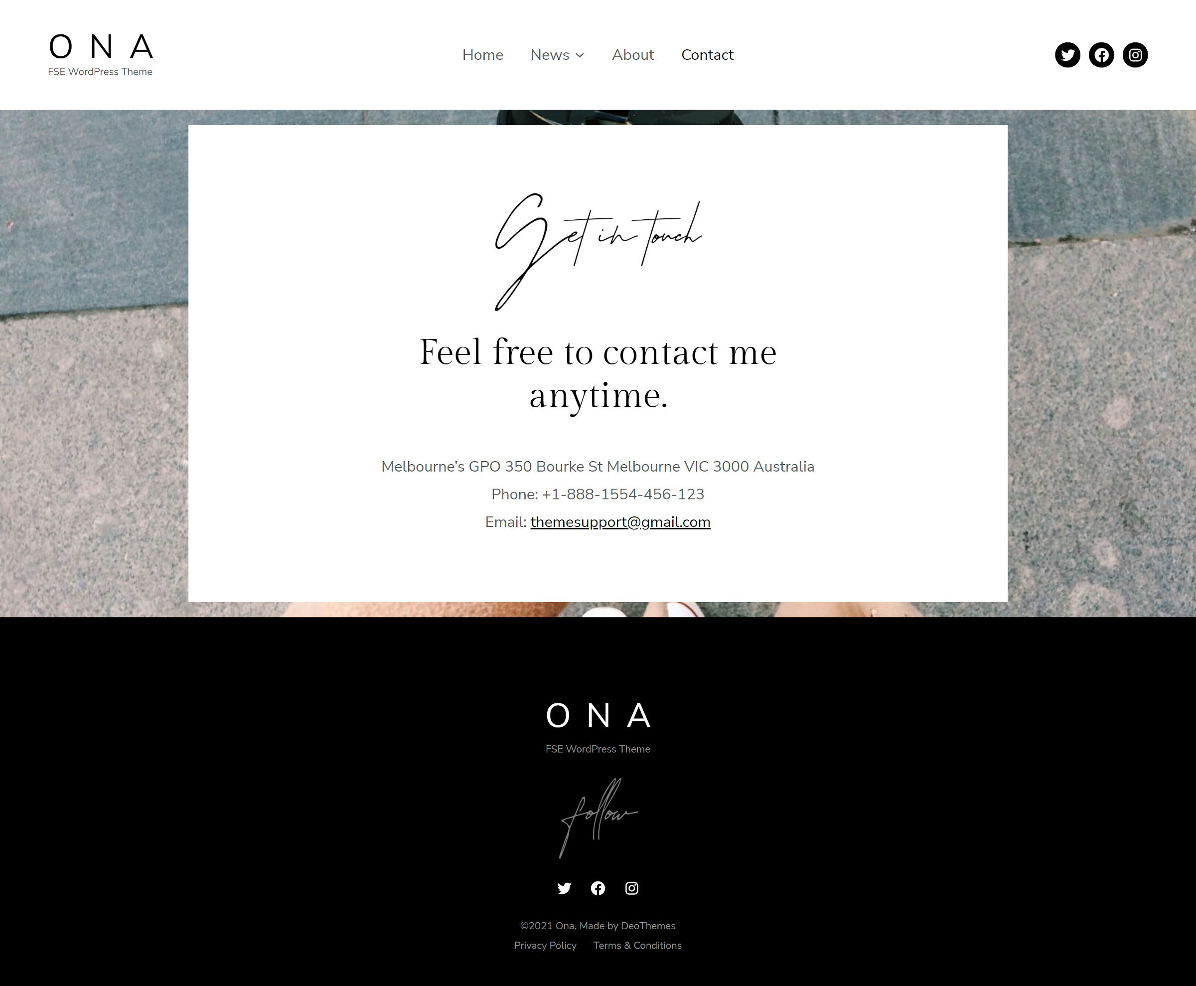
Instead of putting everything into patterns, the theme also offers extra About and Contact page templates. Such custom templates were commonplace in traditional theming, but their usefulness was impeded by the lack of a standard editing interface. That is a non-issue with block themes.

With the template and site editors, Ona showcases how custom page templates could see a resurgence. I still lean toward block patterns as the primary way to offer custom layouts, but having full-page designs ready to go through the templating system is much nicer than in the classic era.
The problem with templates is that it can be hard to judge where structure and layout end and the content begins. For an About or Contact template, this is usually not a problem. Those two are likely to only be used once on a site. However, when you get into templates meant for use with multiple pages, there should be a clear separation of the two. Patterns are going to make a lot more sense for the content.
I rarely judge a theme entirely by its fancier features. What I truly want to know is whether its typography makes for comfortable long-form reading, and Ona does well in that department. I am not a fan of the oversized default blockquote design, but that can be easily adjusted.
The biggest issues I had with the theme were the font and color slugs. However, this is more of a personal grievance about nonexistent standards. Right now, slug naming is a free-for-all affair for block themes, and I do not see that changing any time soon.
Users will also encounter 404 errors from the theme’s default images. Again, this is not specific to Ona; it is a WordPress/Gutenberg issue. A fix only landed in the development version of the Gutenberg plugin five days ago. Maybe when the theme’s next update rolls around, it will be able to make use of it.
If this is the quality we are seeing at this stage, I cannot wait to see what the rest of the theme design community has in store. DeoThemes just raised the bar.
