Some Gutenberg plugin releases feel like heavy-hitters with new user-facing features. Others, such as today’s version 12.2 update, smooth over problems and create a more well-rounded experience.
Switching between the site editor and templates is smoother. The color picker is no longer a hot mess. And, border controls now use the tools panel approach of allowing users to enable or disable the options they want.
Contributors have made progress on updating the Comments Query Loop block, which will eventually be the backbone of displaying comments in block themes. One of the tallest hurdles was making nested comments work. With that now fixed, moving forward with other comment-related components should be less problematic. The latest release also introduced the Comments Pagination Numbers block for handling paginated comment lists.
View Templates Without a Page Reload

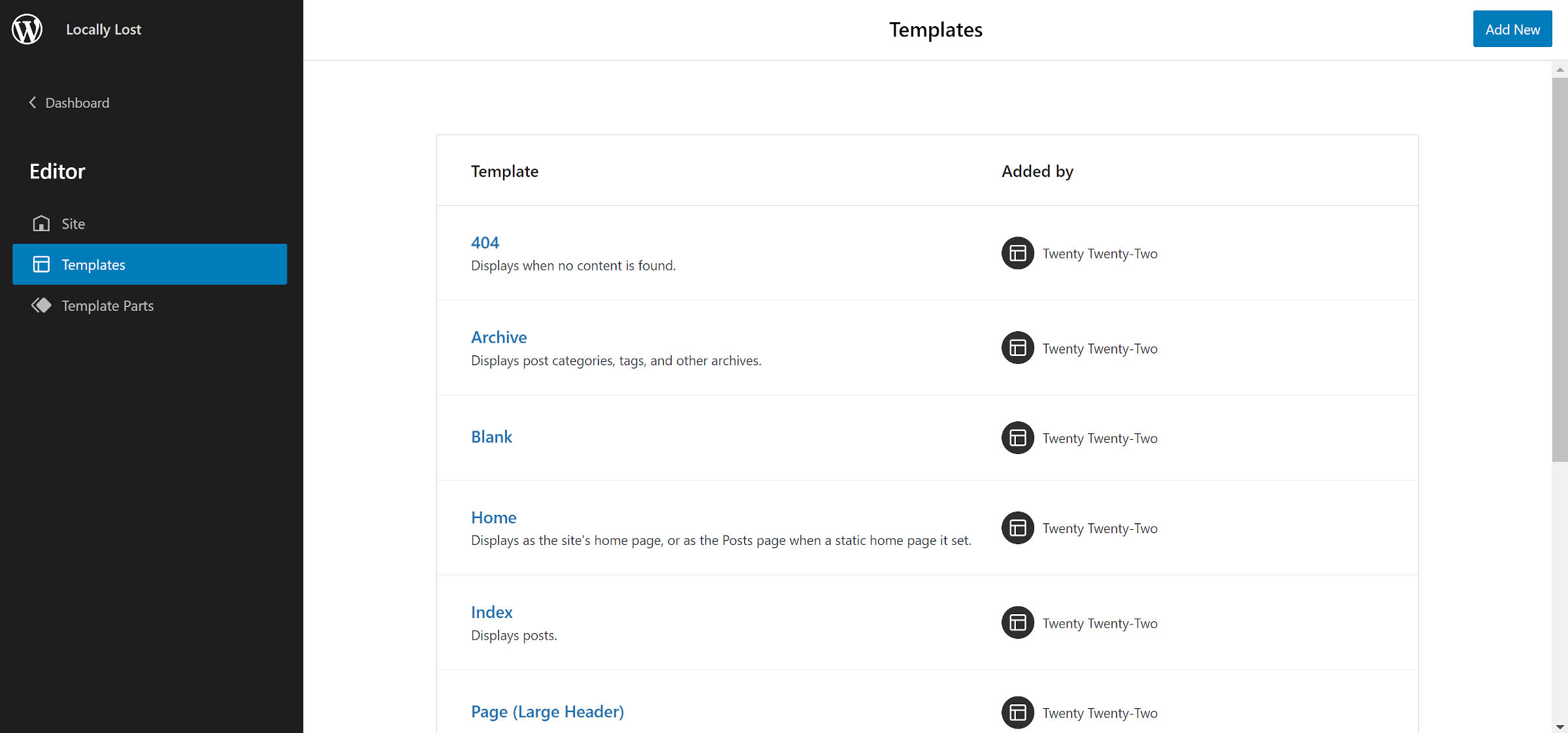
When Gutenberg 12.1 launched two weeks ago, I was happy to see the new and much improved slide-out panel in the site editor for viewing templates. My primary complaint: it was slow. Switching between the editor and template view required a page reload.
In the latest 12.2 release, this has all changed. Thanks to client-side routing in the site editor, the transition between the editor and templates feels fast and smooth.
Changes like this are one of the reasons I have welcomed the postponement of WordPress 5.9 until late January. Some of these little wrinkles needed ironing before showing the site editor to the world.
Improved Color Picker

Gutenberg 12.2 introduces a much-improved color picker. The previous iteration was unwieldy, bulky to the point of being an annoyance. Users would have to scroll and scroll and scroll some more just to jump between changing a block’s text color and its link color. This was especially true if the theme showed both its colors and those from core.
The latest iteration tightens up the UI to the point where users can see the text, background, and link color options all at once. If they want to customize any of them, they can click on one to pull up the color picker popup.
Perhaps this change will open the door for other color options in the future, such as one for link hover/focus. It would have been far too messy in the old UI. However, the new minimalist design leaves ample room.
I would love to see the border-color control get the same treatment. However, there is a separate ticket that offers more fine-tuned control.
Font Size UI Change

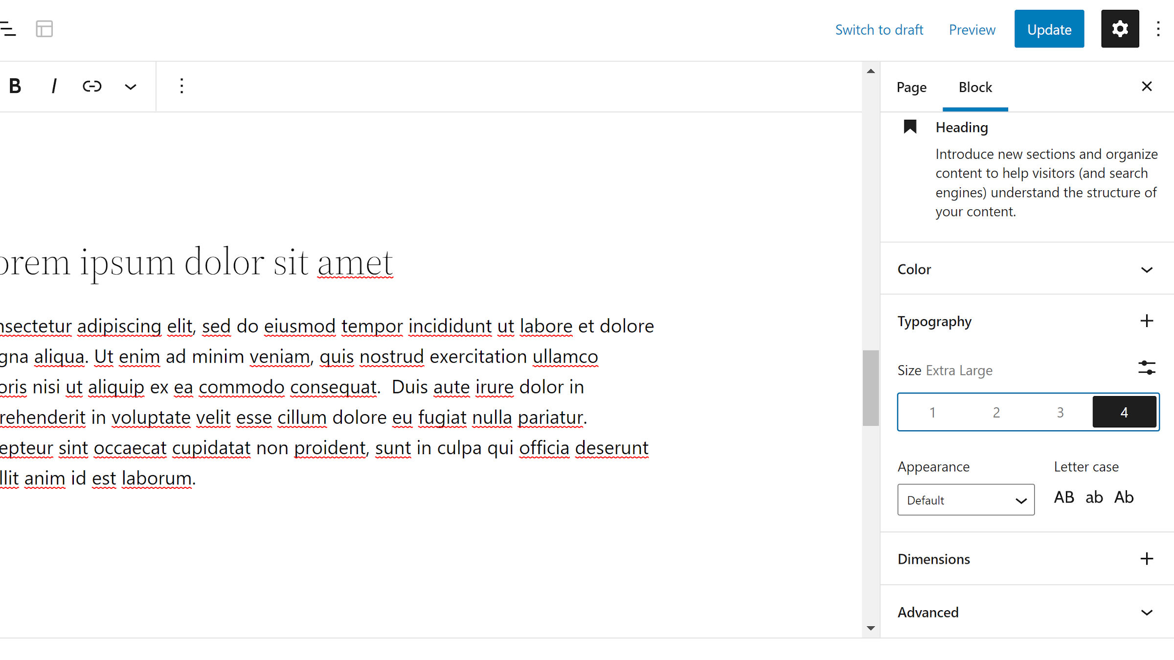
The font size control for supported blocks looks much different. It shows a list of numbered buttons for themes with five or fewer custom sizes. The font-size name appears when one is selected. Otherwise, it is simply a list of numbers with no context.
I have generally liked the progress made toward updating the block options UI. But, I am not a fan of this change. As a user, what do these numbers even mean? Is the “1” size small or medium? There is no way of knowing without testing it. Plus, the context will change from theme to theme. A UI change like this may have been OK on the back of a standardized naming scheme. However, that will be tough to implement after three years of usage.
In general, clicking a single button feels like a better experience than clicking a dropdown, followed by a second click of making a selection. I am just not sure that it works here. However, I am open to seeing where it goes upon further iteration.
There is also no visible way to clear the current selection and return to the default size. If the theme supports custom sizes, users can switch to the “Custom” field and clear it out. This is not obvious unless you stumble upon it. Users could also hit the “Reset All” button, but doing so resets all typography options.
The easiest way to avoid this UI change is for theme authors to register at least six custom font sizes. The option will automatically revert to its former dropdown select field. Fortunately, I have 13 in the theme I primarily work on, so it is a non-issue for me.
Block Template Part Hooks
Theme and plugin developers now have additional action hooks around the block template part system. These should be handy for debugging or other complex use cases.
render_block_core_template_part_postfires when a part is found from the database.render_block_core_template_part_filefires when a part comes from a theme file.render_block_core_template_part_nonefires when no part is located.
