In the dawn of the block theme era, the WordPress theme directory could use a reimagining. That is what Munir Kamal set out to do before WordPress 5.9 launches later this month. He announced an alternative theme directory on the Gutenberg Hub website earlier today. It lists all the block themes that are officially hosted on WordPress.org.
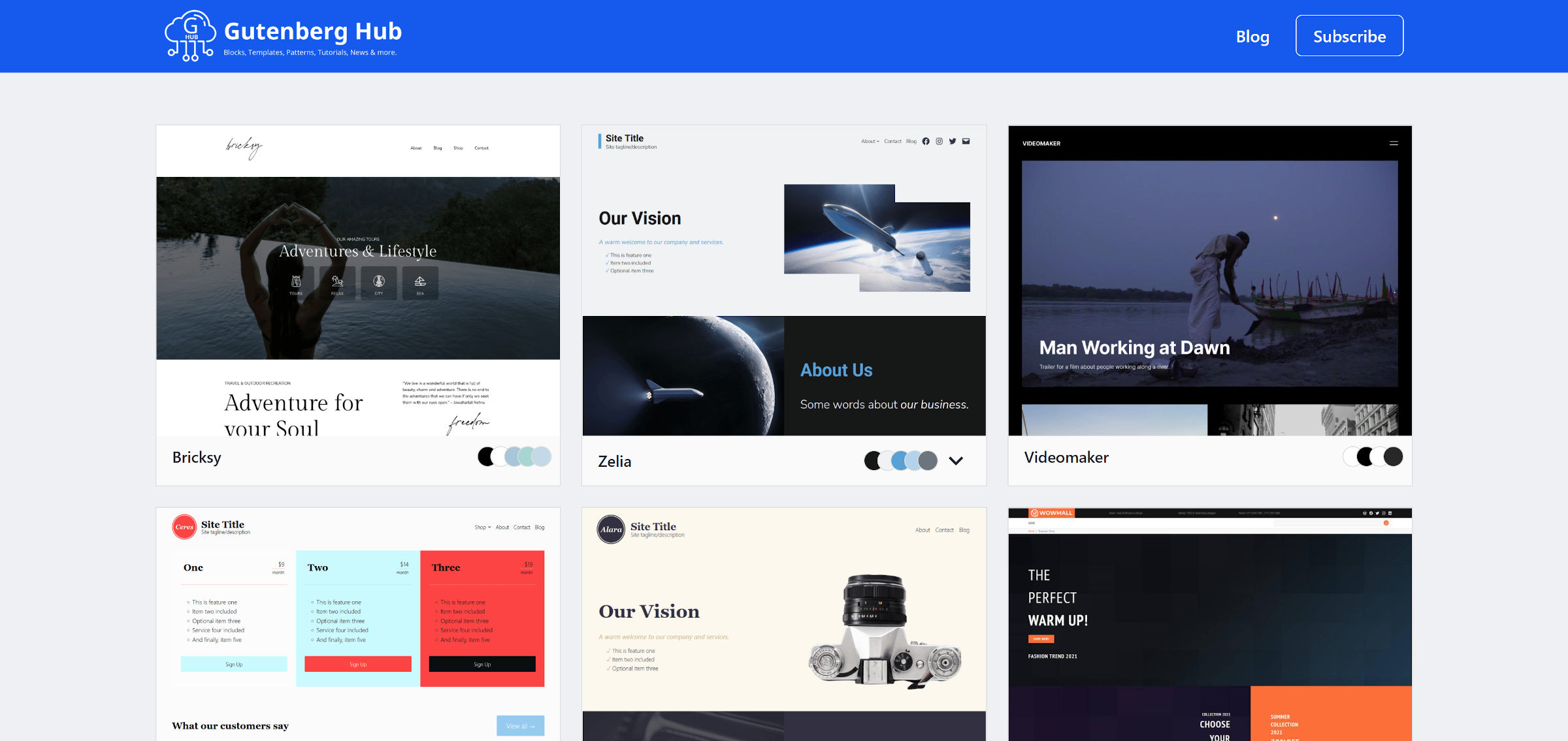
The interface and experience are similar to the official theme directory and for a good reason. Kamal is pushing for changes on WordPress.org.
“I noticed the lack of info the official theme directory provides,” he said. “I want to initiate a discussion around this to fix it, and thus created this as a concept/experiment. Now that it’s an era of the new generation of WP themes (Block Themes), the themes directory needs to be reimagined. Block themes are all about colors, typography, block styles, patterns, and templates. As a WP user, I wish to see all that info related to a theme when I explore themes in the directory. I need to choose without installing and testing multiple themes.”
Single theme pages in this reimagined directory include more data than the official directory. Instead of merely a screenshot and description, each page displays the theme’s color palette, provides typography examples and info, and previews several content blocks.
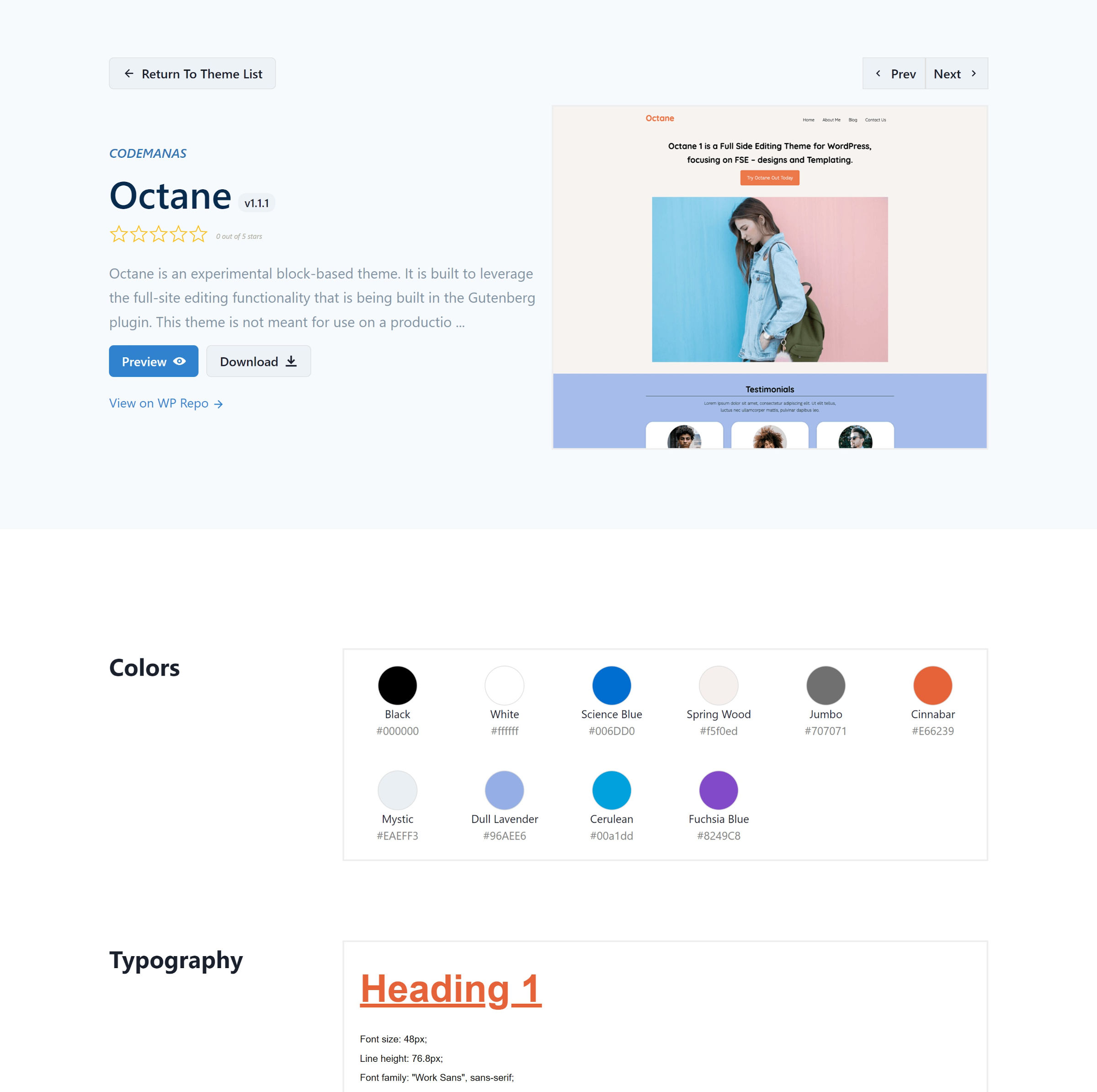
One thing that makes modern themes unique is their included theme.json file. This file allows theme authors to register settings and add styles that work in both the editor and the front-end. This level of standardization did not exist until WordPress 5.8 rolled around last year.
It also allows developers like Kamal to build new tools on top of it. When nearly all the data related to a theme is in a standard format, it is easy to pull out and experiment with it.
For example, because there is a specific key in the theme.json file for colors, anyone can grab and display them via code. Gutenberg Hub’s directory displays these as a palette alongside each theme. Users can even click to copy them.
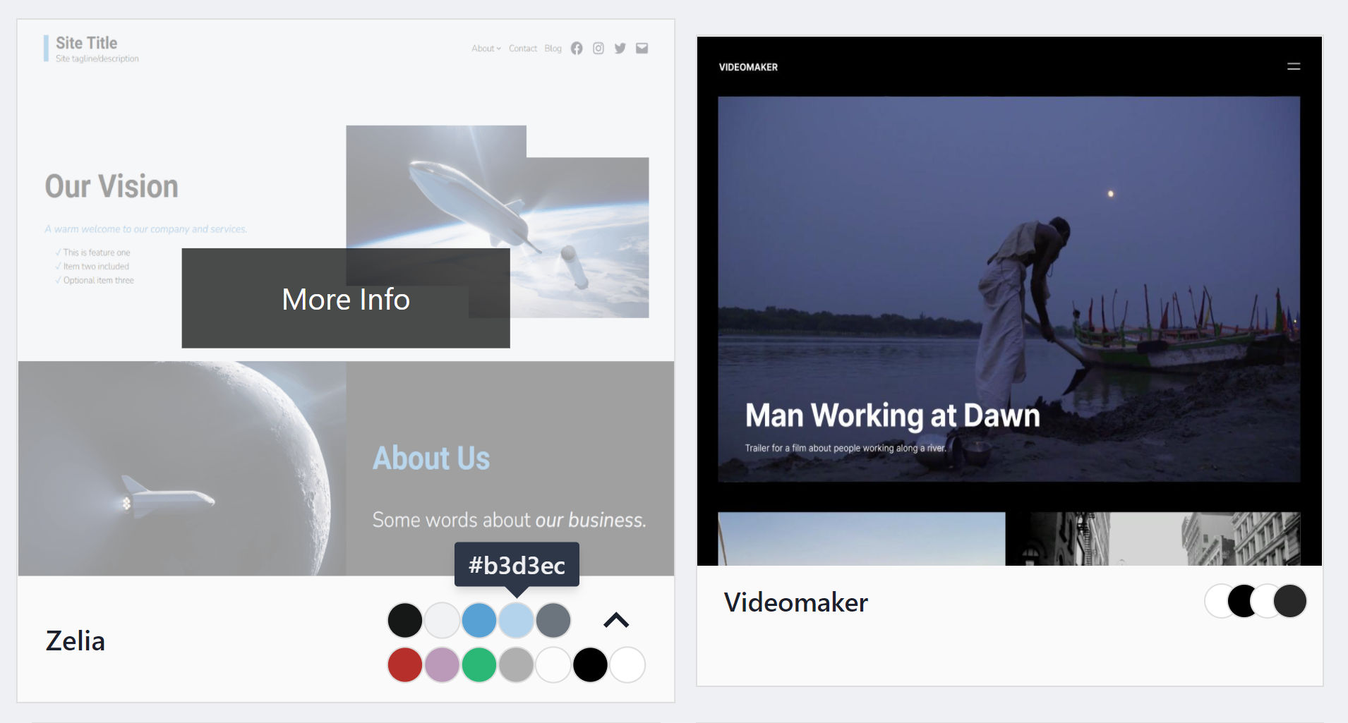
This would have been practically impossible in the past because WordPress did not have a way for themes to define something as simple as a color palette.
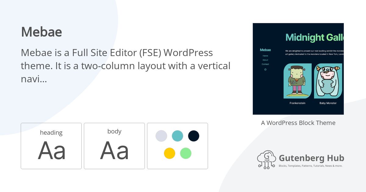
The directory also auto-generates social images for each of the themes. The following for Mebae and Pacer both show their description, fonts, colors, and screenshot.
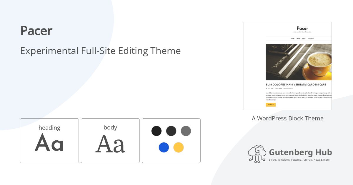
For years, WordPress.org theme previews have been plagued by sub-par demo system. Today, the live demo can show starter content if a theme provides it. However, there is no current FSE support for the feature. Gutenberg Hub displays the same live preview as shown in the official directory.
Kamal has partially addressed this issue by adding a “Content” button. Clicking it allows users to see dozens of blocks in action.
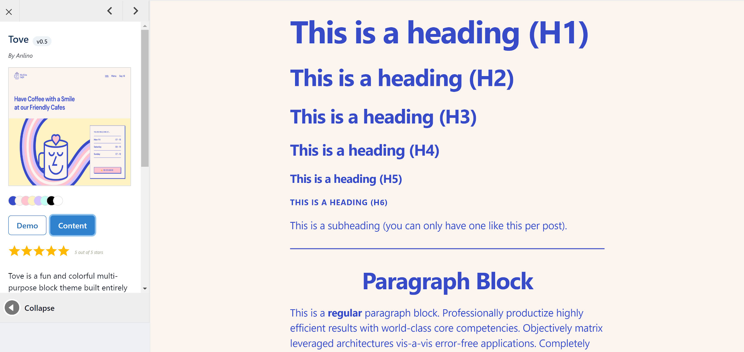
This provides a general overview of what the theme looks like, but the preview experience is still lacking. A handful of featured images would add some visual oomph to the home/blog and archive pages.
Kamal has plans to incorporate theme templates and patterns into the preview in the future. Those additions would make theme demos more useful.
He does not plan on stopping there. “Other plans include providing a super useful search and filter functionality that makes it easier to trim down the result to the closest needs of a user,” he said. “And maybe a comparison tool that a user can use to compare two themes side-by-side with practical elements to decide between the two, rather than reviews, downloads, etc.”
The work Kamal has put in so far looks promising. There is still much that could be improved if we had an entire community effort behind this. With the block theming feature launching with WordPress 5.9, there is no reason to stick to the old theme preview system when so much more is possible.
If I had one extra wish for Gutenberg Hub or WordPress.org, it would be for all child themes to be listed on their parent theme’s page. But, I will take this redesigned directory first.
