The first Gutenberg plugin release of the year contains loads of features. Developers should enjoy a completed core blocks reference. Group block spacing controls offer more layout flexibility, and a new Post Author Name block has arrived on the scene. Overall, the site editing experience is shaping up.
The latest release adds a couple of nice-to-have design options. The Group block now supports typography options. This should make it easier for users and theme designers to change the font size, family, and more for all child blocks at once. The Spacer block supports custom units, so users are no longer restricted to pixels. Paragraphs now have a font-family option.
Theme authors can now register “nameless” font sizes to support the core sizes. They also have new Comments Pagination Previous and Next blocks for handling paged comments.
Users without the edit_theme_options capability (Administrators by default) can no longer create nav menus via the site editor. However, they can select an existing one via the Navigation block. This returns menu creation to its original restrictions.
Let us dive right into some of the big features.
Complete Blocks Reference
While the average user may never look at it, the Core Blocks Reference in the editor handbook should be a welcome sight to developers. It is almost impossible to remember all the blocks and everything about them.
The data is automatically generated. Each block in the reference displays the following information:
- Name
- Category
- Supports
- Attributes
I would love for WordPress.org to automatically display this for all block plugins in the future. The data is standardized through block.json files, so there is no reason it should not be possible. Otherwise, individual plugin authors would need to recreate this to share their own references.
Use Site Logo as Favicon
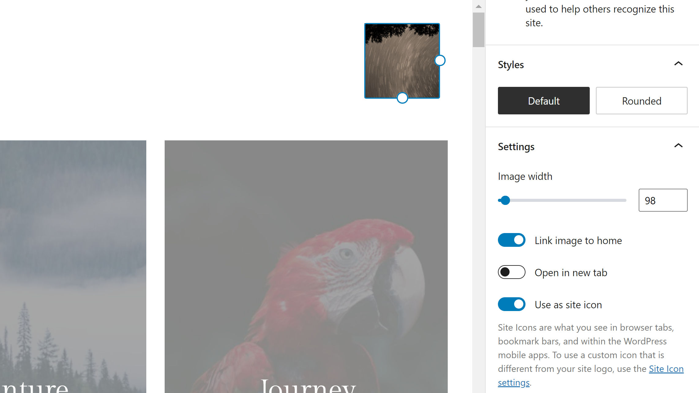
Users can now save the image used for the Site Logo block as their site icon (favicon) via the site editor. This is a step in the right direction now that the customizer is disappearing for block theme users. They will need an easy way to set this.

There are two downsides to this solution. The first is that this option is enabled by default. If a user does not notice it, they could be overwriting their existing site icon without knowing. Logos and icons do not always match. The WP Tavern website shows a prime example of this.
The second issue is that we need a dedicated site icon option. Adding it to one of the available settings screens in the admin would be a simple solution. That would give time to figure out how to eventually work it into the site editor.
Post Author Name Block
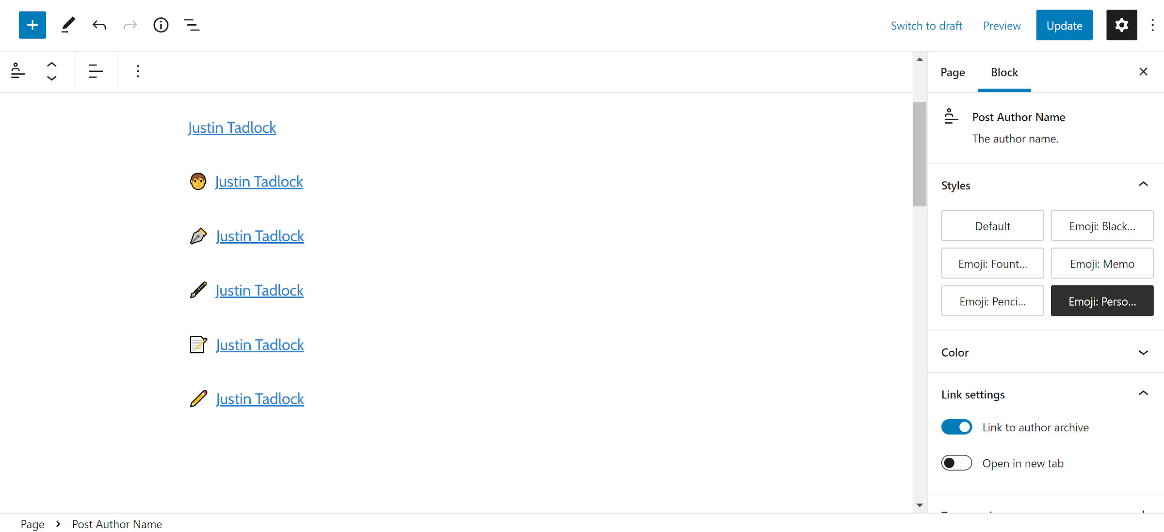
Gutenberg 12.3 introduces a new Post Author Name block. As its name suggests, it displays a post’s author. It is something so seemingly simple, but when you have been waiting ages for it — well, since May 2021, technically — it feels monumental. To show how happy I am to see this block, I made five custom styles for it.

This is a part of an effort to split the original Post Author block into smaller components. Currently, it can display the author name, avatar, bio, and custom byline text. If a theme designer needs just the author text in a one-line meta area, a user enabling those other elements via the site editor usually blows the entire thing up.
Separate Post Author Avatar and Post Author Bio blocks are planned. When these next two land, it will give theme authors more flexibility.
Group Block Spacing Control
I feel like a kid in a toyshop to see more than one of my long-time gripes taken care of in this release. The Group block now supports the Block Spacing control. This allows users and theme authors to define the margin between its child blocks.
One of the primary use cases for this is collapsing margins between similar elements. For example, a user might want to group three File blocks together without any whitespace between them, as shown in the following screenshot:

Typically, these blocks would have the standard top margins between each. By setting the block spacing to 0, users can wipe them out.
“Zeroing out” margins has been one of the most frustrating problems to solve for some themers, especially when dealing with wide or full-aligned blocks. The WordPress editor’s HTML markup does not match the front-end in those cases. A block spacing control on the Group block solves this issue for several scenarios.
Of course, it is not all about getting rid of margins between blocks. It is also possible to create even more space.
When using the Row variation of the Group block, the spacing is horizontal. This should also take care of a lot of theme layout needs.
