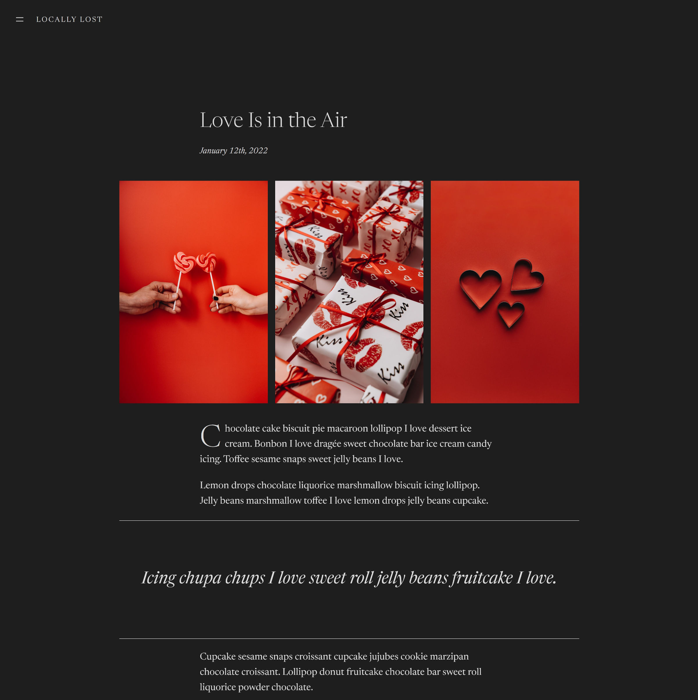
Sometimes the sweetest things in life are the simplest. Automattic’s latest block theme landed in the review queue yesterday, and I had to give it a spin. What I found was a minimally-elegant design that I fell in love with.
Really. I even dedicated an entire demo post on my install to it:

Well, that and Valentine’s Day is a mere month away. It felt like the right time to mix up my install’s test content anyway.
Let me preface the rest of this review by saying that I hate dark themes with a fiery passion. However, every now and again, one comes along that makes me rethink my position. Livro is one such theme. I may dislike it in a week, but I have genuinely loved using it for two days.
The theme’s most impressive feat was using a single font family, Newsreader, across the entire design. It never felt like it needed anything else to separate body copy, secondary text, and headings.
Livro will not meet everyone’s needs — not by a long shot. However, it is the sort of theme that will appeal to those who do not like any bells and whistles whatsoever. The type where content reigns supreme, where a few words and pictures are all that is necessary to make a point.
I did not immediately hop on this whirlwind affair with Livro at first sight. Things started a bit rocky. The theme managed to implement my top three pet-peeves:
- It displays post content instead of excerpts on blog/archive pages.
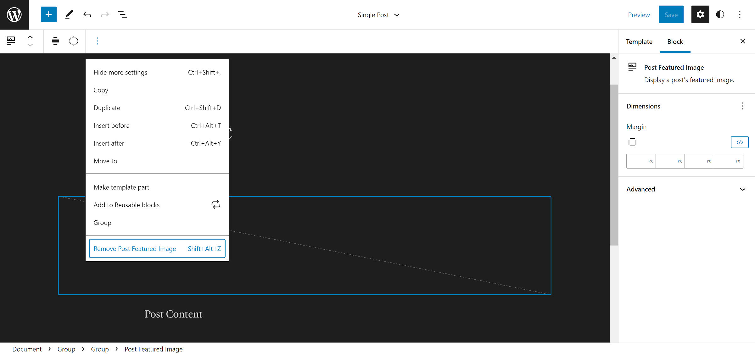
- It shows the featured image at the top of the page on single posts, creating duplicate image output when that same image is used in the content.
- Its navigation menu lists all of my site’s pages by default. All 90+ of them.
One extra issue I noticed with the post content on the blog and archive pages was that wide and full-aligned blocks were the same width as normal content. I do not know if that is a WordPress or theme-specific issue. Since I planned on switching to excerpts, I did not look too deeply into the code.
The Navigation block issue is, in part, a problem with WordPress itself. It will fall back to the core Page List block in specific scenarios. However, theme authors can also address this via the block_core_navigation_render_fallback hook, introduced in Gutenberg 12.1.
Fortunately, all of these issues are dead simple to correct in the world of block themes. The site editor is just a click away, and users are no longer bound to the oddities of otherwise solid theme designs. In moments, I was able to customize how things looked.

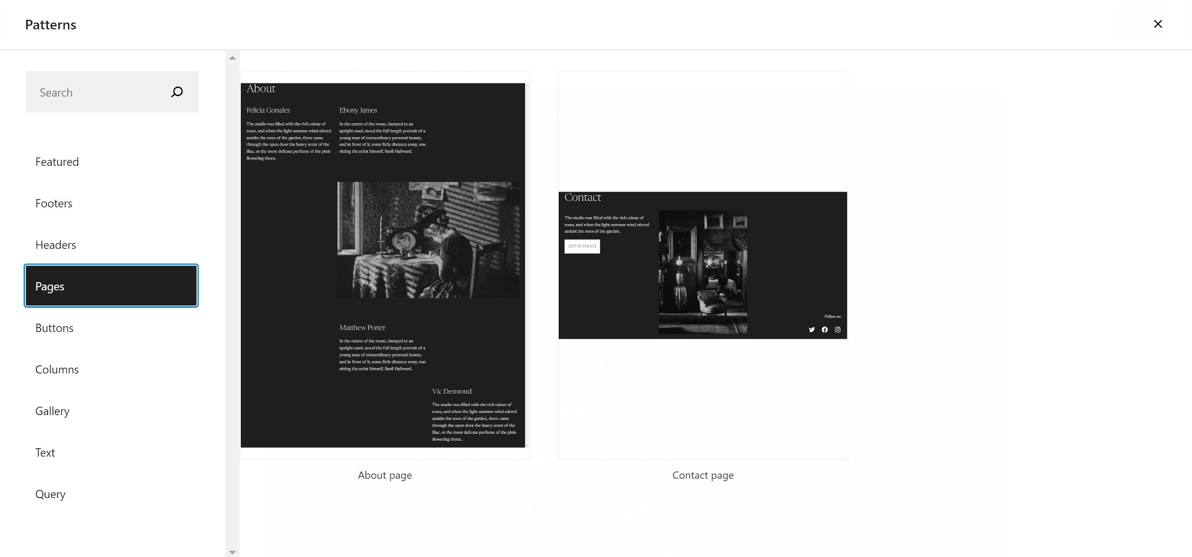
The theme bundles 15 block patterns in total. Eight of them are for headers, and five are for footers. Most of these are variations on the same concept, primarily changing the position of the default elements.
I was a little disappointed to not see more variety for page or general-use patterns. The theme ships one for an About page and another for a Contact page. They both use an offset-column design that I hope one day gets dropped into the black hole where other web design trends go to die.

The nav menu’s “x” close button is on the far right edge of the screen, but the open icon is on the far left. This is more of a problem with WordPress’s handling of the Navigation block than the theme. Nevertheless, it is still irritating trying to find the close button. Ideally, the open and close buttons would always be in the same place.
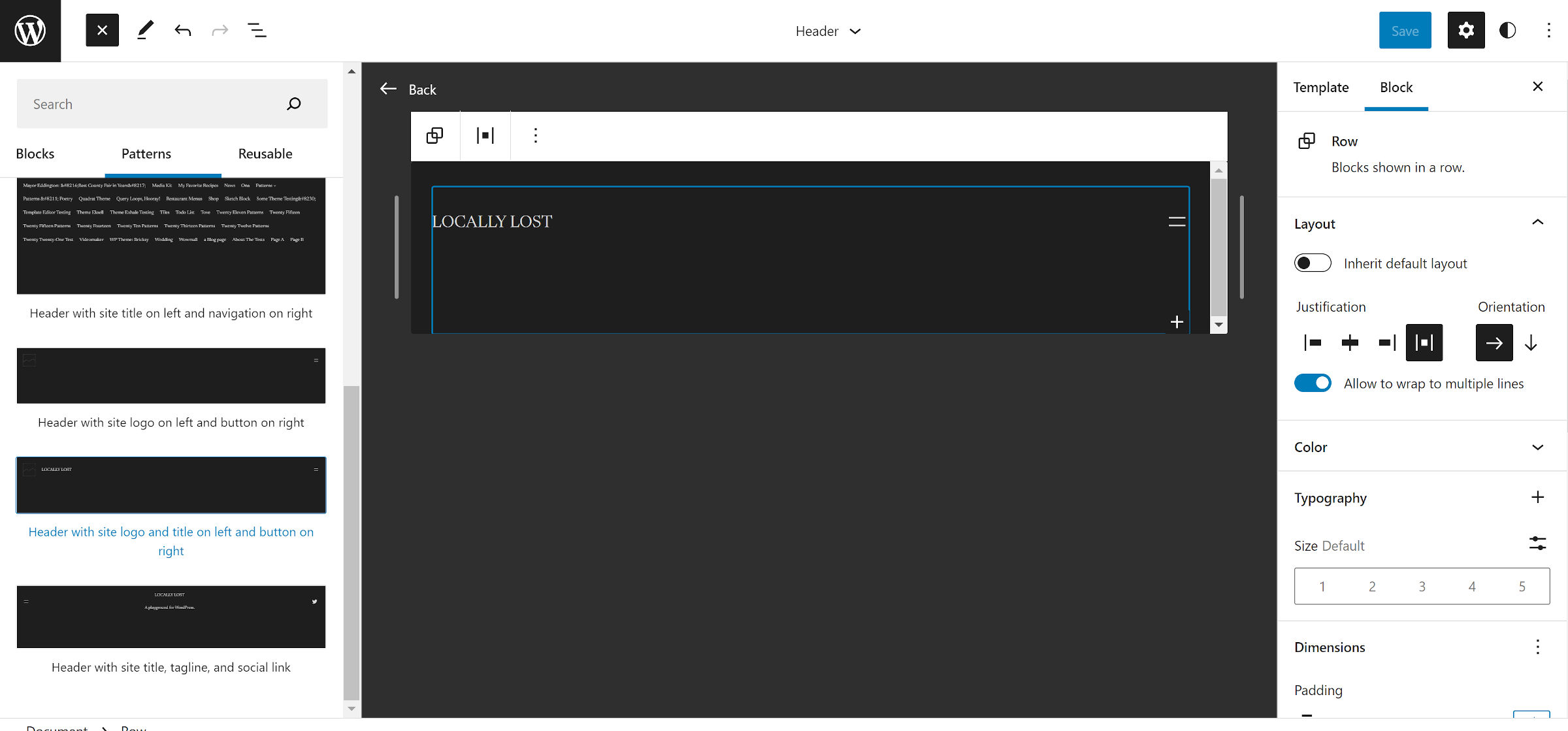
One way to mitigate this issue is to use the “Header with site title on left and button on right” pattern — yes, all the short names were taken on header-pattern naming day.

Users can switch it by modifying the Header template in the site editor. It puts the nav menu open button on the right side of the page. The close button will still be slightly off, but it is a better experience than the default.
For a theme that I claim to love, I did focus on its downsides in this review. Part of that is to show that such issues need not always be the reason to overlook a block-based theme. If they are relatively minor problems, it does not take a programmer to make those adjustments. All of the design elements that I enjoyed about the theme were already there. It just needed some coaxing to make it perfect for me.
I would still like to see the Automattic Theme Team add a few patterns to the mix. Livro’s clean canvas seems to invite a mashup of media and text blocks.
