Raise your hand if you have seen this before. Yet another social sharing plugin. But, with the block system, all things are new again. Some things simply need to be ported over from their former PHP-based equivalents. Others are fresh takes on old ideas, and a few may set the standard for years to come.
Nick Diego forked the core Social Icons block to create Social Sharing Block. Everything about it looks and feels like it is supposed to be in WordPress, so much so that he thinks it could be a candidate for inclusion.
“I tried to replicate the Gutenberg file structure as much as possible,” he said. “It’s close, but they are doing some webpack wizardry. I would love to see this ultimately get included in the core in some form, but may be too niche. I am going to put together a draft PR at some point though after 5.9 is out and I am sure the plugin is 100% solid.”
While it may not ever land in WordPress, it will likely be a go-to solution as more and more users begin to use block themes. Currently, the plugin requires either WordPress 5.9 or the latest version of Gutenberg. It uses some newer components, but it does not make sense to make it backward compatible with earlier versions anyway. The block works best when coupled with the site editor, which requires a block theme.

The plugin deviates from the core block in one necessary way. Instead of users typing in the URL to their social profiles, the Social Sharing block automatically outputs the proper “sharer” URL for whichever service is selected.
It even handles email and print links. Outside of that, it currently supports 10 social networks:
- Skype
- Telegram
- Tumblr
Diego said via Twitter that he plans to support more services in future iterations.
Social Sharing Block is a prime example of the promise of the block system. In classic WordPress, users were limited to whatever design the developer made possible. Often, plugins would output sharing links automatically, and users would need to configure options via a settings page entirely detached from what it would look like on the front end.
With this block, users have flexibility. They have control over every aspect of how their social sharing links are output, at least within the limits of the site editor. Everything from the label to the colors to the preceding “share this” text is at their fingertips.
This is also one of the reasons I am already a fan of this young plugin. It does not try to do too much. It does not concern itself with design aspects outside of the social sharing list that it outputs.
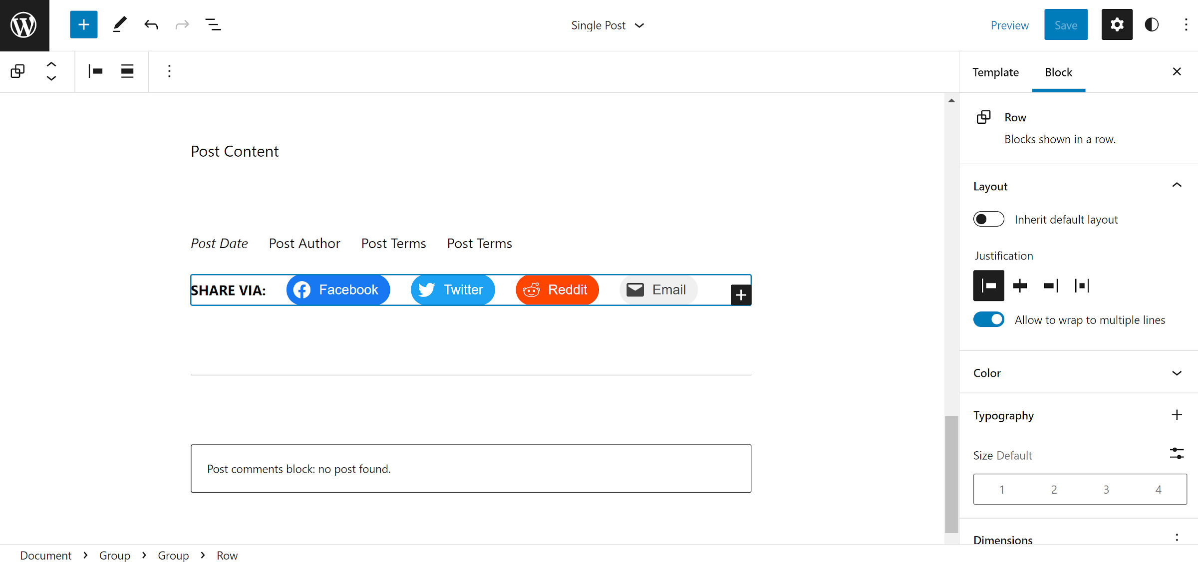
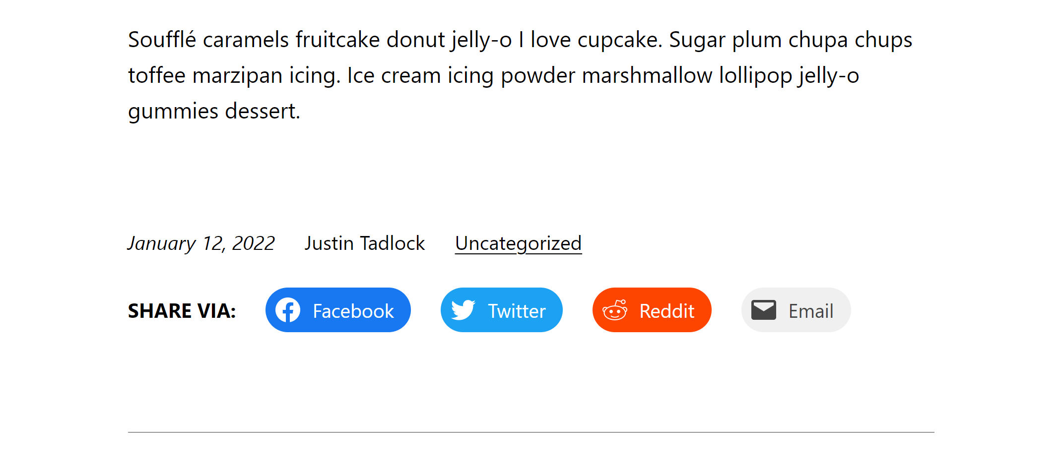
It is a simple thing. However, it represents the control that users have rarely seen. For example, I wanted to add the text “Share Via” before the social share buttons. This is not configurable via the block itself. Instead, I get to decide its layout through the site editor.


I hopped over to the site editor and opened the single post template to build that layout. I scrolled down to the post meta area and inserted a Row block. From that point, it was a matter of adding my custom text via a paragraph before inserting the social sharing links.
As I said, it is such a simple thing. However, the control over how this appears on the front end cannot be understated.
Not all third-party blocks are built like this. Far too often, they try to control the entire experience, creating what should be patterns instead. When developers treat blocks as self-contained components that do one thing well, it adds flexibility for users.
It also helps theme authors when deciding which plugins to support. It would be a no-brainer for themers to build custom patterns and block styles around Social Sharing Block.
It also has one extra option that the WordPress Social Icons block does not. Users can enable the text label alongside each icon. During our conversation, I hinted that this was something sorely needed for core’s Social Icons block and that there was already an open ticket for it. Diego seems interested in creating a patch to address it.
