All the block themes seem to have something similar in how they look. Although unique in their own ways, being generally wide, spacy, and modular instantly make them look like they came from the same mold. This is not to say they’re bad though… I’m just not really fond of such design. I prefer something more compact and personal.
By “compact and personal,” I think of something like a small room cramped with all your belongings, photos, postcards, etc., giving it a cozy feeling (Tumblr themes kind of fit this). The block themes I’ve seen are all just so airy and professional-looking that using them is like taking cautious first steps in a big fancy office, where you’re afraid of making too much sound.
What do you think of this design trend in block themes? And do you happen to know of any “compact and personal”-looking block themes?
Isabel
I love that description of the type of theme you are looking for. It reminds me of my college years where my roommates and I had our own cramped bedrooms. I would always decorate my walls with drawings and other things I had created. I piled my favorite books on the shelves of an old TV entertainment unit that my grandpa had built. Across the top, I lined trinkets and other keepsakes from adventures I had been on.
It was my own little paradise, my world in about 120 square feet. If you walked into that room, it would not take long for you to get to know the person behind it.
That is what I love about personal websites. They can be like college dorm rooms, giving us a glimpse into the unique personalities behind them.
Far too often, it feels like WordPress themers has moved away from the core audience that played at least some part in the platform’s initial popularity. Today, everything seems to be catered to business, eCommerce, portfolios, and minimalist blogging.
To answer your first question, I am a fan of open-canvas designs. The space gives me room to focus on my content.
However, like you, I am not seeing enough variety. This is not necessarily specific to block themes. You will find similar trends for classic WordPress.
With that said, the block system does play a part in what designers are creating. We are still in the infancy of block themes. Technically, they are not supported by WordPress yet. However, they will be when version 5.9 launches next week. Many designers will be timid at first, not really pushing the boundaries of what is possible. It is similar to taking that first step in a pool’s shallow end. You are acquainting yourself with the water, getting a feel for the temp, before you wade farther in.
I expect that we will see more variety over the coming months as more theme authors begin learning the new system. I hope that includes more designs like what you are asking for.
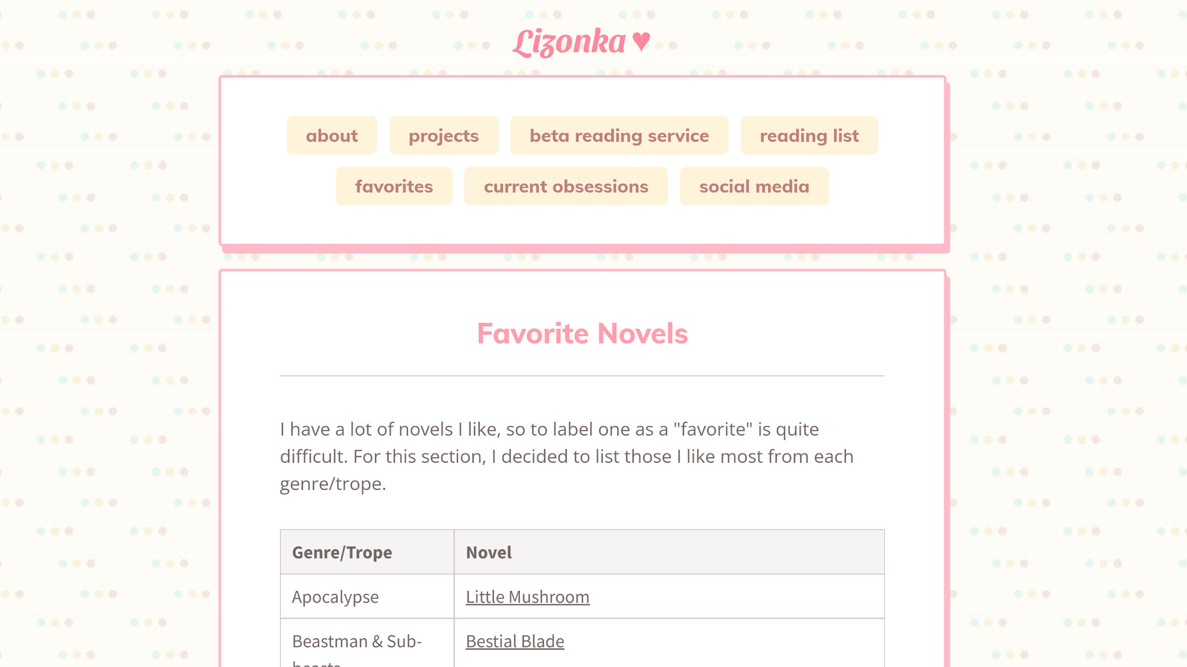
When I first read your question, a Carrd site that I have had bookmarked for a while immediately came to mind. I came across it when venturing down the rabbit hole of anime-related fan sites around the web. The design does not fit my personal brand, but I have been fascinated by it for months.

The site screams personal and cozy. It reminds me of some of my early days on the web when every other blog I visited seemed to have its own brand of quirkiness. You can still find a lot of that if you really dive into the various brands of fandom that are out there.
Every now and then, I come back to this site for design inspiration. I envision building something like this on top of WordPress. The community is sorely missing out on the fun side of the web.
Many Carrd sites like the one shown above have a bit of this, but they are not full-blown websites. They are essentially personal landing pages.
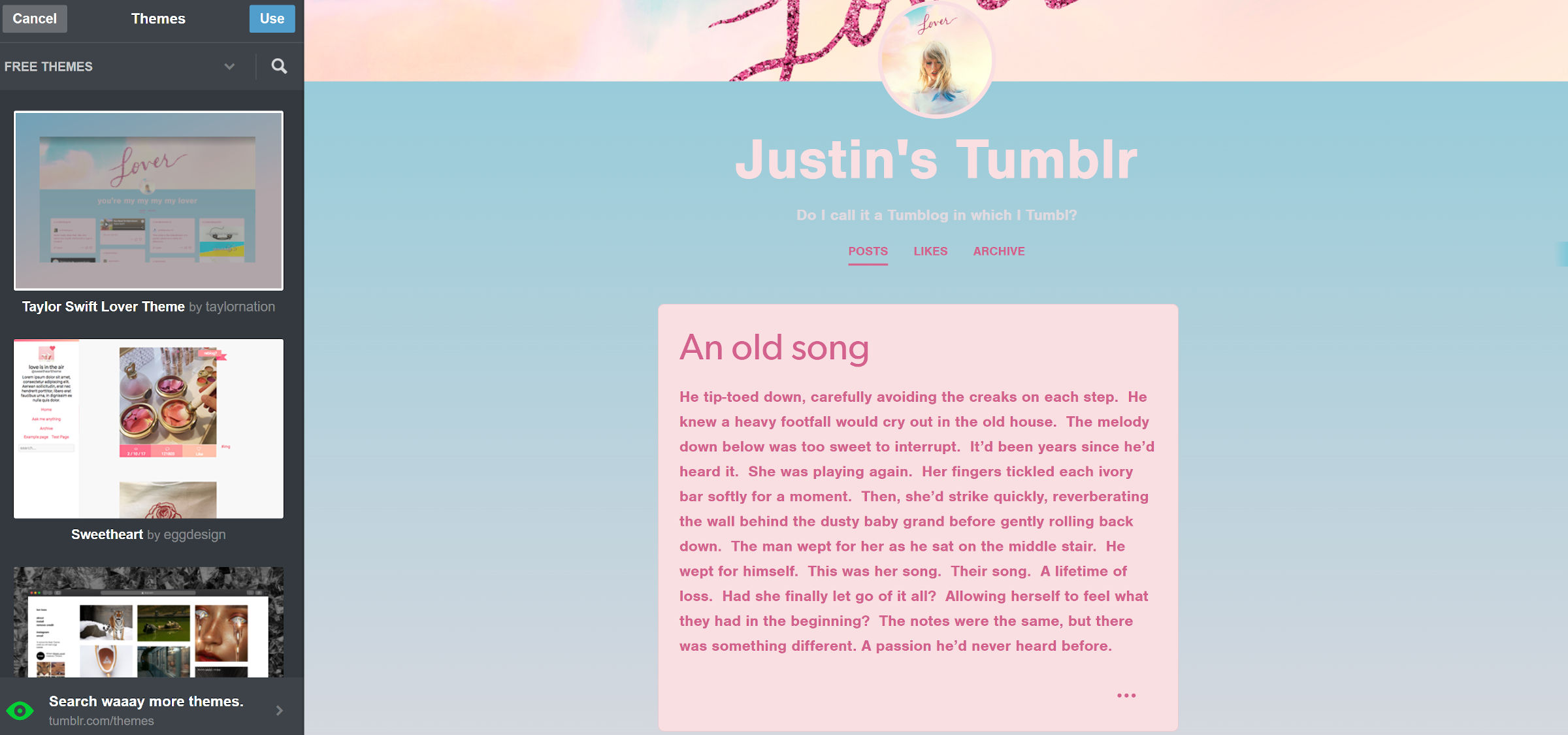
Tumblr is the king when it comes to themes with personality. Where else can I possibly consider switching over to a design dedicated to Taylor Swift?

You will be hard-pressed to find anything like that in the WordPress theme directory.
Right now, I only know of one block theme that fits into the compact-and-cozy category, and that is Kubrick2. I covered it in detail last month in a review. It is now live on WordPress.org.

Kubrick was one of the early default WordPress themes, and Kubrick2 is a recreation of it using blocks. It has that compact layout that seems to fit the description you provided. But, the design is a bit outdated.
Fortunately, it is customizable via the site editor. It is also one of the least complex block themes out there. In mere minutes, you could modify its design with little effort.
Until we see more themes, Kubrick2 is likely your best option.
