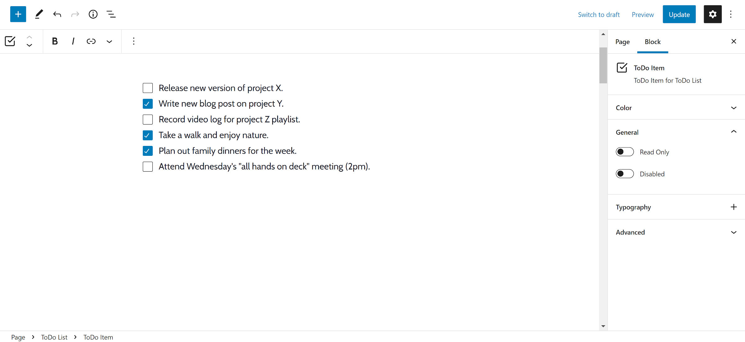
Todo lists. Checklists. While there are differences in their purposes, their output is essentially the same. They are lists of items with boxes to tick off, and a plugin like David Towoju’s Todo Block allows users to create them.
I first downloaded and installed the plugin two weeks ago, but it had a problem. It did not seem to add any blocks at all. This was likely some mistake with porting the plugin over from its development repository. I have been testing it since its update a few days ago and like where it is headed.
Technically, the plugin has two blocks. One exists for the outer list container and the other for the inner list items.

It works similarly to the standard List block. Once users insert the Todo block into the post, they can add tasks. Hitting the Enter key creates a new item.
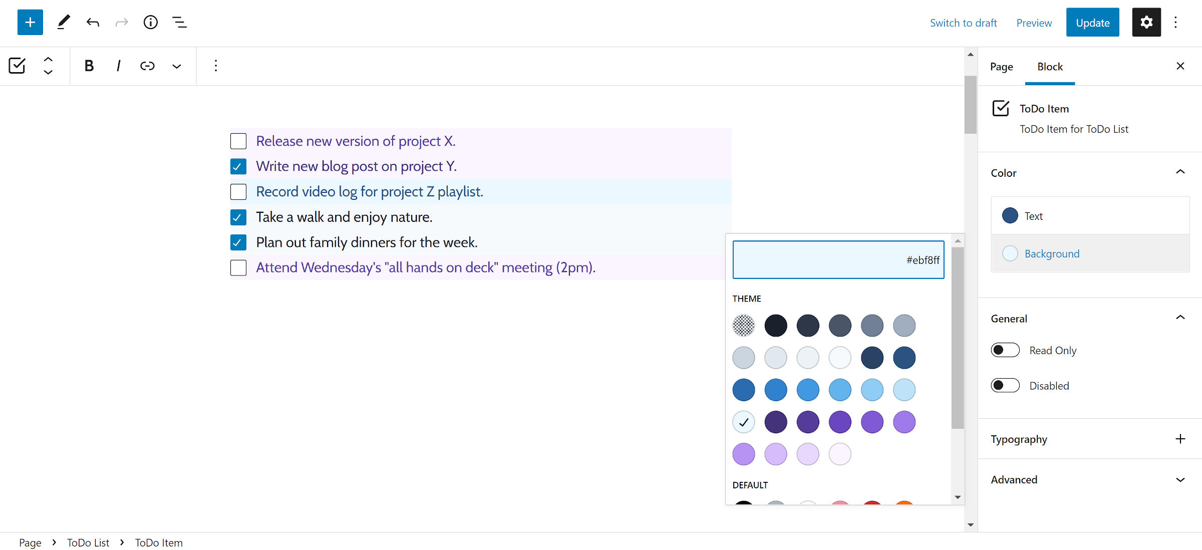
Users can customize the typography and colors for individual Todo Item blocks. The latter is a welcome option for people who categorize items or tasks by color.

However, there are no such options on the outer Todo List block. More often than not, users might want to customize everything at once.
Each item can also be set to “Read Only” or “Disabled.” Since this plugin does not send data through a form on the front end, the differences between the two are subtle. Site visitors cannot check a read-only field, but they can focus on them via mouse or keyboard. They can do neither for disabled items.
If it seems like I was touting a similar plugin not that long ago, it is because I was. In July 2021, Rich Tabor released the Todo List Block plugin. The primary difference between them is that Tabor’s is an editor-only plugin. He built the block as a tool for his publishing flow.
There is also a checklist block feature request in the Gutenberg repository. However, there has been no indication of work on it since 2019. Matias Ventura shared a concept via video in April of that year. Ella van Durpe followed up with a pull request in October. Since then, only a few people have commented. The concept may be too niche to ever land in WordPress, despite my desire for it.
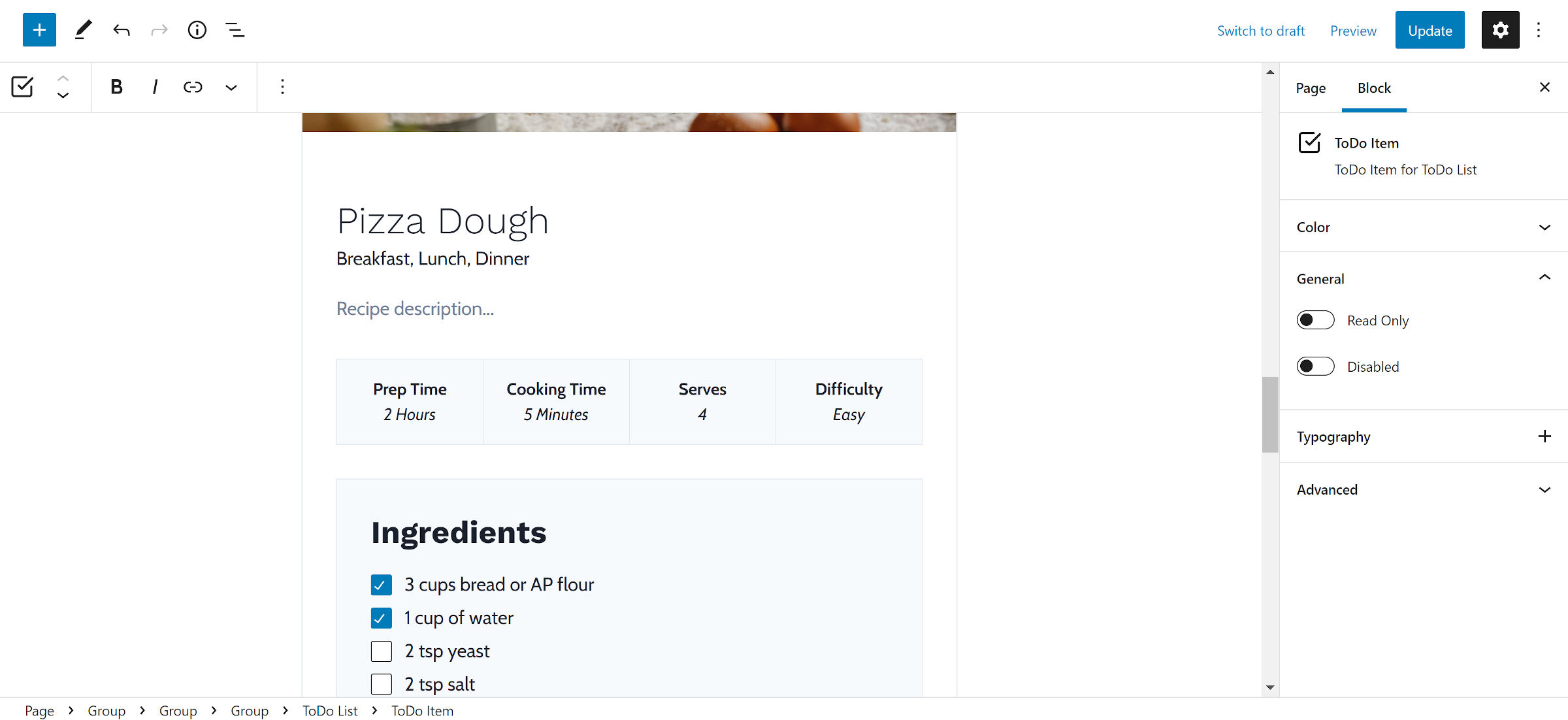
One of the reasons I want to see such a block in core WordPress is because it would be handy for various patterns. I have already built several for recipe and food bloggers, and I used the Todo Block plugin to test the concept.

There are two features really missing in the plugin. The first is a <label> element wrapping the checkbox and text. Adding this would allow checking the box on the front end by clicking the text or the checkbox itself.
The second is crossing out each item as it is checked. Some systems also gray out tasks as they are finished. A “task complete” indicator is a relatively standard feature for todo list apps.
Other than that, Todo Block is a plugin that I could see myself using for some projects. At the very least, I could handle the crossed-out style through my theme’s stylesheet.
A question to our readers: I am trying something different with this post. Some of you may have noticed the WordPress.org plugin embed/card at the top. Would you like to see similar treatments for plugins or themes in the future? Does it get in the way of the article or feel too promotional? Alternatively, I considered putting this at the bottom under a “Plugins Mentioned in This Post” section.
