I have had a block theme idea rattling around in my brain for a while. For months, I have considered building a single-page profile/card theme, and I finally sat down and put in the work over the weekend. In part, I just wanted to do this for fun. However, another part of me wanted to see how block theming has progressed from a developer perspective.
Inspiration for this theme came from a few other people and projects. Kjell Reigstad’s two-column landing page experiment from October 2020 first triggered it. A recent question to the Ask the Bartender column about compact-and-cozy themes got my creative juices flowing again. However, seeing the Themes Team approve a similar block theme, Miniblock OOAK, by Carolina Nymark meant that the rules were now lax enough to possibly put something like this out into the world.
One of the problems is that block-based theming has burned me before. I spent months building a new project last year in my precious free time only to have Gutenberg plugin updates wipe out my progress weeks later. I knew things could change with the unstable foundation of alpha-level software, but it was still deflating. Needless to say, I could never find the motivation to pick it back up.
With WordPress 5.9 and a more stable block-theming system just mere days ahead, it was time to give it another shot.
I wanted to learn block theming deeply. The only way I could do that was to go back to the beginning. I needed to reacquaint myself with those foundational elements of plain ol’ HTML, CSS, and PHP. And forget everything I thought I knew building on top of the modern web. I needed to become a noob again.
Technically, it is impossible to forget everything I know without incurring some sort of amnesia. However, maybe — just maybe — I could get back to the building blocks of the web.
Could I spin up a WordPress theme without a complex web of dependencies spanning over 900 projects in my /node_modules folder?
Could I create something without dutifully pulling in my base PHP scripts via Composer?
Could I, you know, just build a WordPress theme?
The first step was to check my ego at the door. When I set aside years of modern tooling and a workflow built around them, what I found was a beautifully-simple theming system that pays homage to WordPress’s roots but is flexible enough to extend for advanced builds.
This is not to say that there were no hiccups along the way, but we hear about those enough. Plus, I consider programming/development to be the art of solving problems.
I had a restless weekend. I got four, maybe five, hours of solid sleep between Friday and Saturday night. Perhaps I had so many projects and things going on that my mind could not shut them out. Regardless, I was back awake at 3:30am on Sunday morning, tired but unable to catch those much-needed Z’s. So, I cracked open my code editor and created a new theme project.
Within an hour, it was working. It was in decent enough shape to share with friends over Twitter in two.
The following is a screenshot of the current homepage. Technically, it is the only page. I have tinkered a bit since I pushed my first commits live.

This is a block pattern named “Reflections.” The mountain reflecting on the lake photo is from WordPress Photos and shot by Anne McCarthy. The gradient used for the background is a reflection of the image’s colors too, which I thought was a nice touch.
The theme includes several other patterns. The goal is to allow users to pick their favorite for their profile card, customize the content, and save. Easy peasy. I hit a snag with this, which I dive into at the end of the post. For the most part, everything went well.
What I Learned from the Experience
Creating WordPress themes with blocks is easy. Most things are structured and play by a standard set of rules. Templates go here. Parts go there. Plug in your settings over yonder. We are likely to see even more structure in future WordPress versions.
I built the theme from scratch using only my code editor and a local WordPress install. No Node modules. No PHP libraries. No build setup whatsoever.
I will likely use those things before this project is complete. Some tools simply make development easier. However, not needing them or diving into more complex PHP APIs has lowered the barrier to entry.
It felt like I had been transported back to the mid-2000s, just with a better system in place to take care of all the complex bits. For once, I could almost entirely focus on the design.
There are issues aplenty with the underlying system. Oddities like extra wrapper elements around wide-aligned blocks still exist in the editor. And, several blocks need updating — I am looking at you File block for not reusing the existing Button block.
Basically, there are quirks. As a themer, you learn to work with them in mind, wait for a fix upstream, or risk your sanity trying to find workarounds.
I am hesitant about sharing unfinished work, but I should also show proof. Those interested can check out the GitHub repo at the date of this article, at least before I do anything too crazy with it.
Some theme authors may look at my project and think it is too simple of an example. However, I could easily apply everything about it to a full-blown theme. The standards are the same, regardless of the size.
Maybe we should start rethinking what a theme is. With block-based theming being so young, we should all be doing a bit of experimentation.
A Missed Opportunity
I will get slightly technical in this bit because it is crucial for explaining a missed opportunity for a well-rounded user experience. The site editor is in a place where it is easy to build for more advanced users. Patterns help bridge the gap for those less technical, but they are not enough.
Think about the major sections of a webpage. Pieces like the header, footer, sidebar, content, and even sub-sections of those. As a user, how do you replace the entire content area design that is already on the screen with a different content pattern?
You could delete the one that is there and insert a new pattern. However, deleting and inserting sections of a page is a high-risk action.
If the area you want to change is a template part, you can replace one with another. That is assuming the theme author has registered any for that area. This is a low-risk action and one of the best features of the site editor.
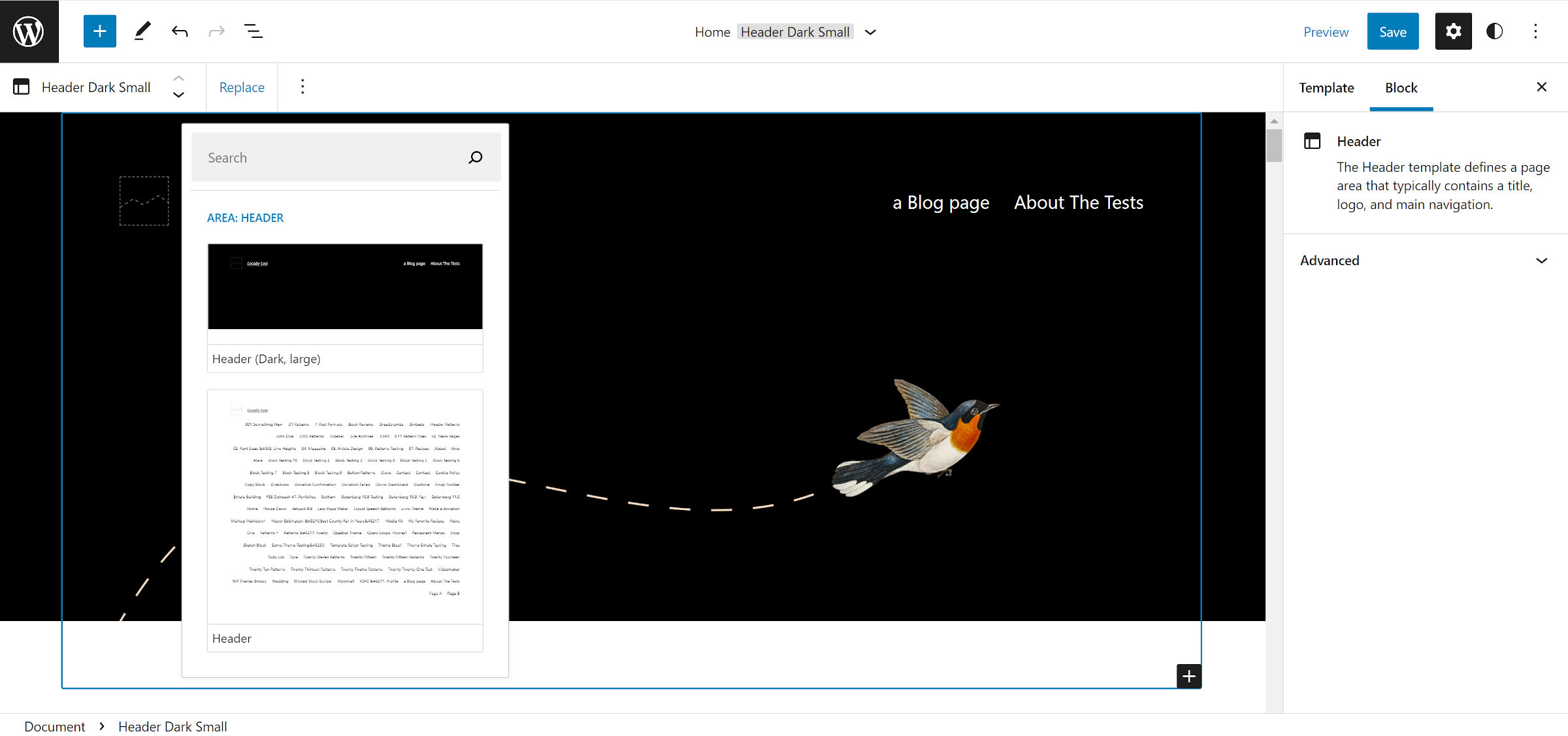
For example, here are header templates that Twenty Twenty-Two registers as they appear under the “Replace” toolbar menu item:

However, that is not the theme’s entire array of header patterns — it has 18 in total. I imagine that most end-users will never discover them.
One of the downsides of creating patterns meant for specific template parts is that end-users have no way of replacing or transforming a part wholesale with a new pattern.
Theme authors can duplicate their efforts by copying the pattern code into the template part, assuming it has no PHP mixed in. Or, they can create those parts and pull in the associated pattern via the Pattern block:
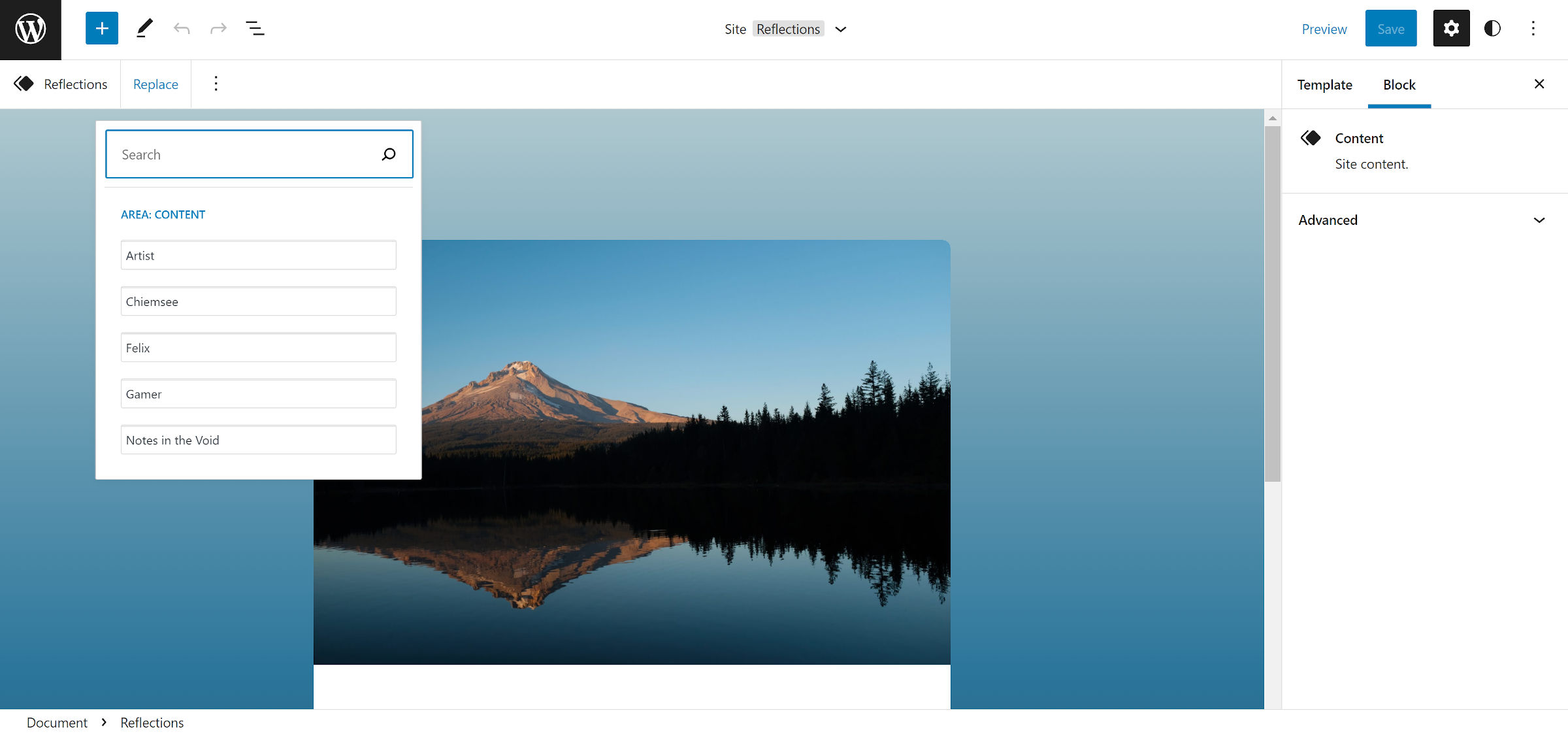
<!-- wp:pattern { "slug":"namespace/slug" } -->The issue with this approach is that the site editor does not display the pattern content in the “Replace” dropdown (did I just discover a bug?):

The solution should be simple. Patterns registered for a template part should be interchangeable via the UI. Or, parts that use the Pattern block should display correctly in the “Replace” dropdown.
