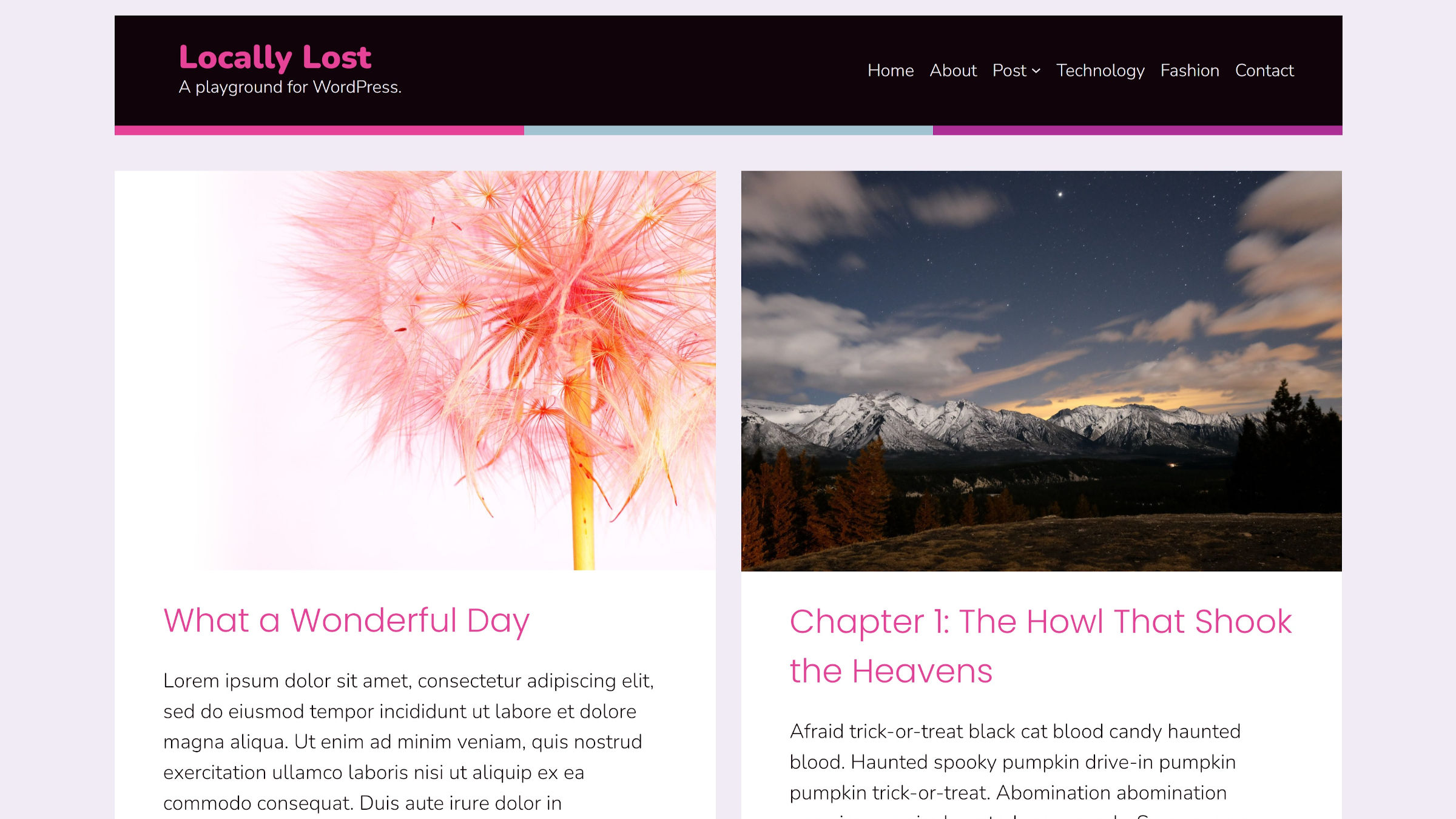
It seems that Andrew Starr is quietly building a legion of block themes. He is the sole developer behind UXL Themes and has released six of them in the past year, with most landing in the last few months. Framboise, his latest project, is a child theme of Alara.
He promised a new design variation, child theme, or block pattern when he launched Alara. It looks like he has consistently kept things moving along. Since I last reviewed it a month ago, the theme has gained four new patterns, bringing the total to 45. Starr has also created two new child themes for a total of three.
My motivation for installing, activating, and tinkering with Framboise was twofold. First, a friend keeps asking me where all the fun WordPress themes are, and this latest outing by Starr has just enough of a weird, funky personality that it feels right up his alley. Those who want a design that shouts for visitors to step into their world could hardly go wrong with it.
I also wanted to see what someone other than Automattic was doing with block child themes. Not many other theme-related businesses or authors have created parent themes yet, and even fewer have created children for them. If Starr keeps up his pace, he has a shot of pulling ahead of the pack, at least in sheer block theme numbers.
I like a bit of visual flair from time to time. I typically prefer to do that within the confines of a clean, minimal, and boring design. I suppose that is more of a sprinkling of flair than anything. However, Framboise’s color scheme, a pastel blue mixed with pink, has me in a cheerful mood today.
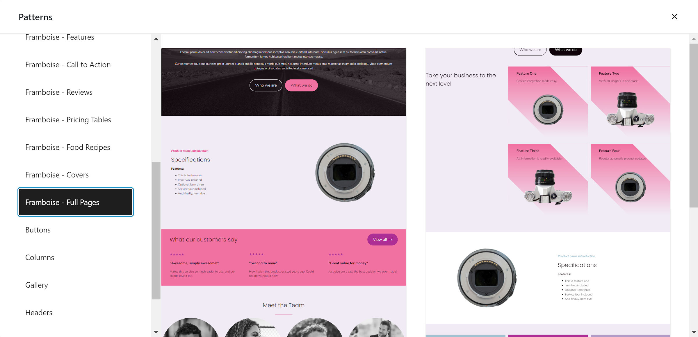
I am digging this about page pattern in particular when paired with the child theme’s colors:

The background shape is handled via a gradient — I am sticking the code for that in my toolbox.
Framboise does not add its own set of block patterns. Instead, they all live in the parent, Alara. The same is true of Ceres and Zelia, the other two child themes. This is a wise decision by Starr. The more that goes into the primary project’s extensions, the more maintenance it creates over time. By keeping them all in Alara, users of each child theme benefit from a shared pool of patterns.
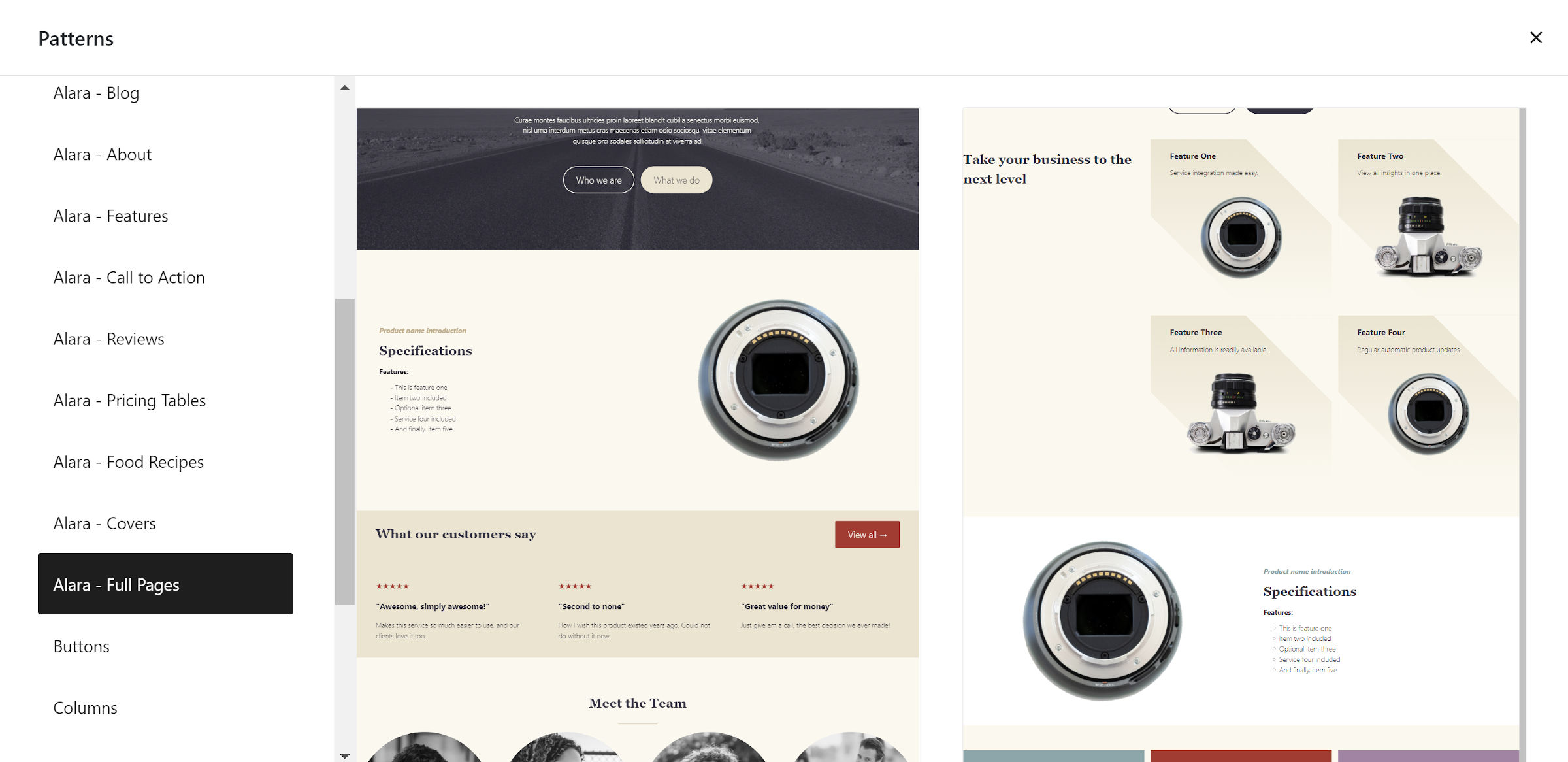
This is one of the most fascinating aspects of child theming with blocks. With a few simple configuration changes, theme authors can create vastly different designs, as shown in the full-page patterns for the theme:


I have built child themes in the past with similar methods, but they were always on unsteady ground. Because WordPress had no standard design system under the hood, changes in the parent could easily break child themes.
With themes now using a standard theme.json file to control settings and most styling, child themes have some extra layer of protection against breaking changes. Plus, templates will always work because they are made of blocks.
theme.json also makes it easy to create design variations without touching another file. While Framboise includes a custom header and footer templates, all other aspects of its design alterations are handled in one place.
I did not even recognize that the theme was related to Alara until I installed it and noticed the author. That is the magic of child themes, and it seems that they are finally living up to their potential now that core WordPress has standards to facilitate them.
My excitement around block theming continues to grow with each new project that lands on WordPress.org. Tomorrow, I can only hope to see something new. But, for now, I think I will continue playing around with Framboise for a little longer.
