With WordPress 5.9 only just stepping its toes out the door and greeting the world, the lead developers seem to have hardly taken a moment to catch their breath. Yesterday, Matías Ventura posted the preliminary roadmap for 6.0. It covers the general scope of the planned features to land this year.
Version 6.0 is expected to be a conceptual wrap of Phase 2 of the Gutenberg project, covering the visual site-building tools. They will continue playing a crucial role in future development, but developers will likely shift much of their focus to Phase 3 for WordPress 6.1 and beyond.
The following are the four phases outlined in the long-term roadmap:
- Easier Editing: Block-based content editing.
- Customization: FSE, block patterns, block directory, block themes, and global styles.
- Collaboration: Co-authoring content.
- Multilingual: Implementation of multilingual sites.
Editor Enhancements
Ventura listed 10 high-level focus areas around the post and site editors in core WordPress. They range from big-ticket items like a site-browsing mode to a more back-to-basics approach to the writing experience. I will focus on some things I most look forward to.
Theme Global Styles Variations

I have a running list of features that I cannot wait for. It seems that I find something new to add to it every other day or so. However, global styles variations would easily land in the top three.
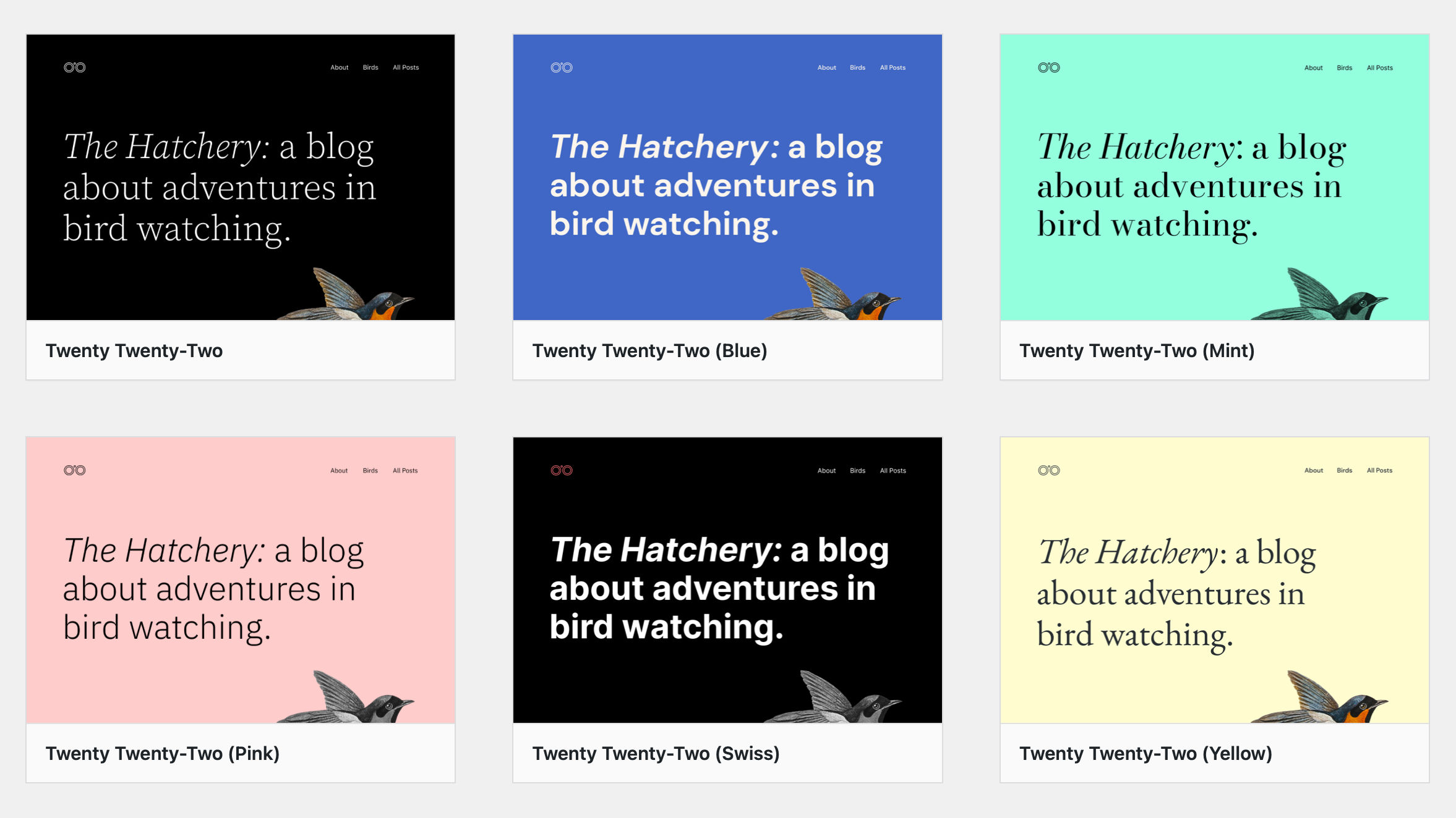
The feature was expected but did not quite make it into WordPress 5.9. The goal was to allow users to select from multiple presets, transforming their site’s colors, fonts, and more at the click of the button. Several variations for Twenty Twenty-Two are already in progress.
This is sort of like a light version of child theming where only the theme.json file can be switched around. Essentially, they are skins.
Navigation Structure as a Dedicated UI
This will most likely be one of the most crucial features of wrapping up Phase 2 of Gutenberg. Some pieces of it can be tough to follow, but several screenshots and videos are in the associated ticket.
Essentially, the goal is to refine the experience of moving around and interacting with the site editor, global styles, templates, and navigation. The work in 5.9 was stellar, but now there is a need to create a more intuitive interface.
Part of this is exposing the site structure as navigation outside the Navigation block in the UI. Users can currently only edit this from within the site canvas.
Such things are easier said than done, so contributors will have their work cut out for them. It will take a community effort.
Template Creation and Theme Switching
There is currently a limited number of templates that users can create through the site editor interface. For example, they can add an archive design but not break that down for specific types of archives (e.g., category) or slug-based versions of them (e.g., category-news).
Eventually, the site editor should allow the creation of any possible template from the template hierarchy. Presenting that in an easy-to-use interface will be a challenge. The hierarchy is limited only by the number of objects (posts, terms, etc.) on a site.
The other piece of the template-creation process is decoupling them from themes. Users should never lose their customized templates when switching from one to another. This becomes even more vital as plugins begin to introduce block templates.
Patterns as First-Class Creation Tools

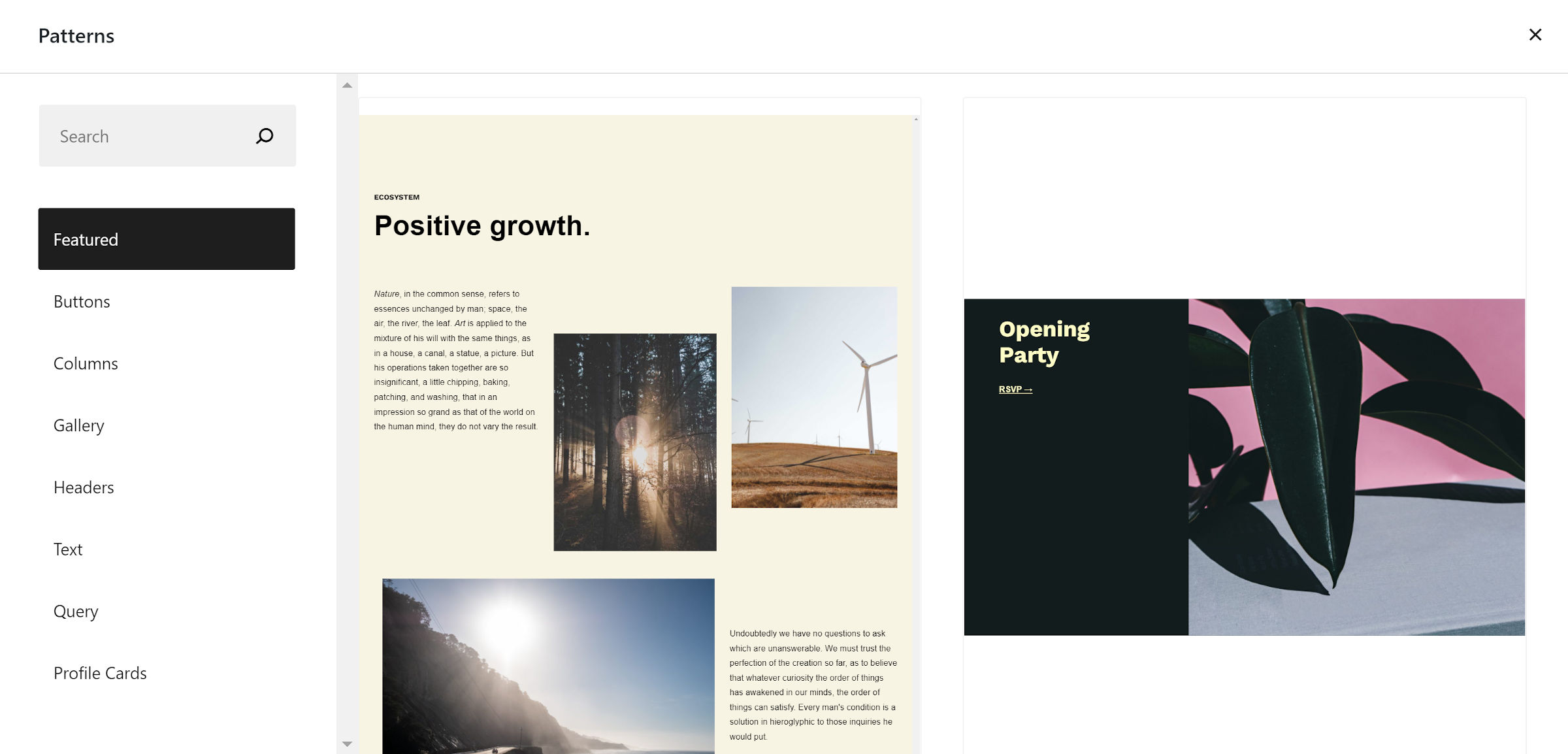
Since their introduction alongside WordPress 5.5, patterns have been one of the most powerful tools available to users. I have been telling anyone who will listen that they will be a game-changer for at least two years. WordPress 6.0 might just make good on my promise.
One proposal would make patterns a central part of template and page building. Several pieces to this may fit into various flows, but one of the overarching goals should be for end-users to figure out what to do with an empty template or page. If done right, patterns can help them get off the ground running.
A proposal to transform existing content sections with patterns is also on the table. I wrote about how this was a missing component of the user experience earlier this week.
For theme authors, pattern registration may become less complex. Currently, they must use the Patterns API to register them via PHP. However, there is a proposal for WordPress to automatically recognize them. Patterns would most likely live in a dedicated /patterns folder in the theme and be registered similar to page templates. However, the final solution has yet to be determined.
Block Enhancements
There is an array of block-related enhancements to look forward to. Much of that will revolve around continued iteration on the Navigation block. Theme authors should also have more blocks for controlling the output of comments.
However, let me dive into some of the features I am most looking forward to.
Featured Images With Superpowers

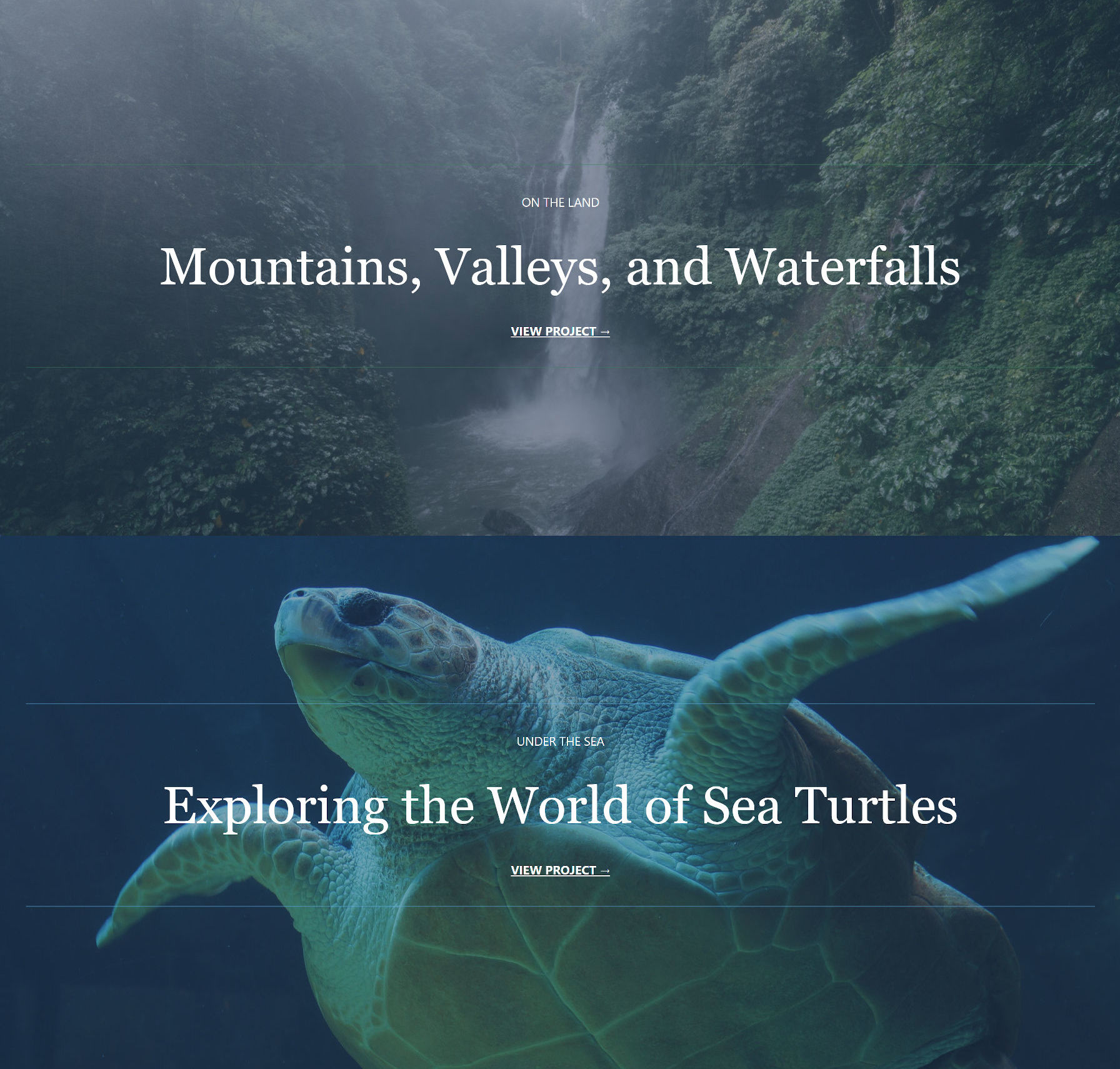
Instead of superpowers, this would cover the use cases already possible in traditional theming. As much as I like block themes, one of the most glaringly-obvious issues is the Post Featured Image block. Essentially, it currently outputs the post-thumbnail image size.
Theme authors can set the width and height but not use cropped sizes that they have registered (fixed in the dev version of Gutenberg). They also cannot use it within the context of other blocks like Cover and Media & Text.
Beefing up featured image capabilities will hand over much-needed design tools to theme authors. Right now, the missing features are blockers for many layouts.
Inline tokens
If there has been one feature I have seen developers ask for more than most, it is the ability to output dynamic data within blocks or HTML templates. Some of this is solved with the Pattern block, but it does not cover every use case.
For example, there is no way to output the current date within a paragraph. This is a routine use case for the site footer copyright line. More typical is grabbing dynamic URLs to theme or plugin resources like images. Ventura noted in the post that they would explore the viability of inline tokens in this release cycle.
Other Blocks

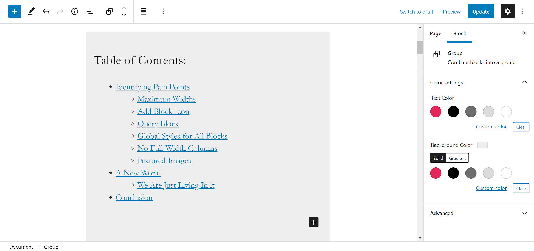
There may be a Table of Contents block on the way. It has been just under a year since I first wrote about such a proposal, so I am eager to see this land.
The Quote and List blocks should finally allow child blocks. Both are severe limitations that were always possible in plain HTML and the classic editor. I know more than a few bloggers who will be happy to see this happen.
Improvements to the Table block are also likely coming. At the moment, it offers a poor user experience — users cannot even tab through cells. At most, it handles the most basic of use cases. Currently, there are over two dozen open tickets to clean it up.
Design Tools
Several components should make theme authors, in particular, excited about 6.0. We could be looking at new height and width controls for more blocks, providing more flexibility in theme designs. And using min and max CSS features along with flex-based containers could make fine-tuning responsive designs easier.
On the typography front, there is a ticket for introducing responsive fonts. This is relatively easy to handle with custom CSS at the moment if a user chooses a theme’s predefined size. However, with custom sizes and line-heights, it is problematic. Because these tools exist in WordPress, we need responsive handling baked in.
One long-awaited typography feature is likely to launch in this cycle: the Web Fonts API. After being pulled from WordPress 5.9, it is now being developed within Gutenberg. I expect this to land sooner rather than later because the bulk of the code is finished.
Support for customizing captions across various blocks and possibly finding a solution for link hover and focus states are also on the slate for 6.0.
What features are you looking forward to the most in WordPress 6.0?
