Freelance WordPress developer Aurooba Ahmed released the Super List Block plugin earlier today. Essentially, it is like the core WordPress List block — just supercharged. It is her first publicly-released extension on WordPress.org.
The primary use case for the plugin is adding other blocks within the list items. However, its options allow users to take it further by supporting grid-based layouts.
WordPress does not currently allow end-users to nest other blocks into list items via the editor. It is rich text or nothing, and it can be an irritating part of the editing experience when you need this seemingly run-of-the-mill feature. It is an issue that makes you wonder why we moved on to FSE before smoothing out the content experience. HTML list item elements are, after all, containers for other content.
For me, at least, it is not something I often need. When I do, I code it via the Custom HTML block. That works if the list’s content is simple but not when you want to nest more complex elements like other blocks.
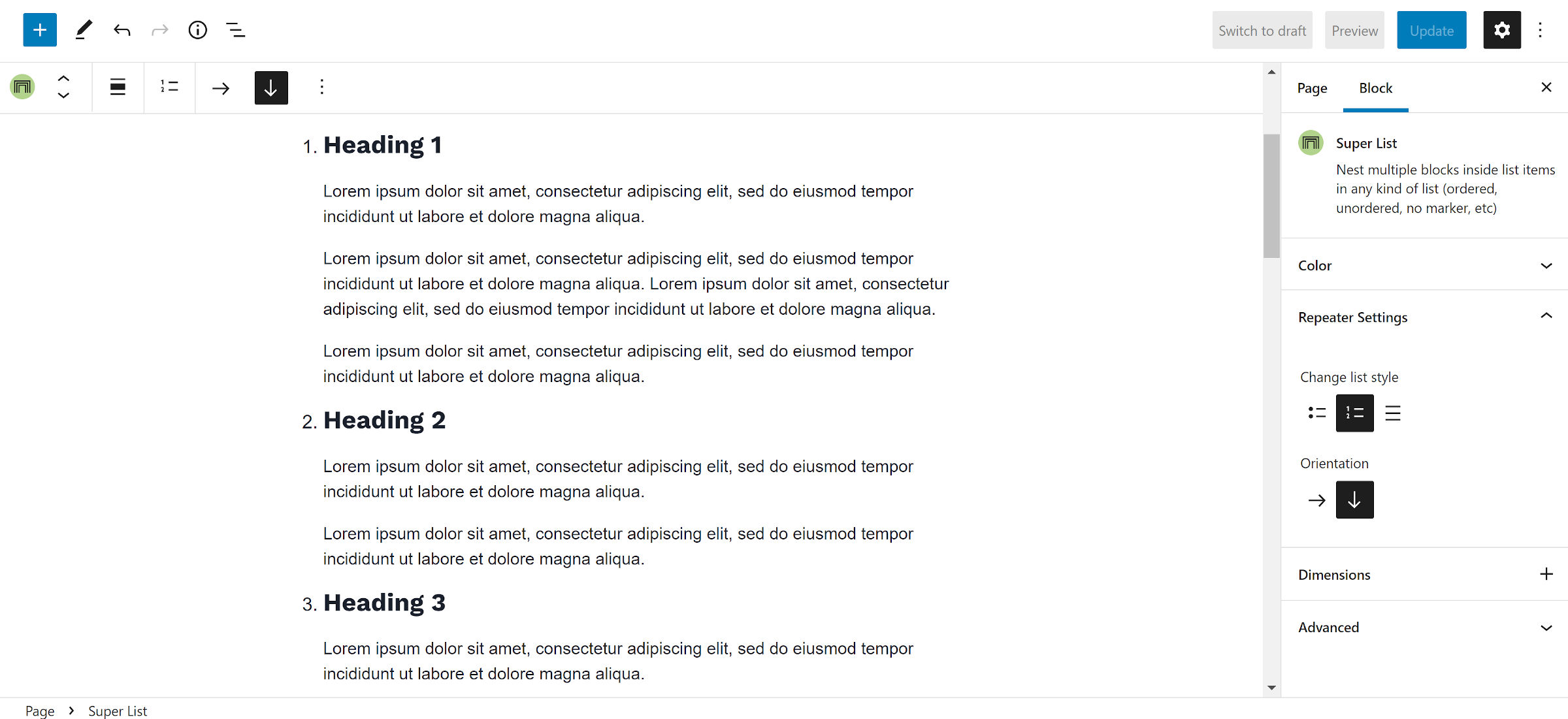
The Super List block turns its nested Super List Item blocks into containers for pretty much anything. One typical use case would be to add multiple paragraphs or other text-based blocks like headings as single list items.

However, the plugin does not limit users to text. They can stick whatever they want in, even nesting a Super List within a Super List Item block. Unfortunately, its indentation is zeroed out in that scenario, so its items do not appear nested.
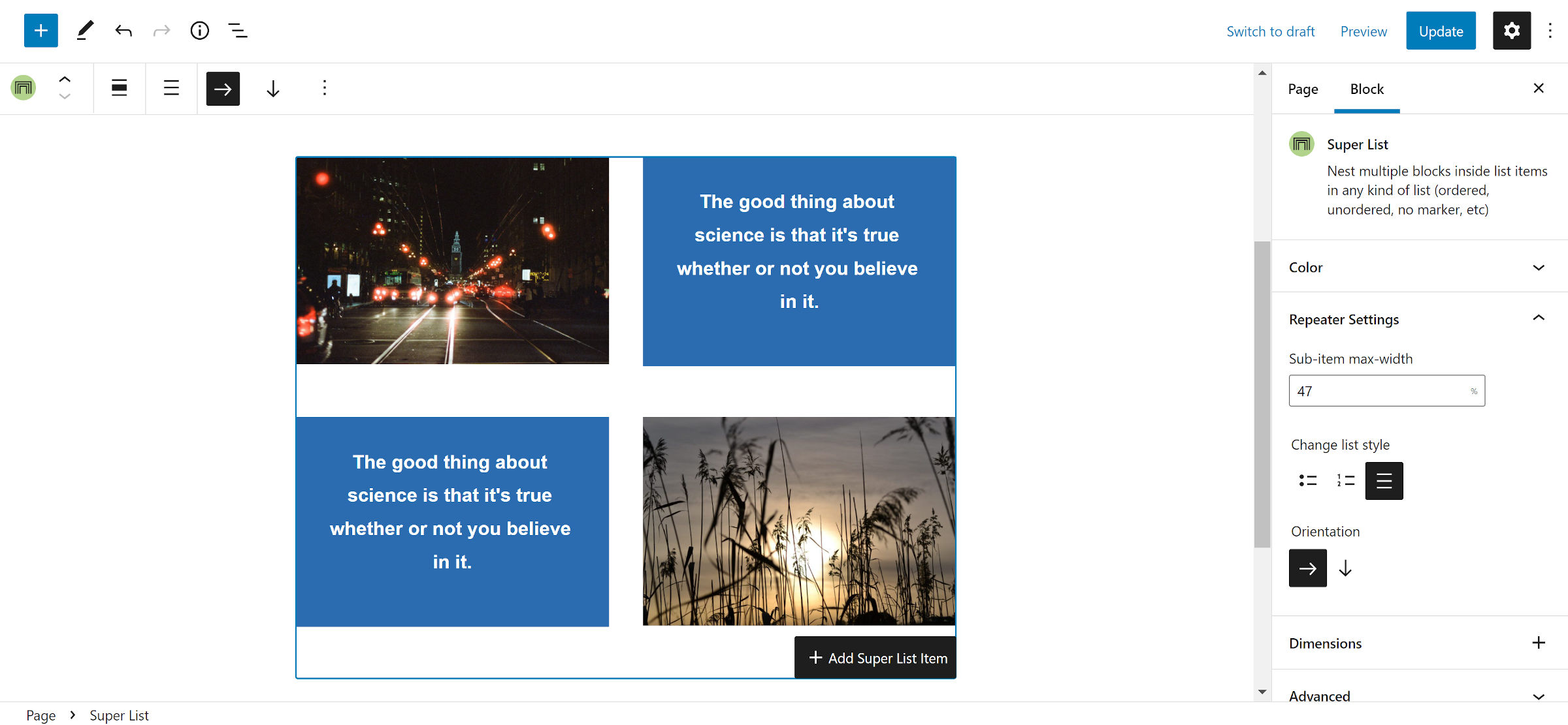
The plugin’s claim to fame may be its grid feature. The closest things in WordPress are the Columns and Gallery blocks. However, Columns are limited to a single row, and Gallery only allows images.
This is also where the Super List block needs a little refinement. When selecting the horizontal (“grid”) orientation, a new box appears to allow users to set the maximum width of all sub-list items.

Wanting to create a four-by-four grid (two rows of two columns), I immediately selected 50%. It made the most sense. However, I did not get any columns. The value was too large and did not account for the gutter space between the items. I then lowered it until I hit a number that worked: 47%. I could have looked at the page’s source code and simply did the math, but it would be a guessing game for the average end-user.
A more intuitive interface would be to switch the max-width option to a column-number setting. Technically, this would limit the flexibility of the block in a few scenarios. However, it would cover the vast majority of cases where users just want a grid of equal-width columns that span the width of their container.
This assumes that the plugin does not eventually allow users to micro-manage each list item in grid mode. There is an open ticket in the plugin’s repository to add the option to individual Super List Item blocks.
Whatever future direction the plugin goes, an easy-to-use block for quickly setting up a grid of items will likely land in many developer and site-owner toolboxes.
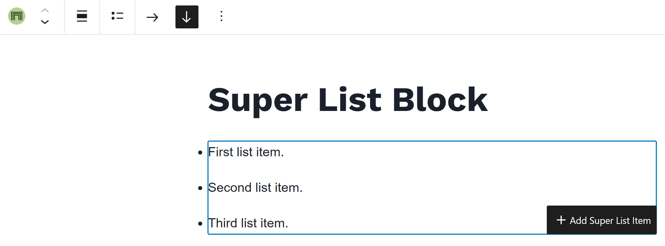
Three features make this plugin simpler to use than many core WordPress or third-party blocks. The first is when the user has the Super List selected in the editor. Instead of only the “+” icon to nest another block, it appends the text label “Add Super List Item.”

It is easy to get confused about where new blocks will be inserted after clicking the “+” editor icon. Super List Block’s text label makes it dead simple to understand. I would love to see WordPress and other third-party plugins take the same or a similar approach.
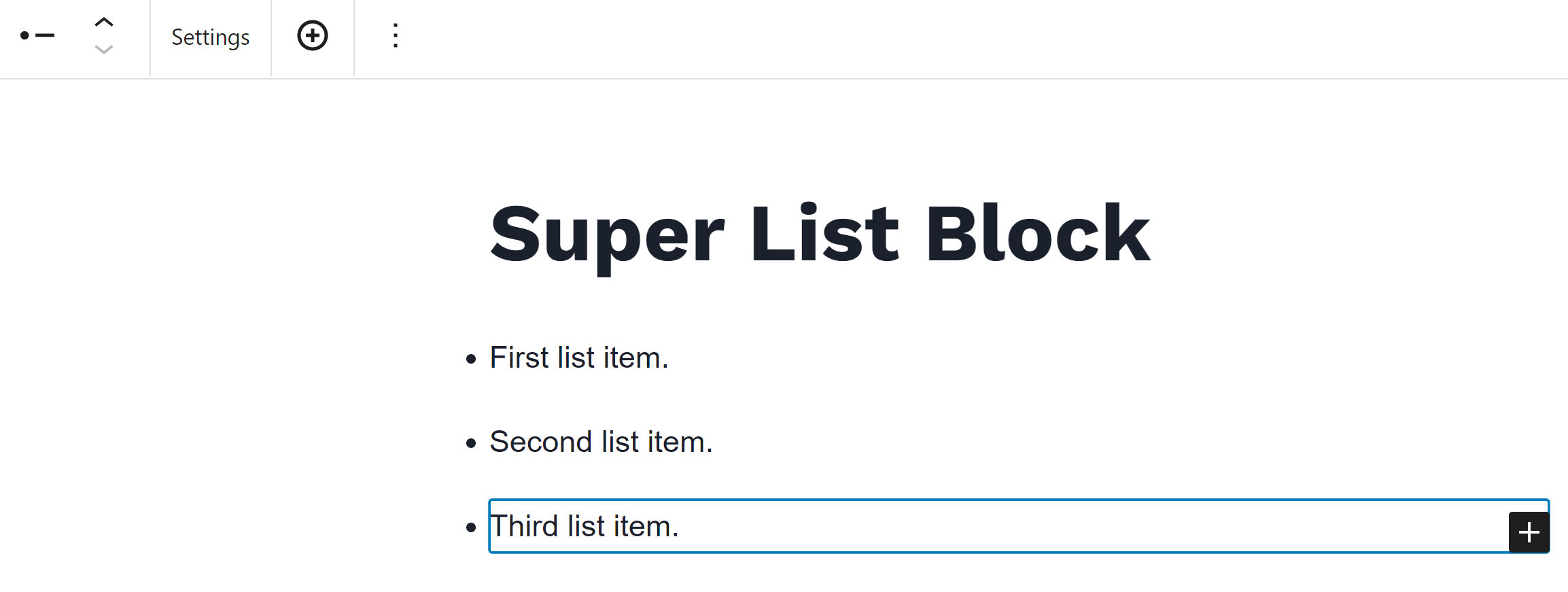
The other two nice-to-have features appear in the toolbar for the Super List Item block. The first is a “Settings” button for jumping back to the parent block. The second is a circular “+” icon for appending another item to the list.

Both options seemed to reduce misclicks when selecting blocks or buttons in the editor. However, I prefer WordPress’s approach to making some parent block settings available in the child block’s toolbar. Social Links is a prime example of this, allowing users to change justification and alignment without jumping back and forth.
Overall, I am impressed with Super List Block as a first release. I will be keeping my eye on it to see how it matures. It is well worth deploying on any site that requires its features now.
