Gutenberg 12.5 landed in the WordPress plugin directory earlier today. I have already been excited about at least one new enhancement, global styles variations. However, this is a beefy update with several developer and user-centric features.
With WordPress 5.9 now out into the wild, it looks like all hands are back on deck as we gear up for 6.0’s release in May. Last week, I covered the early roadmap, and some of the items from that list are already in this latest Gutenberg update in some shape or fashion.
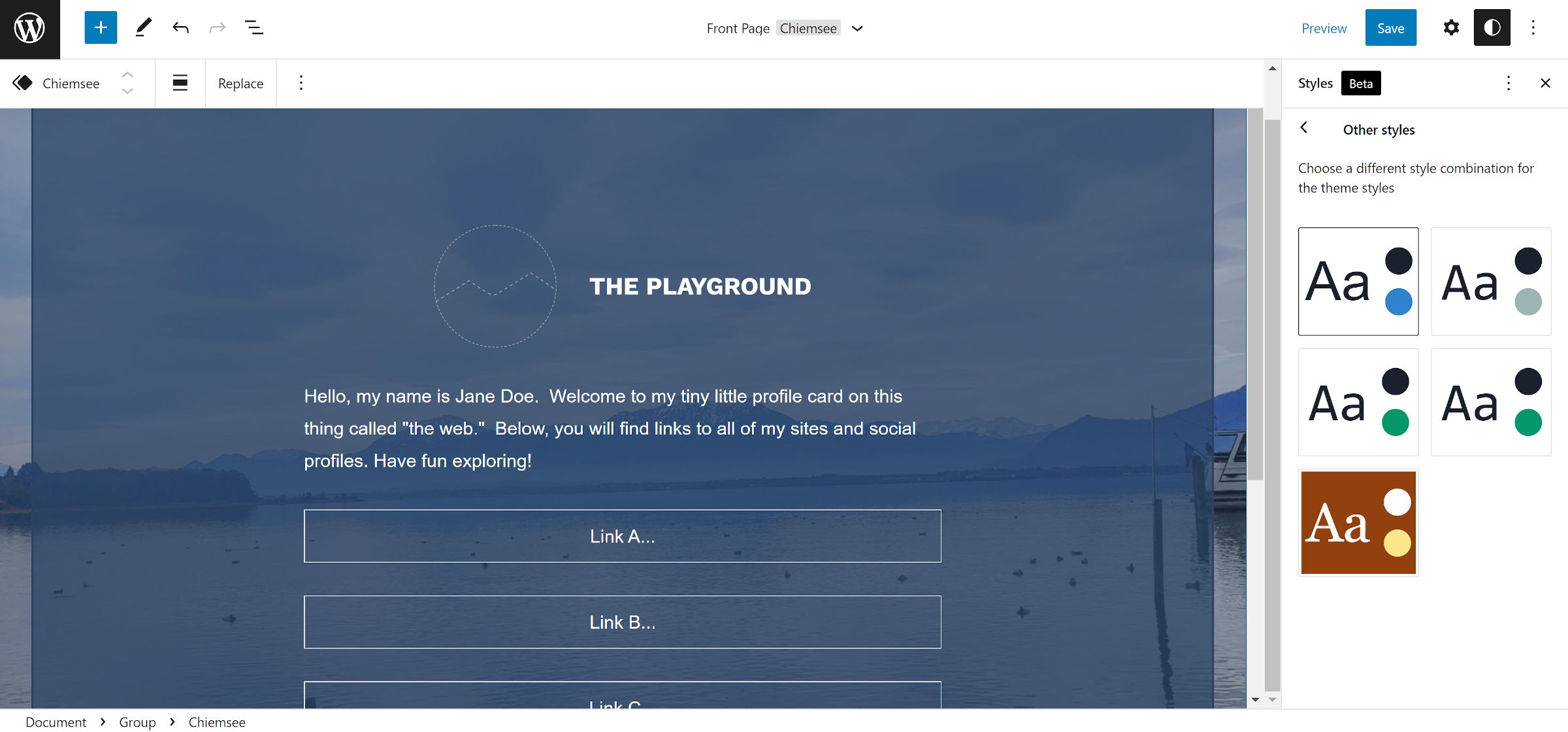
Global Styles Variations


Theme authors can now create multiple theme.json variations and place them into their theme’s /styles folder. Then, users can switch between the various presets to something that suits them best.
The new feature promises to be one of the highlights of the WordPress 6.0 release, and the default Twenty Twenty-Two theme will eventually ship multiple variations of its own.
I dove into the feature in more detail in a post last week. Gutenberg project lead Matías Ventura expanded on this in the comments:
Getting this early in the cycle so we can iron out the experience and mechanics. I expect it to be really good in a few iterations. I’m particularly looking forward to breach the theme-bundle wall, since all these variations are inherently compatible with every block theme out there!
While I share Ventura’s enthusiasm about the feature, I am not sure we can break the theme barrier with 6.0. The idea here is that such variations would be interchangeable between themes. I do not see that happening, given the current state of the global styles system.
Most of theme.json is standardized, but many authors use the settings.custom property. This allows them to set any number of custom values, which are often referenced via the theme stylesheet.
There is also that little problem of not having a standard naming scheme for features like colors and typography.
Because neither of these things will always be the same between any two themes, switching variations will not always be pretty. It is a lofty goal, and perhaps it is worth attempting to see what is possible. However, the concept feels like the pursuit of dropping the theme system altogether for one giant cookie-cutter default.
Variation-switching is best left to individual themes. Allow theme authors who build their custom systems on top of theme.json to manage the user experience and expectations. We should focus on building tools to help them execute their vision while not worrying about a user “installing” their JSON variation inside a wholly different project.
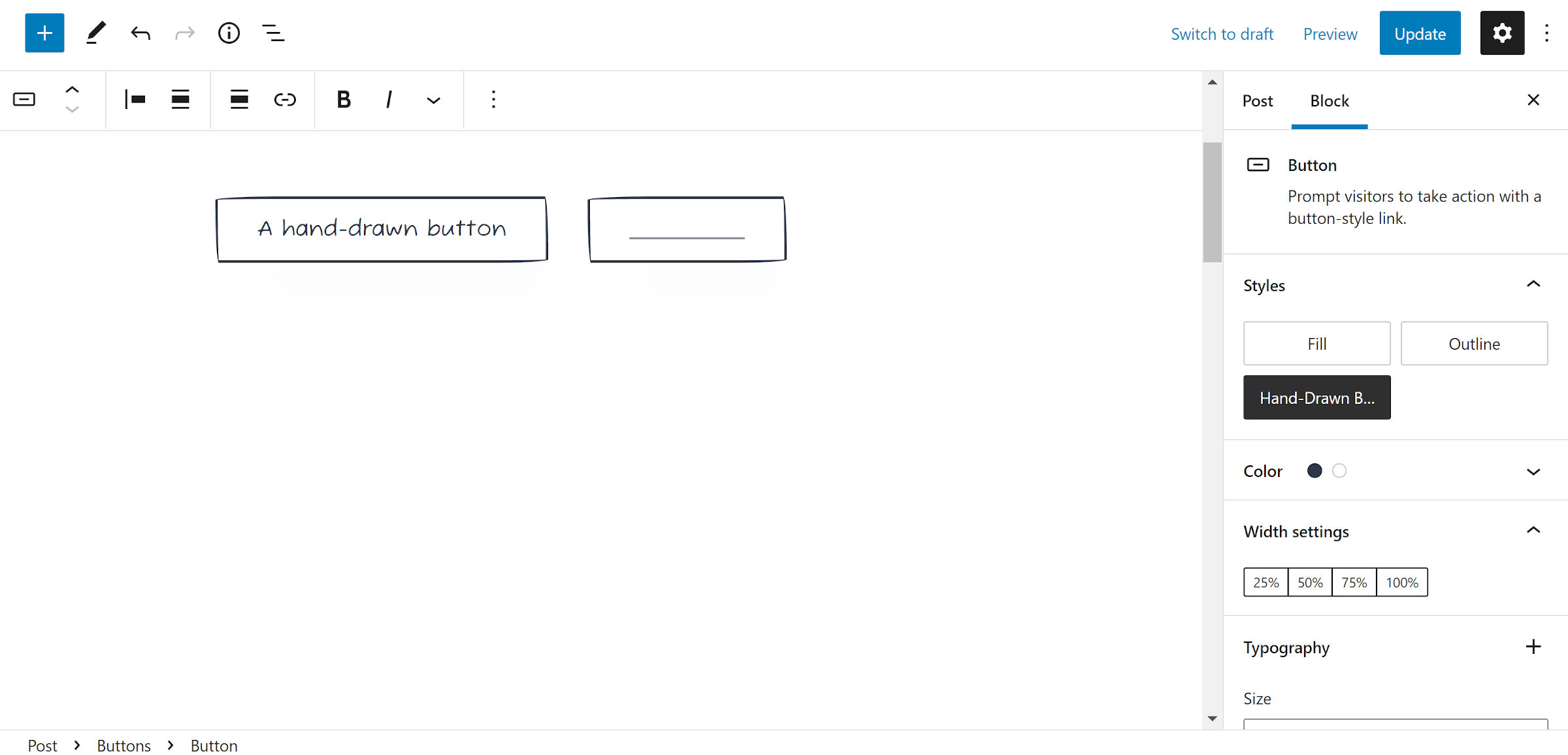
New Buttons Preserve Adjacent Button Styling

WordPress makes it relatively easy to duplicate a Button, but it is hidden away under the options drop-down in the toolbar. That is a two-click action compared to simply hitting the “+” icon to insert a new Button block. Before Gutenberg 12.5, this would result in the new one getting the default style treatment. It is one of those minor annoyances until you start working with several buttons at once.
The latest release automatically duplicates the adjacent Button block’s style when inserting the next one. This is a far better experience.
However, it does not take us as far as we need to go. What happens if you decide to change the design for every Button later? You have a lot of work ahead of you modifying each one. There is an open ticket to copy one style to all others in the Buttons block group.
Users Can Add Transparent Colors

Users can finally control the alpha transparency of custom colors at the block level. The feature works for text, background, link, and border color options. This enhancement closes a ticket first opened in October 2019.
There are some color pickers where it is not enabled. This includes the custom palette section in the global styles panel and icon-related colors for the Social Links block. The same is true for the Cover block overlay color, but it has a separate opacity control altogether.
Post Featured Image Size Option

Gutenberg 12.5 introduces a new option that allows setting the Post Featured Image block to use a WordPress or theme-defined image size. It seems like a trivial change, but it is a hop forward for block theming.
Theme authors have been filtering the post_thumbnail_size hook to handle this. However, that method gets complicated when dealing with multiple post queries with varying image sizes.
I have only been mentioning this for going on a year. I have written about it over and over and over, trying to get anyone to listen. If we want more designers hopping aboard the block-based theme development train, they need control over featured images. Far too many layouts rely on specific sizing to look their best.
Now, if we could only use the featured image inside of Cover and Media & Text blocks…
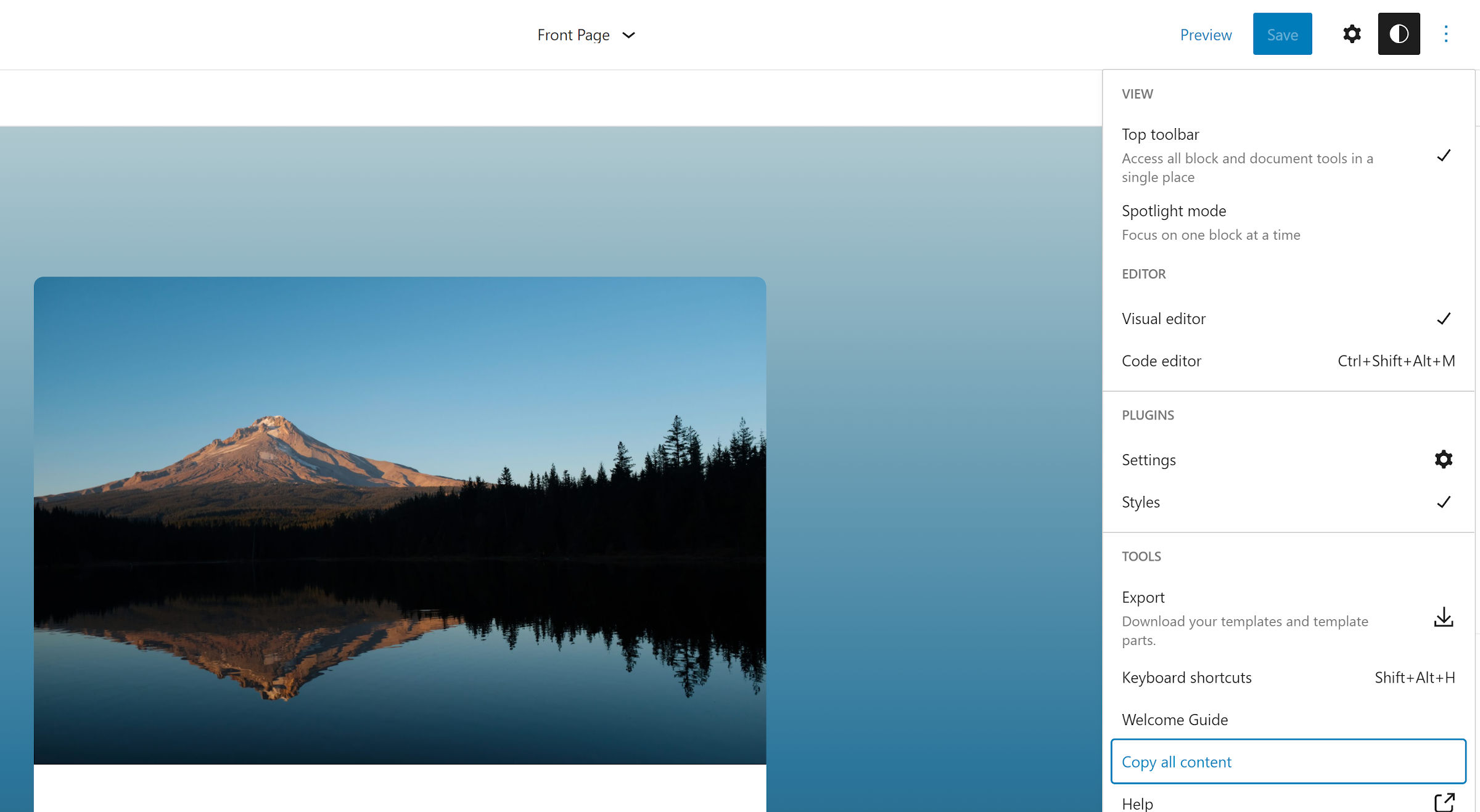
Copy All Site Editor Content

Today I learned that there is a “Copy all content” button in the post editor’s options menu. I do not know how long it has been there, but that is kind of neat. I have been needlessly trying to select all content — sometimes with a measure of success — via the content canvas. Even those of us who spend nearly every waking hour in the editor can learn a new trick once in a while.
That copy-content option has now been added to the site editor as part of an initiative to bring feature parity between the two editors.
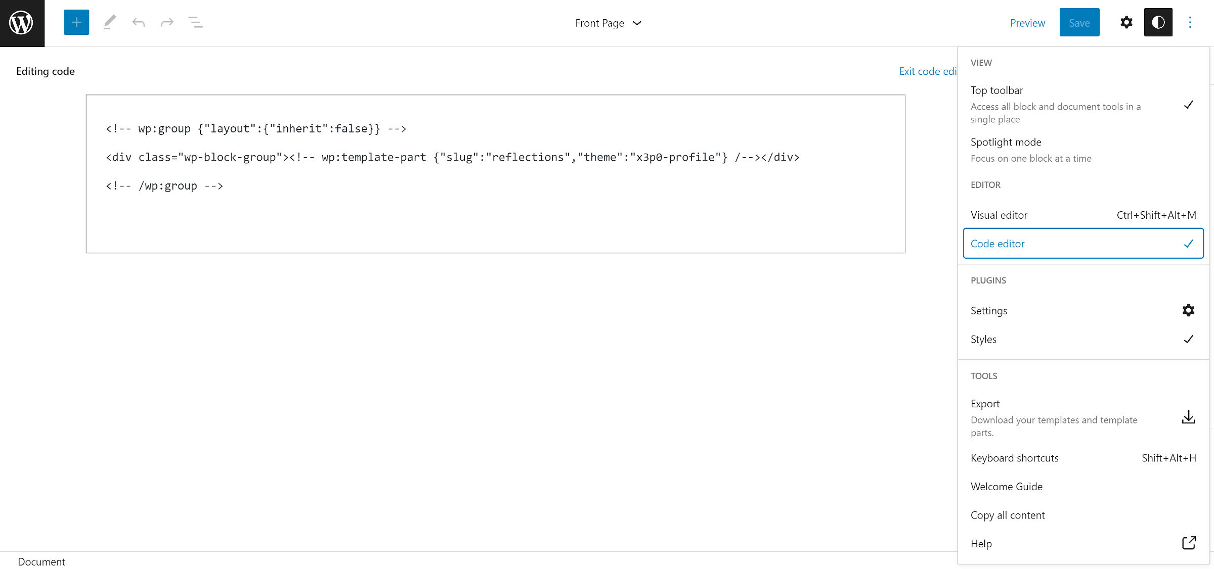
Code View in the Site Editor

Continuing with feature parity between the post and site editors, users can now switch to the code view in the site editor.
Technically, this is called the “code editor,” but there be dragons ahead for anyone who attempts to edit anything. At least if they expect anything other than the dreaded “this block contains unexpected or invalid content” message. I would sail into calmer waters and avoid it for anything other than reading or copying.
