The FSE Outreach Program is back with another round of testing. Anne McCarthy asks for volunteers to test and provide feedback on media-related features in WordPress. Anyone is welcome to contribute, and feedback is open until February 23.
This round of the program includes two tasks. The first has users explore today’s media-related experience. The second asks what they would like to see in the future.
“Like last time, the focus of this exploration is to think with a more long term, ‘wishful thinking’ perspective in order to gather useful insights that will help inform the design of media related experiences going forward,” wrote McCarthy in the announcement.
As always, I dove right in with the hope that any discovery would make its way upstream to help mold the future experience.
Task #1: Exploring the Possibilities
I altered this task slightly. The call for testing asks that volunteers explore what is currently possible with the core media-related blocks. However, I work with these every day, so I know most of the ins and outs of the system.
Instead, I explored the WordPress photo directory — my favorite place on the internet right now — and see what new images have landed. I visit Pexels, Pixabay, and Unsplash far less often these days, and I am sure that I can do away with them altogether as the directory gets more CC0-licensed media.
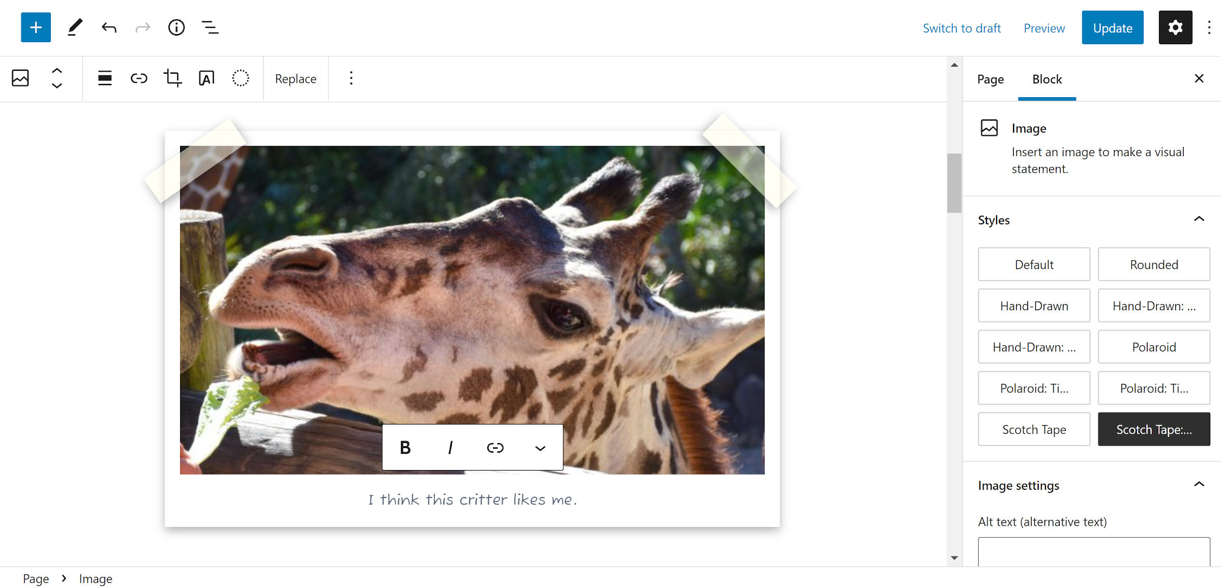
I downloaded a picture of a giraffe by Marcus Burnette. Then, I attempted to add a couple of different Scotch-tape/Polaroid effects via custom block styles. The following is a screenshot of one of them:

I am happy that I went off-path in this stage of the exploration. I learned a lot about the inner workings of blocks in the editor and that styling the ::after pseudo-element is problematic. WordPress uses it to add a blue border around selected elements. So, I just wiped that out, at least for my custom styles. I am 100% sure that will come back to bite me at some point.
WordPress has come a long way in balancing the block-editing experience for users and allowing theme authors to style a WYSIWYG canvas. However, there will likely always be these edge cases where the two will be at odds.
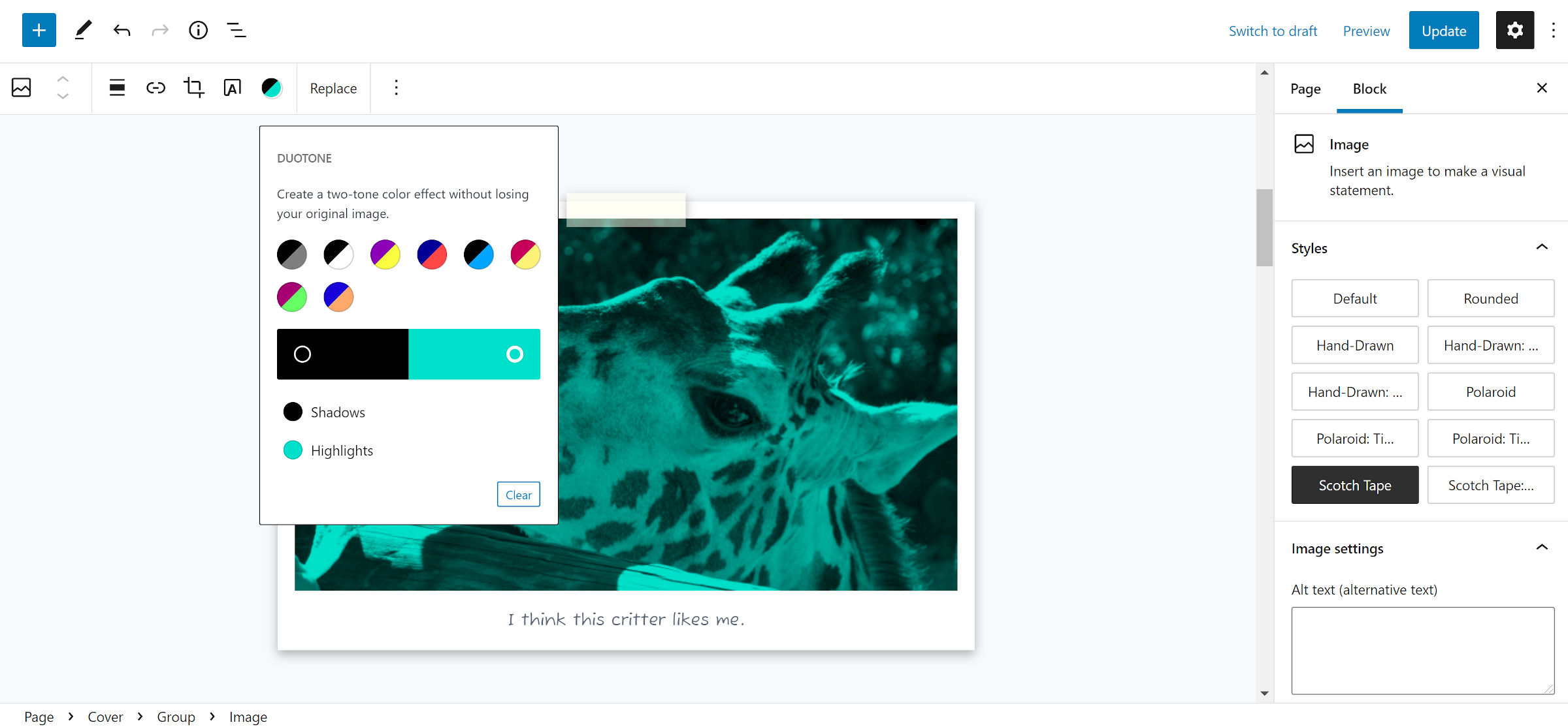
Since I was already there tinkering around in the editor, I tested various combos of custom block styles and duotone filters:

It is hard to remember that there was a time when this was impossible in WordPress.
Task #2: My Vision for Media
The second task of the exploration calls for volunteers to think about the long-term picture. What features do you want to see? How can the experience be improved?
Quickly moving up the ranks of my wish list is WordPress Photos integration. Now that the directory is nearing 1,000 images after less than two months into its soft launch, it is clear the community is backing the project. Finding images without ambiguous licensing terms goes hand in hand with WordPress’s vision of an open web. Users merely need easy access to them.
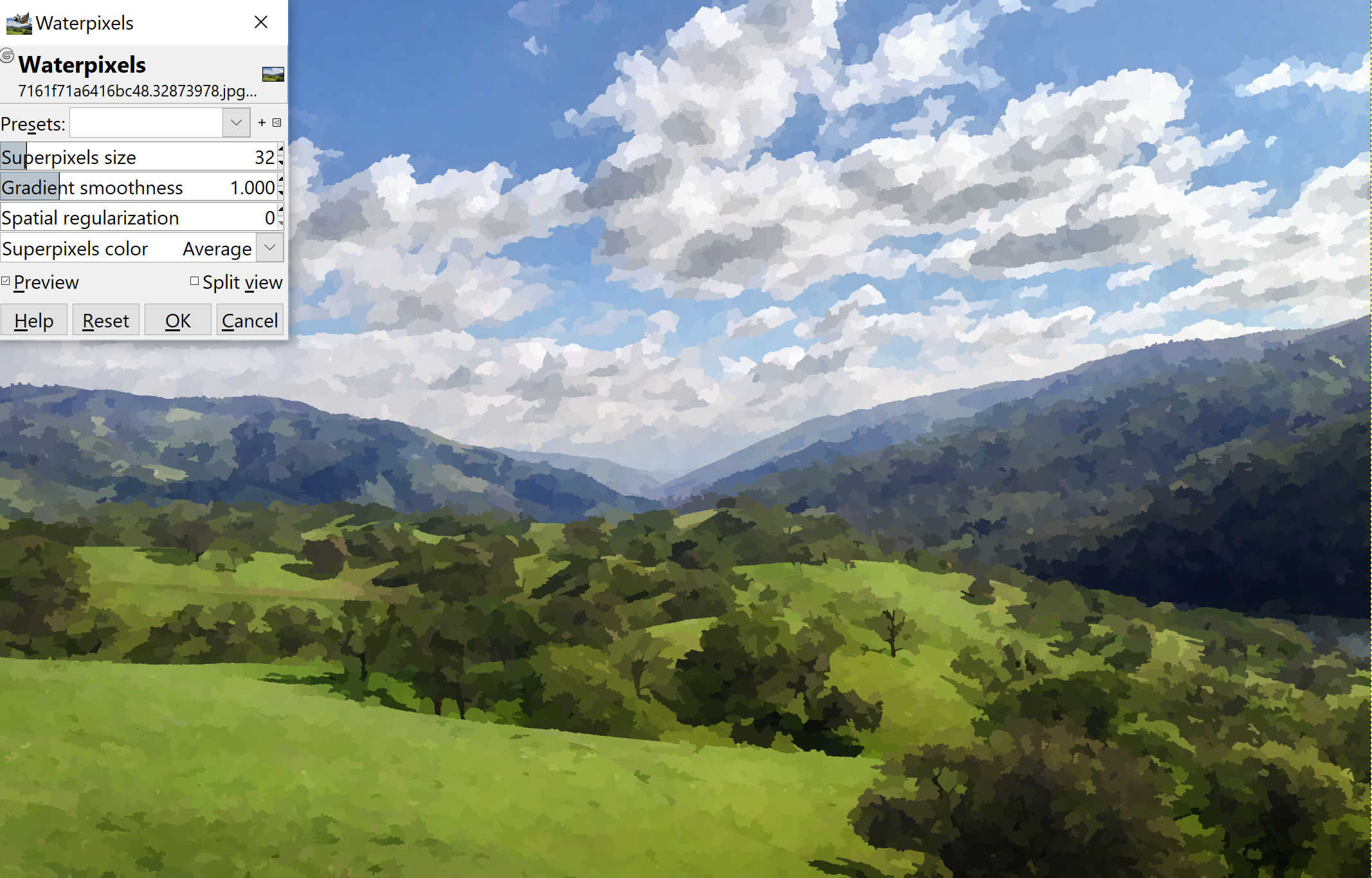
When laying out an idea for a theme design earlier this week, I realized how much I wanted to see more image filters. One of the patterns I was working on included a comic, watercolor-like background image. I grabbed a photo by Patrick Boehner — yes, once again, it was from WordPress photos. In a minute or so, I had imported it into GIMP and applied the “waterpixels” filter to it.

There was a distinct style I was going for with the design, but users cannot easily recreate it from within WordPress. It may be possible to implement this filter via a custom block style, and I may very well attempt it if this particular theme idea ever comes to fruition.
However, I would like to see a range of filters available to users. If this is too much for core, perhaps a standard filter-registration system for developers might be in order. This is just me thinking out loud at the moment. I do not know what that system would look like, but it is on my mind. I have little doubt that some user out there is thinking the same.
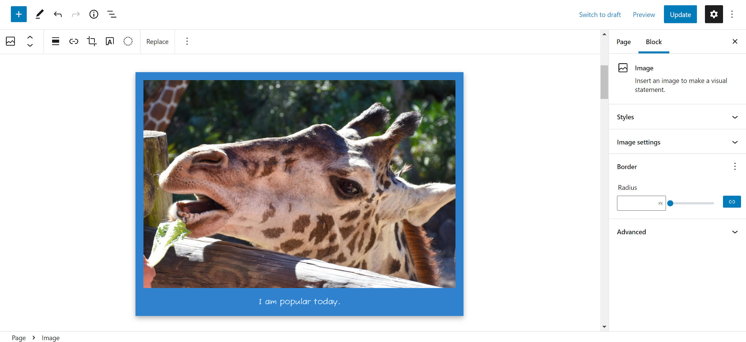
The addition of existing block design controls would also help. Implementing the border options across the range of media-related blocks is low-hanging fruit. Captions should be a dedicated block with a range of typography and color controls. Padding and background color options for the <figure> wrapper around images would allow users to “frame” their photos:

Outside of the previous ideas, there is at least one obvious wish-list item. I want to use my post’s featured image in any image-related block. I have long requested the ability to drop them inside of a Cover, for example.
There are less-obvious ideas too. It may be time that we rethink the concept of a featured “image.” In my previous life as a full-time theme designer, one of the scripts I had built and shaped over the years was a “media grabber.” Essentially, it allowed theme authors to get audio or video from the post content and display it in various places, such as alongside excerpts on the homepage.
There is no longer an easy way to use that PHP script in block-based HTML theme templates. It would require a third-party block plugin (none exist as far as I know) or a core feature.
