In today’s post, Tavern readers are in for something a little different than our regular stream of news and opinion. Welcome to the Building with Blocks series. It is a new type of post we are trying out to show people some of the fun, unique, or creative things they can do with WordPress blocks.
Our team decided to split the series into both developer and user-centric tracks. Posts may cover creating an “about me” page, coding custom block styles, piecing together a pattern, or something else entirely.
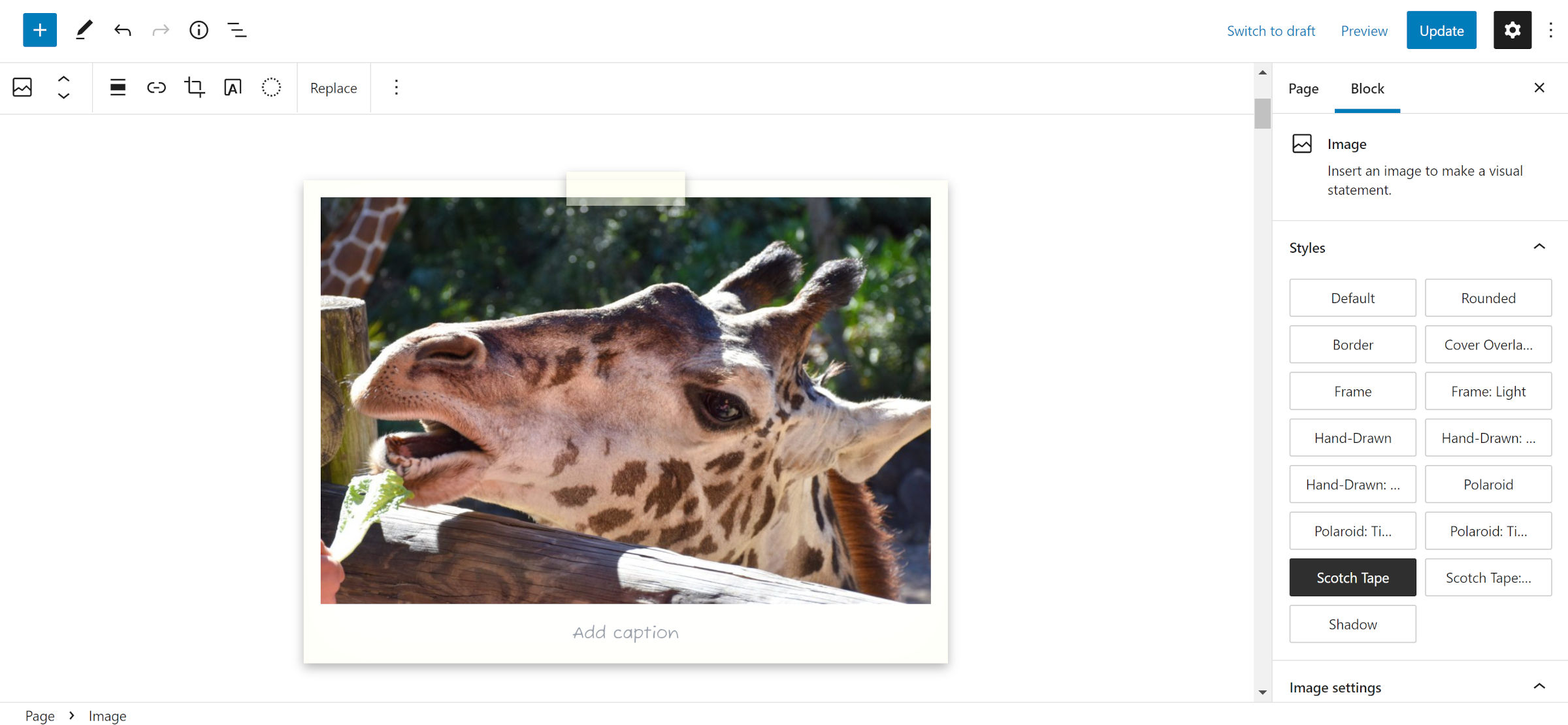
Since I am kicking off this series, I wanted to answer a question we already received from one of our readers. I had previously shared a custom block style with a “Scotch tape” look in my coverage of the FSE Outreach Program’s call for media testing:

Devendra Meena asked in the comments:
Hey man, how to get the “tape” custom block image?
This felt like a natural starting point with my first post in the series.
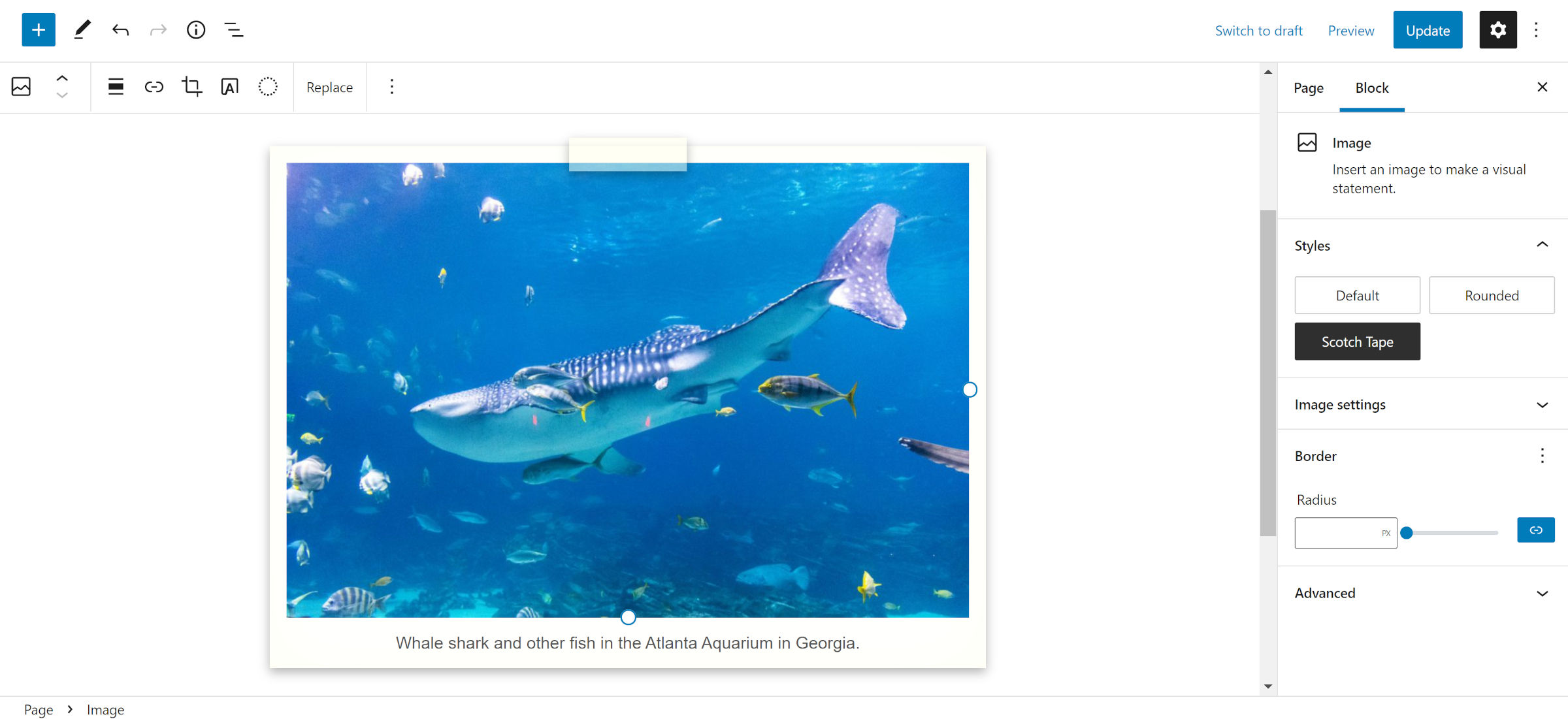
The design shows a piece of tape holding a Polaroid-style, framed image. Technically, I also had an alternate style with two pieces of tape at the corners. However, this tutorial will focus on the former. The two-corner design requires overwriting some editor-specific CSS, technically breaking functionality, and is not something I should encourage.
I also wanted to begin with block styles because they are underutilized. Most variations I have seen have been simple changes like adding borders and removing margins. These are often best left to block design tools. Of course, themers are adding these styles because WordPress currently lacks or has previously lacked the UI controls for handling them. It is also one of the reasons so many have asked to mix and match multiple block styles — themes are doing the work that core should be doing. More tools are continually being added, but we still have a long way to go.
When I think of block styles, I want to create designs that are unlikely to be available via the standard design tools. I want to serve something unique to theme users. That is where we are starting today.
As a bonus, custom block styles work in classic and block themes.
Despite having written hundreds of tutorials in my life, this exercise turned out to be a little tougher than I had anticipated. It is easy to forget that everything I code starts with a base of “fixing” the things that I find odd about the default block library styles. This makes my life easier. However, many theme authors will lean on core’s defaults, so I needed to make this general enough to work for them.
Therefore, I opted to start from the default Twenty Twenty-Two theme. In testing, I suggest working with it. The CSS code in the following section may need slight alterations for others.
Creating the “Scotch Tape” Block Style
The first step is to register a custom block style via the theme. WordPress has both server-side and JavaScript APIs for this feature. Using PHP is easier to set up if you do not already have an editor script file to drop the code into.
To register the custom block style, add the following code to your theme’s functions.php file:
// Register block styles on the init hook.
add_action( 'init', 'tavern_register_block_styles' );

// Wrapper function for registering all block styles.
function tavern_register_block_styles() {

        register_block_style( 'core/image', [
        	'name' => 'scotch-tape',
        	'label' => __( 'Scotch Tape', 'tavern' )
        ] );
}
Doing so will register the style in the editor. You can test this by adding an Image block on the post-editing screen. “Scotch Tape” should be selectable under the styles tab.

Registering a style is the easy part. Writing the code is where things can get dicey. WordPress has so many methods of loading CSS styles that you might not know where to start.
The register_block_style() function used earlier allows developers to add a style_handle, a reference to a registered stylesheet. Themers can also add an inline style directly via the inline_style argument. For just a few lines of CSS, this works well.
In my own themes, I register block-specific stylesheets via the wp_enqueue_block_style() function — yes, the function names are terribly confusing. This was officially added in WordPress 5.9. It will only output the CSS when a block is used on the page. For example, I add a core-image.css file to house all Image block CSS. This is the method I recommend.
However, for the sake of simplicity, I added the following code to the end of Twenty Twenty-Two’s style.css file:
/* Design for the <figure> wrapper. */
.wp-block-image.is-style-scotch-tape {
	position:         relative;
	overflow:         visible;
	padding:          1rem;
	background-color: #fff;
	box-shadow:       0 4px 10px 0 rgba( 0, 0, 0, 0.3 ),
	                  0 0 4rem rgba( 255, 255, 235, 0.5 ) inset;
}

/* Design for the "tape". */
.wp-block-image.is-style-scotch-tape::before {
	content:    "";
	display:    block;
	position:   absolute;
	width:      7rem;
	height:     2rem;
	margin:     auto auto auto -3.5rem;
	z-index:    1;
	left:       50%;
	top:        -0.5rem;
	background: rgba( 255, 255, 235, 0.5 );
	box-shadow: 0 4px 10px 0 rgba( 0, 0, 0, 0.3 );
}

/* Remove TT2's image shadow. */
.wp-block-image.is-style-scotch-tape img {
	box-shadow: none;
}

/* Adjustments for the caption. */
.wp-block-image.is-style-scotch-tape figcaption {
	display:     block;
	margin:      1rem 0 0;
	line-height: 1;
	font-size:   1rem;
	font-family: 'Fuzzy Bubbles', sans-serif;
}
With the CSS in place, it is merely a matter of finding an image to test with. I chose Marcus Burnette’s whale shark from WordPress Photos.

If you want to add a bit of flair to your captions, load up Fuzzy Bubbles or another handwriting font from Google Fonts.
This style does not necessarily need to be tied to the Image block. There is no reason it could not apply to Paragraphs, Groups, and more with some adjustments.
For now, I hope you all have fun with it. Also, feel free to share in the comments where you would like to see the new “Building with Blocks” series head in the future.
