Gutenberg 12.6 landed in the WordPress plugin directory yesterday. The update includes several transform-related enhancements and new Read More and Post Author Biography blocks. Users can now also show visible labels via the Social Icons block.
Nothing seems to be broken with this release, which is always welcome. Gutenberg has not fundamentally wrecked something I relied on in a long while. There were a few growing pains, but the software has become more stable in the past year. I just wanted to add a note to commend the people working on it every day.
As usual, I have a few nit-picks, but this looks like yet another solid release overall.
Transforming Blocks
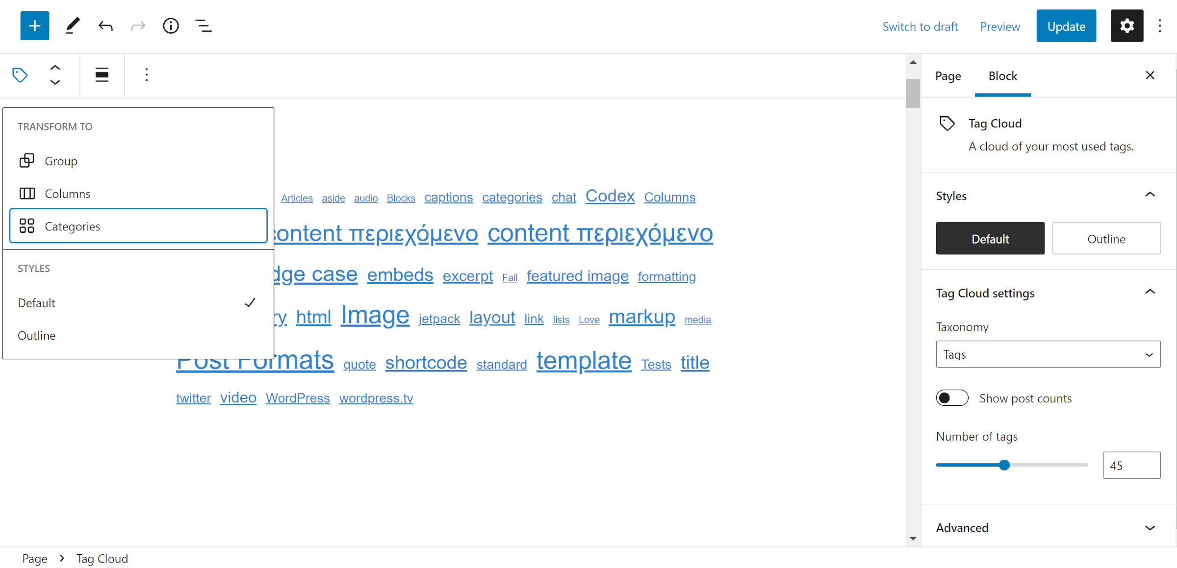
Developers went all in on block transforms in Gutenberg 12.6. The following blocks now support switching between one another:
- Calendar
 Archives
 - Code
 Paragraph
 - Tag Cloud
 Categories
 - Group
 Row (via the Variation control)
A new mechanism for retaining styles during transforms also landed in this release. It currently supports font size and color options. For example, users can switch between a Heading and Paragraph block, a run-of-the-mill use case, without losing those specific customizations. However, other settings are lost, even when shared across blocks. There is not much I would not give to retain text alignment in this scenario.
Anchors on the Heading block are omitted when transforming to a Paragraph in this release. The reason for this change was that WordPress auto-generates them. However, manually-added anchors are also removed.
When transforming a Gallery to an Image block, the link destination, link target, and image size settings were previously lost. A new patch adds those missing attributes.
Social Icon Labels
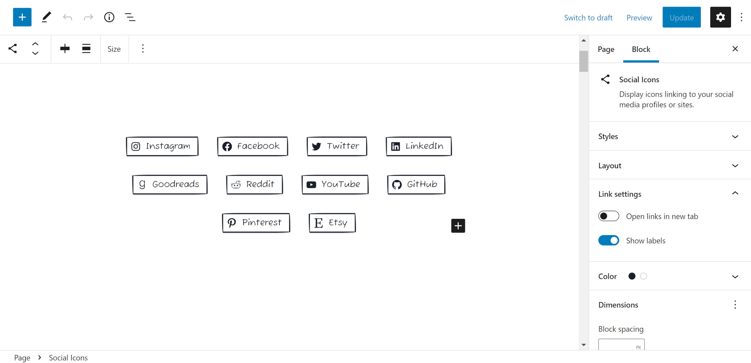
If there is one thing that I am particularly ecstatic about with the Gutenberg 12.6 release, it is the option to show text labels via the Social Icons block. Previously, these were only displayed for screen readers. However, users can now toggle them on for everyone.
This addition can open a ton of design variations for the block. Of course, I have already put my own spin on it with a hand-drawn border design, as shown in the above screenshot.
WP Tavern actually played a small role in making this feature happen. When discussing a similar control with Nick Diego in his Social Sharing block, I mentioned an open ticket for the core Social Icons block. It was not long before Diego had a patch ready, and now it is in Gutenberg.
Color Panel Uses Tools Panel Component
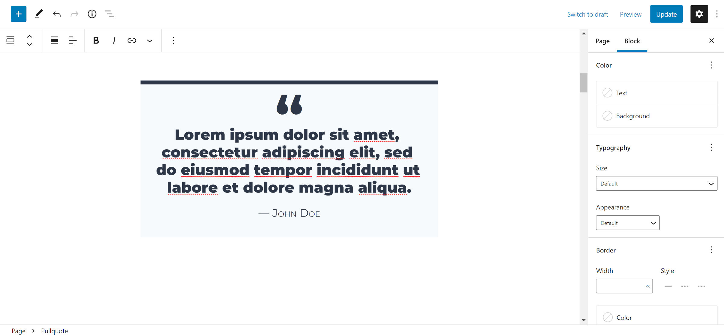
The latest update switches block color options to the Tools Panel component. In most scenarios, the text and background colors are shown with the link color available through the “view options” dropdown (ellipsis button).
To create a more unified and clean UI, it seems we have now added more clutter for several blocks. As shown in the screenshot above for the Pullquote block, the color, typography, and border panels are all permanently open. The Group block is even heavier with its addition of a dimensions section. Users have no way to hide them or the default controls.
When the Tools Panel component was first introduced, it had a decluttering effect because it meant that some controls were tucked away. However, now that more panels are using it, that minuscule real estate in the block options sidebar has disappeared. Expect to scroll through several form fields to find just the right setting.
Can we make them collapsible again? Or, better yet, can we have a combination of tabs and the Tools Panel component?
Post Author Biography Block
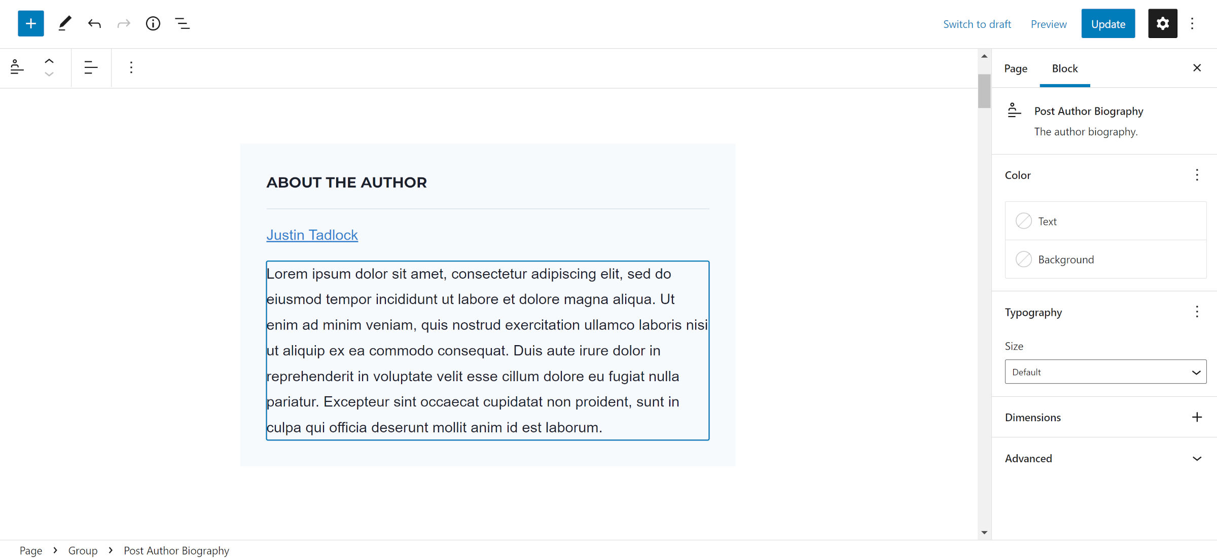
A Post Author Biography block landed in Gutenberg 12.6. Its purpose is to display a user’s “biographical info,” which can be set via their user profile page in the admin. It covers most of the base design options but is missing border support.
It is a solid start, but there is still one looming issue. It does not run wpautop() over the output. This means that the content is not wrapped in a <p> tag. Because of this, it also does not respect double-line breaks entered via the user-editing screen. WordPress has never had a standard function for outputting and formatting the user bio, allowing theme authors to handle it. However, some users may expect their custom formatting to work.
We are inching closer to a complete set of author-related blocks. WordPress initially shipped a Post Author block that did a little bit of everything. Because of this, it made it next to impossible to consistently use for post bylines or other single-line metadata areas in themes. It also limited the design range of “about the author” sections often shown at the end of a post.
We must now wait for the Post Author Avatar block to round out the set.
Read More Block Added
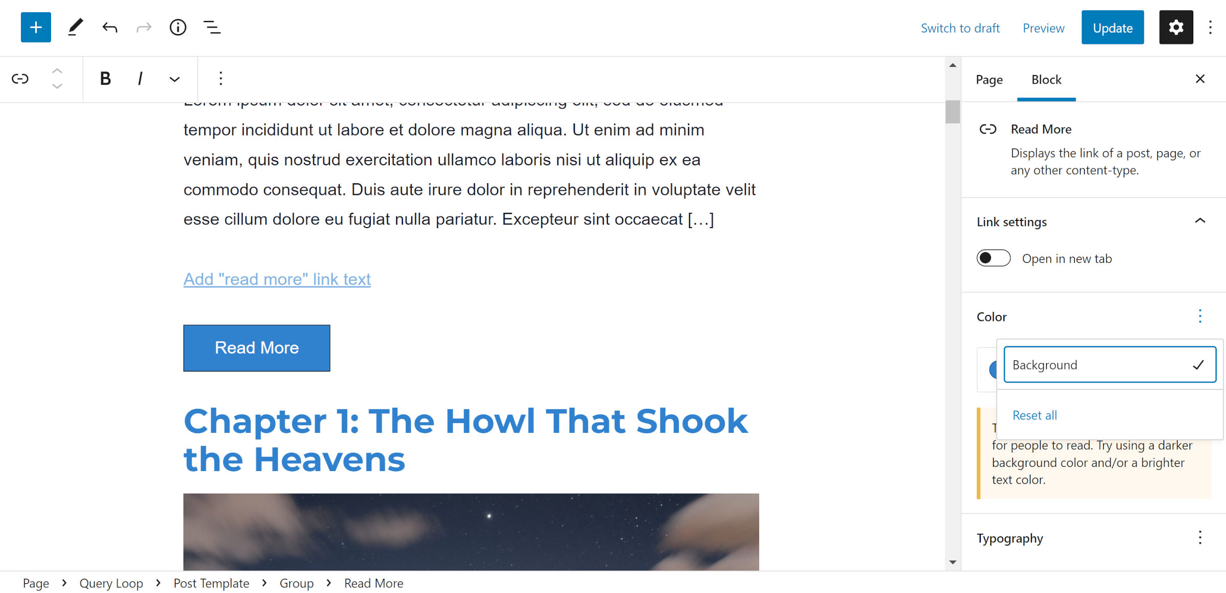
Gutenberg 12.6 adds a dedicated Read More block for theme authors to work into their Query Loop designs. It is merely an HTML permalink to the post. This is separate from the link output by the Post Excerpt block. Unfortunately, it has multiple issues and needs more testing before practical use.
Users can add a background color to it but no text color. This makes it easy to create unreadable text. I was able to work around this by putting it in a Group block and changing the link color from there.
It supports most border options, but the style control is missing. It also does not have a block-level HTML wrapper, so there is no way to align it horizontally without wrapping it in another block.
This is an odd case. I am not sure if there are any other inline HTML elements (technically, it is set as a block element via CSS) for any top-level blocks elsewhere in WordPress.
The other issue is the potential for two “read more” links. One via its dedicated block and the other through the Post Excerpt block. There is a draft patch to toggle the link for the latter.
Responsive Handling for Classic Images
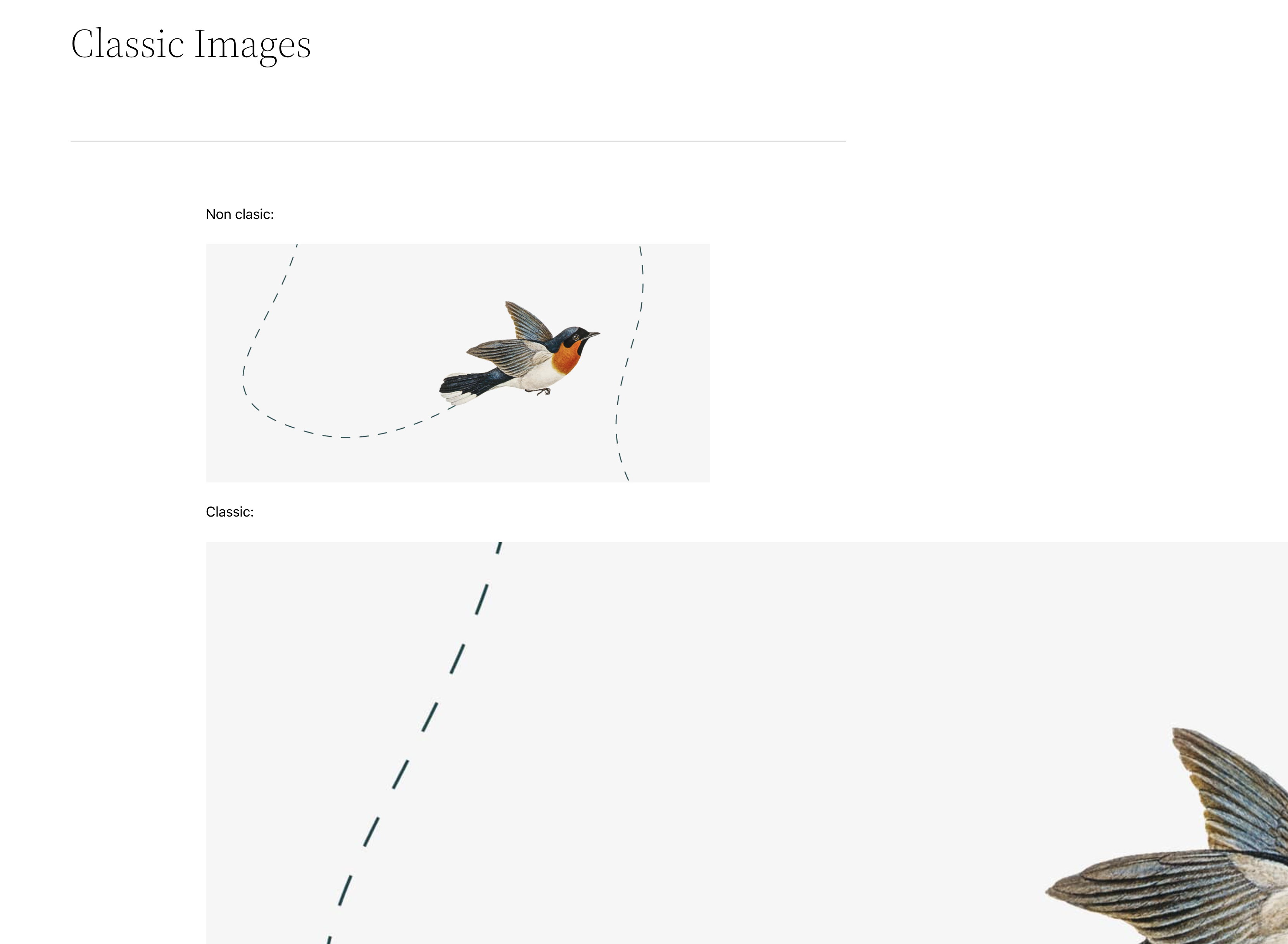
For posts written in the classic editor with large images, the media would blow outside the content area when using a block theme. Gutenberg decoupled its responsive image handling from the core Image block as a fix. This change is marked to be backported to a minor WordPress release, so users should not have to wait for WordPress 6.0.
While this provides a fix for images, it does not address the issue of block themes not handling classic content or styling simple HTML. As an example from our site, I recently added a <table> element because the core Table block lacks some features. Since this was custom HTML, none of the block’s CSS was loaded, leaving it essentially unstyled. The same issue exists for classic content.
One issue at play here is that WordPress is pushing CSS styles at the block level via theme.json. However, it only allows styling a handful of HTML elements, such as links and headings. This type of component-based design works well when everything is wrapped into a component (i.e., block).
It makes more sense to style the underlying HTML elements than their representative blocks. That way, it is a shared style across any blocks that use the element, including third-party plugins.
Large Quote Style Removed
Finally, someone removed the “large” Quote style. It has been unnecessary since adding a font-size control for the block.
I have made a point, several times at least, that WordPress should avoid shipping custom block styles of its own. In most cases, this is best left in the capable hands of theme authors. At the very least, new block styles should be avoided until the design tools are more well-rounded. Deprecating block styles creates legacy CSS baggage loaded with every WordPress site.
