After being involved in web design for almost 19 years now, there are grinding days where nothing feels fresh. However, there are also moments where you look at another web developer’s approach to problems and feel like there is a whole world of possibilities that you have yet to step into. And, it is rarely something complicated. The best developers make it look simple, and Rich Tabor’s Wabi is dotted with those little tricks that make poring over WordPress block theme code feel exciting again.
Earlier today, the WordPress theme directory hit 50 block themes. However, I was more interested in what was waiting in the review queue. Tabor had submitted his project less than 24 hours before, but I spun it up anyway. I had to see what one of the more prolific writers on block theme development had built. While he had contributed to GoDaddy’s Go theme before taking a job with Extendify, this was the first theme submission from his personal account.
I love diving into themes where I can learn something. That is the best way that I can describe Wabi.
It is primarily geared toward bloggers and writers. It features the type of design those who want nothing to overpower their content would appreciate. However, it has enough whimsy thrown in to not be an entirely boring black-and-white affair.
One of Wabi’s unique features is its per-post accent color selector. The control is located under the “Status & Visibility” panel in the post sidebar and allows users to select from the theme’s color palette. This accent is primarily used for the background behind the header and post title area. However, it is sprinkled around various other elements and blocks.
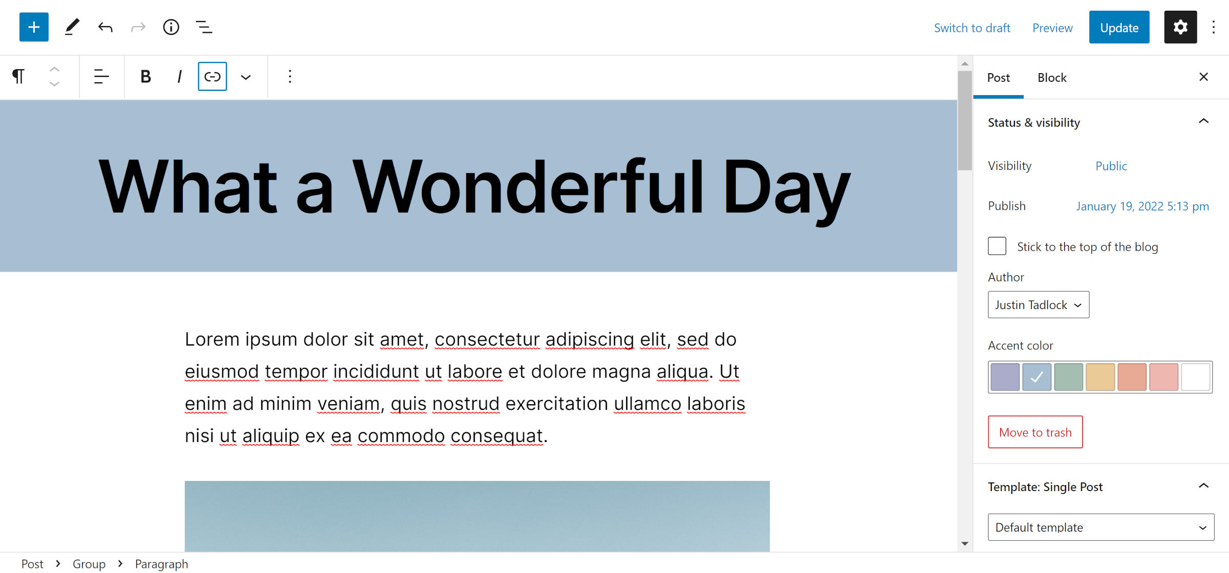
I have yet to see a block theme utilize custom post metadata. This is likely because few developers know how to create the components in the post sidebar after relying on the old meta box system over the years. The theme’s accent-related JavaScript is structured well enough that other themers can pick it apart and build similar features in their designs. If this has been a holdup in block theme development for anyone, it is well worth doing a deep dive into the mere 117 lines of JavaScript used to make this feature.
A nice touch Tabor added to the global styles’ color palette was a custom background for the accent color. Instead of showing a solid-colored circle, it is a conic gradient of all the available variations.
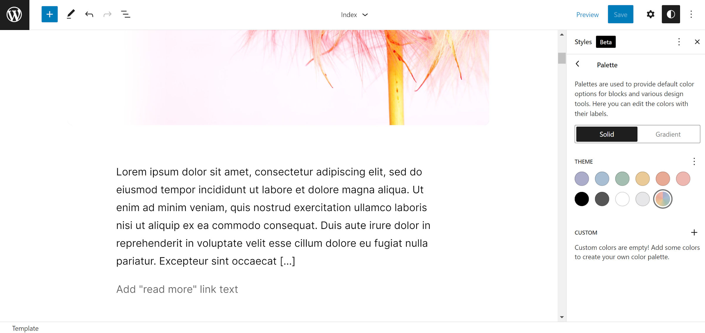
This detail might seem insignificant, but it is a visual cue that this particular color is different than the others. Users can still edit it to set the default, but they can also override it on a per-post basis.
In a post on creating a custom block style earlier this week, I said the feature was underutilized when building WordPress themes. Many were not pushing it forward with unique design variations for users. Wabi includes a little over a dozen custom styles, but I have not seen any like those it offers for Image and Video blocks.
The theme registers Bottom Right, Bottom Left, and Center styles. Each changes the position of the image within its <figure> container as shown in the following screenshot:
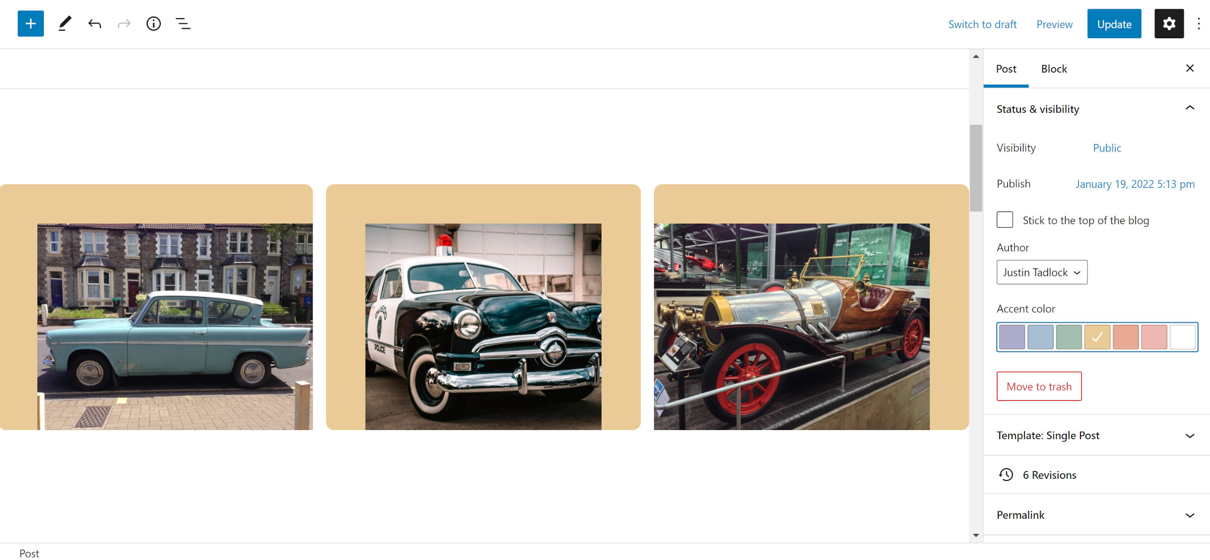
The styles are not particularly complex. They are simple twists to offer some visual oomph that can sometimes lack in text-heavy blog posts. And, they are unique, something you would not be able to build with the core design tools. To top off the feature, the background color behind the media uses the theme’s accent color.
That is the type of creative thinking around block styles that I expect from theme authors. It is not that I think others are incapable of it, but building projects with blocks sometimes requires approaching design in new ways.
Wabi also supports global style variations, an upcoming feature expected to land in WordPress 6.0. To see it in action, users must activate the Gutenberg plugin.
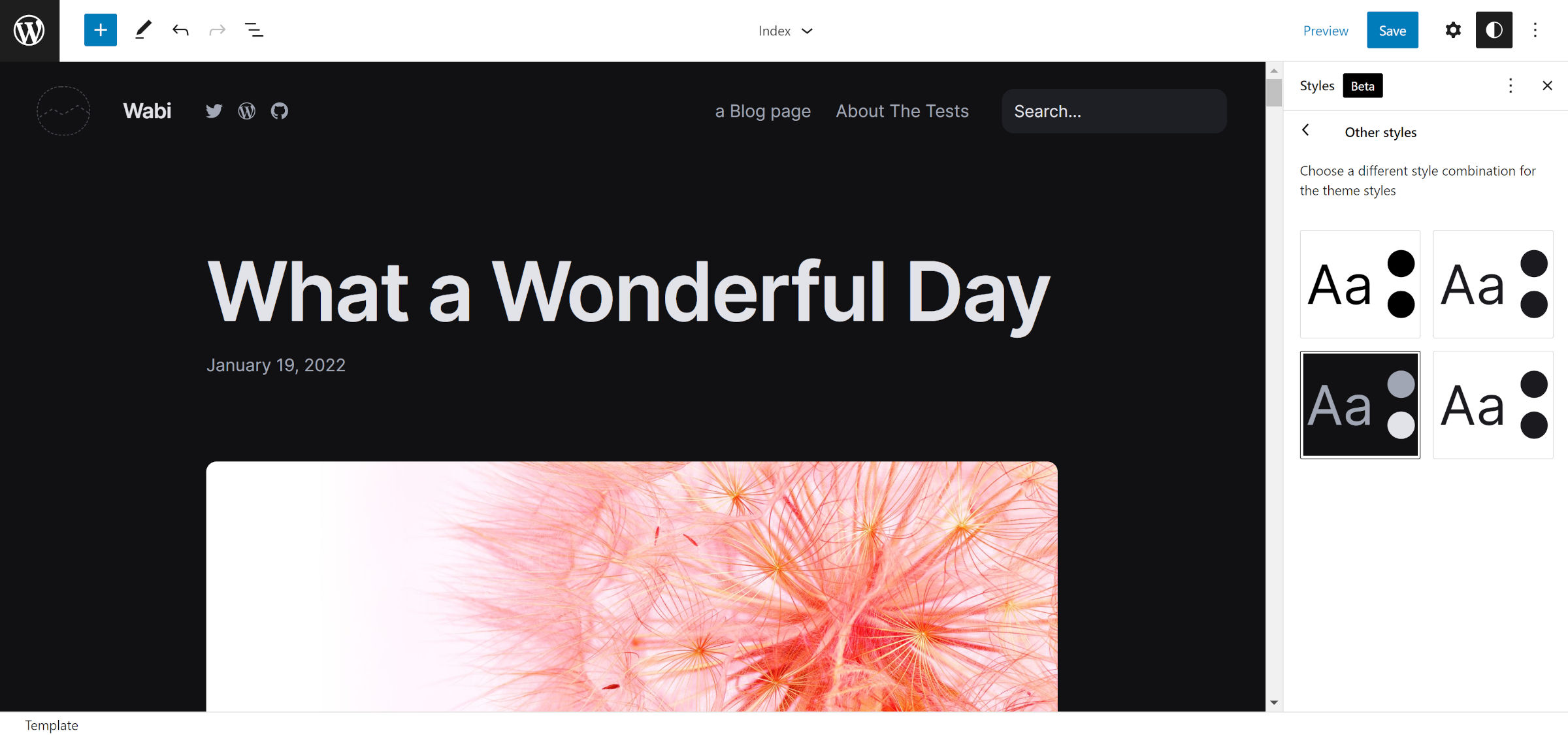
The theme packages four style variations, including the default. Each of them offers alternative color palettes, including a dark scheme.
Wabi also includes 15 patterns. Most of them are variations for headers, footers, and post loops, but in the spirit of keeping things unique, there are style-guide patterns too.
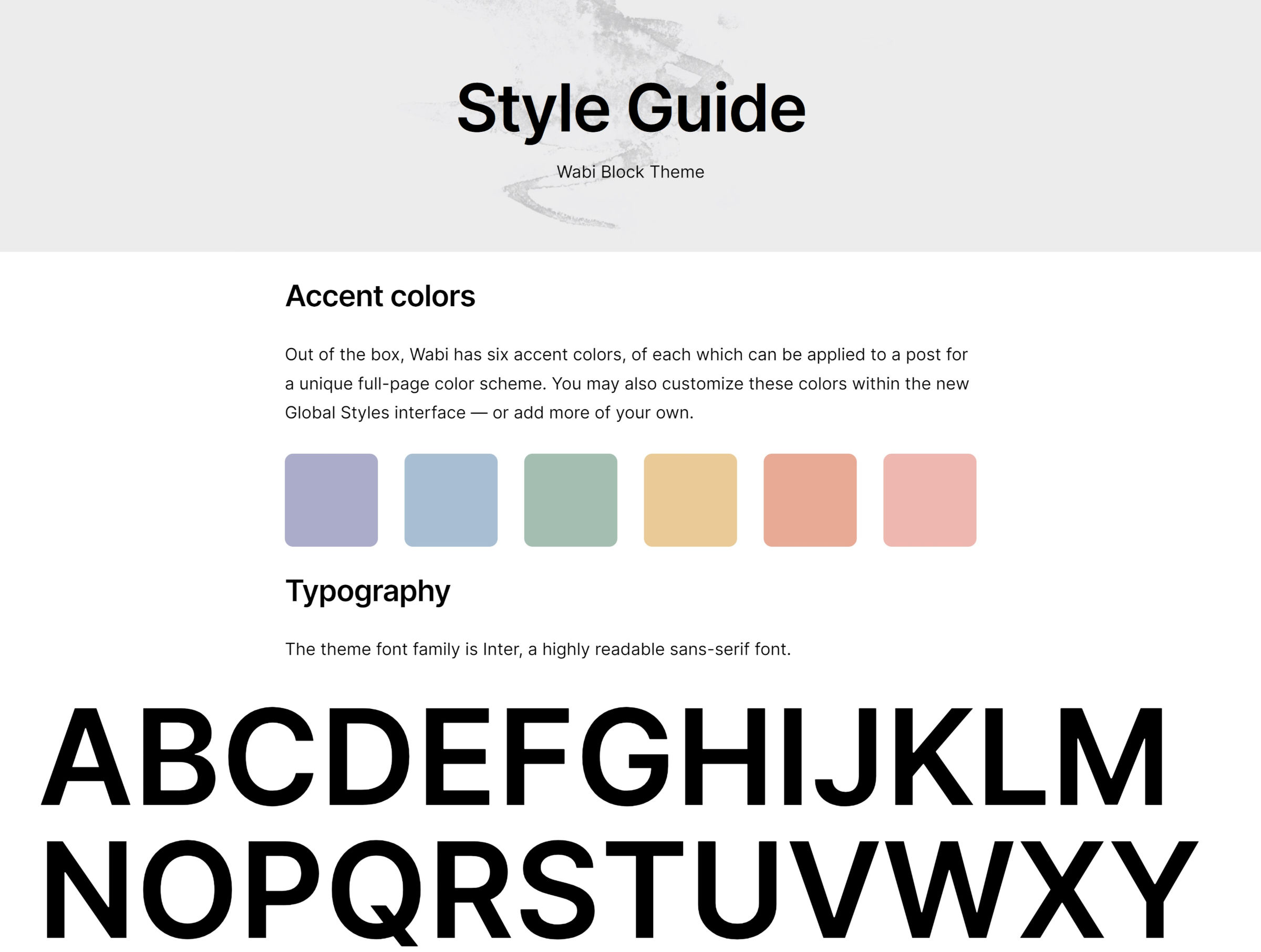
Users can look through the theme’s color palette and typography by inserting them into a post. They may not be needed for use on the front end for most sites, but they offer a quick glance at the theme’s overall style.
The theme works well enough for blogging. Post content is readable with it, and it makes generous use of white space. It will not get any complaints from me in that department.
I only wonder what other little treasures Wabi holds that I have yet to discover.
