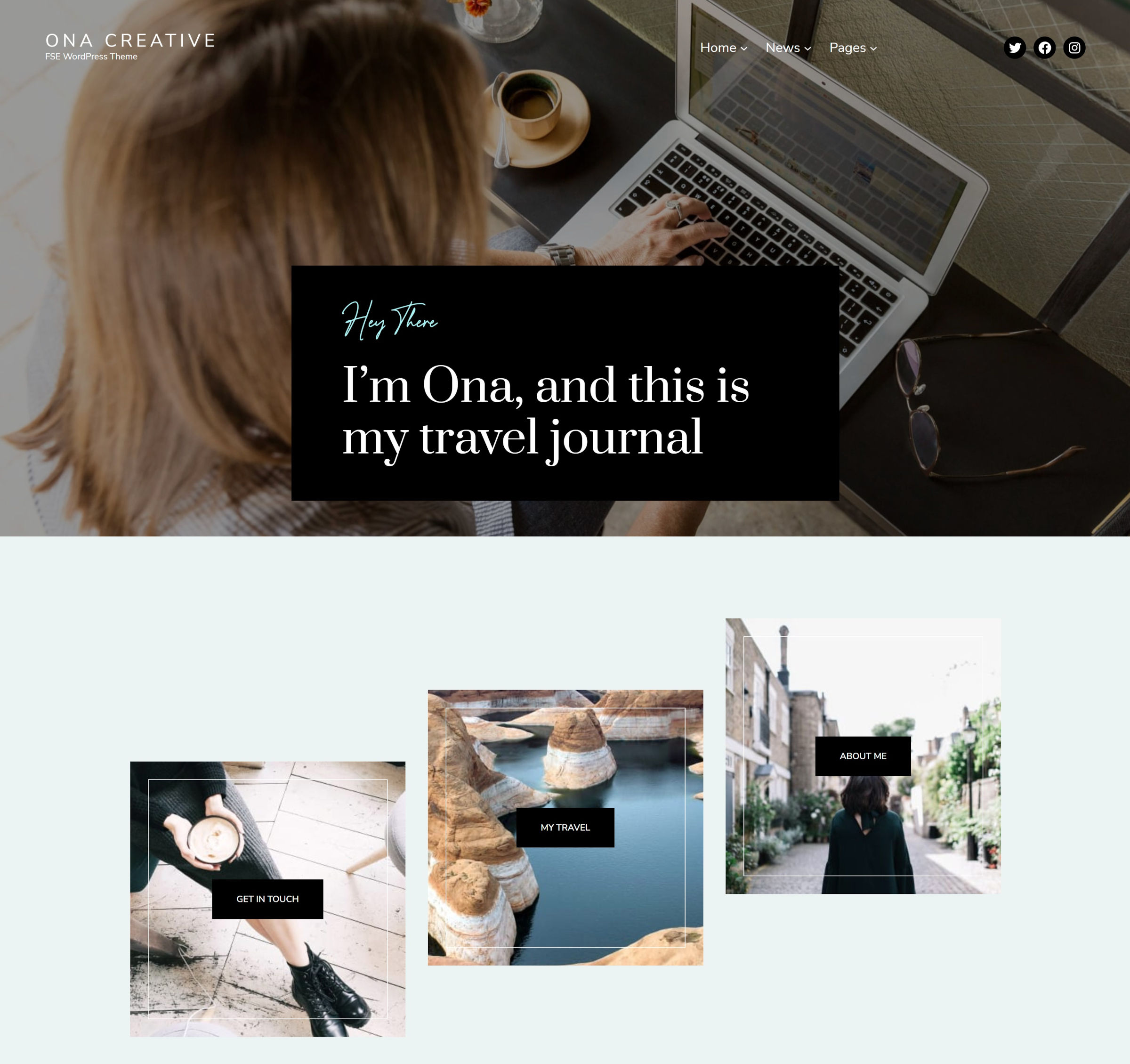
Yesterday, DeoThemes’ latest block theme, Ona Creative, landed in the WordPress directory. It is the second child of Ona, a theme I initially showcased here on the Tavern in November 2021.
When I first reviewed the Ona parent theme, WordPress 5.9 had yet to be released, and users were required to install the Gutenberg plugin to test it. Developers were still rapidly launching features in a push to get a production-ready version of the block-based templates and global styles features.
Ona was unlike any other block theme submitted to the directory at that point. If not paying attention, one could mistake it as a classic theme. It was well-designed in its own right, regardless of the system under the hood. However, most block themes were bare-bones experiments for a system struggling to launch. Ona carried a promise that block themes did not need to suck all the life out of design to function.
At the time, the theme had bugs that were not of its own making. Depending on a user’s site structure, default images could return a “404: Not Found” result. The Pattern block did not exist in either WordPress or Gutenberg, and themes had no surefire way of inserting dynamic data. However, Ona now uses this feature to create beautiful default templates.
Not only does the Ona parent do this, but the Ona Creative child theme reuses and rearranges those patterns without needing to write nearly as much new code. The front page template adds a custom header but inserts two existing patterns to set its design apart from its parent:

But, there are also some missed opportunities with Ona Creative. While it uses patterns from its parent theme, there are sections in its front page template that would have made perfect patterns themselves. Users may like the default posts Query block and want to use its layout on other pages.
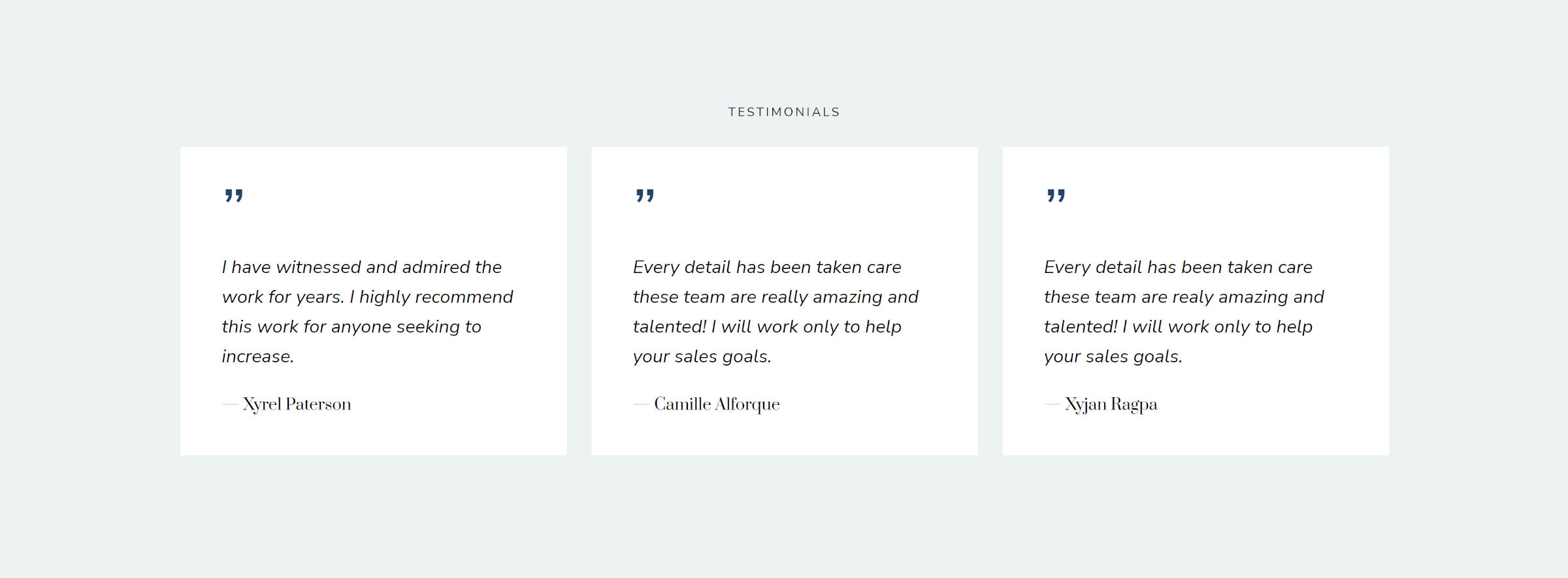
The following testimonial section definitely makes sense as a pattern:

At this point, I am not sure if directly inserting most block code in theme templates is an ideal path. If it is good enough to be in a template, why not make it reusable? I have hardly seen cases where theme templates should not just be made up of one or more patterns.
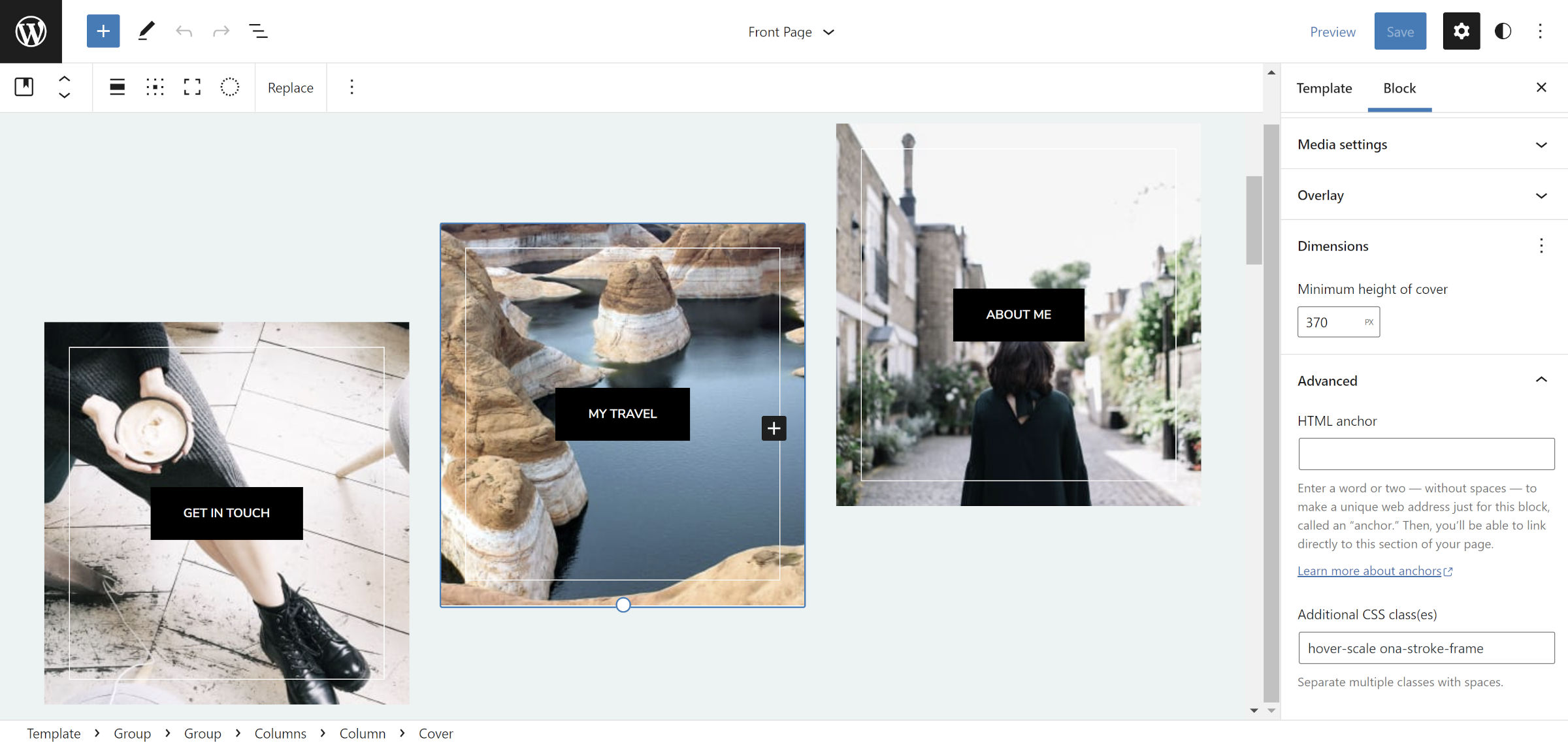
The most significant issue I have with Ona and Ona Creative is that they eschew the block-style system in favor of custom classes. For example, the theme has two classes that it adds to the Cover block in this section of its front-page template:

The first styles the inner border, and the second creates a hover effect that zooms in on the background. There are two ways for users to recreate this design on the Cover block elsewhere. Either copy and paste one of the blocks in the pattern or manually type the classes under the “Advanced” section of the block options sidebar.
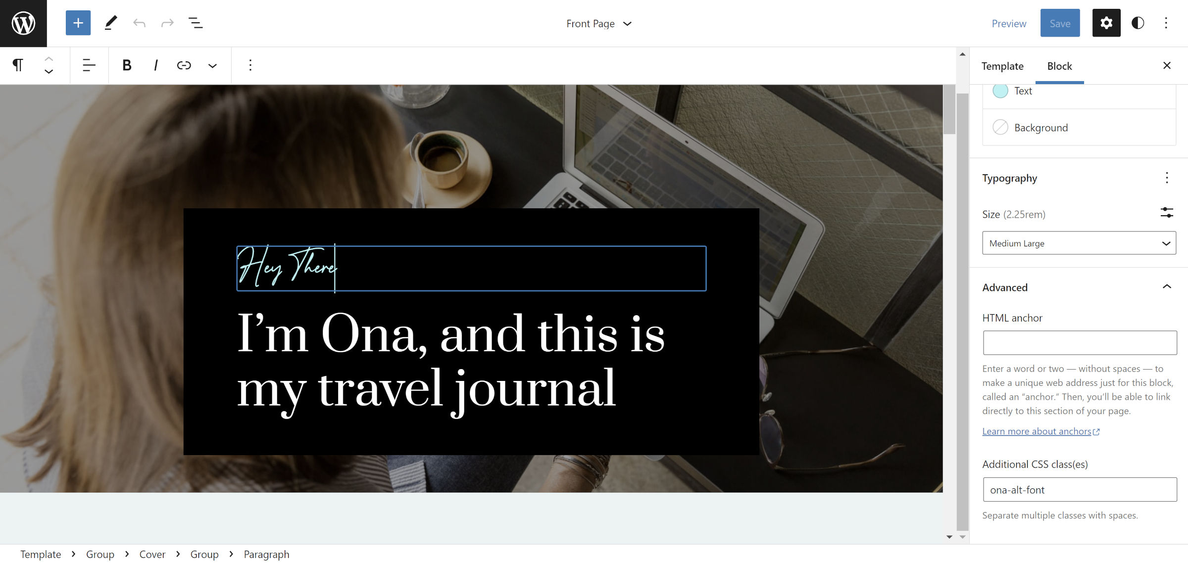
The same is true for the cursive handwriting style used in some sections. Users must manually add the ona-alt-font class instead of picking it from the design tools. I am willing to give a pass on this because font-family selection should be handled via the Font Family block control. However, this is not yet supported for blocks like Heading and Paragraph in WordPress.

Both are cases of the old way of designing themes, requiring users to jump through hoops to recreate a specific look. Themers need to leave this way of thinking back in the classic era. The block system has a standardized block styles feature that allows users to select these classes visually. If they are registered via the theme, users can recreate that same design with literally any block that supports them.
There is a simple question to ask when deciding whether to register a block style: Is the class on a block in a pattern or template? Except in some rare use cases — usually involving headers and navigation — the answer is almost always that the custom class should be a block style.
I may be a bit nit-picky about the implementation of some features. The space is still largely unexplored — Ona Creative is only #56 out of 58 block themes in the directory. This does not take away from how well-designed it is.
And the one thing that DeoThemes continues to get right is the design. Ona Creative deserves to grace the front end of many WordPress sites. Its development team has kept up with changes to the block system, the typography is on-point, and it simply looks good.
