WebMan Design owner Oliver Juhas released the first version of the Abs – Additional block styles plugin on Monday. Unlike many block-related extensions, it does not offer any blocks of its own. Instead, it registers custom styles to enhance those packaged with core WordPress.
In total, the plugin adds 18 styles. Some are specific to a single block, such as Accessibility Hidden, which creates invisible Headings, making them available to screen readers. Others, such as the Drop Shadow style, are registered for multiple blocks.
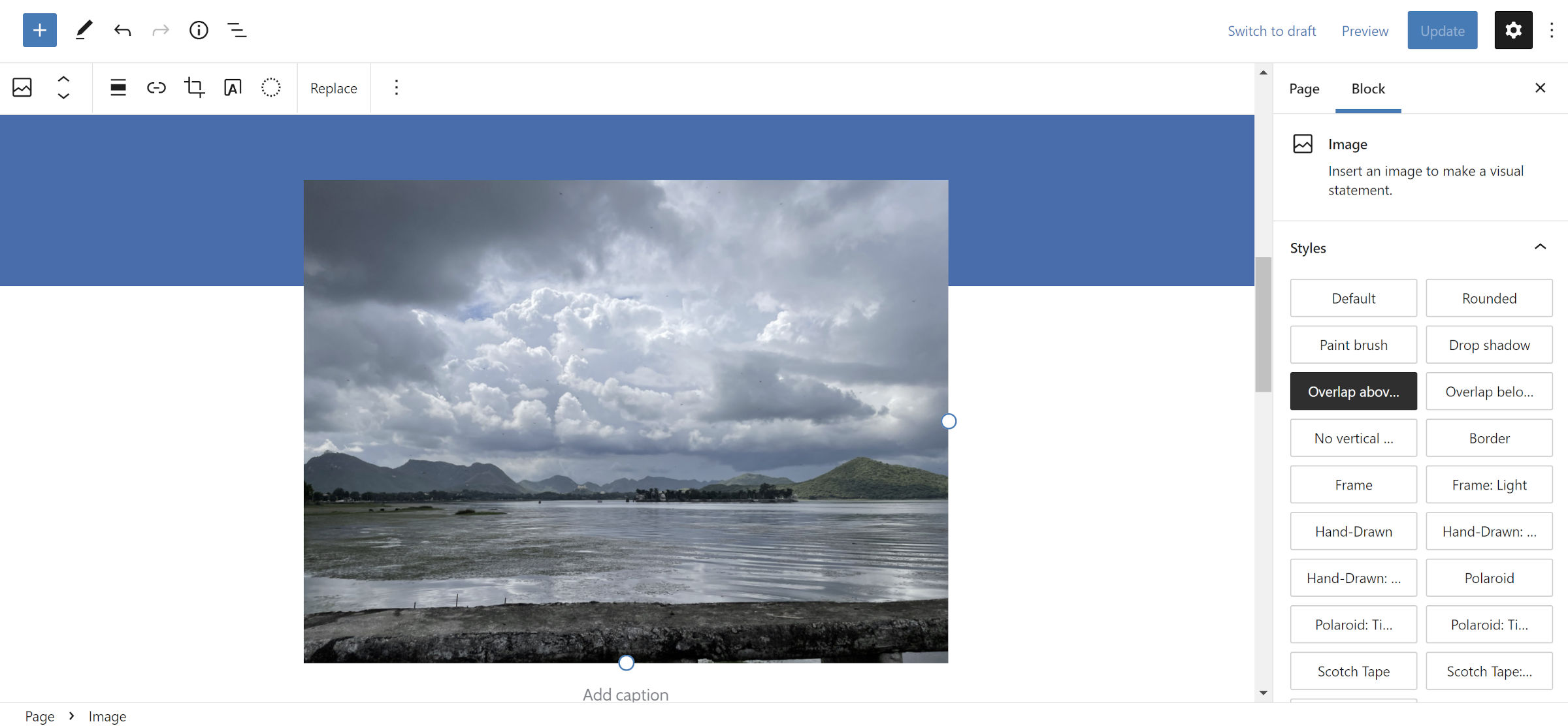
On the whole, it is a well-rounded set that often leans into more practical use cases. The Overlap Above and Overlap Below styles fit into this scenario. The former allows users to bump Image, Cover, and other blocks up, overlapping the section above them. The latter goes in the opposite direction.

The downside to such overlaps is that the user cannot control how far up or down the block shifts. Negative vertical margin controls are a sought-after feature in WordPress, often necessary to create specialized layouts.
Juhas provided a --abs_overlap_value CSS custom property. DIY users could control this via CSS. At the very least, theme authors could integrate directly with the plugin. However, they may simply want to register the styles for their own themes if going through all the trouble.
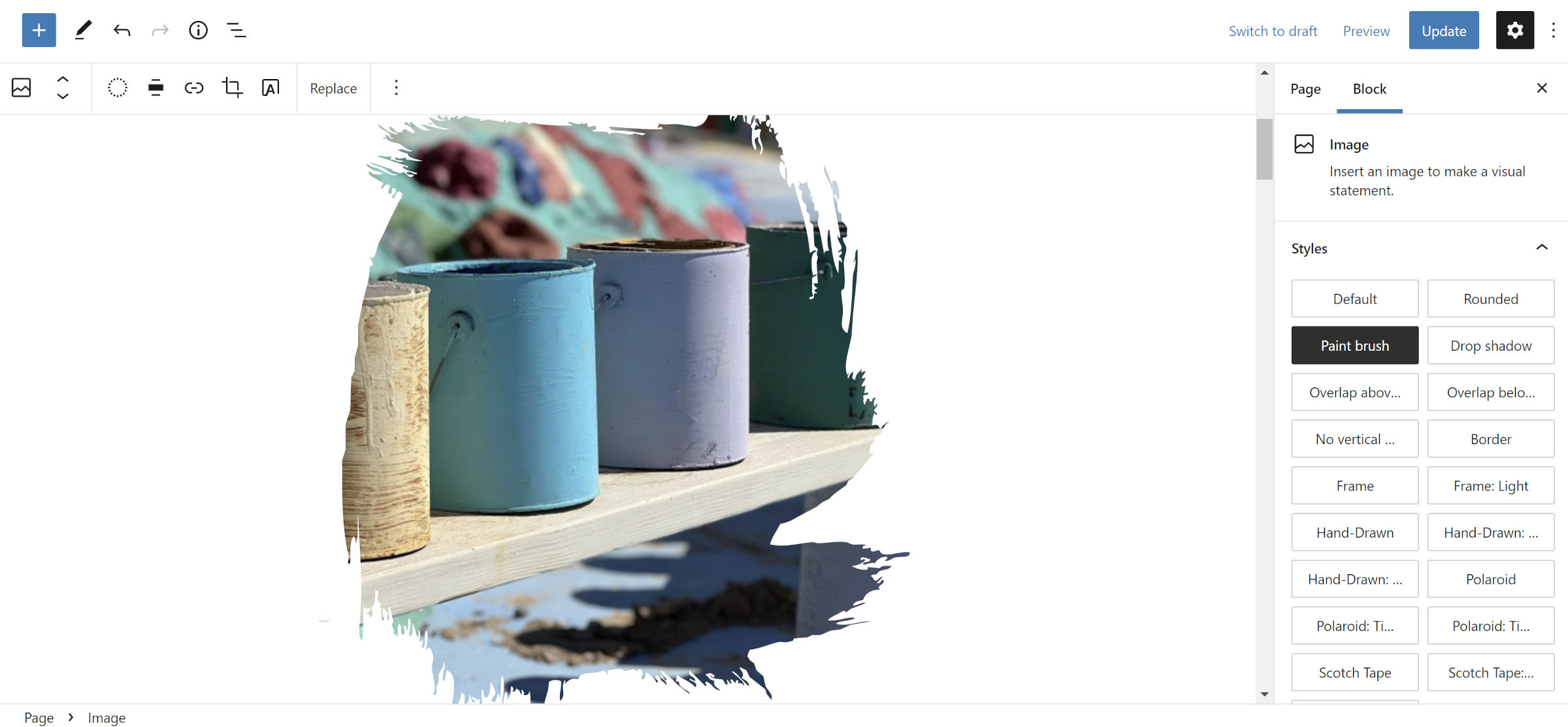
While the plugin styles may be practical in many ways, Juhas also threw a bit of whimsy in the mix. Almost as a signature, nearly every similar plugin offers at least one SVG mask for image-related blocks. Abs follows the same path with its Paint Brush style:

That is the only such SVG mask in the plugin, a style that has almost been overdone. At least the Paint Brush option breaks from the mold of “blob shapes” that have become commonplace.
Juhas has several example screenshots and GIFs on the plugin page that explore what the plugin is capable of, many of them mixing and matching different blocks and styles. It is unlikely that I will do it justice here. However, I did try my hand at several layouts.
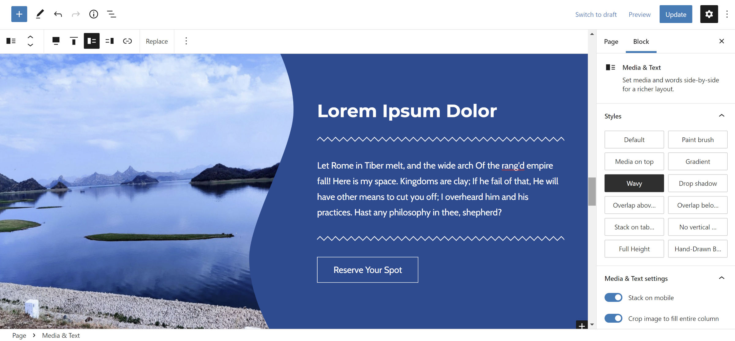
One of my favorite creations was mixing the Wavy style for the Media & Text block with Zigzag for Separator:

Abs also includes a Double Line option for the Separator block. But, the plugin shines the most with Media & Text. I can only assume that Juhas looked at it and realized that not enough designers were doing anything interesting with it, taking the responsibility upon himself. That is merely a guess, anyway.
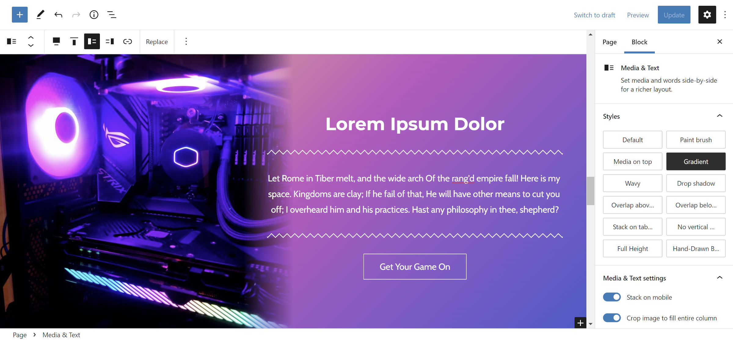
The plugin adds a Paint Brush style for Media & Text as it does for other image-type blocks. It also has a Media on Top option for stacking the block’s contents on both desktop and mobile displays and a similar stacking option for tablets. It supports both the previously-mentioned overlapping styles. Plus, users can get some mileage from its Gradient variation, as shown in the following screenshot:

I am merely scratching the surface of possibilities with the plugin’s out-of-the-box styles. With time and creativity, users can create some unique layouts with it.
I tested Abs against several block-based themes, and it held up well. The only issues I ran into were likely related to running the latest Gutenberg plugin. After selecting a custom color when using the Zigzag style for the Separator block, the background color overtakes the shape. And, the alignment styles for the Column block do not align left or right in the editor. However, they do work on the front end.
I am a fan of plugins that offer custom styles, and Abs is a welcome departure from the carousel of block libraries. It has just enough variety to please those looking for business-friendly design options while not neglecting users who just want to have a little fun.
