Anne McCarthy announced round #13 of the FSE Outreach Program on March 31. This call for testing focuses on creating an author template via the site editor. Several of the new features used during this round were only added in Gutenberg 12.9 last week.
The call asks volunteers to test and provide feedback on features related to Full Site Editing before they land in WordPress. Anyone can participate, and the deadline is April 21.
For this round of testing, I used the Archeo block theme. It is a recent favorite, and I have been working with it since I first reviewed it.
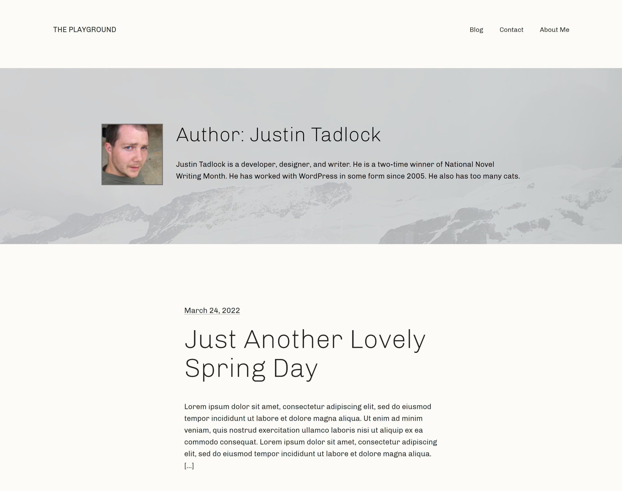
The following is a screenshot of my final author template design:
I read through the testing instructions and forged my own path. I still managed to cover everything except block locking. I had already extensively tested it with Gutenberg 12.9’s launch and wanted to focus on the other features.
Outside of the user-experience issues noted below, everything went well. No editor crashes. No problems saving. And the front-end matched what I was seeing in the editor.
Building an Author Template
The most immediate issue when creating a new author template is that it was devoid of default blocks. Where was the—at minimum—header and footer?
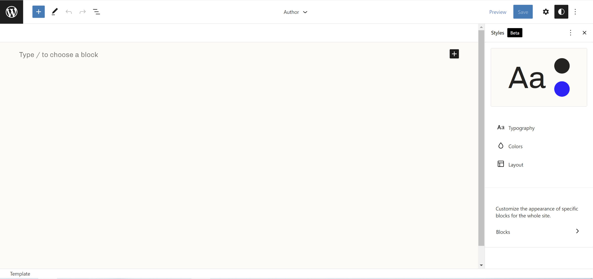
The empty template would make sense if I was building something from scratch. However, this is not a from-scratch project. It was built from a theme with existing archive.html and index.html files, ancestors in the template hierarchy.
Since the author template is merely a more specific version of the archive template, it should be a copy of its “parent” in the hierarchy.
Users will most likely want to make modifications rather than start from scratch. Using an ancestor template as a base means that they are less likely to unnecessarily deviate from the existing layout, especially with more complex designs.
The second set of actions I took was to go back to the Templates panel, open the archive template, copy all content, and paste it into the new author template.
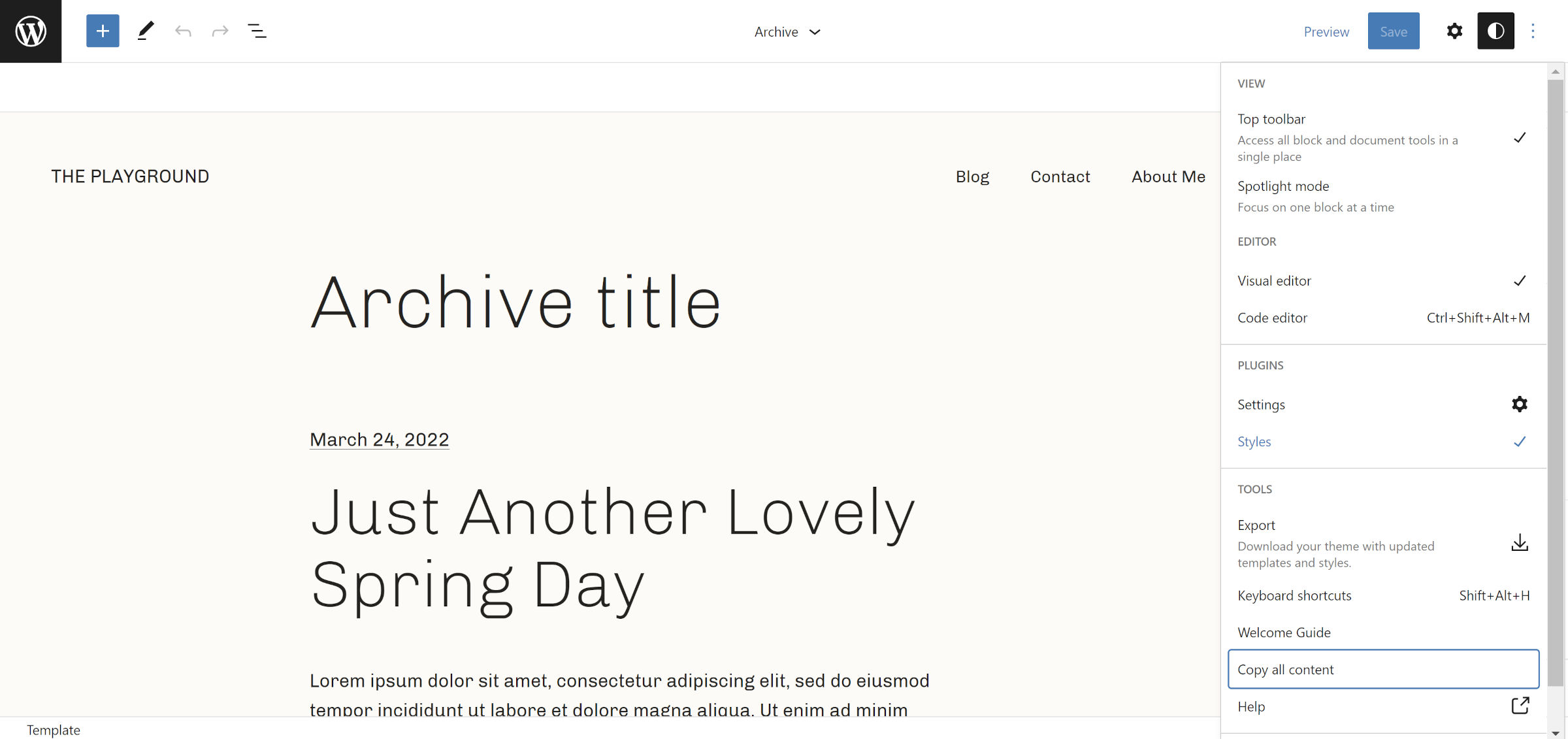
This is — while a bit irritating — easy enough to do, at least from a developer perspective. However, it is a massive boulder sitting in the middle of a user’s path to success.
For the design, I fell back on the ever-trustworthy Cover block. I snagged an image that worked with the theme’s style. Then, I placed the Avatar, Archives Title, and Post Author Biography blocks in two columns.
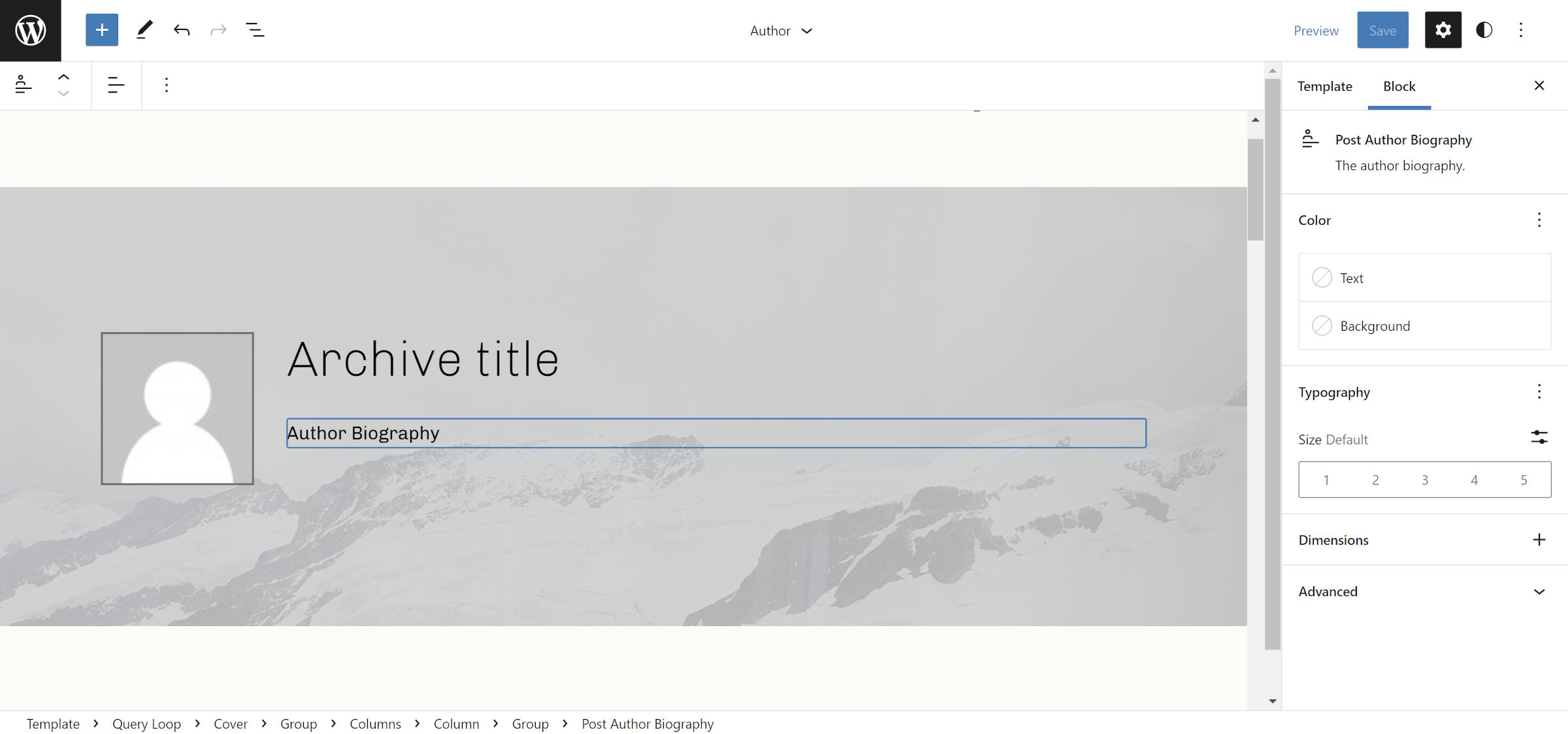
I spent some time pondering the idea of featured images for authors, categories, and tags. How awesome would it be if the Cover block background was contextually displayed based on the current author? Unfortunately, such a feature does not exist.
I was surprised that the Avatar and Post Author Bio blocks worked. I tested these both inside of the Query Loop and outside of it. When an author has published posts, the two blocks appear as they should.
However, if the author has not published any posts, the avatar reverts to the site default, and the bio disappears. I have not performed a deep dive into the code, but I am guessing they pick up on WordPress’s global $post variable, which is why it works in the first scenario.
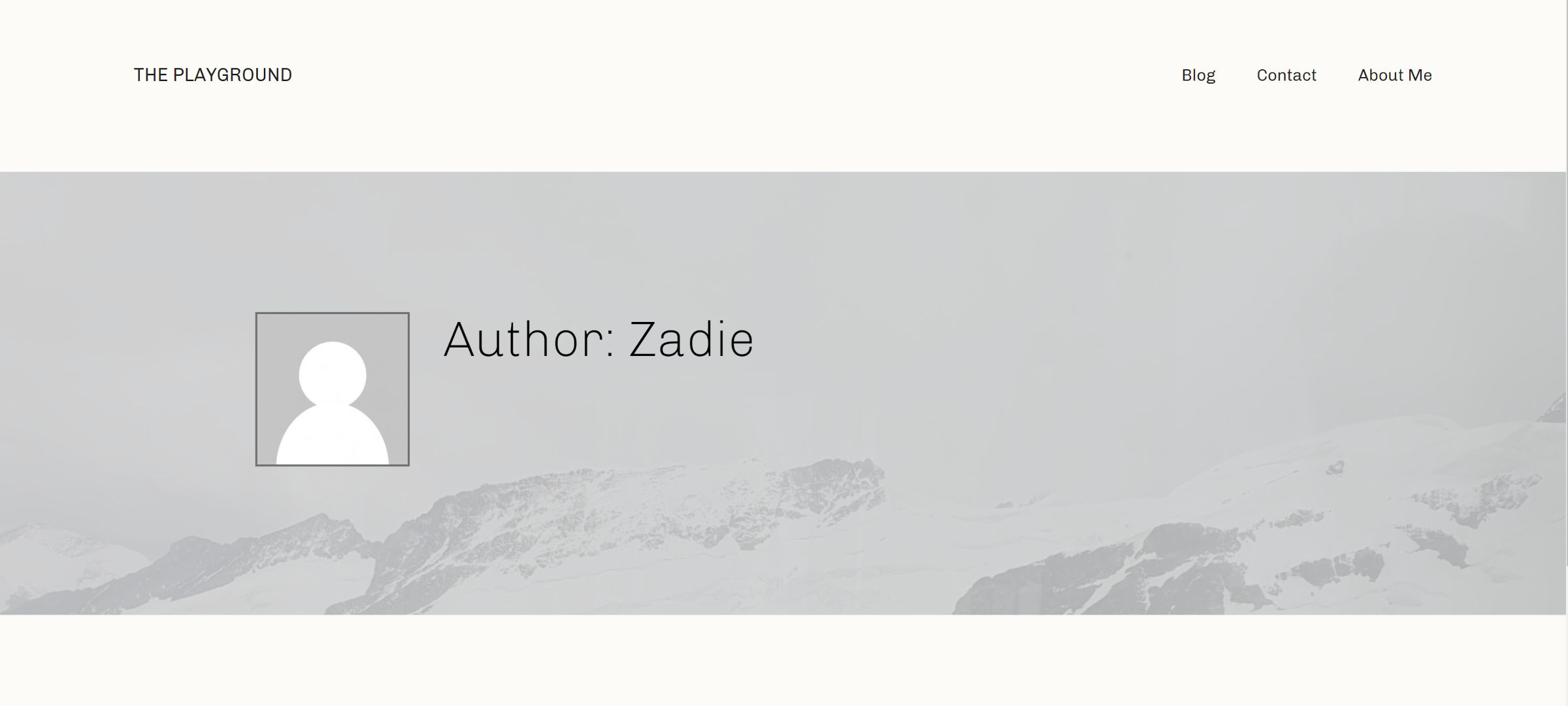
This limitation means that the block system is still not up to par with what is currently possible with classic, PHP-based themes. Avatar, Post Author Biography, and similar blocks should rely on the queried author variable as a fallback when viewing an author archive.
One part of this FSE testing round was using the new No Results block from Gutenberg 12.9. It is a conditional block that appears when there are no posts to show. WordPress creates “author views” for every user on the site, regardless of whether they have written posts. The No Results block will likely be the most useful in this context.
Working with the block felt odd at first. Where does it go? After the Post Template? Before?
It turns out that you can actually stick it in anywhere inside of the Query Loop parent block. I even tested before and after pagination. Basically, it just works.
The UI left something to be desired. It simply reads:
Add a text or blocks that will display when a query returns no results.
Aside from the glaring grammatical error, displaying the message is necessary, but I expected it to look and feel more like the Group block. After all, it is essentially a container for other blocks, and WordPress already has an existing UI for that.
It was also odd to visually edit a feature that is conditionally displayed. There should be an indicator that its contents may or may not be shown on the front end. I am not aware of any precedent for such a block in core WordPress, but we should look at other projects and how they handle this.
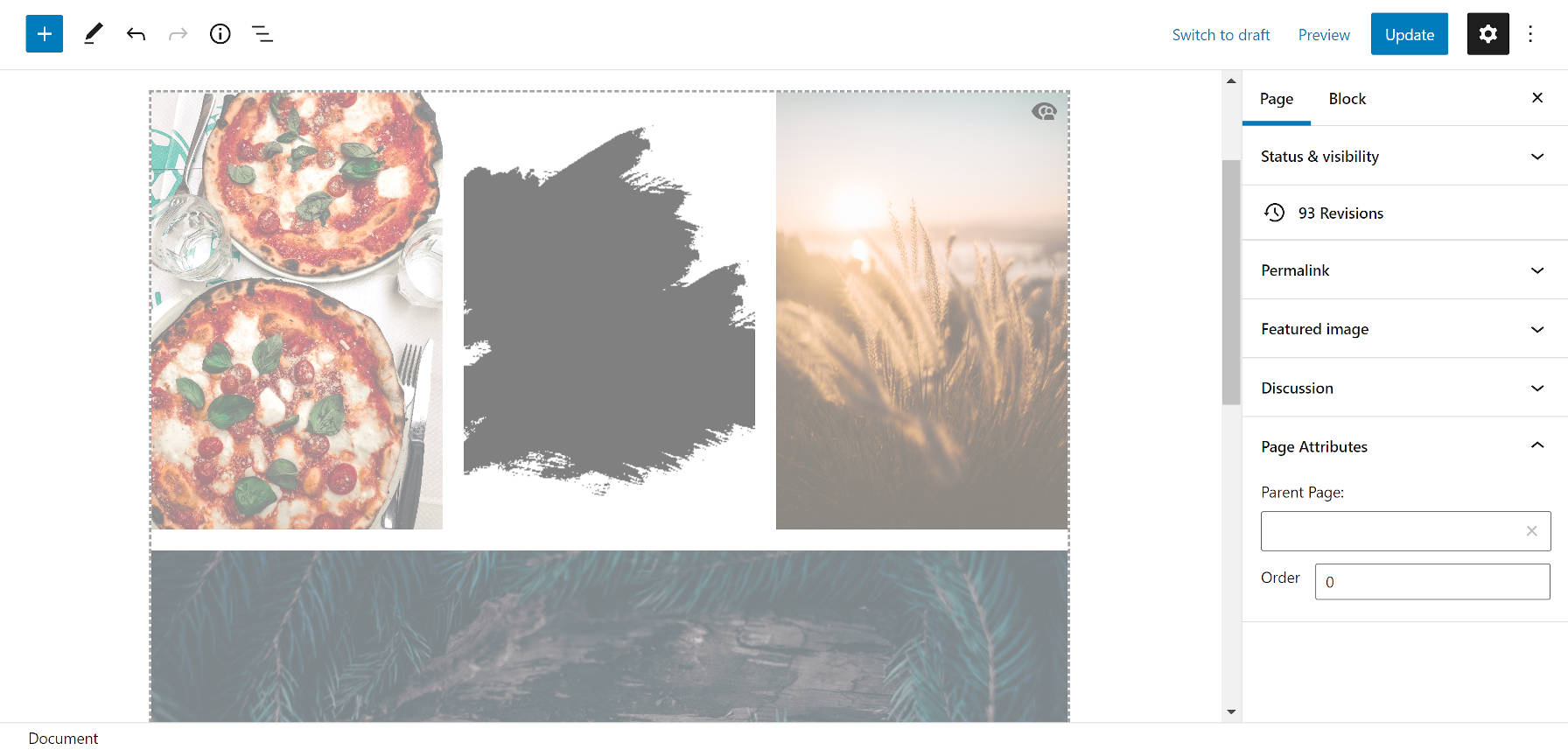
The Block Visibility plugin by Nick Diego might be a plugin to borrow from. It adds an overlay, border, and icon for contextual blocks:
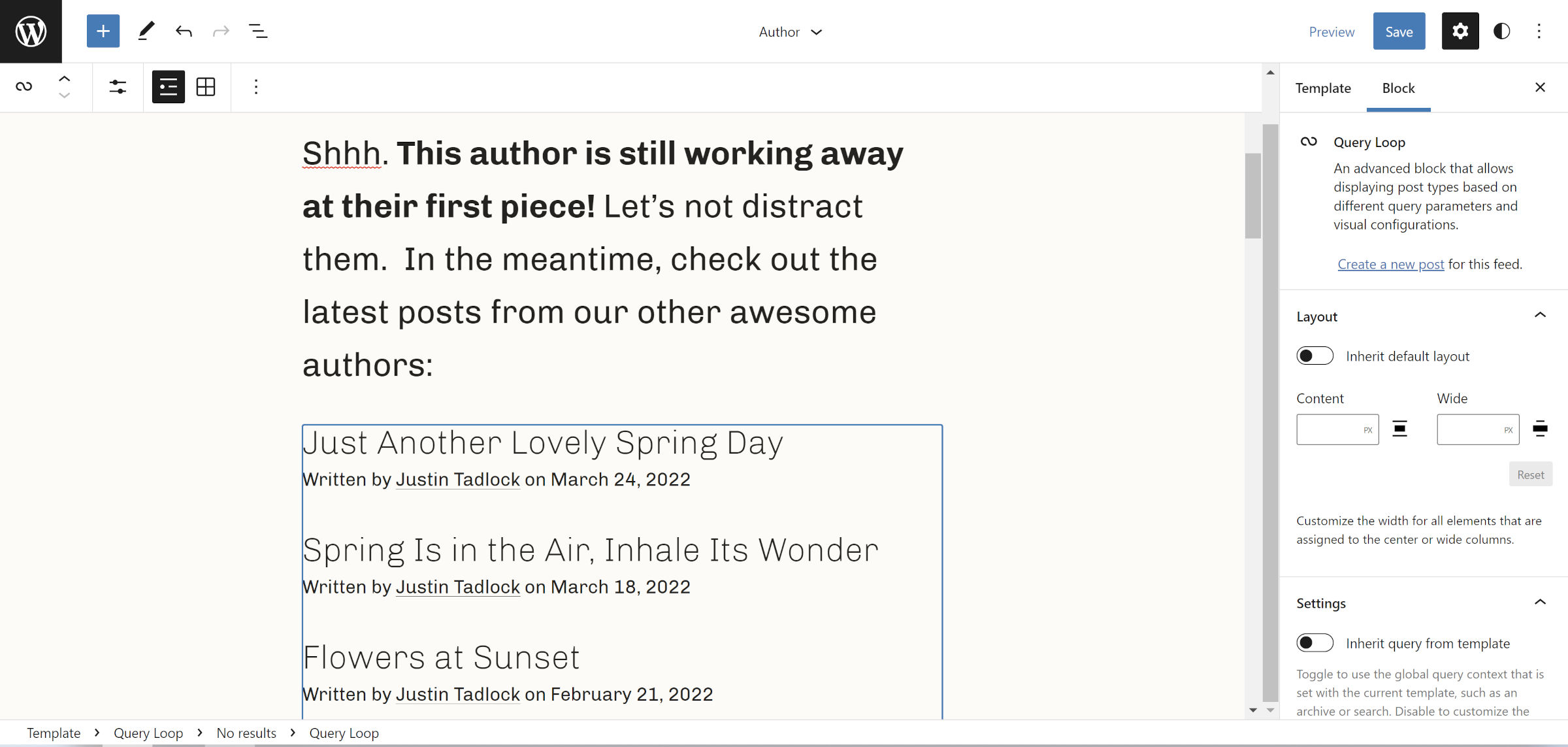
Ultimately, I decided to copy McCarthy’s original message from her test and paste it into the No Results block. Then, I took things one step more and put a Query Loop inside of it — yes, a Query Loop inside of a Query Loop.
It worked without issue:
Overall, the No Results block is a welcome addition to the theme-blocks toolset. I would like to see the UI fleshed out a bit. Theme authors will likely start using this more when 6.0 lands, and I could see users inadvertently trying to delete it, thinking it is part of the default output. This would make it a candidate for block-level locking.
