WordPress 6.0 will attempt to tackle comments lists via the block system. It is an area that has fallen behind other features, which have received the bulk of the work in prior releases.
Last week, JuanMa Garrido called for volunteers to test the new blocks via the Make WordPress Test blog. Contributors are asked to leave feedback in the comments or create new issues via the Gutenberg GitHub repository.
Post comments lists have undergone a few changes over time. Before WordPress 2.7, theme authors used a PHP foreach call to loop over a comment objects array directly in their theme’s comments.php template. It was a simple system of basic HTML and a few template tags scattered throughout. It worked well until the introduction of nested replies. There was a mad scramble from developers and users alike to update themes to use the new wp_list_comments() function.
Fast forward to the era of block templates and the site editor. Once again, comments changed, but it was only on the surface. The Post Comments block was merely a wrapper for the existing implementation. Any block theme author has had to use custom PHP filters to modify the output of the comments list, and users were mostly out of luck altogether outside of a few design controls.
WordPress 6.0 will almost bring us full circle. Comment output is returning to templates via the block system. PHP filters are no longer required to move the layout around. And users can make modifications via the site editor.
Admittedly, I had not spent much time working with comment-related blocks before today. For the most part, I have avoided them altogether because I was awaiting the set of blocks expected to land with WordPress 6.0.
The latest version of the Gutenberg plugin ships an entire suite of blocks specific to comments. Comments Query Loop and Comment Template should work similarly to their post counterparts. The set includes several metadata-related blocks for the comment author, date, reply link, and edit link. There are a few new ones for pagination, and the upcoming Avatar block will also work inside the Comment Template.
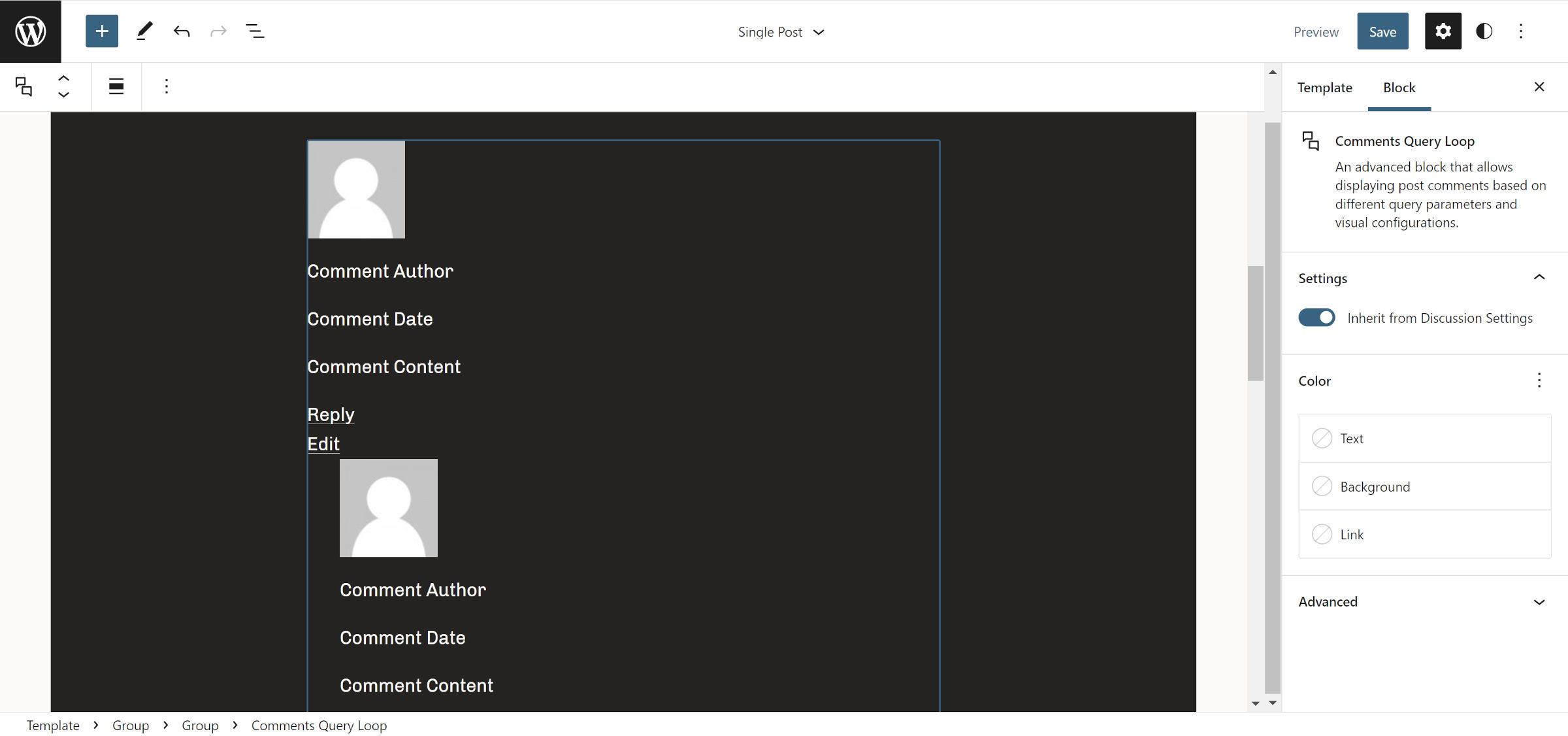
I opened my active theme’s Single Post template and removed the old Post Comments block. Then, I inserted the new Comments Query Loop:

I was surprised that there were no opinionated styles—a welcome surprise. However, because the default output included most of the possible blocks that a themer or user would use, I would have liked to see them wrapped in one of the layout-related blocks like Columns or Row, providing some simple structure.
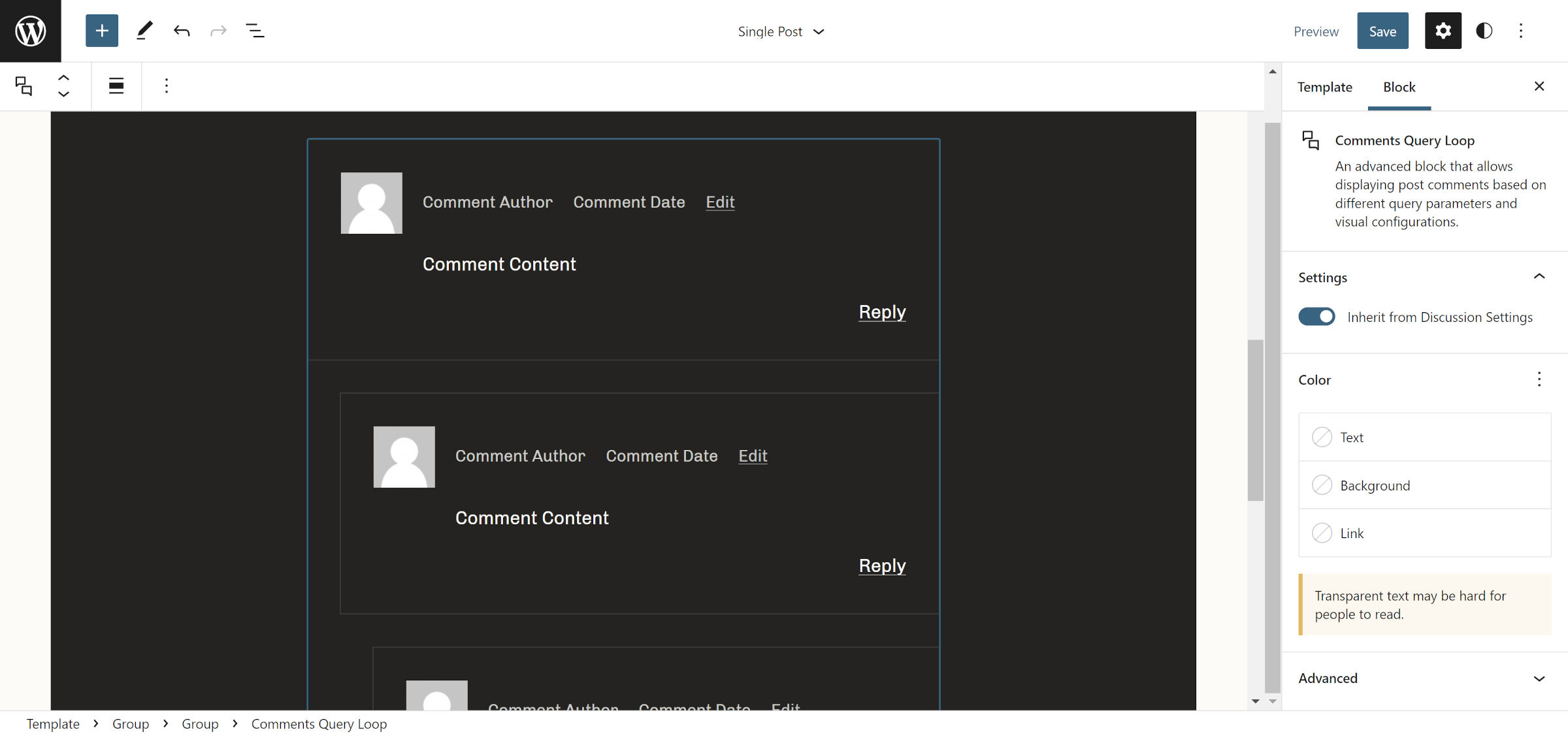
It did not take long to move a few pieces around and get a layout that I liked. I did get the dreaded “Aww Snap!” message once, losing all of my work as the editor crashed. I could not replicate the issue, but I nervously hit the save button every other minute from then on out.


Other than the one random editor crash, everything was going smoothly. However, I was only touching on the basics at that point. With those out of the way, I wanted to know if the new blocks would offer the tools that theme authors and users alike could use in real-world projects.
The first issue I ran into was the missing comment ID in the front-end output. This is necessary for the user’s browser to jump back to their comment after submitting one via the form. I also suspect this is necessary for the comment-reply JavaScript to work when clicking the reply link.
The front-end output does not display the comment classes from the comment_class() function. This leaves no way for theme authors to directly target comments based on data like their depth, type, status, and so on at the moment. This is a regression from previous comments list solutions in core WordPress.
There also does not seem to be a “Comments Title” block, which would output something like “X response(s) to Post Title” above the list.
Most of these issues should be trivial to address in core. They are what I would consider baseline requirements for a functioning comments list. However, there is an issue that will likely take more than one release cycle to flesh out.
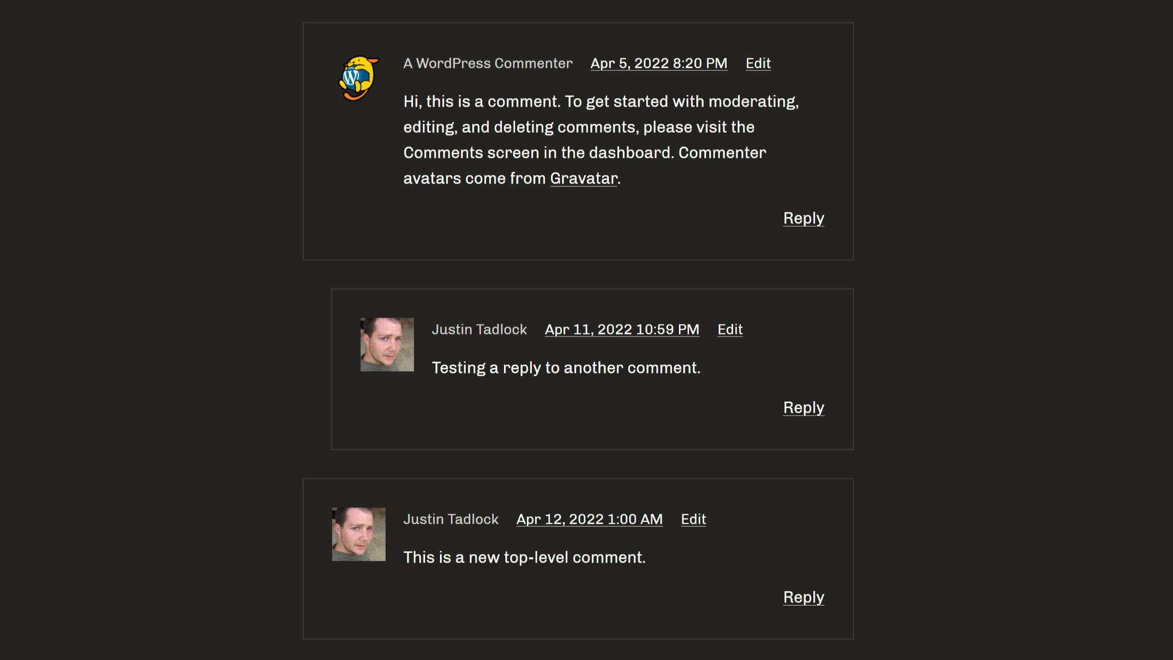
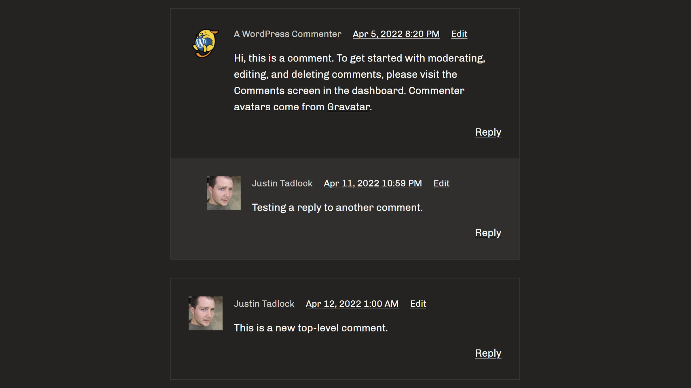
There is no concept of nesting in the current design tools. Each reply to a parent comment gets a little padding bump to the left. Other than that, all nested levels receive the same design treatment as their parent, each in their own little box. Some designs are not currently possible through the interface, such as giving a single thread a background color.
Something as simple as the following cannot be made through the design tools:

And that is merely a run-of-the-mill comments list design. Do not expect to do anything more advanced without custom CSS.
There are no tools built around the hierarchy. The WordPress block system has not dealt with similar scenarios well. One need only attempt anything remotely complex with the Navigation block, for example, to see its shortcomings. However, that is a far more complicated scenario than a nested list of comments.
This is not an issue with the block system itself. The design tools have yet to catch up, and presenting such complexities in an easy-to-use interface is not a stroll through the park.
As of Gutenberg 12.9, the Comments Query Loop block feels like a regression from a theme design standpoint. It is not as flexible as the current method or as it once was all those years ago when comments were output via a simple foreach loop, a bit of HTML, and a few template tags.
While it may be limited, it still empowers end-users who want to modify their comments list design. That is a welcome enhancement, and I am excited about how core can build on it in future versions.
