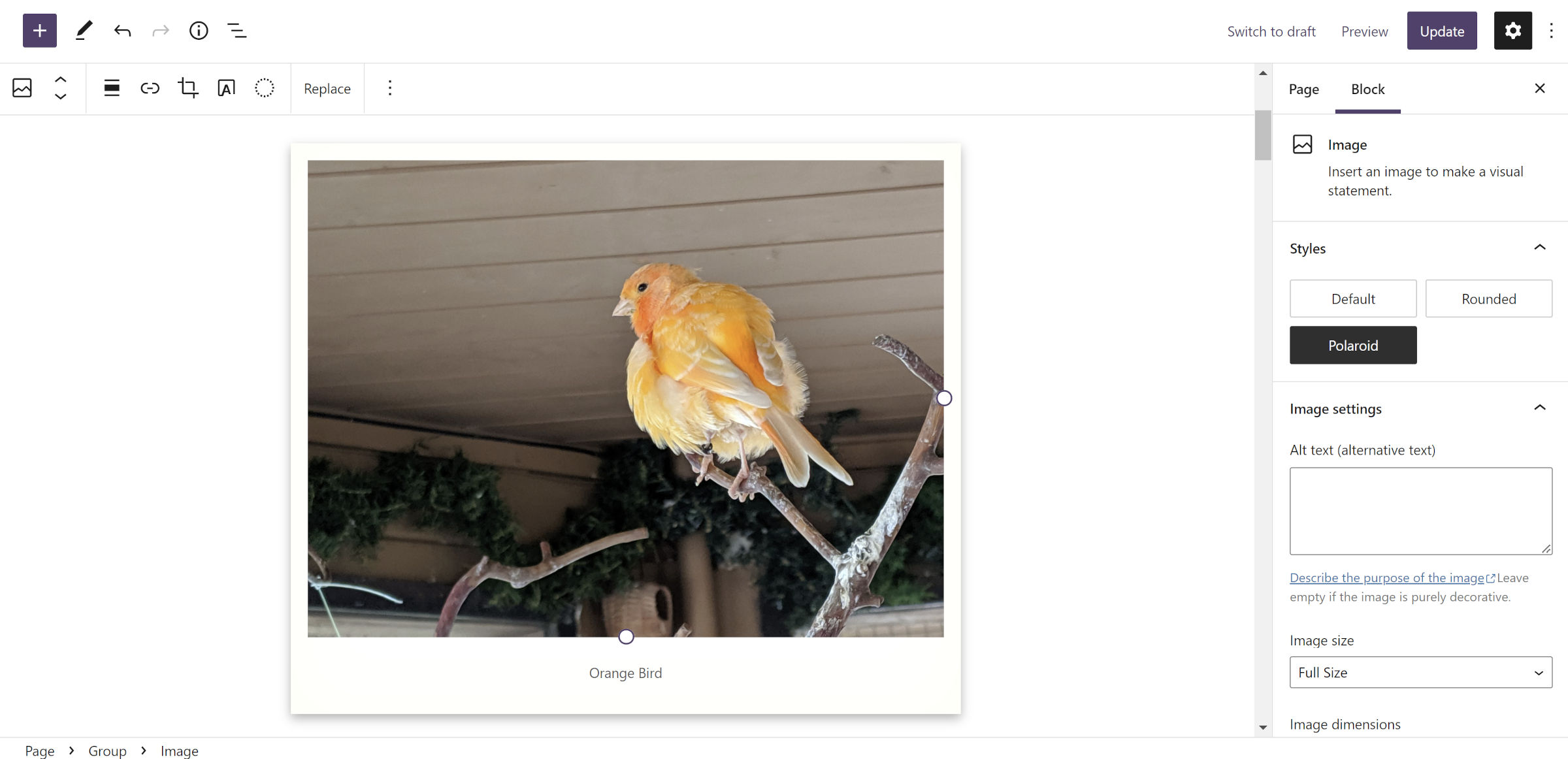
I am a child of the late ’80s and ’90s. Before we all had cameras built into our mobile phones—well, before mobile phones took off, really—families would lug around Polaroid cameras to capture those special moments. Even though I hated posing for awkward photos with my siblings, I am still nostalgic about the magic of film from a bygone era.
Now, I have grown old enough to see the return of physical prints, sparked primarily by Fujifilm Instax. They are at least popular in the journaling groups that I lurk around. I have yet to shell out the money for one of Fujifilm’s mini cameras or smartphone printers, but I am admittedly tempted. Perhaps it is a fad, but I am still pulled toward reliving that part of my youth.
Regardless of whether I own the physical equipment, I can always recreate Polaroid-style photos on the web. The WordPress block system makes it simple.
This Building with Blocks post will cater primarily to theme authors. However, DIY users can also try their hand at it. The tutorial will walk through the steps of creating a Polaroid-style image frame as a custom block style.
For this tutorial, I used Twenty Twenty-Two and WordPress 6.0 Beta 2. It should also work with WordPress 5.9. For other themes, you may need to adjust the colors.
Building the Block Style

Much of the fun I have had with the block system has been creating custom styles. They typically only take a few lines of code to transform blocks into something entirely different. The Polaroid style is the same.
The first step is to use the register_block_style() function to register a custom style via your theme’s functions.php:
add_action( 'init', 'tavern_register_block_styles' );

function tavern_register_block_styles() {
    register_block_style( 'core/image', [
        'name'  => 'polaroid',
        'label' => __( 'Polaroid', 'tavern' )
    ] );
}
Once registered, it will appear as a selectable style for the Image block in the editor. However, it still needs a custom design. For that, you only need a bit of CSS.
Add the following to your theme’s stylesheet or, preferably, register it via wp_enqueue_block_style():
.wp-block-image[class*=is-style-polaroid] {
    box-sizing: border-box;
    padding: 1rem;
    background-color: #fff;
    box-shadow: 0 4px  10px 0 rgba( 0, 0, 0, 0.3 ),
                0 0 4rem rgba( 255, 255, 235, 0.5 ) inset;
}

.wp-block-image[class*=is-style-polaroid] figcaption {
    margin-top: 1rem;
    margin-bottom: 0;
}
That is literally it. Custom block styles are such easy wins that I do not understand why more theme authors are not including them. I had 70+ in my last theme project, and I was holding back—OK, so I may have gone a little overboard.
If you want to change the “age” of the photo, you can darken the inset shadow in the above CSS. It is a subtle effect by default, but feel free to tinker with it.
Keen-eyed readers may have noticed that I targeted [class*=is-style-polaroid] instead of .is-style-polaroid. There is a reason for that. It cuts back on the code for additional styles built on the same concept.
Bonus: Tilted Styles


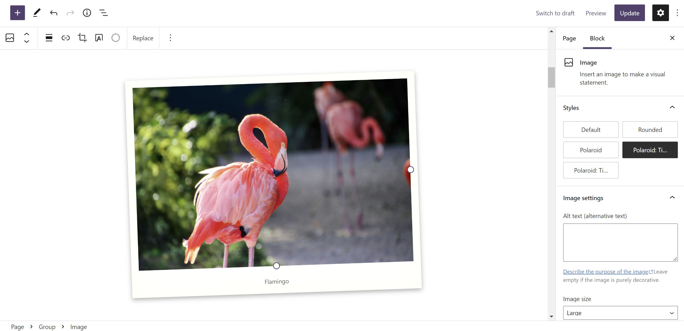
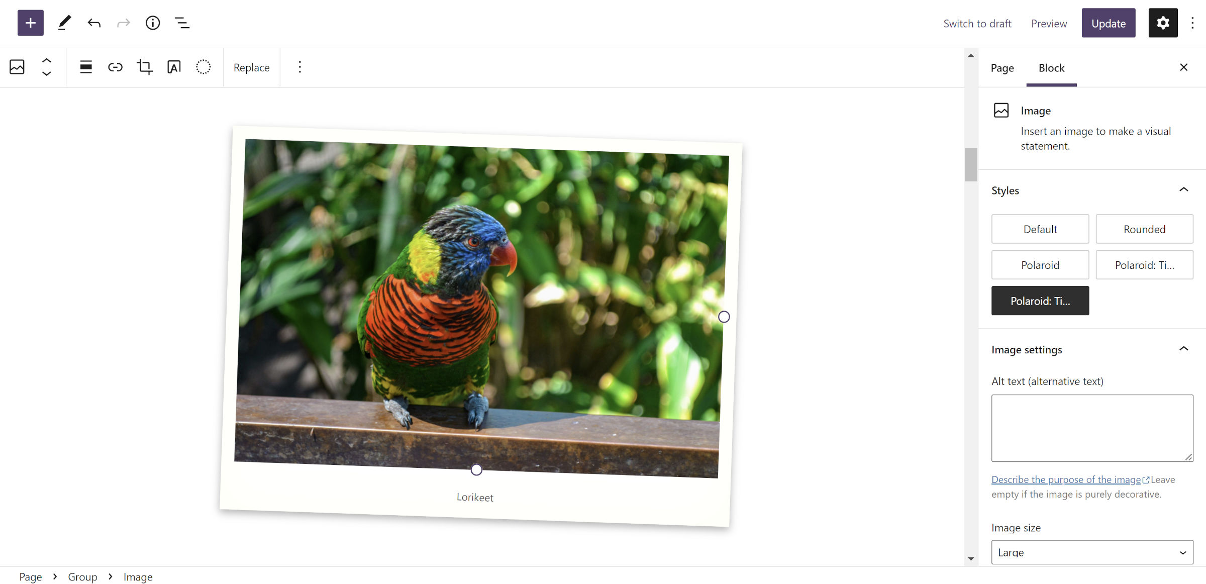
A Polaroid-style frame is a fun effect, but we can take that one step more and add variations for tilting images left or right. Add the following to the existing tavern_register_block_styles() function created in the previous section:
register_block_style( 'core/image', [
    'name'  => 'polaroid-tilt-left',
    'label' => __( 'Polaroid: Tilt Left', 'tavern' )
] );

register_block_style( 'core/image', [
    'name'  => 'polaroid-tilt-right',
    'label' => __( 'Polaroid: Tilt Right', 'tavern' )
] );
For each of the “tilt” styles, you can use the transform CSS property along with the scale() and rotate() functions. I chose slight rotations of 2deg and -2deg, but you can push that as far as you want to get your preferred design.
.wp-block-image.is-style-polaroid-tilt-right {
    transform: scale( 0.99, 0.99 ) rotate( 2deg );
}

.wp-block-image.is-style-polaroid-tilt-left {
    transform: scale( 0.99, 0.99 ) rotate( -2deg );
}
One fun effect is to remove the tilt transformation when a visitor hovers their mouse over the images. Use the following CSS for that:
.wp-block-image[class*=is-style-polaroid-tilt] {
    transition: all 0.5s ease-in-out;
}

.wp-block-image[class*=is-style-polaroid-tilt]:hover {
    transform: scale( 1, 1 ) rotate( 0 );
}
Let me know in the comments if you gave this block style a shot. If you really want to lean into the old-school Polaroid style, try it with a custom handwriting font for the caption. Also, please share any custom image-related designs if you have them.
