Gutenberg 13.1 landed in the WordPress plugin directory earlier today. Not quite as heavy on the feature list as its predecessor, the update focuses more on improvements and bug fixes. The highlight of the release is the overhauled border design component.
One notable bug that theme authors should watch out for is missing styles in the site editor. When enqueueing stylesheets via wp_enqueue_block_style(), they are noticeably absent. This bug was introduced in Gutenberg 13.0 but has yet to be fixed. It is not an issue in the WordPress 6.0 beta releases and is only present in the plugin.
This release also included a couple of block-related changes that I do not dive into later. The Categories block now has a setting for hiding “empty” categories (those without posts). And the duotone button has a new triangle-shaped icon by default, which reverts to its circular shape when a filter has been applied.
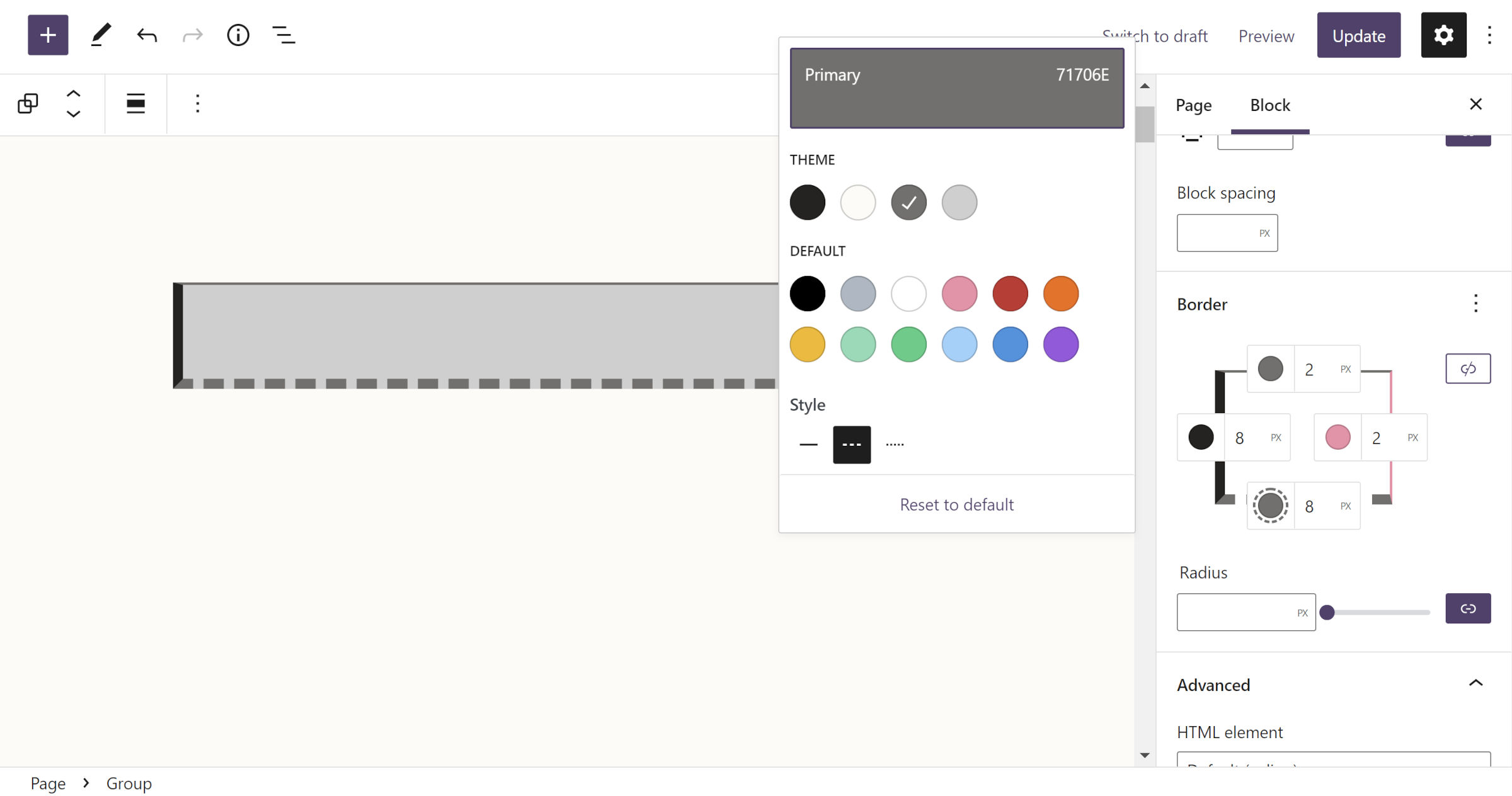
New Border Controls

Gutenberg 13.0 introduced new BorderControl and BoxBorderControl components. These updates were an overhaul of the previous border design tools that users would see in the block inspector.
With 13.1, any block that opts into border support will use the new components. This allows end-users to define the top, right, bottom, and left borders. Theme authors can also register these individual borders via theme.json for specific blocks.
Alongside this update, the core Column block now has border support.
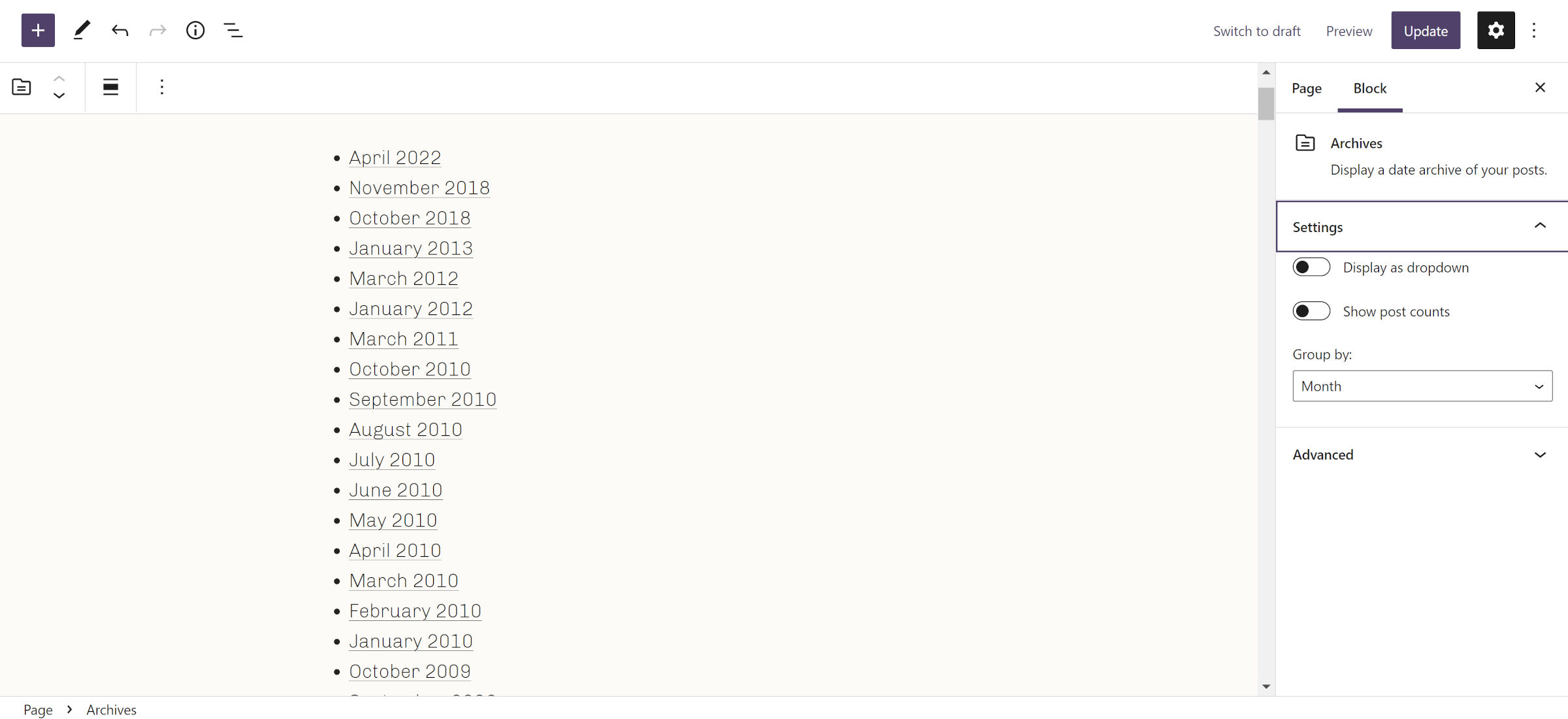
Block “Settings” Panel Renamed

One of my favorite changes will likely not get much attention, but it is worth mentioning. Over a dozen blocks had custom settings panels that read “Block Name settings” in the block inspector. These have all been reduced to “Settings.”
The update might seem minor, but the UI is more polished without the cruft. It is not the most exciting work contributors are putting into the project, but it is the necessary stuff that creates a better user experience in the long run.
Plugin authors who have followed the Gutenberg naming scheme for their own blocks’ settings panels should take note. It might be time to do the same.
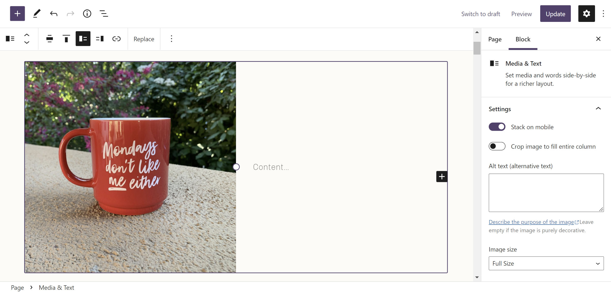
Media & Text Font Size Change

The latest plugin release changes the template used to create the Media & Text block. In the past, a large font size was given to the default Paragraph block inserted into the “text” column. The update removes this issue.
This has long been one of those frustrating defaults set by the editor that users would need to adjust each time they added the block. It was also a problem for theme developers who either removed or did not support that specific font size.
Now, if we could only do the same for the Cover block…
Improved Comments Query Loop and Related Blocks

Two weeks ago, I reviewed the new comment-related blocks shipping with WordPress 6.0. While the concepts had potential, the experience was still buggier than I expected late into the release cycle. However, those issues are now fixed via a massive team effort. Most, if not all, should also be in WordPress 6.0 Beta 3, which landed yesterday.
The introduction of the Comments Query Loop block opened a ton of flexibility for theme authors and users alike. It acts as a wrapper for other comment-related blocks that can be rearranged for different designs.
The primary issues were on the front-end output. Comment classes were not output via the Comment Template block, but that feature was not a deal-breaker. However, the missing ID meant that comment permalinks and the comment-reply script were not working.
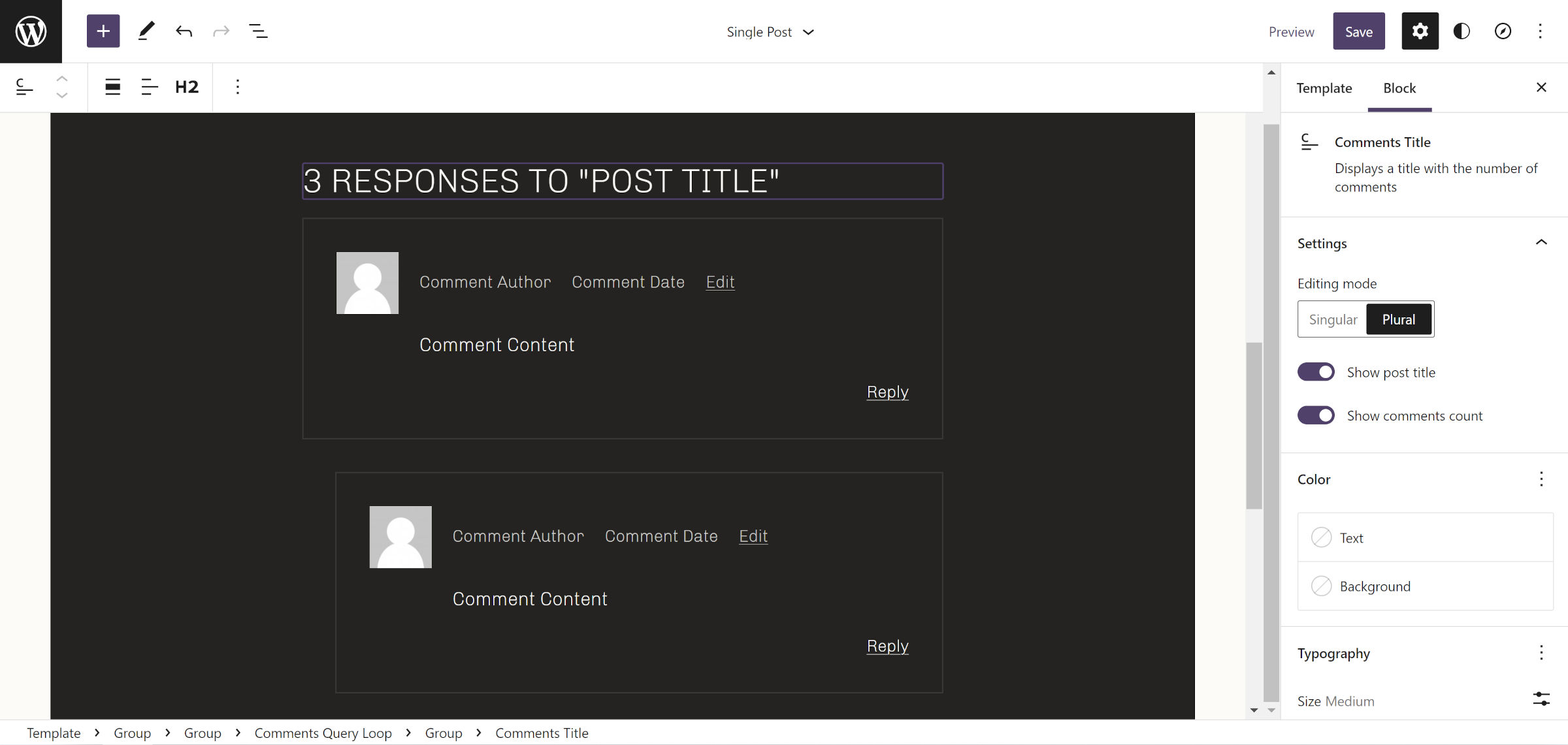
One of the other missing pieces was the “X responses to Post Title” heading. This was needed to bring feature parity with the Post Comments block, deprecated in Gutenberg 13.0. I shared a starting point that others, particularly Carlos Bravo, built upon, creating an even better version. Now, we have a dedicated Comments Title block in Gutenberg. I was happy to play even a small role in making it happen.
