Round #14 of the FSE Outreach program is now open to the public. Anne McCarthy, who oversees the program, calls for testers to build a recipe post using existing tools like the template editor and some new and experimental blocks.
Those who want to leave feedback can do so until May 18. The program always needs testers from across the spectrum of user experiences. This is an easy way to contribute back to the WordPress project.
The latest round calls on users to test some new blocks in the Gutenberg plugin. Some of these are related to comments. I opted out of this part of the test because I had already covered everything I had to say in an article in early April. That post, along with feedback from the community, helped drive some of the changes that should land in WordPress 6.0.
My focus was on the List and Quote block updates for this round. “Version 2” of these are available via Gutenberg 13.1 and must be enabled via the Gutenberg > Experiments admin screen.
The new List is no longer a single block. Instead, each item within it is a separate block of its own. Likewise, for each sub-list.
The overhaul of the Quote block allows end-users to nest other blocks within it. By default, this is a Paragraph, and there seems to be no limit to what can be placed inside.
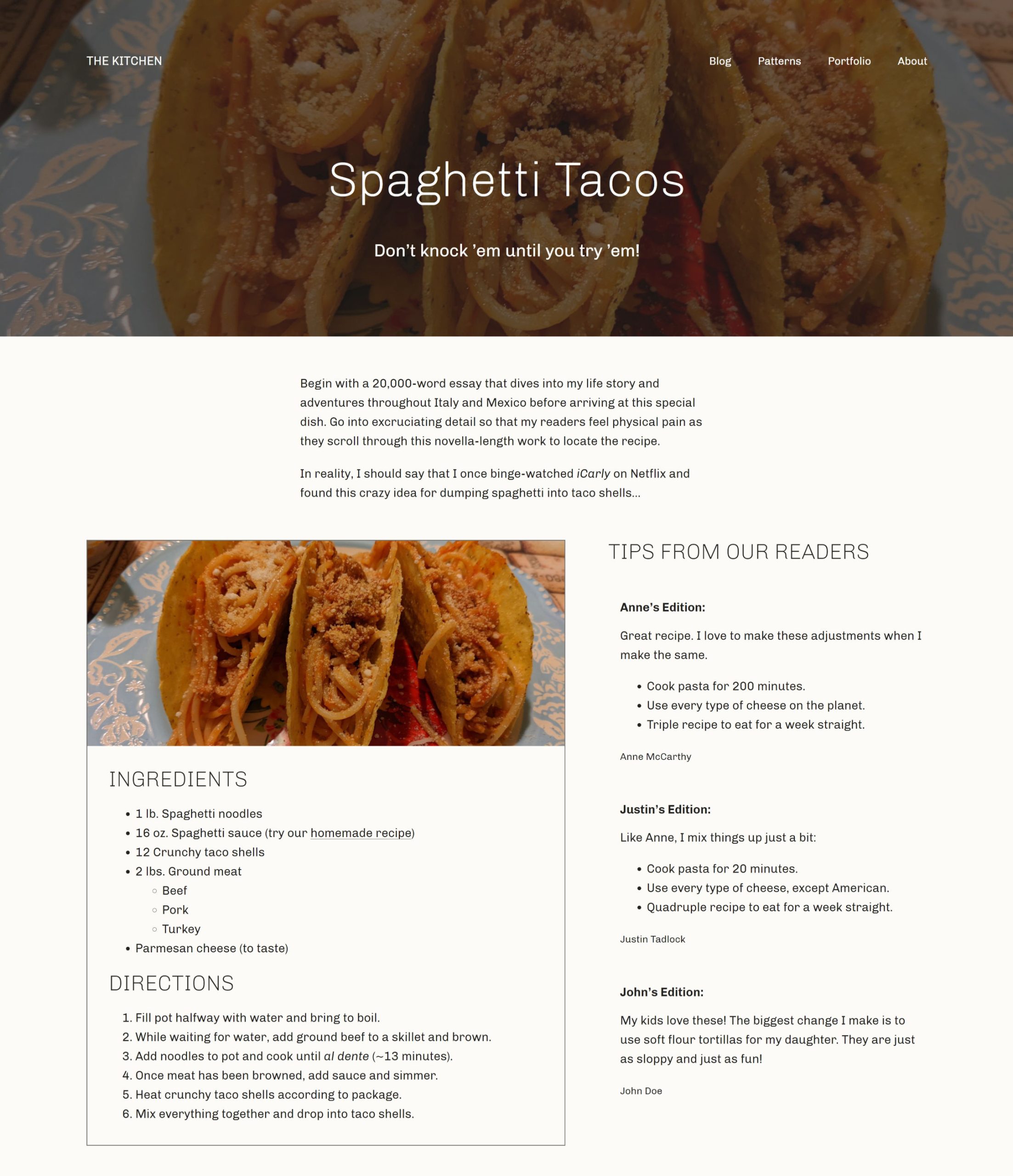
I had fun with this testing round. Recipes are my jam, so I had to pick the perfect one to share. Ultimately, I built a custom “recipe template” and a faux recipe post, as shown in the following screenshot:

For this experiment, I relied on the ever-reliable Archeo theme by Automattic. It has been my go-to for several weeks now, and I will likely continue using it until I find something new that sparks my interest. It is definitely a solid solution for these types of tests.
Testing the New List and Quote Blocks
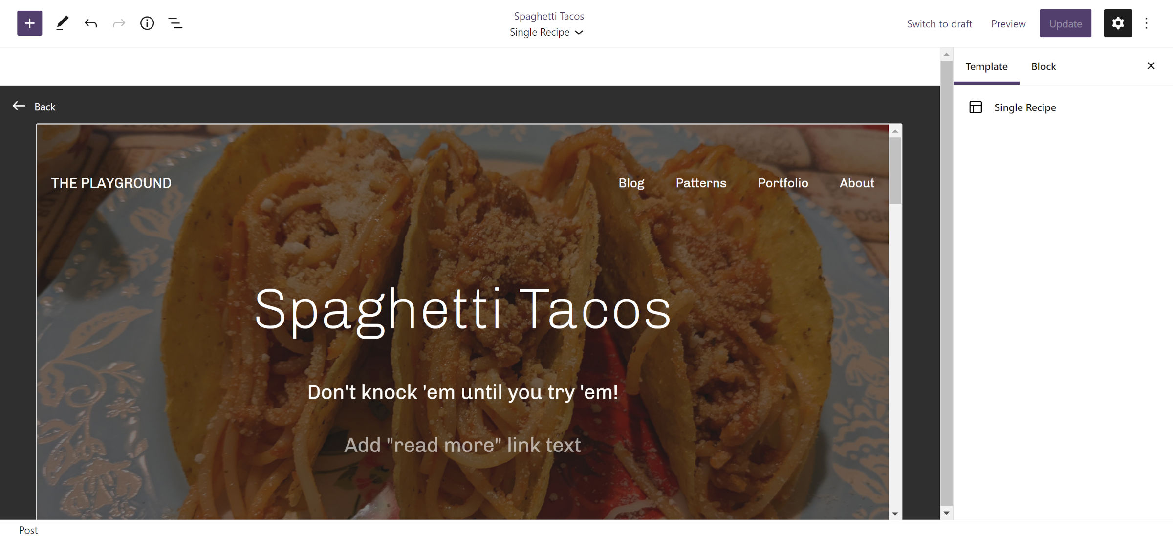
The call for testing asks volunteers to create a custom template for recipe posts. The only change I made to the theme’s default single template was to wrap the site header, post title, and post excerpt in a Cover block tied to the post’s featured image.

I described how to do this in a post in April. Once that was in place, I moved forward with building out a recipe post.
Ultimately, I added a short intro for the recipe. Then, used the Columns block to section off the recipe card and some tips from readers. This is where I was able to dive into the experimental List and Quote blocks.
The List block proved to be the most problematic. It seemed impossible to add a new item to the top level after an inserted sub-list. Clicking the first item and hitting Enter deleted everything nested below it. No amount of clicking or keyboard input seemed to get me back to the top level to continue adding more items.
Eventually, I wised up and navigated to the top level via the breadcrumbs in the editor. Then, I clicked the “+” icon (this could also be done from the editor’s list view). As someone who primarily works from the keyboard, this felt unintuitive.

It also seems impossible to escape the List and into a new Paragraph block. In the past, this could be accomplished by hitting the Enter key twice while on the final list item. That action now creates a nested list.
Markdown-based lists are also not transformed into a List block when pasted into the editor. The formatting is lost, and each item gets absorbed into a Paragraph block.
The new Quote block worked well. It is now possible to add nested blocks inside it, one of the features I have long needed as a writer here at the Tavern when quoting from third-party resources.
One enhancement I would like to see for Quote v2 is the <cite> element separated into a standalone block. This would allow end-users to customize its design separately from the wrapping <blockquote> on the block and global levels. Currently, only theme authors can modify its style, which must be handled via custom CSS.
Overall, I am eager to see the finalized versions of these blocks. They will bring back some of the missing functionality from the classic editor and give users the flexibility to do even more.
