Last year, I designed several patterns for showcasing coupon codes on a site. They were part of a larger theme project that I never finished. However, I had a ton of fun playing around with variations. Disliking them withering away on my laptop’s hard drive, I thought I would share them with the Tavern audience.
The base coupon card looks like the following:
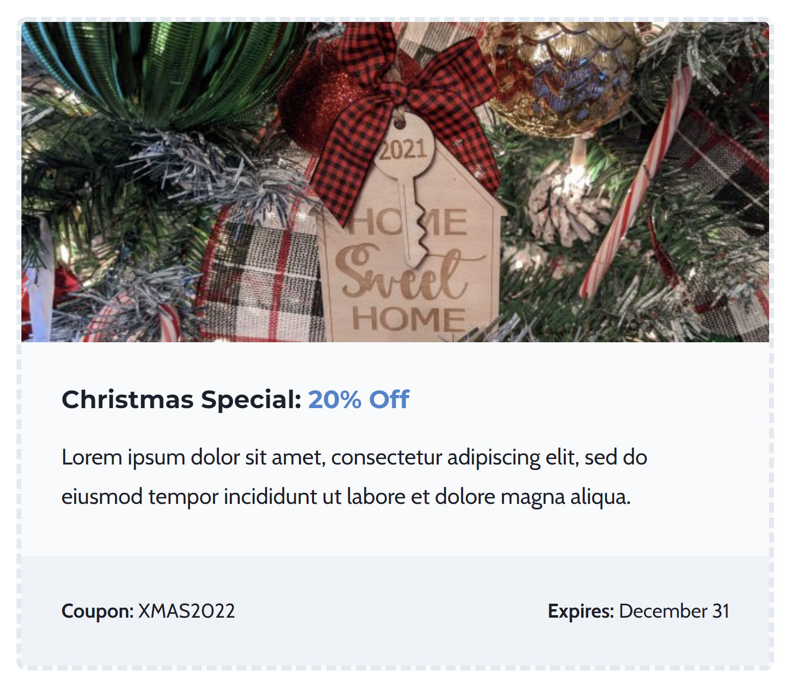
When I designed it and the others, I had Christmas on my mind (if that was not obvious from the screenshot). Of course, I am always thinking about the holiday, usually starting my shopping by at least July each year.
Other than the image, I intentionally left most of the design generic so that it easily applies to other holidays and events.
This tutorial in the Building with Blocks series will walk you through each step of creating custom coupon cards from the editor. I will also share a couple of ideas for variations at the end.
Step 1: Adding a Group Block
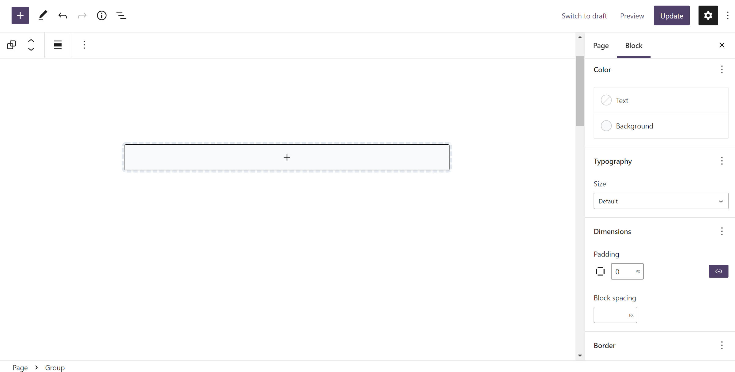
As with most patterns, you should start with a container-type block. For the coupon card, begin by inserting a Group. You are free to personalize this however you want. However, to use the same layout in the tutorial, you should at least set the block’s padding to 0px and block spacing option to 0px. Those need to be zeroed out for the rest of the design to work.
I adjusted my Group block to have a light gray background color. Then, I added a 4px dashed border and an 8px border-radius. Each of these design tools is available in the block inspector in the sidebar panel. Have a little fun with colors and other settings until you find something you like.
Step 2: Add an Image
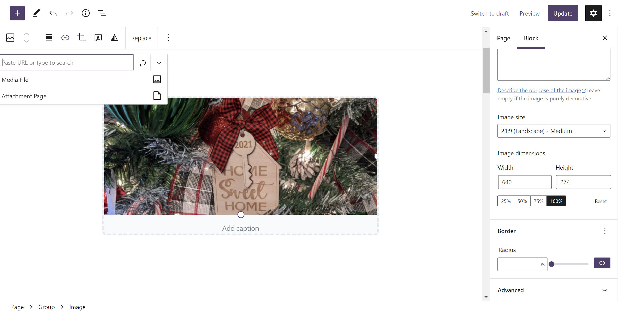
This step is straightforward. Insert an Image block inside of the Group from step #1. There are no particular settings required.
Of course, you should link it to something via the insert-link button in the toolbar. You are presumably selling a product and want folks to click on it.
Step 3: Add Content Group
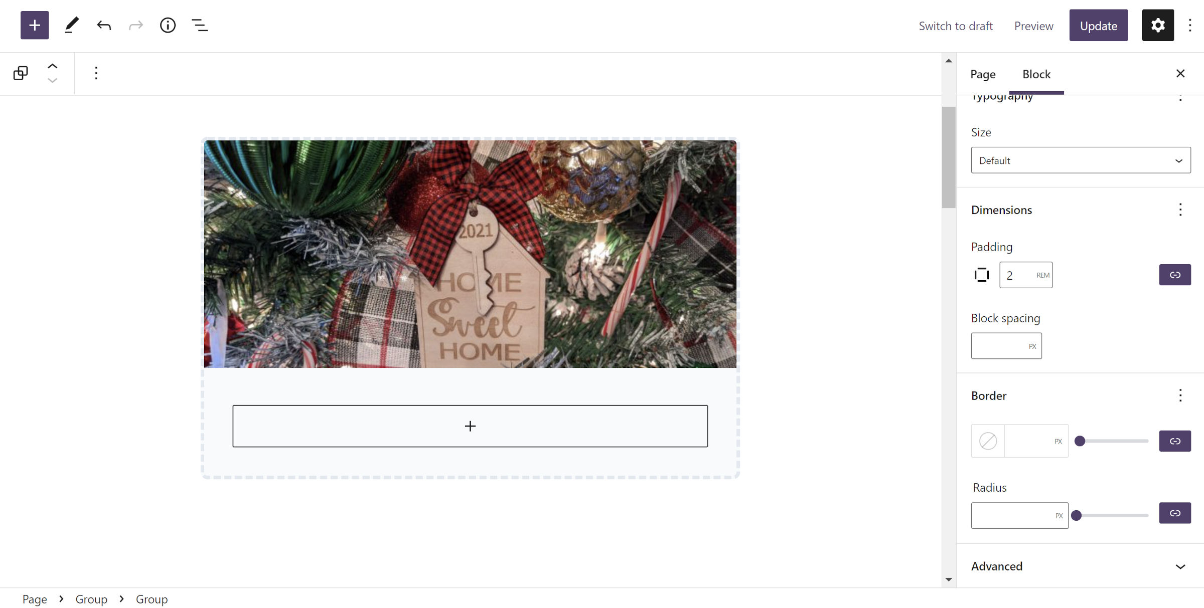
This should be another simple step. Below the Image block from step #2, add a new Group. This will house the “content” you will add in step #4.
The most crucial setting for this block is to add padding via the block design tools in the sidebar panel. I opted for 2rem to match my theme. Remember that you zeroed out the padding in the outer Group in step #1. Now, you need to add some to keep the content from butting against the side of the container.
Step 4: Add Content
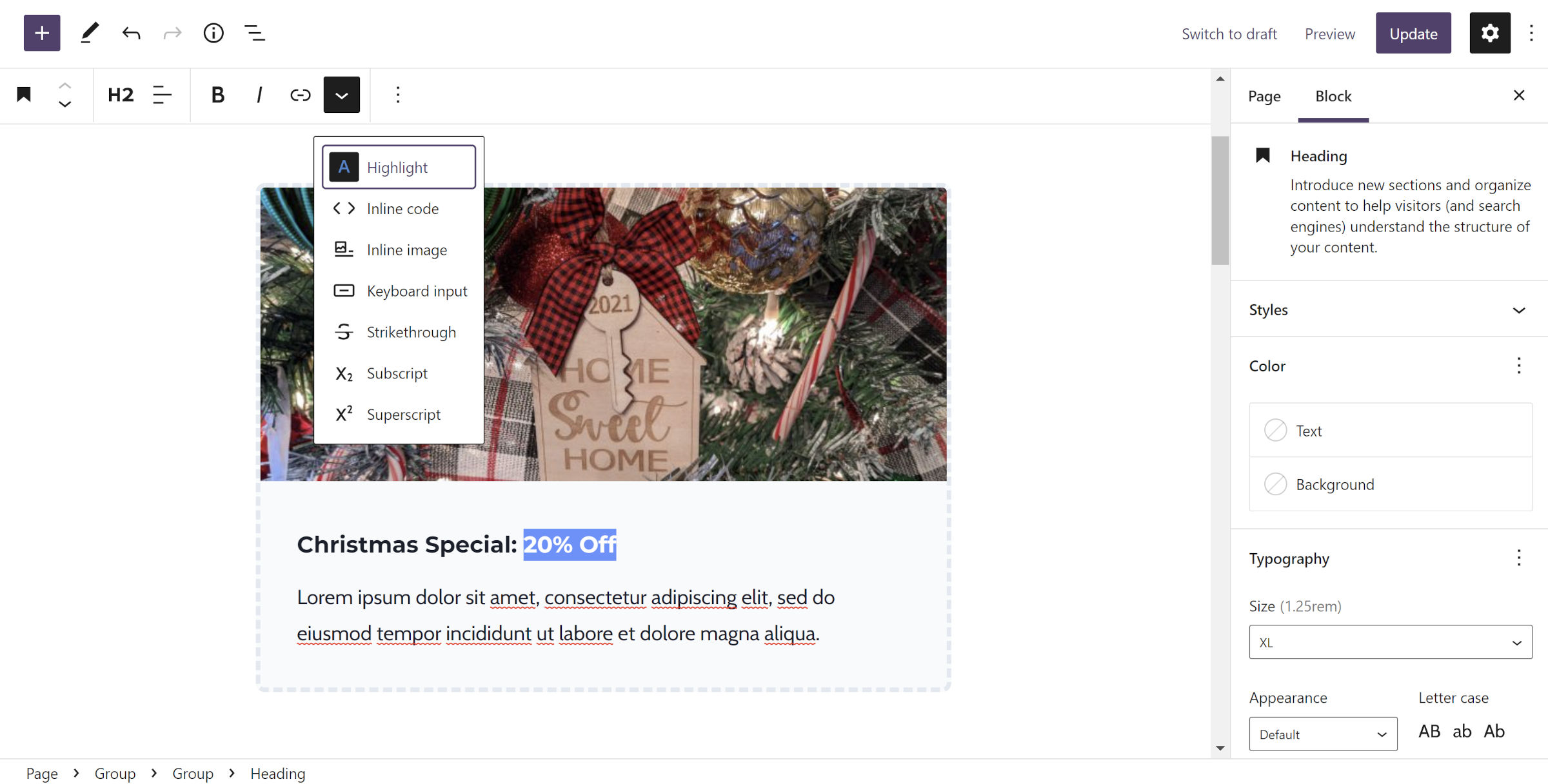
With the Group block in place from step #3, you have a new freeform area to throw in your sales pitch to potential customers. This can be as simple as a Heading followed by a Paragraph or something much more complex. It is probably best to keep it short and on point.
Step 5: Coupon Code Row
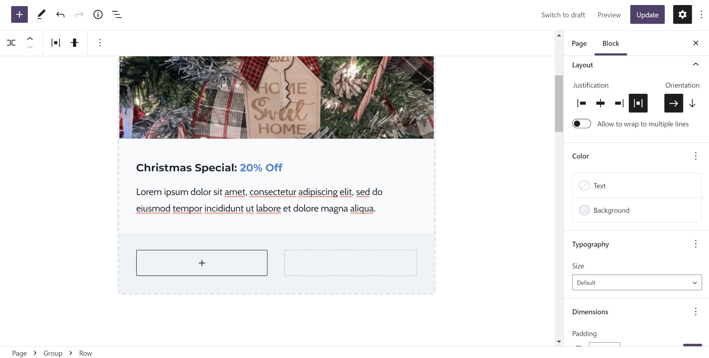
To highlight the coupon code, add a new Row block below the Group block added in step #3. This allows you to add a section for the code and expiration date in the next step.
Select the “space between items” option for the justification control. This setting pushes each nested block away from the other.
Then, select a custom background color. This should automatically give padding to the Row block. If you opt out of setting a color, you should manually set the padding to match the Group block above it.
Step 6: Add Code and Expiration
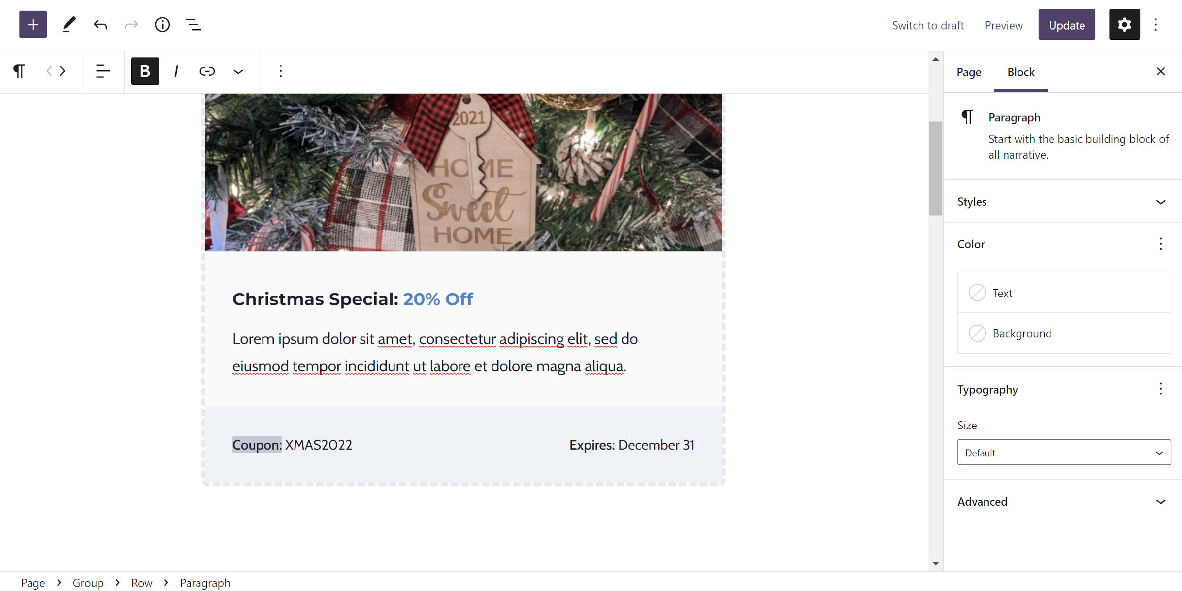
The final step is to add two Paragraph blocks into the Row container. The first should read something like “Coupon: XMAS2022,” and the second should be “Expires: December 31.”
Of course, it is your card, so have fun customizing it.
Variations
The wonderful thing about the WordPress block editor is there are so many ways that users can modify the output of a set of blocks like the above. Something as simple as changing the colors can give you an entirely different look. And, by rearranging a block or two, you can craft something uniquely your own.
One of the easiest ways of customizing the coupon code above is by throwing in a few emoji, as shown in the following screenshot:
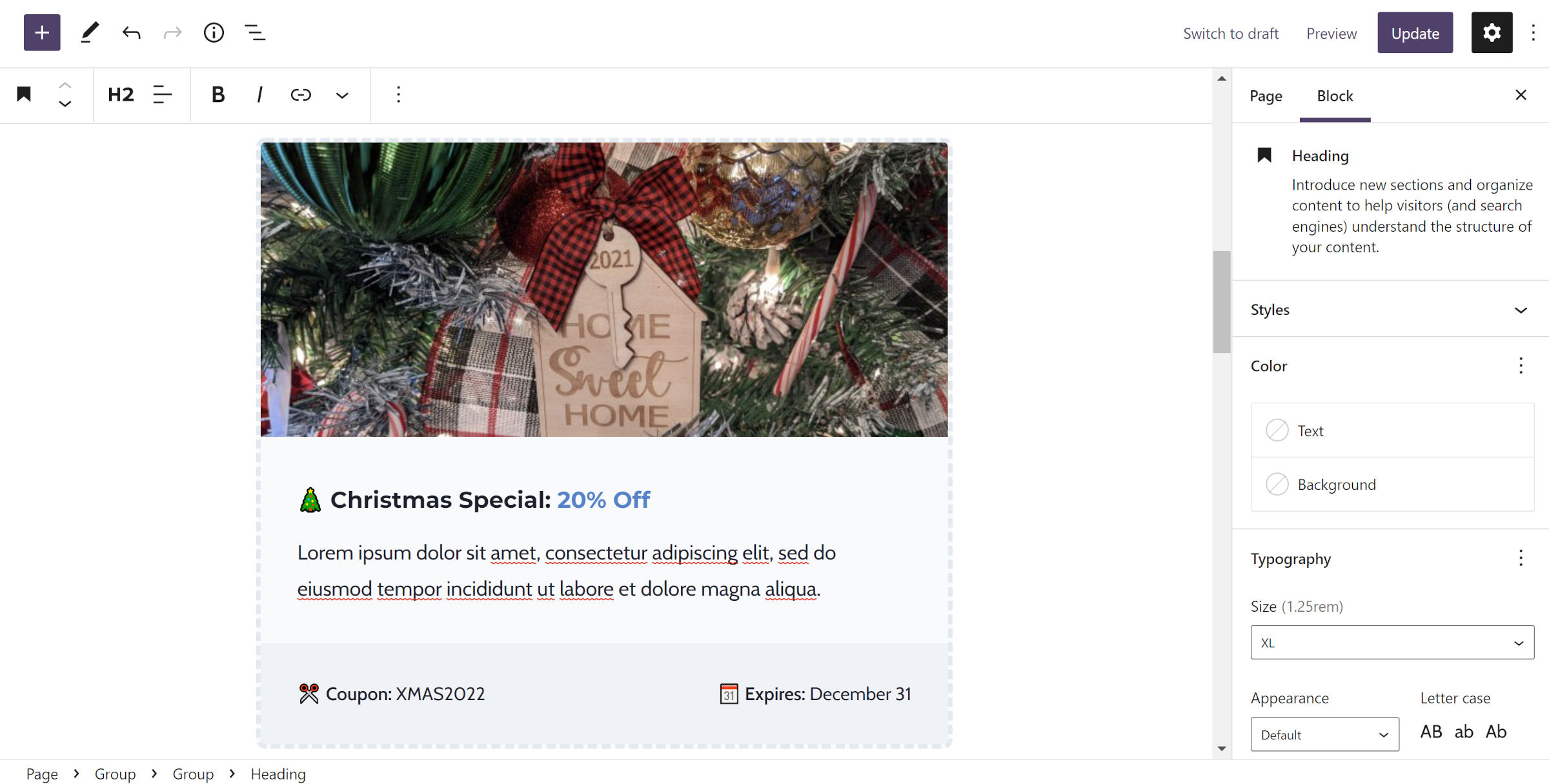
OK. I was having a bit of fun with that. On a more serious note, there are many ways to tinker with the formula and create something new.
It took me only a few moments to merge steps #2 and #4 (skipping step #3) from earlier to create the following:
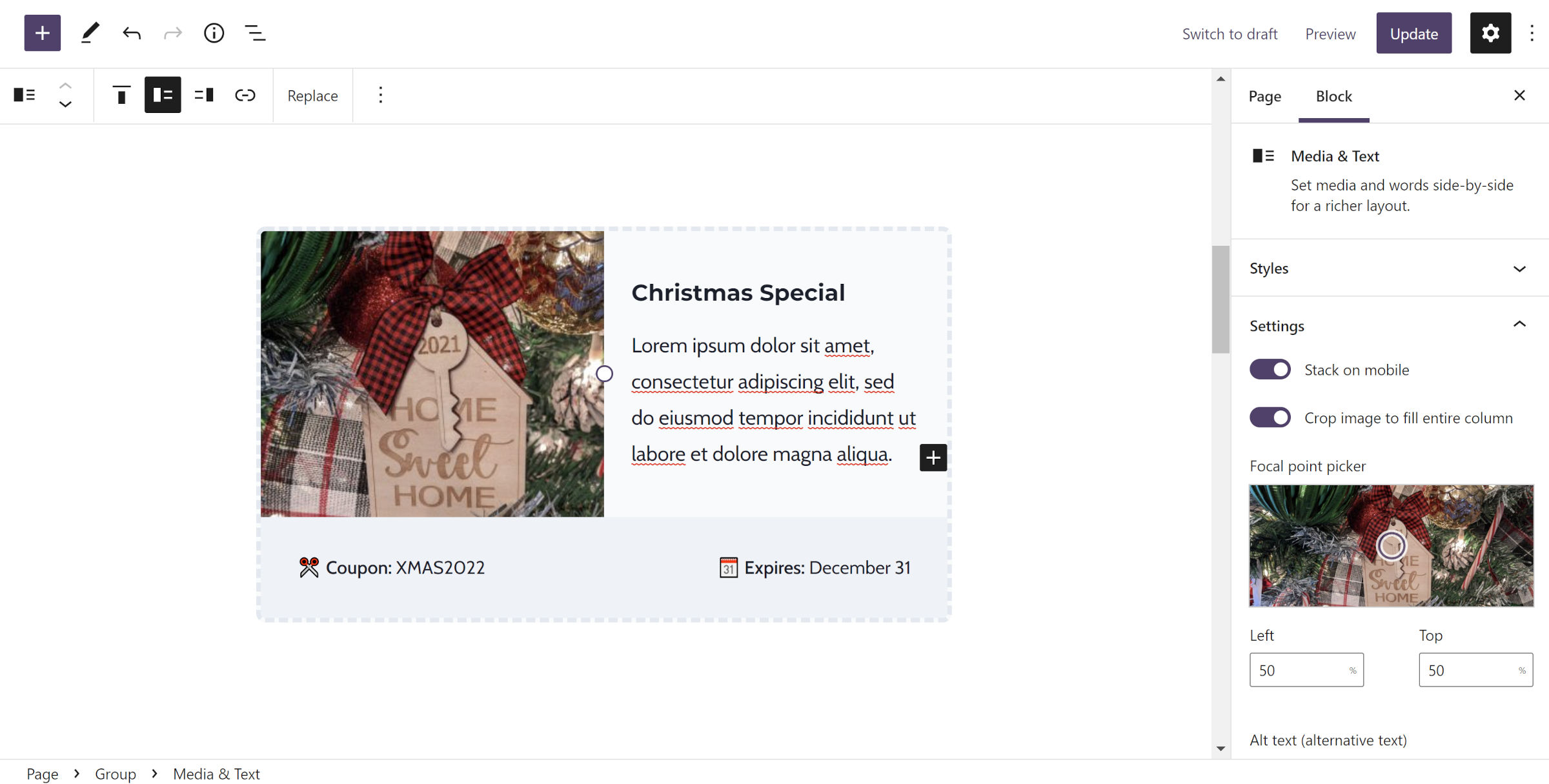
That is a Media & Text block in the mix. I will leave you with the challenge of recreating this variation without a complete walkthrough. If you get stuck, check out my previous tutorial, which covers Media & Text extensively.
