Rich Tabor’s new Wei theme is one of the most well-designed contributions to hit WordPress.org’s free themes directory this month. Wei is a minimalist block theme that keeps things simple while offering users a range of artfully selected accent color combinations. It also includes support for full-site editing and Global Styles for a wider range of site customizations.
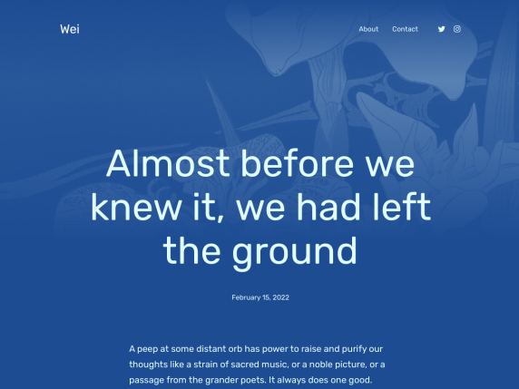
Wei joins WordPress.org’s collection of 86 full-site editing themes. The number of FSE themes is growing but it is a far sight behind the goal of 500 for 2022, which WordPress Executive Director Josepha Haden Chomphosy set for the community. While the Themes Team discusses ideas for making block theming easier for theme authors, a few trailblazers like Tabor are pushing forward with contagious enthusiasm and creative works that show what is possible in the new era of block themes.
Wei is a follow-up to Tabor’s popular Wabi theme. The name was selected to highlight its simplicity as a supporting tool in the user’s publishing workflow.
“It’s derived from ‘Wu wei,’ which has a lot of meanings, but I lean towards the ‘effortless/actionless’ bit,” he said. “I wanted to build a theme that lets you effortlessly publish — and looks really creative/inspiring as well.”
Tabor said Wei took him less time to make than any traditional legacy theme he created in the past.
“I started, and nearly finished, Wei on the flight back from WordCamp Europe,” he said. “A couple years ago, this would have taken weeks — at least.”
Tabor’s expert curation of dynamic accent colors is the highlight of this theme. Since most people are not designers, Wei offers four different overall styles that users can browse inside the Site Editor and enable with one click.
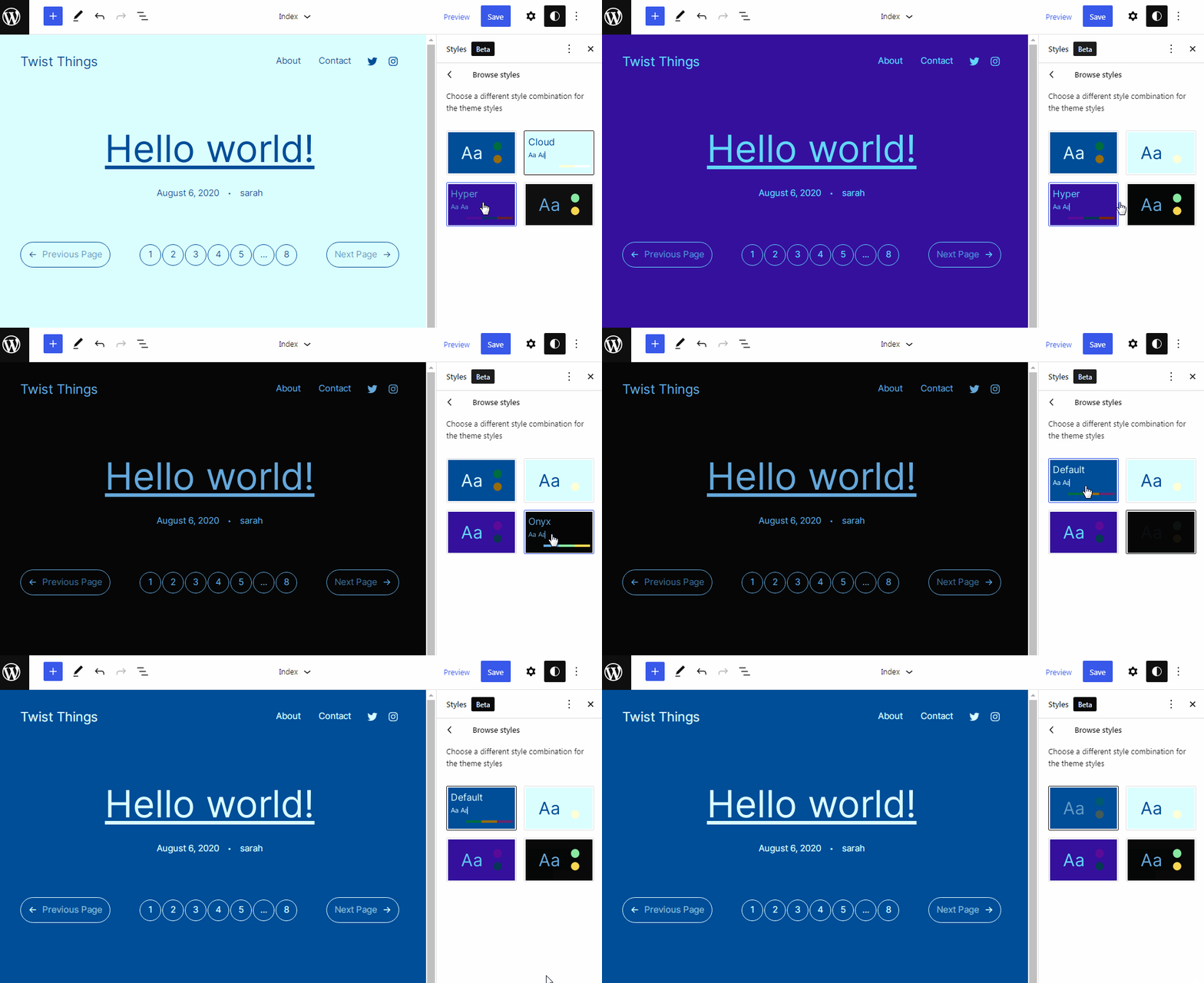
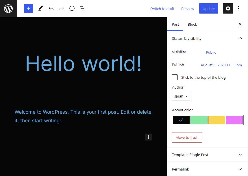
Depending on what theme style you select in the Site Editor, the post editor will display a different set of accent colors. These options are unique to each style and all of them are aesthetically pleasing combinations that can be set based on the mood of each individual post.
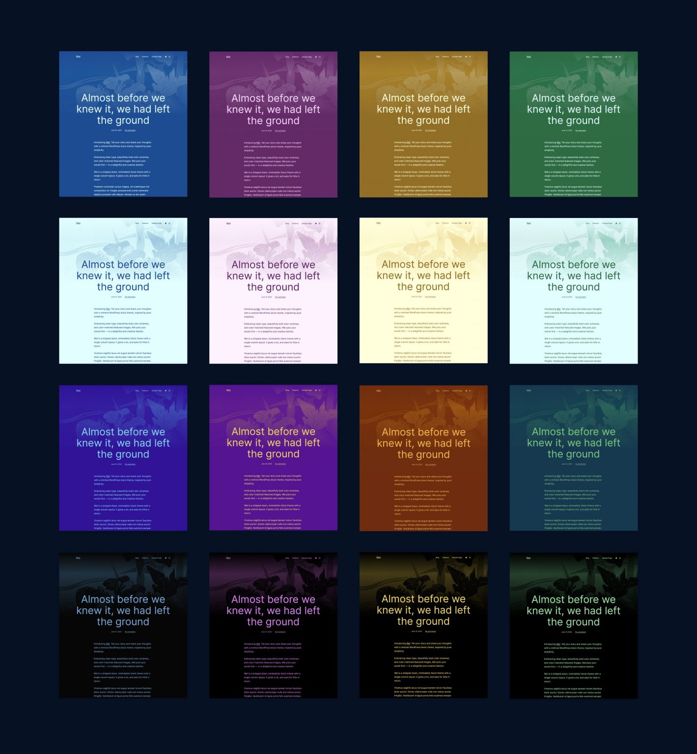
Tabor’s Wei theme announcement post includes an image with all the style variations included. He selected colors that are AAA contrasting for all available styles.
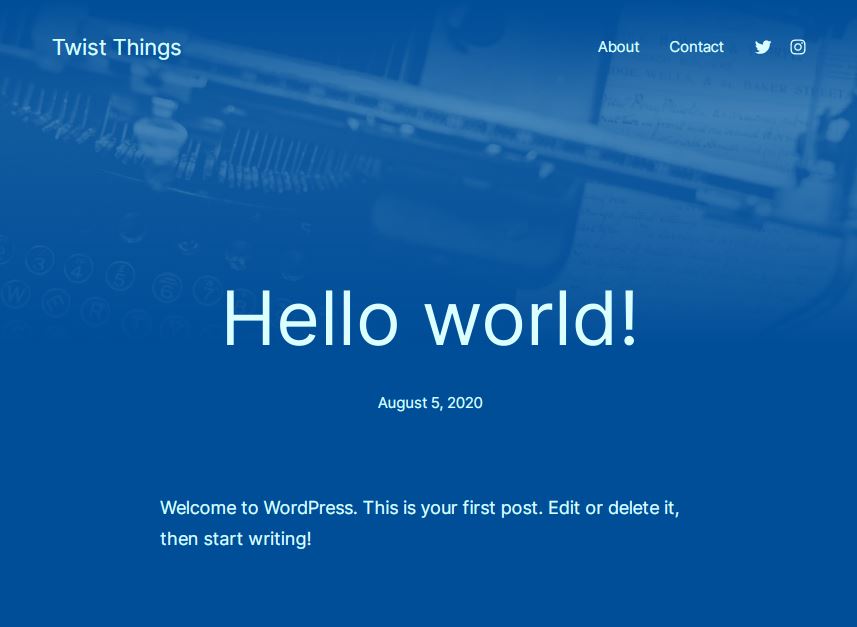
One of the most magical things Wei does is seamlessly blend the background with the featured image on the single post template. The template includes a Cover block that fetches the post’s featured image and applies the duotone from the color scheme assigned to the post. This just works in the background and users don’t have to do anything to enable it.
Wei does not include any custom patterns, but everything in the theme is a block and can be easily manipulated. Users can change the headers, footers, change the layout on single post templates, add blocks to the homepage, edit template parts, and anything else supported by the latest full-site editing features.
Check out the demo to see the theme in action with different color schemes assigned to each post. Wei is available for free on WordPress.org and requires WordPress version 6.0 or later.
