Brian Gardner, founder of StudioPress and co-creator of the Genesis Framework, has a new block theme in the directory called Bright Mode. The theme features a vibrant color palette with tasteful gradients, 14 beautifully designed block patterns, and so many fun variations tucked into custom block styles.
It’s difficult to nail down a niche for many block themes, as patterns and templates make them flexible enough to serve just about any use case. Bright Mode falls into this category. It could easily be used as a business or personal website, blog, or portfolio.
If you look closely, you can see subtle hints of Gardner’s trademark style. It’s forthright and minimalist with meticulous attention to typography and spacing. The colors are bright but harmonious and balanced, so it doesn’t preclude Bright Mode from use in professional contexts.
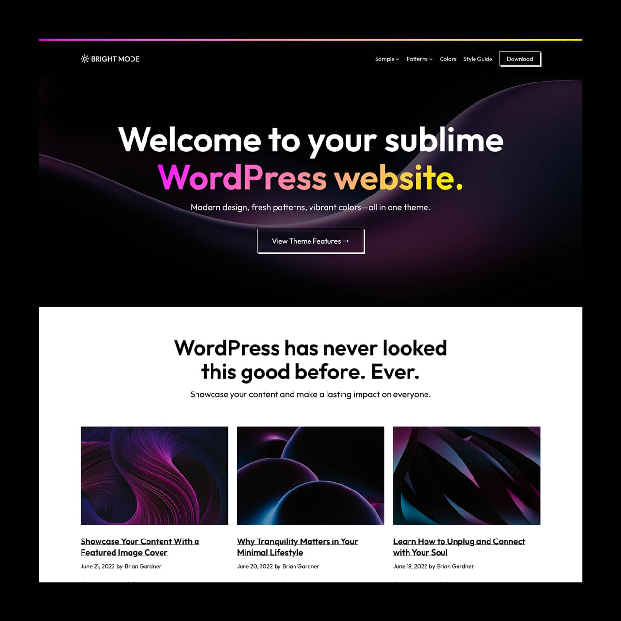
Gardner has a unique perspective as one of the OG theme authors from the early days of WordPress theming when everything was just getting started. He helped kick off the commercial theme ecosystem with his Revolution theme and continues to bring that same trailblazing spirit to the new world of block themes.
“Last summer, I read an article written by Justin Tadlock about block patterns and the pattern directory (which was in beta at the time,)” Gardner said. “He linked to it, and I spent a few minutes clicking around. Finally, I saw a pattern I thought was cool and clicked the ‘copy pattern’ button. I wanted to see how this all worked, so I opened up a post on my blog and pasted the code. Voila, there it was. At that moment, I knew—the potential of modern WordPress flashed before me.”
Gardner’s new theme makes use of patterns to define every section you see in the demo. Bright Mode offers a colorful array of patterns that users can insert into their sites, including a cover image with heading, text, and buttons, multiple testimonials, different query layouts, and multiple footer and header designs. View the demo to see them all in action with sample content.
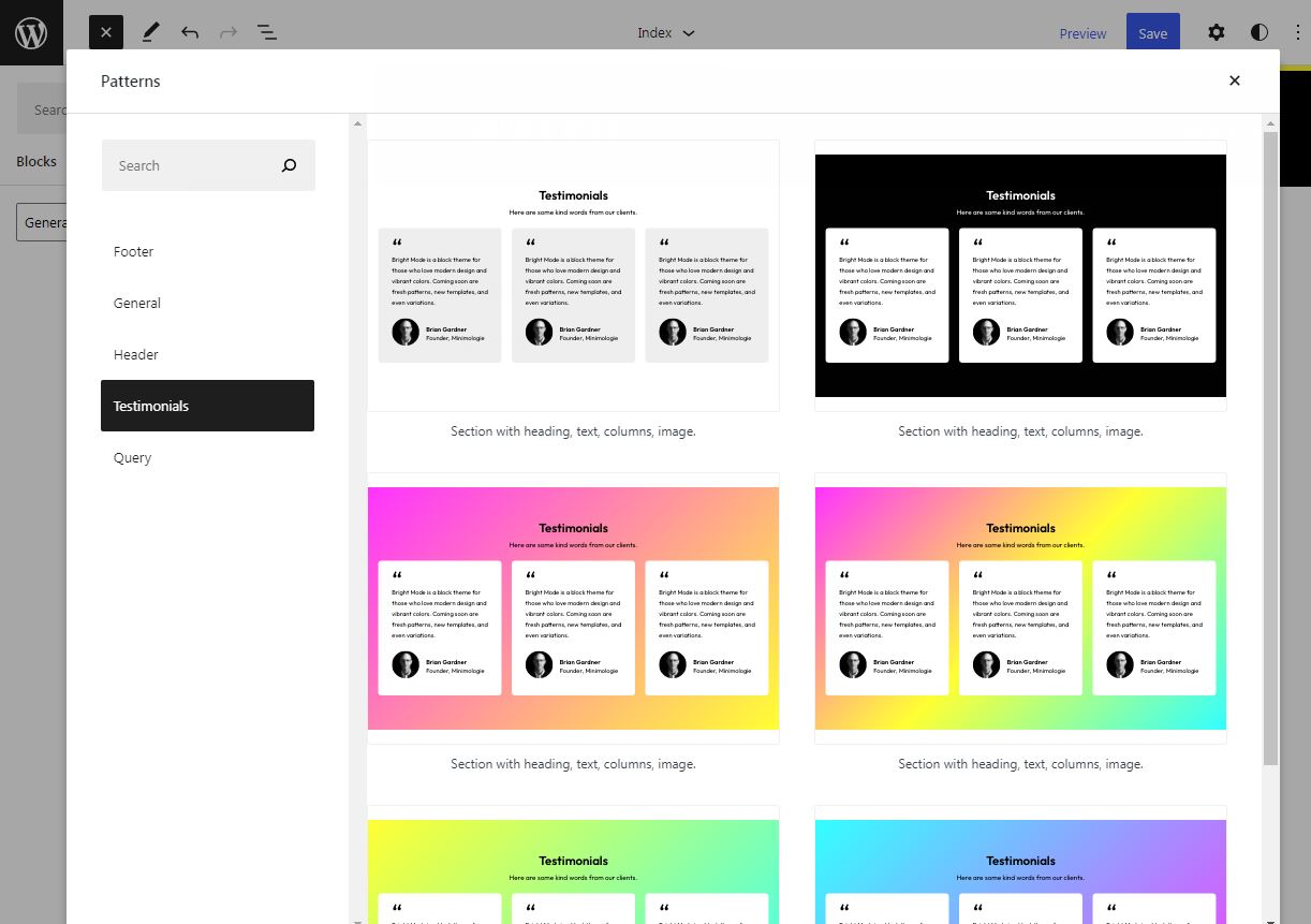
Gardner is currently building more patterns to add to Bright Mode’s collection. He said the ones likely to come next are hero sections, featured boxes, call-to-actions, a link page, and portfolio patterns.
“I had spent several months iterating on the design for Bright Mode, so I felt the need to accomplish two things: Ship it and leave the door open to adding more,” Gardner said.
When you first install Bright Mode and click on Customize, it doesn’t look like the demo. Users would have to insert patterns to make it look closer to the screenshots. I asked Gardner about having patterns inserted in the home page by default to match the demo and he said it’s a possibility for a future update.
“As for inserting patterns by default, the only instance that might be useful is the Bright Mode home page, which is merely a welcome pattern, and then the grid loop below,” he said. “Of course, as I add more patterns, this could be part of an update.”
One of the unique features in this theme is the Headings block has a set of fun block styles that create a variety of color gradients for the text.
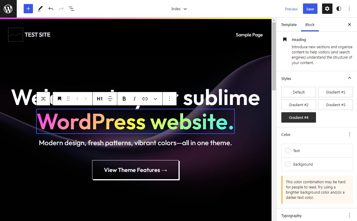
“Accessibility and color contrast were paramount with the design of this theme, so much that I even created the Colors page,” Gardner said. He aims to inspire more theme authors to make colors a consideration, given that many newly released FSE themes do not have any sort of intentional approach to colors. Gardner has identified a set of primary, secondary, and tertiary colors that are used in different block styles throughout the theme.

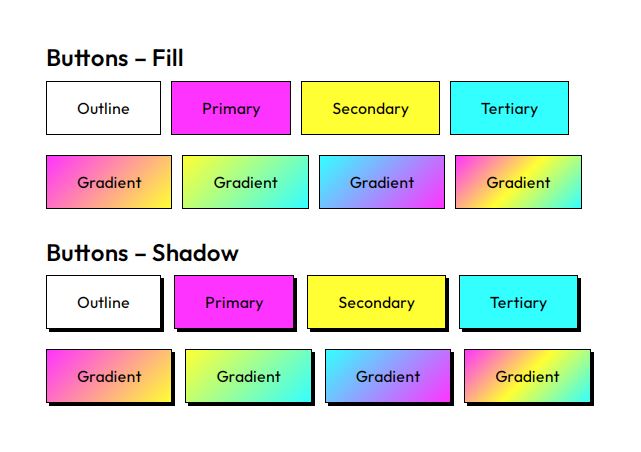
“The primary, secondary, and tertiary colors pass both WCAG 2.0 level AA and WCAG Level AAA contrast tests for the following: Normal Text, Large Text, Graphical Objects and User Interface Components,” Gardner said.
Viewing the Style Guide, you can see the colors applied to buttons, quotes, and social icons.
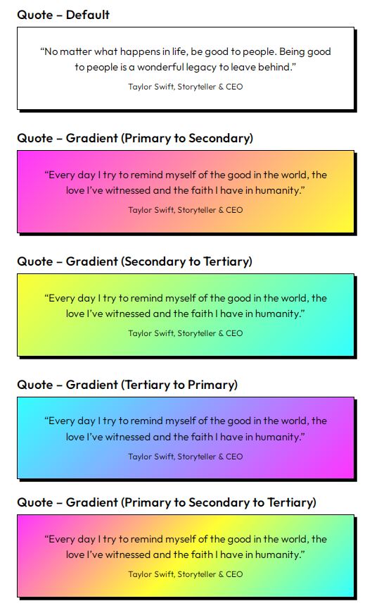
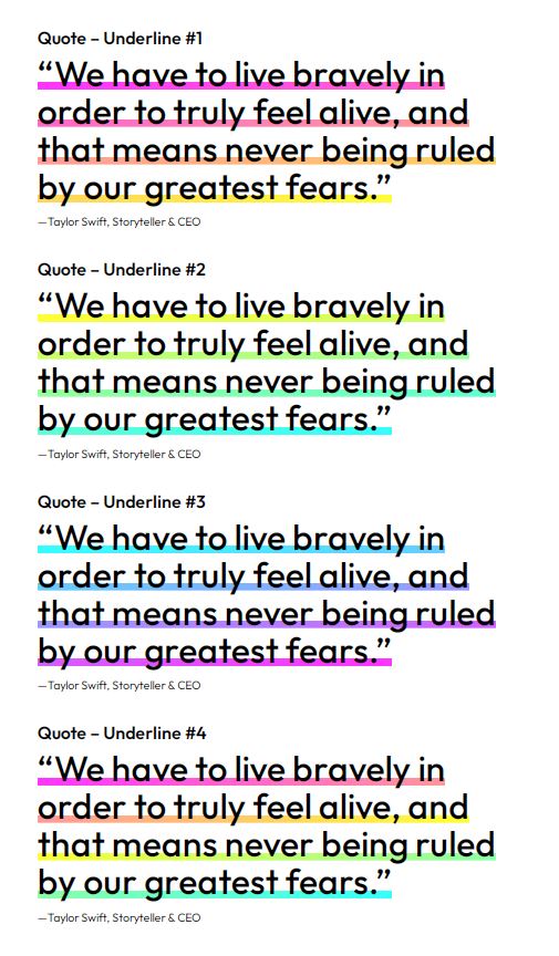
Bright Mode offers multiple different style options within the Quotes block. They can be plain or have a colored background or a gradient background. Quotes with no background can also have a color gradient underline applied. The nice thing about this is that this can be changed on a per-quote basis and does not have to be the same for each blockquote. Users can have a lot of fun customizing their quotes with different designs. A few of them are pictured below. When used sparingly throughout the site they are quite striking.
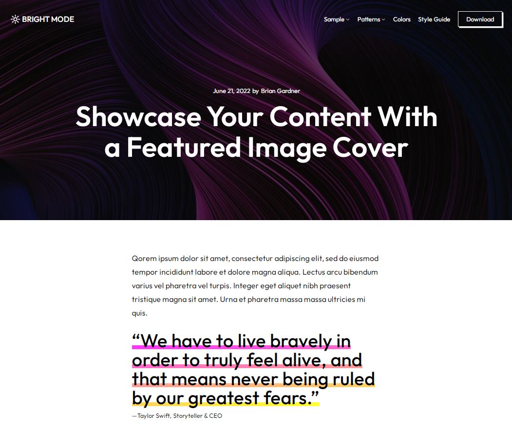
One of the aspects of Bright Mode that Gardner said he loves most about the theme is the way the Cover Block is used on single pages. It pulls the featured image into the Cover block and also offers custom block styles for shadows and full-height options. (The fallback is just a black header with the title). “I feel as though this really presents what’s possible with modern WordPress.,” Gardner said.
After testing the theme, I was surprised by how many hidden gems there are to uncover in the block styles, and how much creative control users have over every aspect. The only thing I would change is ensuring the home page looks similar to the demo so users feel that they have a solid starting place without having to hunt down the patterns to reproduce the demo. Gardner has a talent for creating aesthetically pleasing patterns and in this case the more diverse set he is planning (portfolio, call-to-action, etc) would enable Bright Mode to be used in more contexts.
Although many traditional theme authors still have some resistance to block themes gaining more visibility in the Themes Directory, Gardner is privileged to have a day job as a Developer Advocate at WP Engine where he is paid to engage with the community and help users transition to the block editor and full-site editing.
“Essentially, keeping pace with Gutenberg development and what’s new with WordPress is what I get paid to do,” Gardner said. “So naturally, this makes it easy to experiment with themes (like we do with Frost) and give back with resources such as our newly launched site for Builders. On top of that, I spend my free time at night and on weekends digging deep to see how far I can take things creatively.”
Bright Mode is the result of his personal explorations into what is possible with block theming. It’s available for free on WordPress.org or via the Themes install screen inside the admin. More patterns, templates, and variations will be on the way in future updates to the theme. Bright Mode is among the first 100 block themes in the directory, a milestone WordPress.org passed today.
