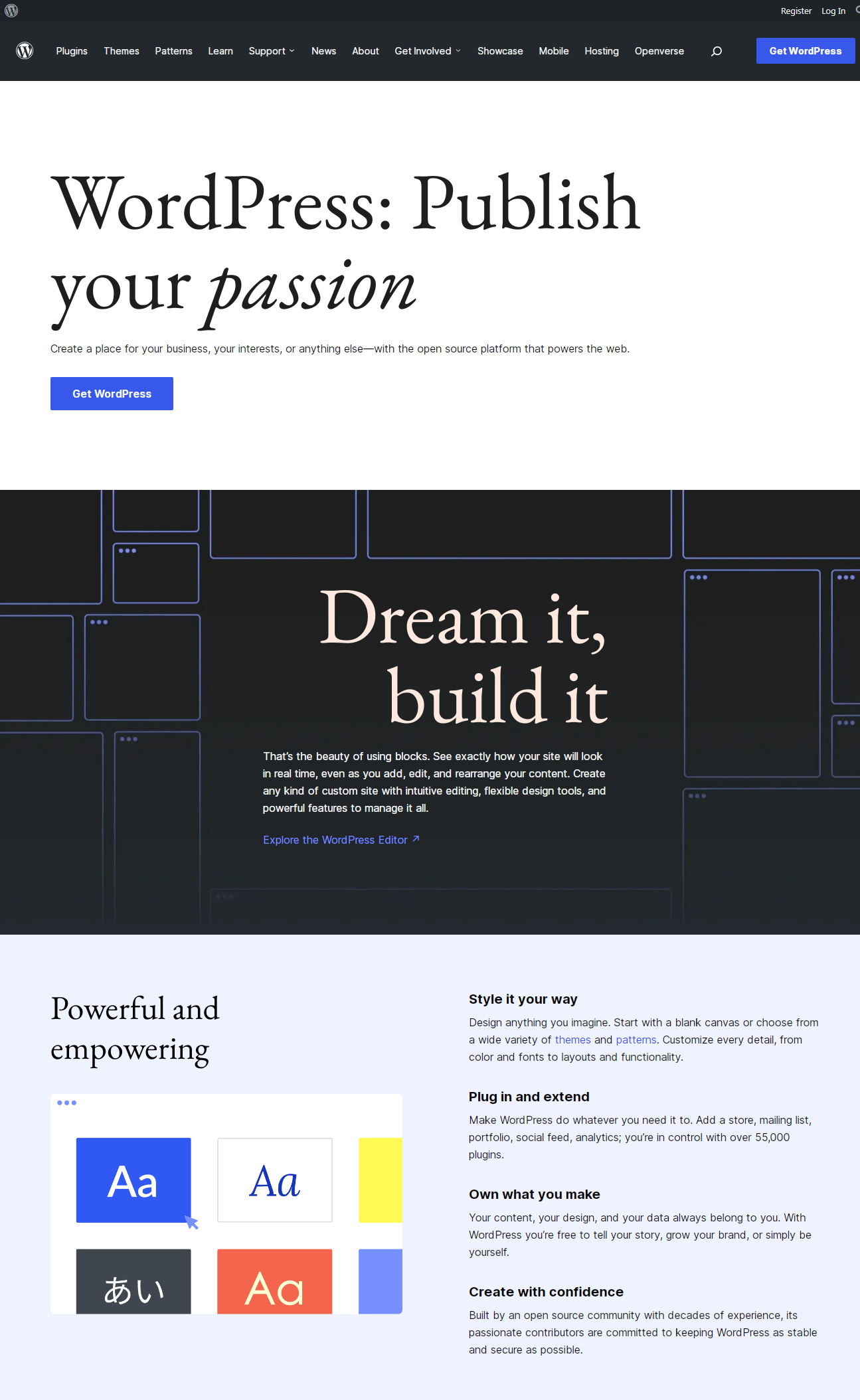
WordPress.org is now sporting a new look with a refreshed, jazzy design that complements the recently updated News pages.
“The new homepage brings more attention to the benefits and experience of using WordPress, while also highlighting the community and resources to get started,” Automattic-sponsored WordPress marketing team contributor Nicholas Garofalo said.
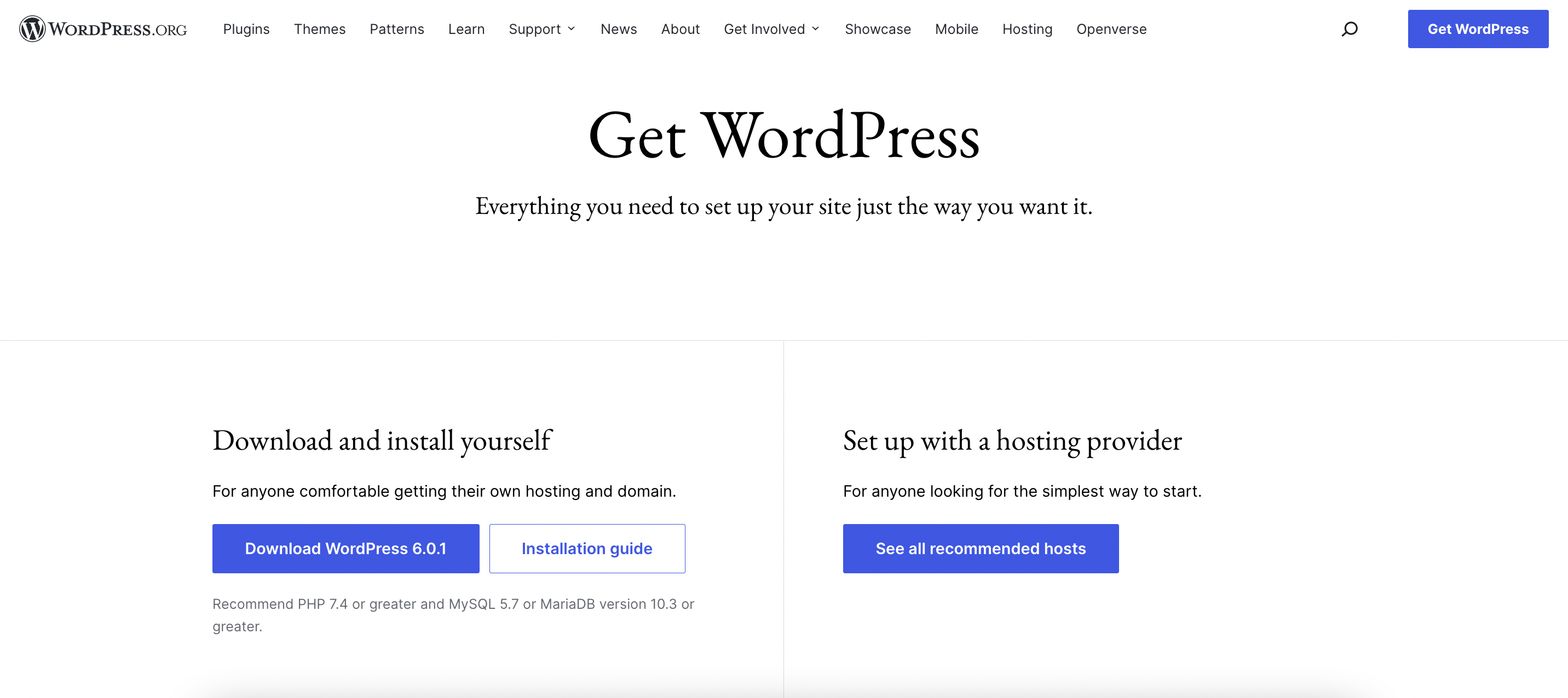
“The new download page greets visitors with a new layout that makes getting started with WordPress even easier by presenting both the download and hosting options right at the top.”

The Download page now clearly offers two paths at the top – buttons for downloading and installing WordPress, and hosting recommendations for setting it up through a hosting provider. It also includes help getting started with resources linked further down the page WordPress courses, developer resources, support, and user forums.

Although the designs have received overwhelmingly positive feedback, their journey to development was not without a few bumps in the road. When the Meta team published an update about taking the designs into development, less than three weeks from the design kickoff, Matt Mullenweg’s criticism of the pace of the project drew the ire of some community members who were offended by the interaction.
“This is not a good use of time, nor does it further the actual goals of a new homepage or download page, and we have better places to spend our development time,” Mullenweg said in response to the plans to create a block theme for the new designs.
Responding to the criticism on Twitter, Mullenweg said, “Regardless of whether someone is a volunteer or sponsored, open source developers need to be able to debate and discuss our work in public, as we have since the dawn of wp-hackers, so that we arrive at the best outcome for users.”
Automattic-sponsored contributor Alex Shiels defended the amount of time spent on the project and elaborated on some of the behind-the-scenes work. Mullenweg contended that turning Figma designs into a theme should have taken far less time to launch.
“On the ‘hours not weeks’ to implement — it’s such a basic layout, it’s hard to imagine it taking a single person more than a day on Squarespace, Wix, Webflow, or one of the WP page builders,” Mullenweg said.
“So, if we’re just doing a prettier version of the same thing, make those changes in place with the existing code approach quickly and move on to something higher value. If you are trying to further WP itself, you need a fundamentally different approach.”
Some interpreted these comments as a referendum on the block editor’s usability. The development plan Shiels outlined included the creation of custom blocks in order to launch an MVP of the new theme. For some, this called into question whether the block editor is delivering on its “dream it, build it” promises.
“The core team has to edit the core blocks for such a simple layout – after 2+ years, what should ordinary users/developers expect?” WordPress developer Aleksandar Perisic commented.
“Dog-fooding is needed just as much as code-focused contributions right now,” WP Engine software engineer Mike McAlister said. “One informs the other. I’ve been knee deep in FSE for months and honestly it doesn’t feel like anyone has tried to make a REAL site with this.”
In addition to giving WordPress.org a fresh coat of paint, the project has sparked a larger conversation about how challenging it still is to build out simple designs with the block editor, even for the people who make WordPress.


 (@sereedmedia)