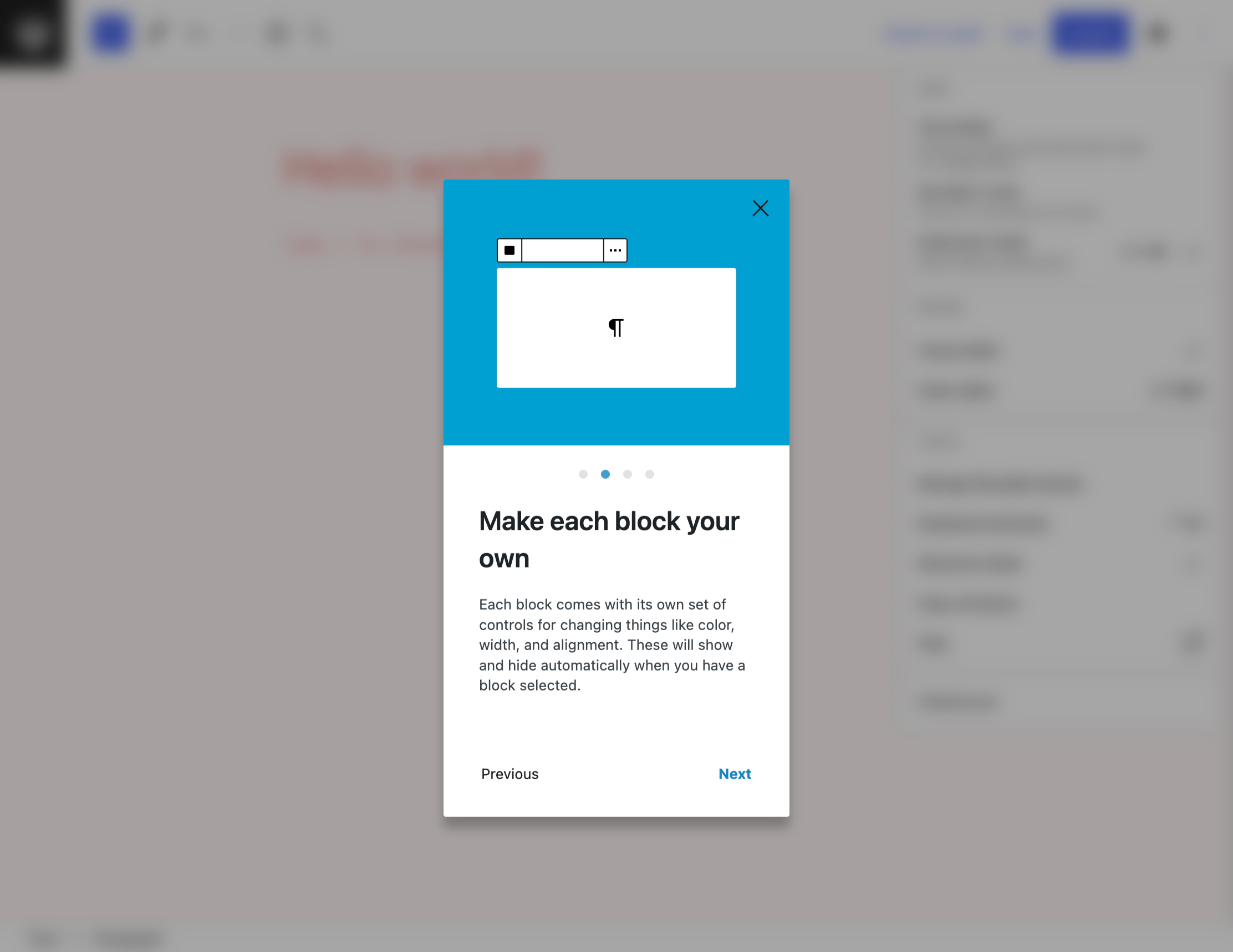
Gutenberg designers are considering replacing the current welcome guide modal with a new onboarding screen that prompts users to configure some of the editor’s many individual preference settings.
The existing welcome setup was designed during the earlier days of the block editor when many WordPress users were experiencing it for the first time. It briefly introduces users to the concept of blocks and invites them to customize them. The editor has matured since this welcome guide was created and it could use an update.

The editor is now loaded with more settings for personalizing the content creation experience, such as document toolbar placement and accessibility features, that users may not ever discover on their own.
“To create an editing experience that feels intuitive, folks will often need to tailor these settings based on their individual preferences and needs,” Automattic-sponsored designer James Koster said in a post on the Make Design blog. “There is no such thing as a one-size-fits-all.
“Instead of relying on people to find these settings on their own (admittedly they’re a little scattered, but that’s another issue), it might be good to surface them during onboarding. Consequently, users can set up a comfy editing experience straight-away.”
Koster is proposing users configure these settings when getting started with the editor for the first time. He shared a video demonstrating how that might look.
The modal is much bigger than the existing welcome guide. It is also more interactive. When users mouse over the options in the left side, it shows a preview in the right side of the modal. The following user preferences are included in Koster’s prototype:
- document toolbar display
- the block toolbar
- text formatting tools
- accessibility options for toolbar button display, editor styles, and block keyboard navigation
The first screen of the modal allows users to skip the setup and go straight to writing. This will be useful for those who do not care to configure any user preferences or those who are in a hurry.
Koster posted the proposal a couple weeks ago, asking whether it is a good idea in the first place, but hasn’t received much critical feedback.
Visually, the larger modal is an improvement on the existing welcome guide, but will it be overwhelming to users who are brand new to the block editor? Will it even make sense to them? A certain level of familiarity with the block editor is required to have any context for the editor customization options. An onboarding wizard with a lot of new terms could take a psychological toll on new users. It’s a lot to take in before getting started in the editor. Are these preferences so important that they need to be the first thing users see when they open the editor? Something like this will need some real user testing before it makes its way to millions of users.
Koster and the Gutenberg design contributors are still looking for feedback on the project. If you have thoughts on these designs or suggestions, leave a comment on the proposal.
