WordPress users looking for a block theme for blogging will have no shortage of options while Anders Norén is on a run with back-to-back theme submissions. Beaumont, his second theme release this month, is another one designed for personal sites and blogs but with an emphasis on longform content. It was named for Thaddeus Beaumont, a character in Stephen King’s The Dark Half.
The new theme features the same Albert Sans typeface used in Björk, his previous release, supported by STIX Two Text in text content. Beaumont was inspired by the design he is using on his personal website, which Norén said people have requested he make into a theme. It has that faded paper look that instantly puts the focus on text content.

The demo of the single post template has an elegant design with drop caps, pullquotes, a custom “Preamble with a separator” pattern, and a minimal previous/next post navigation at the bottom. The spacing and typography are exquisite in this theme and lend themselves to a bit more of a formal presentation for longform content.

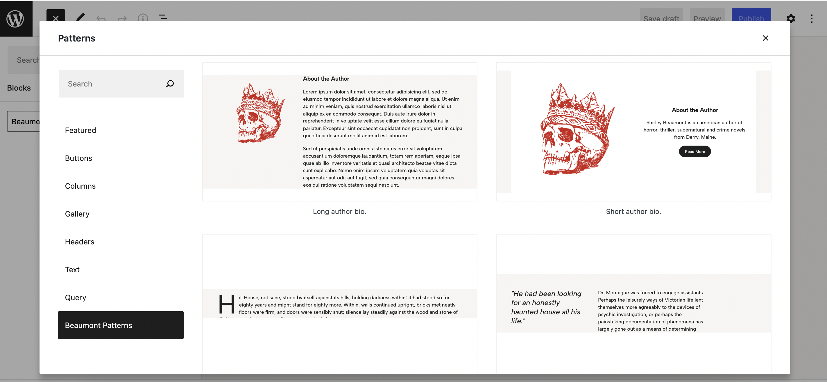
Beaumont comes with nine block patterns, which writers will enjoy, as most of them are dedicated to text presentation. The patterns include a long author bio, short author bio, paragraph with drop cap, paragraph with pullquote aligned left, paragraph with pullquote aligned right, large pullquote, preamble with a separator, wide quote with diamond separators, and a resume full page pattern.

If you notice a discrepancy in how post content appears in the editor, this is a bug in WordPress, not a problem with the theme.
“Currently, text will be set in Albert Sans when you edit your content in the Post Editor, despite it being set in STIX Two Text on the front-end,” Norén said. “This is because WordPress currently doesn’t apply the core/post-content theme.json settings to the Post Editor preview. This should be fixed in WordPress 6.1, which is scheduled for November 1.”
Beaumont packages 11 different style variations in the Styles panel that can totally change the look of a website – a couple of different yellows, multiple dark variations, and several subtle variations on the default. Users can select one and further customize the background, text, links, and more.

Since this theme is geared towards writers, it includes seven different layouts for blog archives, which means users can opt for a more visual display using featured images or keep it simple displaying just titles. These different loops are packaged as Template Parts and can be further edited using the Site Editor.

View the demo to see how all the pieces work together or check out the Matt Report, an early adopter, to see how a podcast is using the theme.
Beaumont would work well as a blog, a writing portfolio, or a resume site, but, thanks to the wide world of blocks, it could also be used as a base for nearly any other type of website. Anders Norén has hit another home run with this theme. It is simple and elegant with just 16K of CSS and no JavaScript, visually distinct from his other themes, and designed for readability. Download it for free from WordPress.org.
