Sometimes Gutenberg introduces features that you never knew you needed. Such is the case with the new color coding system in the Site Editor. The latest 14.7 release adds color to template parts and reusable blocks in the list view, block toolbar, and block selection outlines. The colorization is intended to help users differentiate between the different block types as they edit their designs.
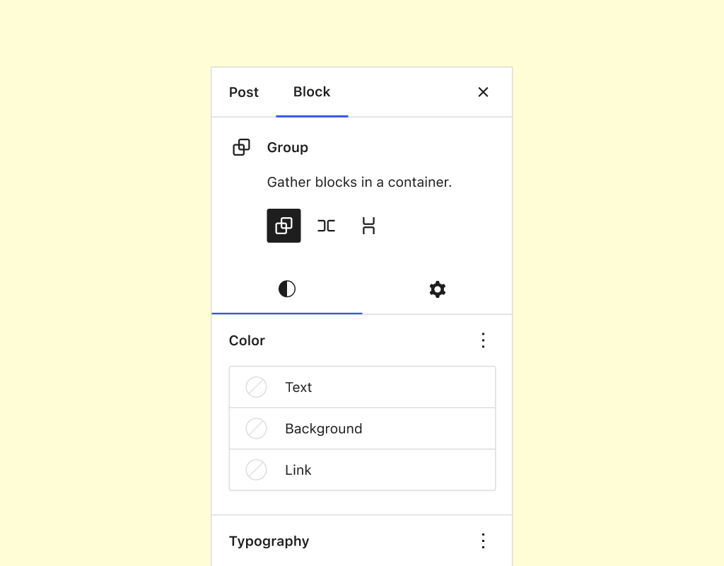
Another UI enhancement in version 14.7 is a new, experimental split control for block settings. It splits the block inspector sidebar to separate the settings controls from the appearance controls, giving the appearance side the same half-moon icon used for styles in the Site Editor. The intention is to make it easier to manage blocks with many controls, such as Group or Navigation blocks, that would end up having the settings scrolling down the page.

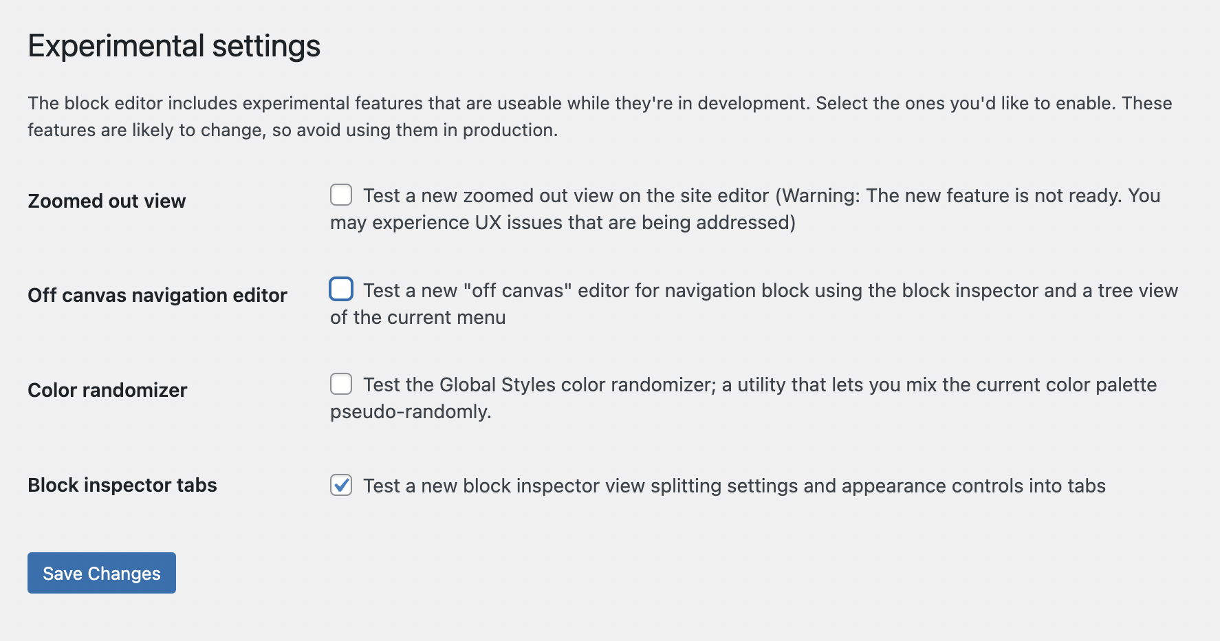
The split control enhancement isn’t set in stone yet, as it must be enabled as an experimental feature in the Gutenberg > Experiments admin menu. It seems helpful but could prove to be more confusing for users, so further testing is needed before it moves out of experiments.

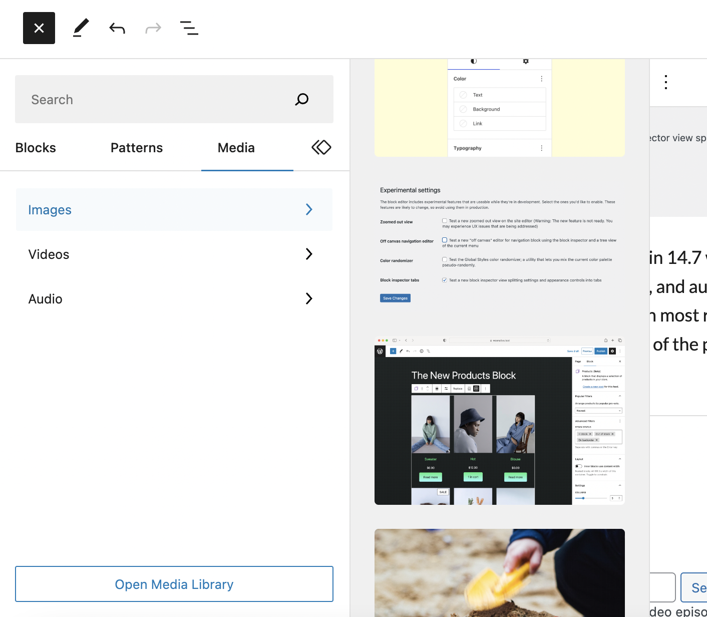
The inserter is getting a major change in 14.7 with the addition of a Media tab, making it faster to add images, video, and audio. Users can select the new tab and select a media type to see the ten most recent items. There’s also an “Open Media Library” button at the bottom of the panel.

Other notable updates in 14.7 include the following:
- Page List block can now expand inside the List View to see the hierarchy of pages (45776)
- Layout controls added to children of flex layout blocks (width for row and height for stack are now available for child Row and Stack blocks) (45364)
- Significant load time performance improvements from caching the results of querying settings from theme.json. (45372)
Check out the changelog to get a more detailed look at the dozens of improvements and bug fixes included in 14.7.
