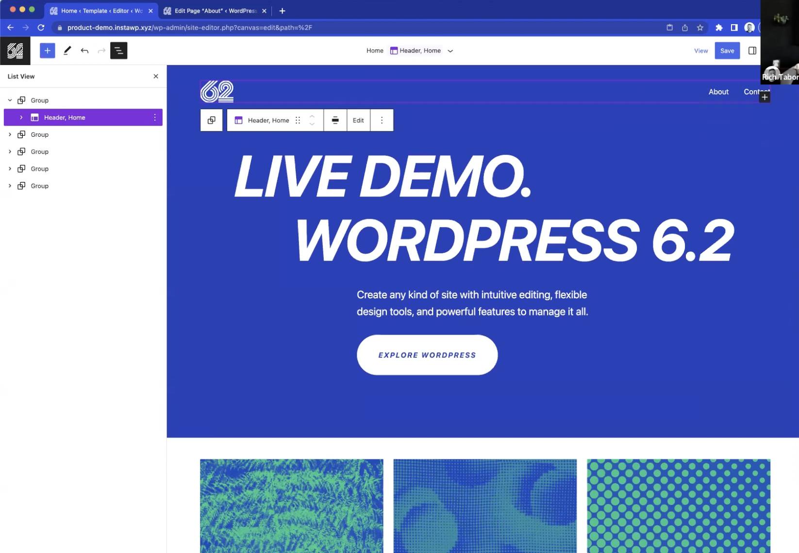
If you’re not yet excited about the upcoming WordPress 6.2 release, you will be after watching the new live demo product video that was recorded last week. The demo was presented by Anne McCarthy and Rich Tabor, and moderated by Nathan Wrigley.
The team used a beautifully customized version of the default Twenty Twenty-Three theme, which showcases what is possible in 6.2 with just core blocks and themes. They started from the Site Editor view, demonstrating how easy it is to zip around from pages to templates and template parts with the new browse mode. This mode also features a resizeable pane that previews the site at different viewports.
WordPress 6.2 is light years ahead in terms of its progression as a design tool. The team gave a short introduction to pushing styles globally, as well as the ability to copy and paste styles. The features make it much easier to make changes across the site, instead of having to apply them separately to each block. They also gave a tour of the Style Book, which is helpful for quickly making global changes to blocks with a preview. Tabor noted how users could actually use that screen to design the entire site.
Other features covered in the live demo include the new sticky positioning for top-level group blocks, a tour of the new navigation and dedicated list view, distraction-free mode, and the improved pattern and media panel, which reduces the number of steps for exploring patterns and adding images. At the end, the presenters took questions from viewers, many of which cover what is and what isn’t currently possible with the Site Editor.
WordPress 6.2 is expected on March 28, 2023, less than four weeks away. RC 1 has been delayed due to a regression which impacts the Site Editor. An additional Beta 5 is expected on March 7 to text a fix for this issue. In the meantime, the live demo video is a good way to familiarize yourself with all the major features coming in the next release.
