Automattic’s latest Blockbase child theme landed in the WordPress.org directory today. Videomaker is aimed at film directors and video creators. I have put it through its paces in the last week as it waited for approval in the review system.
At first glance, there is not much that separates Videomaker from any other plain ol’ block theme. Aside from a different color scheme, it looks and feels like its parent, Blockbase. It takes some digging to figure out what this theme brings to the table. Once you find its block patterns, it is evident that it would work well for indie filmmakers.
WordPress block themes have a pattern-discoverability issue. I have been noticing it for a while. So many often seem lackluster until you begin tinkering with their patterns, applying them to pages, and seeing what you can build. Custom patterns are where block themes will shine the most, and these need to be front and center when a user activates one.
The most straightforward solution is for themes to bundle a custom front page template out of the box, giving users a small taste of the included patterns. Starter content could also help, but the ticket for making this compatible with block themes is still open.
I almost bypassed Videomaker because I could not see its potential. After some time with it, I enjoyed how much thought the design team put into its patterns. While the theme can be used for anything, its block patterns are specifically geared toward film directors and creators in the indie space.
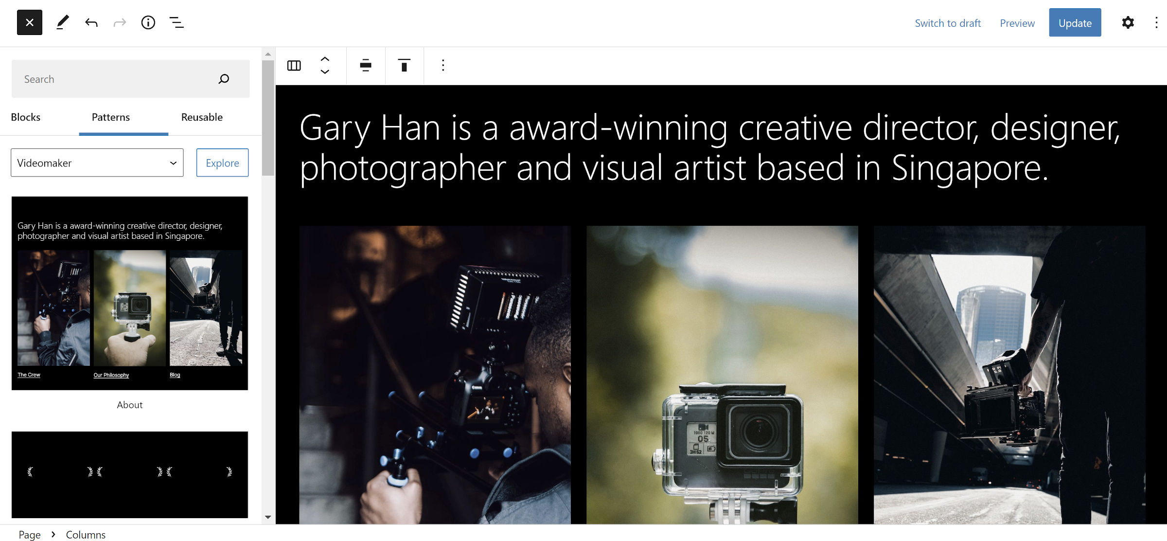
The theme focuses on two areas. The first is the creator. It includes a few layouts that allow the site owner to show who they are, such as the About pattern:

The second focus area is on the art itself. There is a full-width homepage for showcasing a trailer or film, and there are patterns for the film description, credits, and more.
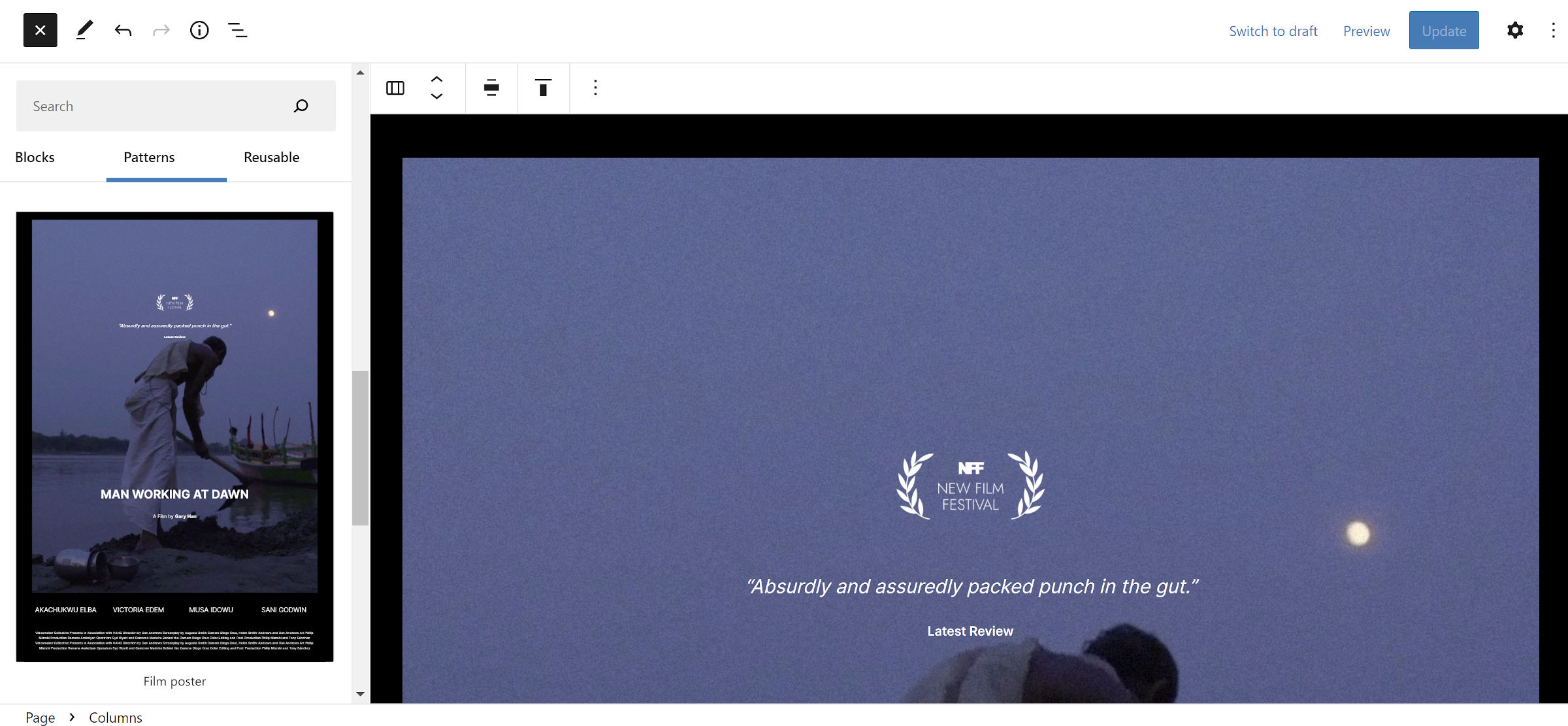
One of my favorite patterns was one for a film poster. This one stood out in particular because I could have used this back in college when I was going through my filmmaker phase — no, do not ask to see my $0-budget, half-finished vampire picture. I built my film posters in Photoshop back then via on-campus computers. It would have been fun to visually edit them in WordPress.

The theme never overcomplicates things. It offers a variety of 16 patterns for quickly throwing together a film-related website.
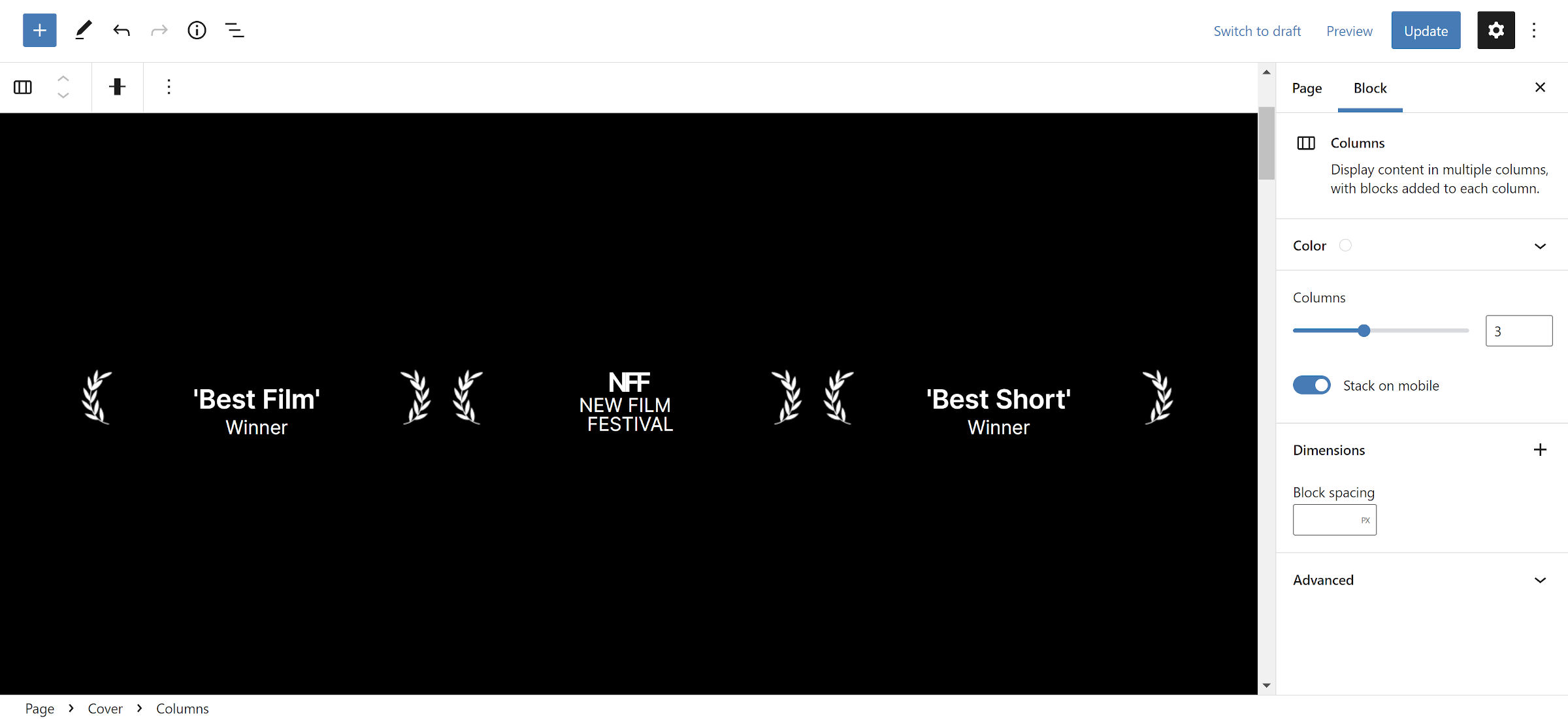
I particularly like the addition of the seemingly-minor sections. For example, the Awards pattern is a simple columns layout that allows users to showcase their film’s awards:

There is nothing especially groundbreaking about the pattern. It is just a Cover, Columns, Images, and Paragraphs. Creating something like this in the classic era would have been overly complex. Users would have likely had to input a shortcode without any chance of seeing it live, at least until they previewed the page. Or, it would have existed as a customizer option and limited to wherever the theme allowed.
Looking back, it is crazy how something so simple was so complicated in the past. With patterns, theme designers can have a lot of fun adding these little touches to their themes, and users reap the benefits.
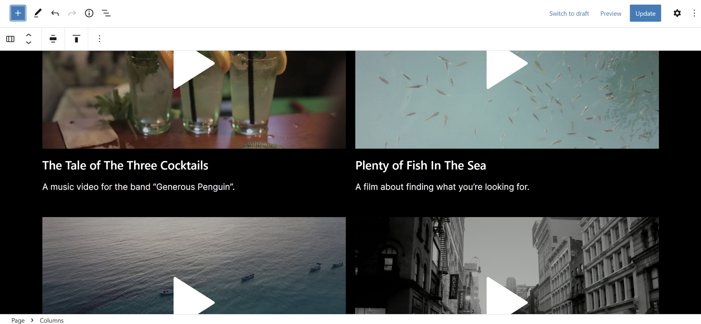
One area that could be improved would be the addition of featured media. Creators should not be required to manually edit their video list as shown in the following pattern every time they have an update. It should simply automatically show their latest video posts.

WordPress has allowed featured images for years, but video and audio are a no-go. I have a bookmarked ticket that proposes expanding into “featured media” from 2020. There has not been any movement toward a solution. It turns out, the Automattic Themes Team had commented about the need for featured videos when they had started work on Videomaker.
This is not an issue that is best solved via the theme. While it was easier to do with classic, PHP-based theme projects, WordPress should provide the capability out of the box.
I only found one significant issue with the theme. Its default page template currently displays both the post date and featured image. I am hazarding a guess that this was an unintentional copy-paste error during development. Typically, these items are not desirable on pages. One of the best things about block themes is that users can adjust these problems — intentional or not — via the site editor. Don’t want the post date and featured image on pages? Just remove them.
Outside of that, I like seeing the continued experimentation from the Automattic Theme Team. I am waiting to see what they tackle next.
