Over the weekend, Virgiliu Diaconu asked me to check out his Carousel Slider Block plugin, a project he has maintained for three years. It has slowly garnered more than 5,000 active installs since its release.
I get emails like this every day. More often than not, the projects are fundamentally broken or are a bit too spammy for my taste. Like so many others, I ask myself, Could this be one of those diamonds in the rough? I am always optimistic enough to hold out the tiniest sliver of hope.
I should preface this review by saying that I have a general dislike of sliders and carousels. They are often used to hide away content, forcing site visitors to take additional action to find it. Or, they begin to automatically slide before users finish reading the first panel. I tolerate them on some sites if used to tidy inconsequential content.
However, I know a lot of people like them. The question I needed to answer was whether this was a solid implementation. The TLDR version is it handles far better than others I have seen.
What makes Block Slider Carousel a solid plugin is that it is, mostly, WYSIWYG. It also does not complicate the experience more than it has to. There is one fixable problem, which I will get to. Overall, creating a carousel full of slides was straightforward.
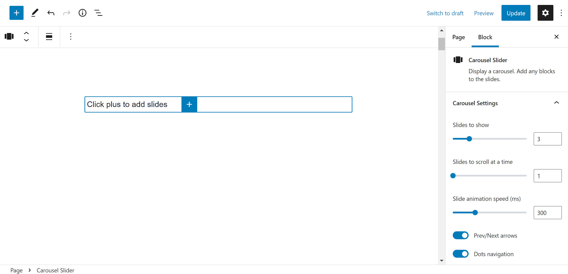
Users merely need to insert the Carousel Slider block in the editor to create a new carousel. The UI is similar to the core Row block when inserting slides — click the “+” icon. From there, users can add any other block within each:

I added a screenshot of this default setup to show that the plugin feels almost native to WordPress. There is no management via a separate custom post type screen. The slides do not all stack atop one another, looking nothing like their final output on the front end. And it does not have a dizzying array of configuration settings.
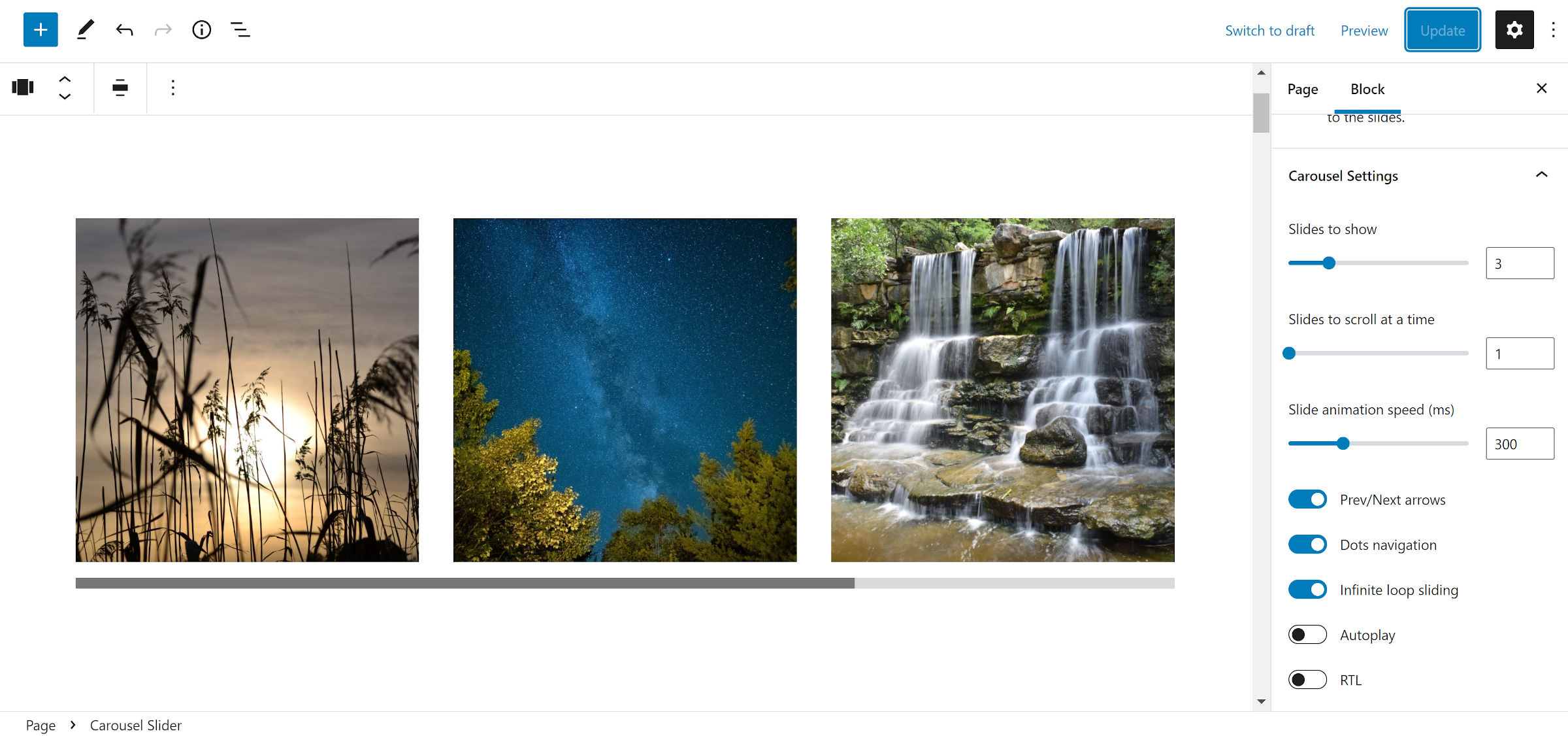
The primary difference between the editor and front end is the horizontal scrollbar shown on the post-editing screen, used for navigating the carousel. Once a few slides are added, it appears below the outer Slider Carousel block:

I would love to see that replaced with the previous/next arrows and dots navigation in the editor view if either of them is enabled. The plugin allows users to toggle both on and off.
The block’s options are the baseline controls expected from such a plugin. Users can control the number of shown slides, how many to show on scroll, and the animation speed. It includes toggles to loop back around at the end of the carousel and an auto-play option.
There is an RTL mode, which was not immediately clear was working correctly. Switching it on did not seem to make any changes in the editor. However, the slides are shown in reverse order on the front end.
The block has a separate panel for controlling the number of slides on smaller screens. Users can manually set the breakpoint or leave it to the default of 768px.
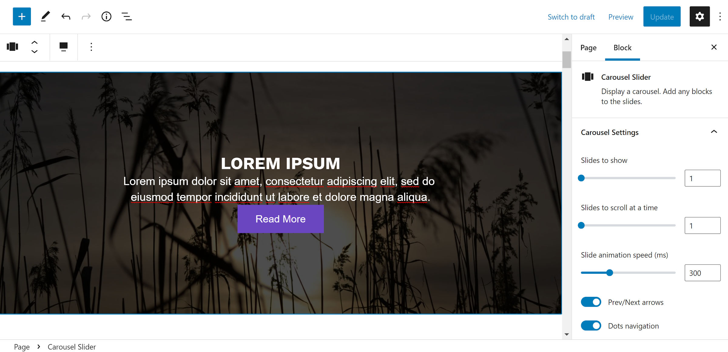
The biggest problem I ran into with the plugin was that it overwrote block margins within the slides. As shown in the following screenshot, the Heading, Paragraph, and Buttons blocks have no space between them:

The theme I am testing uses the new “block gap” feature in WordPress 5.9 to handle vertical spacing. However, with the way the CSS is written in the plugin, it was likely an issue in previous versions. Carousel Slider Block’s styles zero out block margins with a high level of specificity.
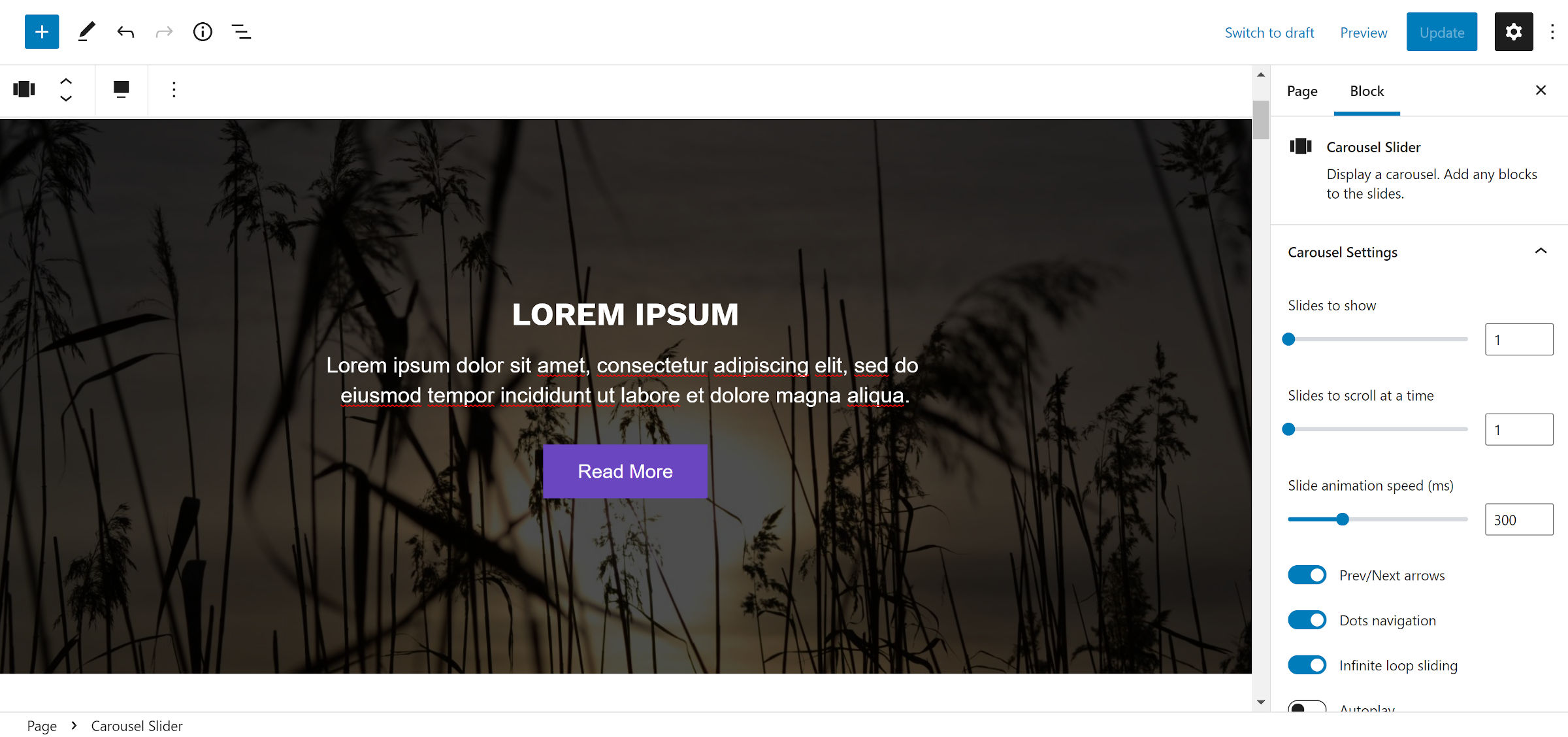
This issue is only in the editor. If you can get past not knowing exactly how each slide will look until previewing or publishing, it is not too rough of an experience. But, this should be an easy fix for the plugin author. I removed the offending code without issue.

And my sanity was restored — I am a stickler for decent spacing.
A welcome addition would be color options for the arrow and dot navigation and features like padding, border, background, and block spacing. This would make it easier for end-users to customize the carousel container.
Would I use this plugin? Knowing myself, I would likely build a custom block, overengineering it when there is a perfectly acceptable solution at hand. Of course, I do not use sliders. However, I would be comfortable handing it over to a client if I still did such work. Plus, the plugin’s front-end CSS is lightweight enough to overwrite for custom designs.
