I “officially” dubbed Newsletter Glue my favorite plugin in the 2021 yearly recap post. WordPress’s block system makes such projects more feasible than before, or at least more easily built and extended. Since I first took note of it, I have kept a watchful eye on its progress. Late last month, the plugin’s development team released an overhauled version 2.0.
Last September, I put Newsletter Glue through the ropes. It was a well-rounded plugin that was easy to set up and connect to my preferred email software. The onboarding process was top-notch. Creating and sending newsletters was as easy as publishing a blog post.
There were some pieces of the user experience that I did not like. Not being able to permanently disable fullscreen mode was one of them, and that seems to have been fixed since then. I would also welcome more integration with the active theme’s color palette in the Newsletter Theme Designer and the meta box moved to the sidebar panel.
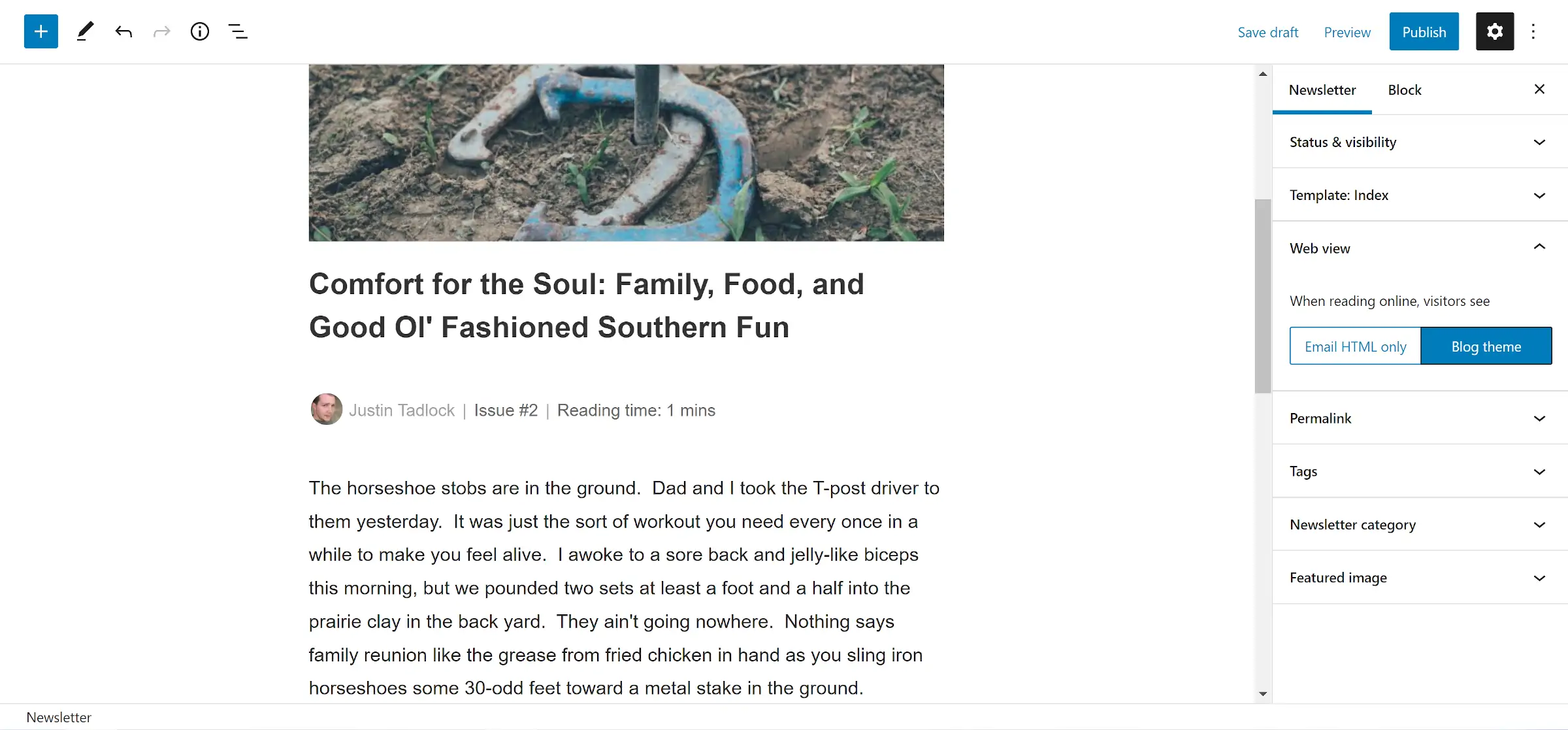
With version 2.0 out, I headed back to my initial idea for this plugin. I blew the dust off my fictional family newsletter and began tapping out Issue #2.

I am still motivated to turn this into a real-world newsletter if I ever find the time. If only there were about 30 hours in a day.
Usability has remained the same in version 2.0 with the publishing process. The plugin still balances its bells and whistles against the simplicity of sending an email.
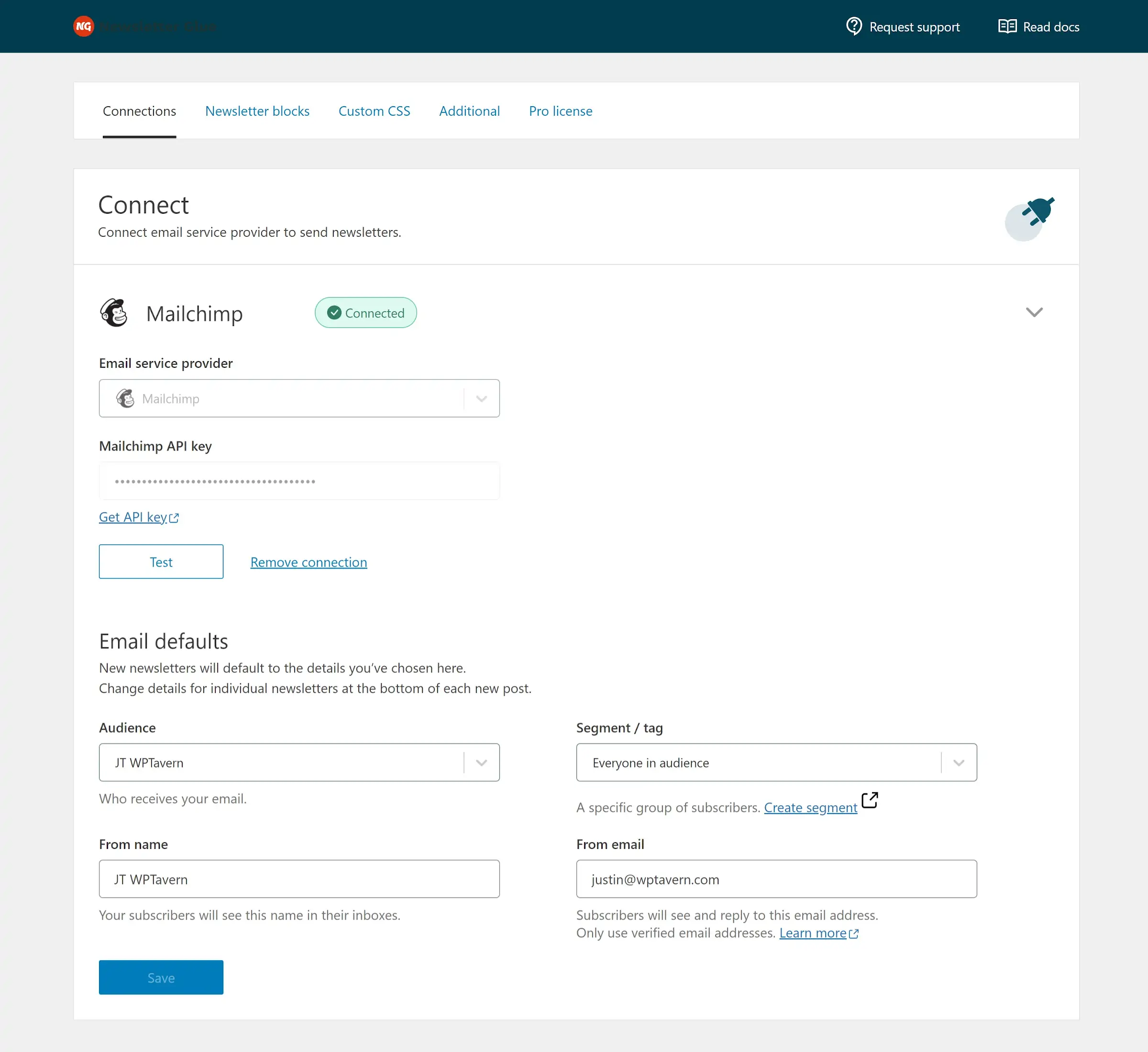
Version 2.0 introduces a new admin settings UI built as a React app using components from the block system. Newsletter Glue co-founder Lesley Sim said it was inspired by the WordPress.com, Jetpack, and WooCommerce interfaces.
“We built it to lay a faster, easier to navigate foundation for all the new features we have planned,” she wrote in the announcement. She did not spoil the surprise of what those new features will be. Like other Newsletter Glue fans, I eagerly await what the team has in store later this year.
Navigating the settings screen tabs was snappier. I now wish all plugins with multiple options pages had the same polish.
The most obvious change was the new Connections tab. It merges the old Connect and Email pages into a single unit. The change makes much more sense now.

Sim said in the announcement that the move conceptualizes connections to be more like profiles and provides a stronger foundation for upcoming features. I have been picking my brain, trying to figure out what those could be. Right now, the plugin allows a single connection. Perhaps she was hinting at allowing multiple connections or tying different user-based email addresses (profiles?) to newsletters.
The Newsletter Theme Designer feature now exists as a separate tab under the Templates & Styles section in the admin. The default screen showcases the built-in patterns and pattern creator.
One of my favorite features is the Newsletter Blocks settings section, which allows users to enable or disable specific blocks:

Instead of only having toggle switches for the blocks, the team also has a video tutorial on what each one does. Clicking the “watch demo” button for a block pops up a YouTube video with a walkthrough. Take note if you are a developer: this is how you educate and empower end-users to use the tools you are offering.
Version 2.0 is much more of a foundational release than a splattering of new features, but shoring up the inner workings of a project is sometimes the best use of an update.
Sim listed the general areas the team is working on in future releases. The list included integrations with more email service providers and plugins, more newsletter blocks, and “A***ma***” newsletters. Any Wordle superstars want to take a crack at that last one?
