Another two weeks have flown by, and another Gutenberg plugin update is in the books. This release is not as feature-heavy as the last, but it feels solid overall. Other than one breaking issue, version 12.7 includes several nice-to-have enhancements.
The latest update includes some early work for a new style engine. This is a longer-term project that should improve saving and rendering block styles.
The template and site editors should surface patterns over blocks in the quick inserter under certain conditions, such as at the root level of a template. However, I was unable to see this in action. I may need to refresh my install.
The Columns block also supports border width, style, color, and radius options. I look forward to this eventually being the case for all blocks.
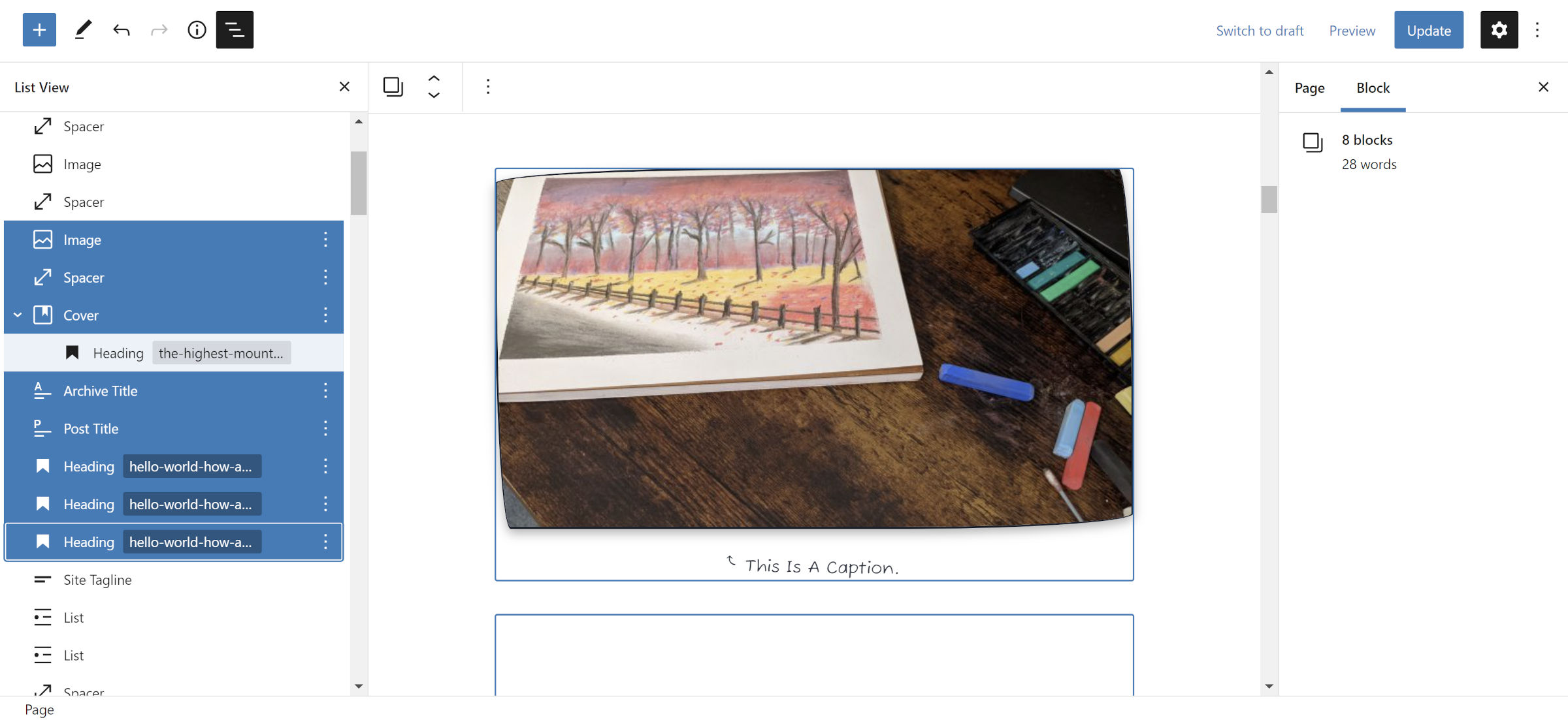
Multi-Select in List View

Users can now select multiple blocks in the list view when the Shift key is selected. Once holding the key, users can use the mouse to click on others, adding or removing them. The up/down arrow keys are an alternative to using the mouse.
The enhancement also allows users to drag and drop the selected group of blocks.
Broken Images

I let my guard down. I became comfortable with WordPress and Gutenberg handling some of that foundational CSS work I had always included in past themes. Things seemed to be going so well.
Gutenberg, you and I had a sweet streak going where you did not break anything. Now, it is time to reset the ol’ “releases without incident” counter.
Previously, the default block library stylesheet provided baseline responsive styles for images. That CSS now only targets <img> tags if they include wp-image- in a class. This is particularly problematic for images in some block patterns. The case may be the same for other image instances.
The previous selector was overly broad and broke images in third-party plugins.
The best course of action is for theme authors to include the following CSS for images:
img {
    max-width: 100%;
    height: auto;
}
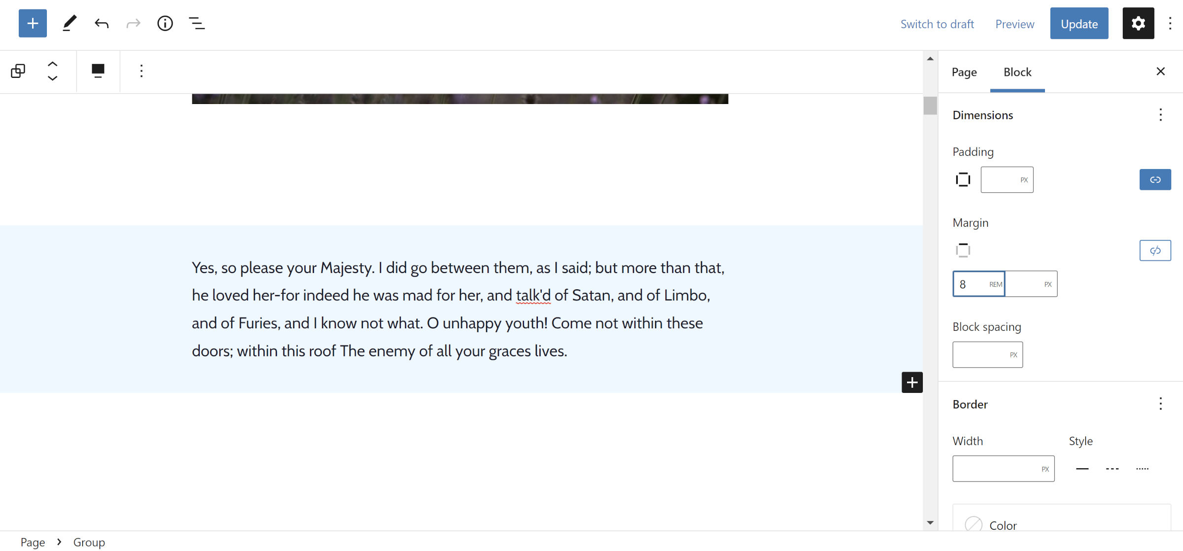
Group Block Margins

Customizing margins is almost synonymous with the term “web design.” The Group block — the flagship container — has lacked support for margin control until now. Some have gotten around this limitation by using a Spacer, but it only increases the space between blocks.
Most issues have been around reducing margins. Theme designers have often needed to employ workarounds, a problem Nick Diego mentioned in the ticket:
Theme developers (myself included) are resorting to “magic classes” to zero out, or modify, margins on blocks. Allowing themes to opt-in to Group margin support will provide greater flexibility and decrease the reliance on custom CSS/classes in the theme’s stylesheet.
Margin support is still missing for many other blocks, including paragraphs. Users can always wrap them within a Group and modify it for now.
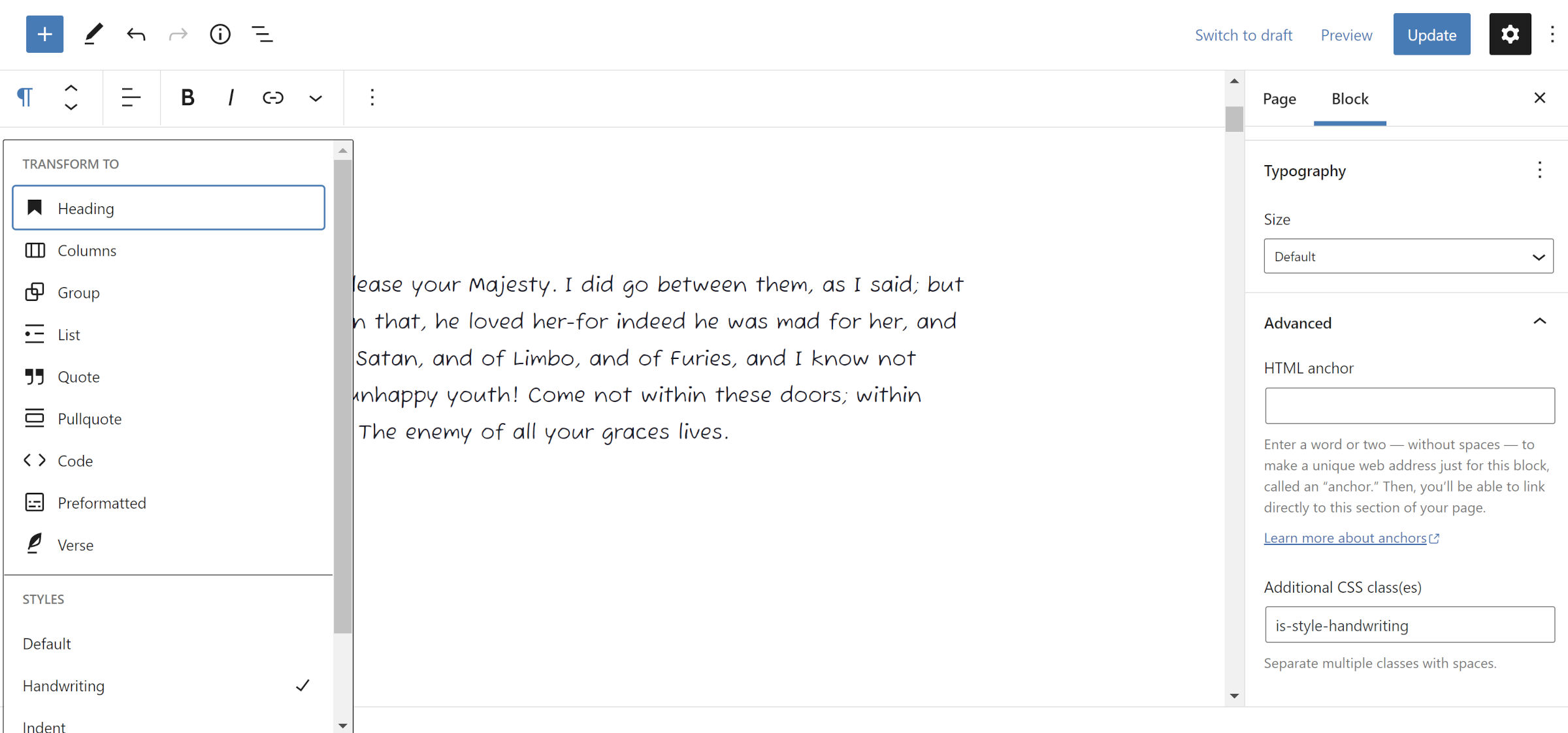
Block Transformations Maintain Classes

Gutenberg 12.6, released two weeks ago, saw much work on improving the block transforms, a feature that allows users to switch one block to another. One of the primary improvements in the previous update included maintaining font size and color options.
Version 12.7 adds custom CSS classes to the mix. This includes those users added manually and those added by the custom block styles mechanism.
The upside of maintaining custom block style classes is that the new block keeps the selected style if supported. The downside is that it becomes a junk class if not.
There are still some missing options that I would like to see maintained through transforming text-based blocks. In particular, keeping the text alignment the same would help with my workflow.
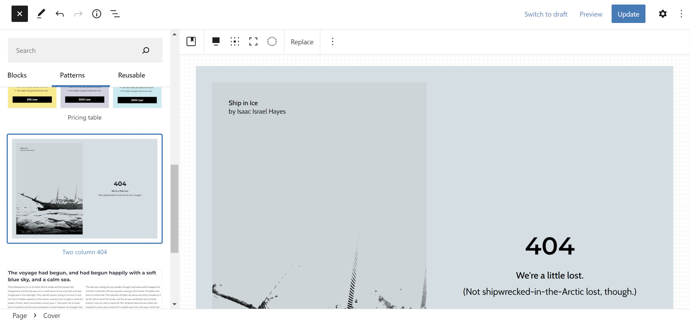
Themes Can Register Patterns from the Directory

Gutenberg 12.7 allows theme authors to load patterns from the WordPress.org pattern directory for their users. Those added will appear in their respective categories in the inserter.
Currently, there is no method for highlighting the selected patterns, and they will only appear based on the order they were registered. Unfortunately, featured patterns from WordPress.org appear higher on the list, even if they were not selected by the theme.
This is a solid first iteration. Getting it in now will allow theme authors to provide feedback and contributors to build upon the foundation.
The theme.json how-to guide includes new documentation for registering these patterns.
Alignment Wrappers Removed
It is no secret that I am a block fanboy. However, there has been one longstanding issue that has almost made me want to ditch the system. Actually, I quit developing a free block theme altogether last year in large part because of this problem.
Gutenberg 12.7 removes the extra <div> wrapper for wide and full-width blocks in the editor, at least for themes that support the layout feature. This wrapper element created a conflict between the back and front-end designs previously. In some cases, theme authors couldn’t style them consistently.
For example, if a theme author wanted to give extra spacing to a sibling block (one that follows another), it was impossible to target it in the editor with CSS. The additional wrapper meant they were no longer siblings in the document structure.
The more recent blockGap feature, introduced in WordPress 5.9, alleviated spacing-related issues to some degree. It was enough relief to tolerate the broken system, knowing that some designs were still impossible.
Today marks the start of a new world of possibilities for designers. This is one roadblock I am happy to see left behind. For the most part, I just want to revisit and implement several old ideas.
