Block themes continue to trickle into the WordPress theme directory. Classic design submissions still outpace them by margins that make it look like blocks are not even in the race yet. However, some designers seek to pioneer this still-foreign space.
Brian Gardner is not new to this. His latest theme, Avant-Garde, plays on the block system’s strengths without forcing it into something it is not capable of yet. It also does not hurt that Gardner leans into minimalism with his designs. The simplicity of the block system plays back into his strengths, too.
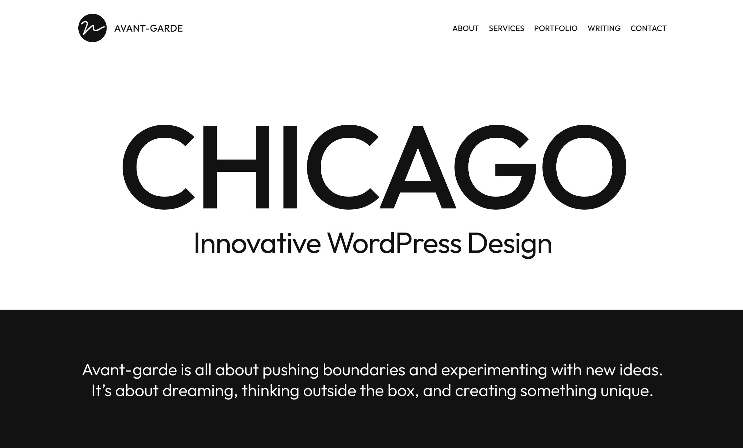
Reading through the code and browsing Avant-Garde’s design elements almost feels like taking a master-class in block theme development. Other than a typo where “Primary” is misspelled in the color palette (fixed in version 1.0.2), it seems to be doing everything right. It is vying for my coveted favorite theme of 2022 award, but we still have nearly a full 10 months left before the year is out. A lot can happen in that time. However, Avant-Garde raises the bar for those that follow.
There is one thing I am not fond of, so let us get this out of the way. The content area of single posts and pages is split into two columns. The title and meta are aligned left with the content to the right.
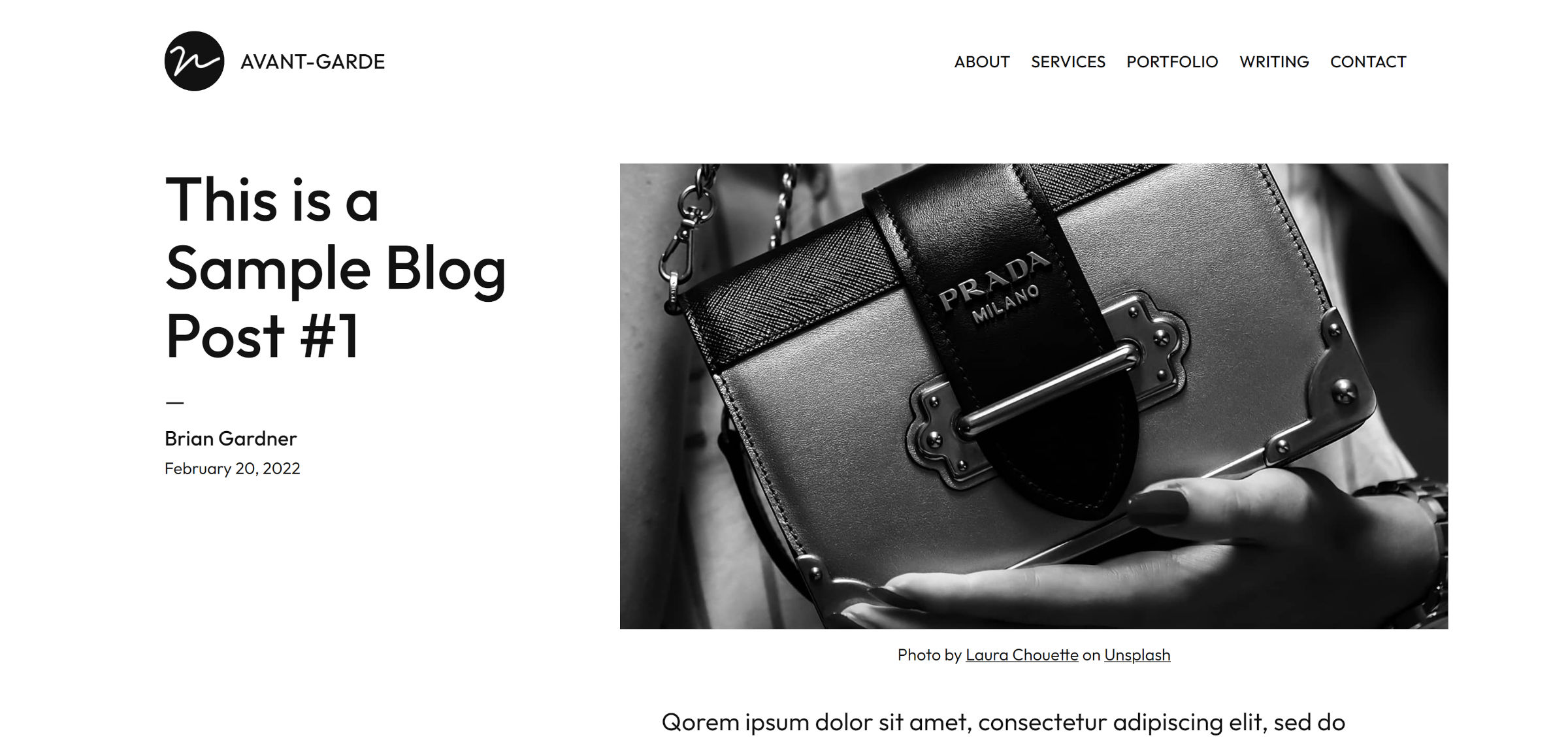
I like the willingness to break from the mold — it is titled Avant-Garde, after all. However, I never felt comfortable with the right-aligned content, even after tinkering with the theme for a week. Center or left-aligned is more natural.
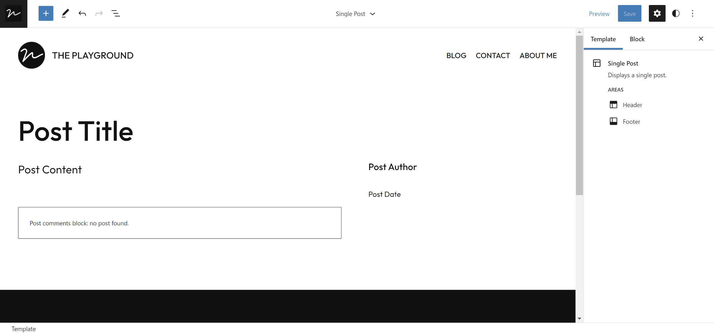
I know I will sound like a broken record, but this is why I enjoy using the site editor. If I find a theme that covers 80% of what I want, I can customize it. Even as a designer and developer, this was often more trouble than it was worth with classic themes. Every theme developer had their in-house design system to figure out. Blocks always follow the same standard. Moving a column here or putting the post title over there simply induces fewer headaches.
So, I made a couple of minor changes to single posts. No big deal. I erased my single dislike about the theme in mere moments via the site editor, and all was right with the world.
Where Avant-Garde gets things right is its patterns. It bundles 14 in total, and one is of the homepage design from the demo. Users do not have to piece it together; just insert and customize. This is the primary reason I have called for a separate full-page pattern feature in the past.
My favorite block pattern in the theme is for creating a portfolio:
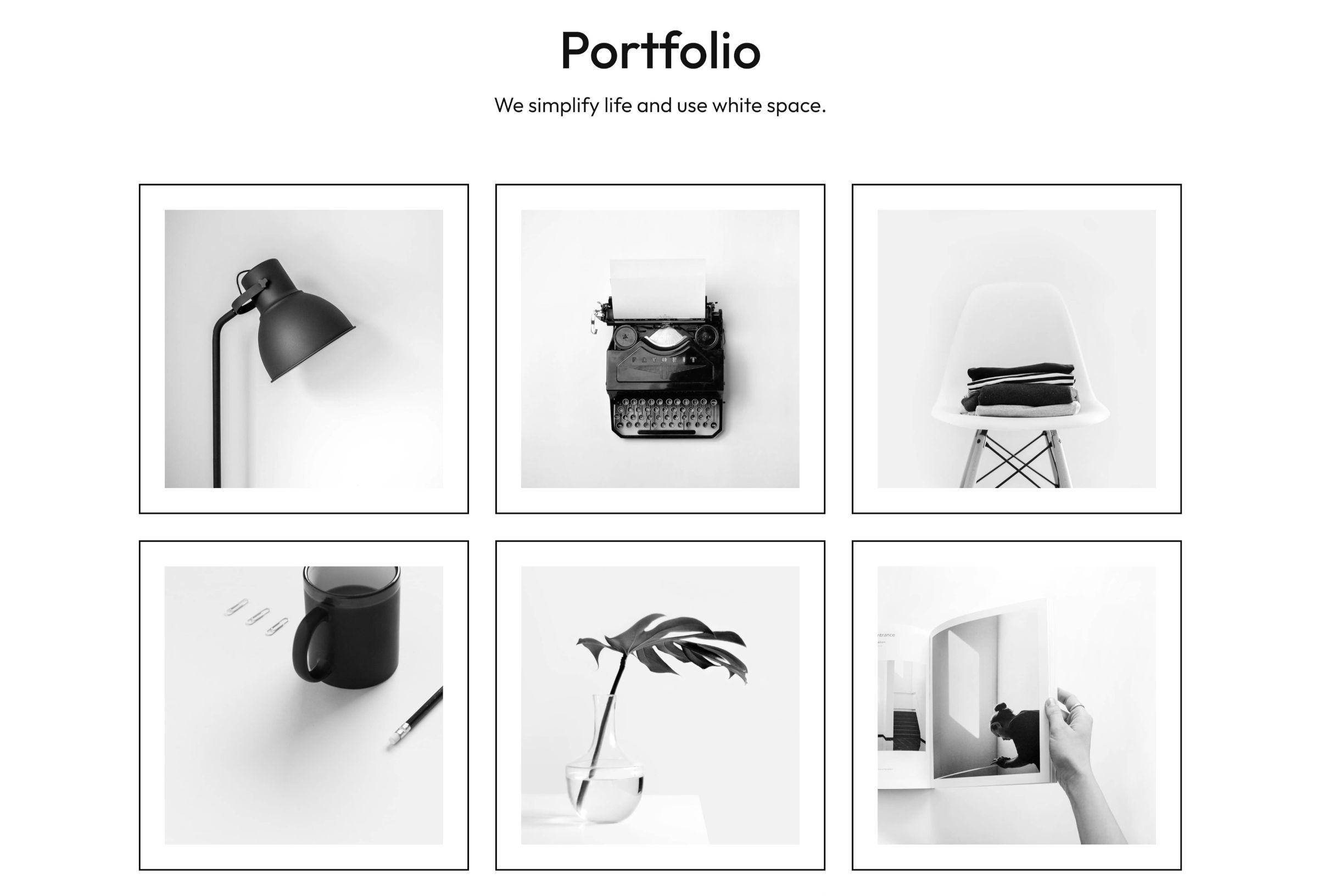
It is merely a Heading, Paragraph, and a three-by-three grid of Image blocks. It feels like something anyone should be capable of building, but the simple elegance combined with on-point spacing is sometimes more complex than it looks.
I am also warming up to the list-style Query pattern as someone who enjoys writing from time to time and does not want to worry about finding the perfect featured image:
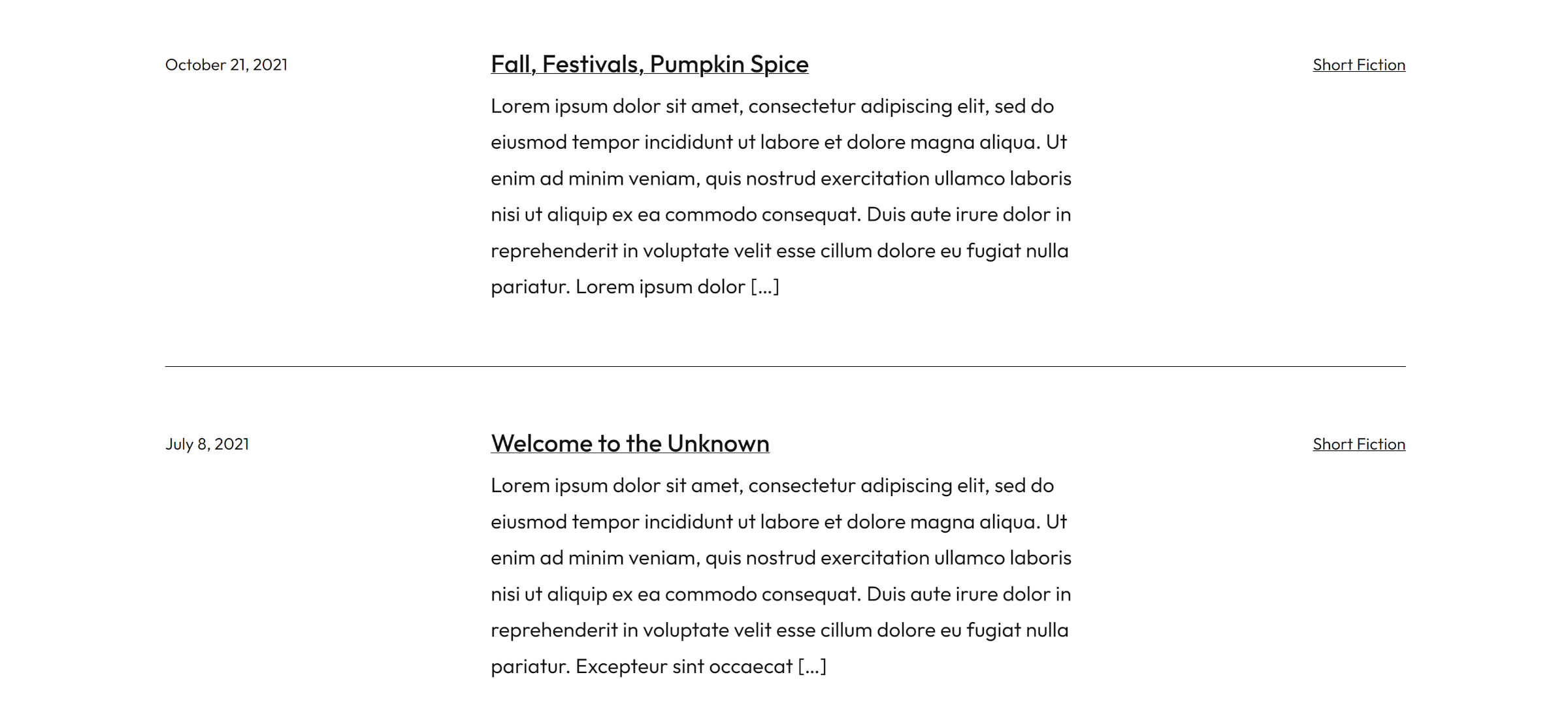
Avant-Garde includes a couple of alternative Query patterns for a grid and a one-column post list for those who prefer something different.
I rarely get to point to footer design as a positive attribute of themes. Far too often, this section is tacked on as if it had no right being there in the first place. However, Avant-Garde has not one but two footers that say, “Hey, do I have your attention?”
The first is the default, which includes the text “Design with courage.” in large lettering:

The alternative is a business-friendly, full-width lead-in for visitors to contact the site owner:
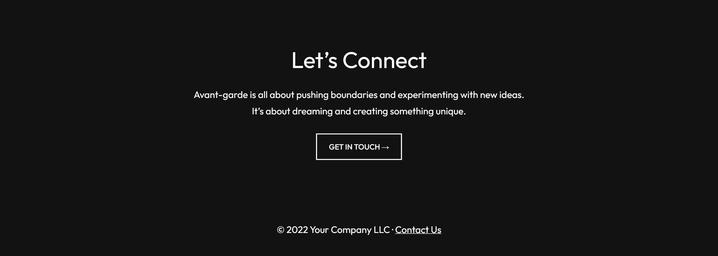
Avant-Garde has a short pattern for displaying copyright text and links for those who prefer a footer that seeks less attention.
The theme does not include many custom block styles. A few fill-type and outline Button options can be replaced when core supports borders on the block. A “no margin” style for Paragraphs handles a missing WordPress feature.
Its more unique options include shadow and full-height styles for the Group block. It also offers framed images, which are showcased in the portfolio pattern.
Overall, I want to see more themes like Avant-Garde land in the directory. The design does not push against every boundary — though it does experiment plenty. What makes it a solid choice is the attention to detail. The little things matter, such as selecting the right photos for the demo and not leaving the footer design as an afterthought.
