One of the features I liked about Automattic’s Archeo theme that I reviewed earlier this week was its split-screen single post header. I loved that an author was doing a little something different with the Featured Image block, giving users some variety.
The design was simple. It is a two-column section with an image on the right and the post title and date on the left.

It reminded me to dust off one of the untold numbers of “ideas” folders on my computer. I knew I had built something similar last year. I merely needed to find it.
I finally stumbled upon it after a bit of rummaging — I really need to learn how to name things to make them easier to find:
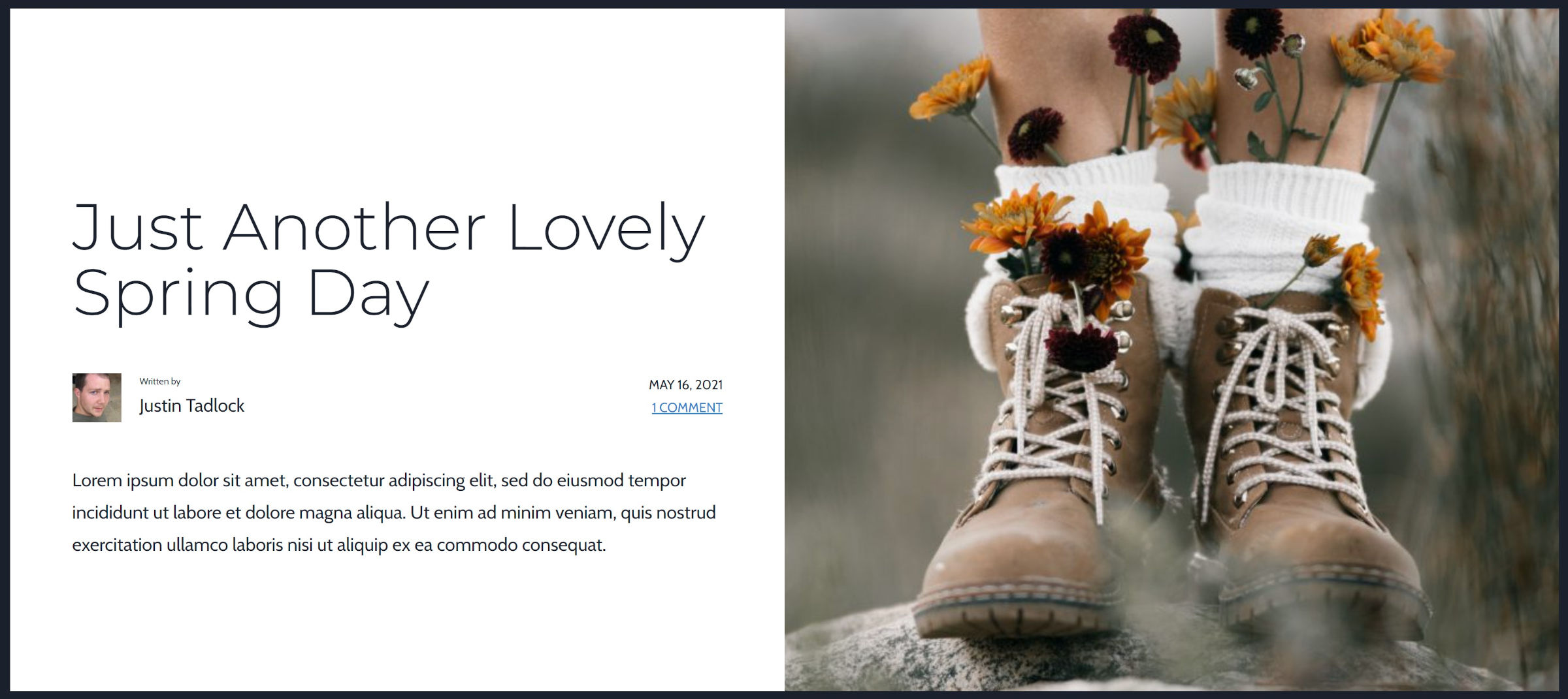
My approach to the problem was different, and I remember why it went to the scrap-heap. It used the Media & Text block instead of Columns. Then, and this is still the case, it is impossible to use the Featured Image inside of Media & Text.
The Columns block is a decent second choice, but it stacks differently on mobile views, with the first column always landing on top. The image takes precedence when using the Media & Text block, regardless of its horizontal position on desktop views.
There is an open ticket to use the post’s featured image within the Media & Text block. There is a similar ticket for using it within a Cover. Both would be solved by addressing an issue that would have farther reach by allowing generic blocks to utilize site or post metadata.
At least for now, we must work with the tools we have.
For this entry in the Building with Blocks series, I will walk you through modifying Twenty Twenty-Two’s single post template to create a similar layout.
It is hard for some people to visualize the result without the post data. As shown in the following screenshot, the editor has placeholders:
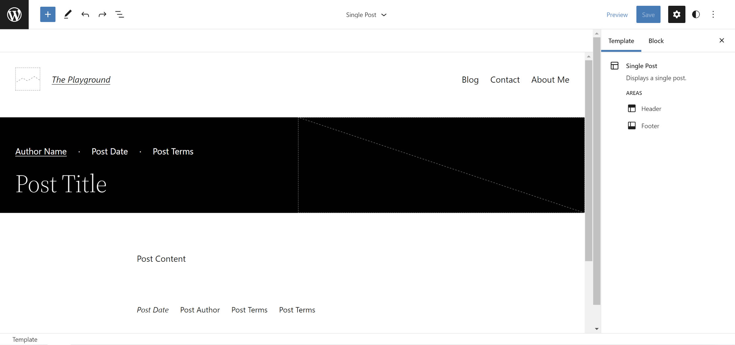
However, those placeholders will be transformed on the front end. How do we know that what we see there will translate correctly and turn out like the following?
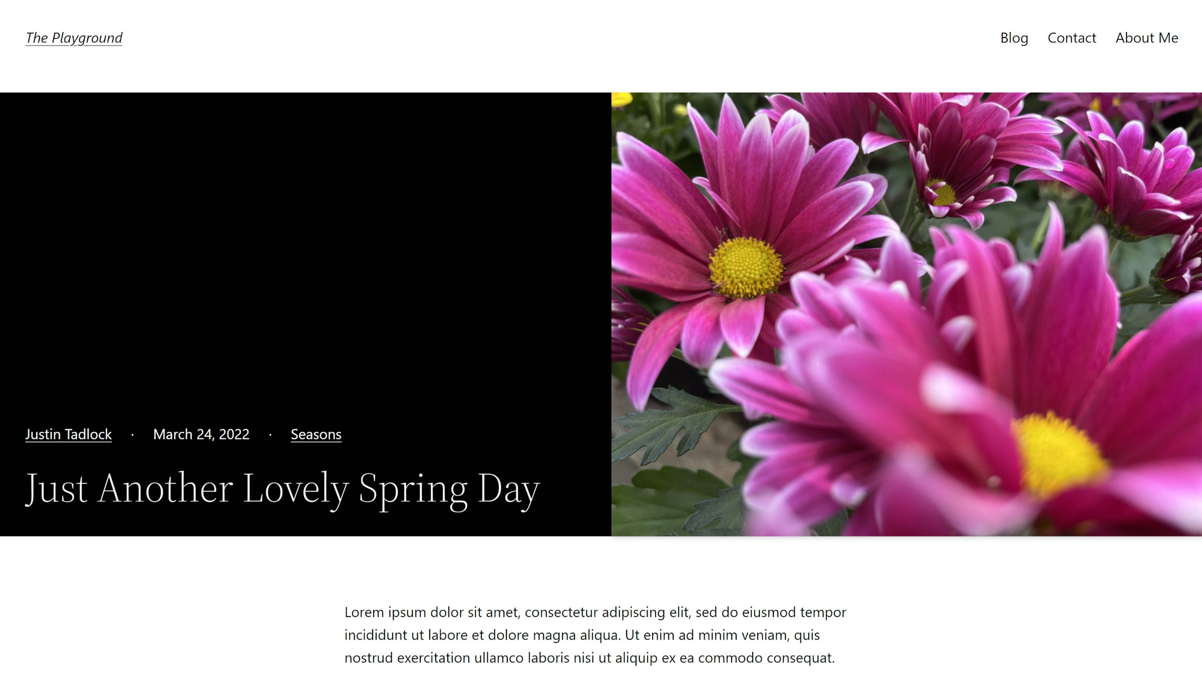
Even I struggle with this visualization at times. The placeholders used for Post* blocks do not offer me enough direct feedback, so I often refresh an example post on the front end as I build layouts like this. I wanted to note this in case it disorients or even throws anyone else off. It is OK to save and check your work on the front end as you go through this.
Side note: I would love to see a plugin that adds dummy post data instead of the default placeholders.
Step 1: Selecting the Single Post Template

To make this layout change for all single posts, you must go to the site editor via Appearance > Editor in the admin. Select the WordPress logo/icon in the top left corner to open the slide-out panel. From there, click on the Templates link. The next screen should display a list of editable templates. Select “Single Post.”
If you prefer to make this an optional template, you should build this from the template editor. The process is similar, but the UI does have some differences.
Step 2: Adjusting Site Header (Optional)
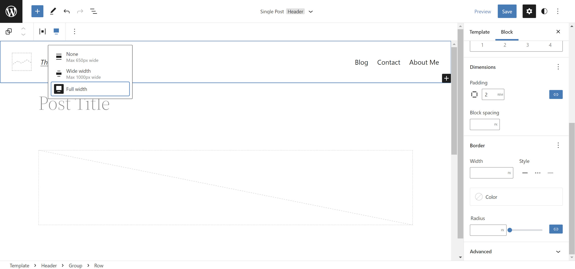
Twenty Twenty-Two’s header does not work well for the type of layout that we are building. It has a ton of padding at the bottom, and its width is limited. You will want to make a few changes for a more ideal design. Note that this will change the header across the entire site unless you save it as a separate template part. This step is optional, but the final result will look better.
In the Header area of the editor, select the Row block that holds the Site Title and Navigation blocks. From the toolbar, select the “Full width” alignment option. In the block sidebar panel on the right, set the “Padding” option to 2rem or a value of your preference.
Step 3: Creating Columns
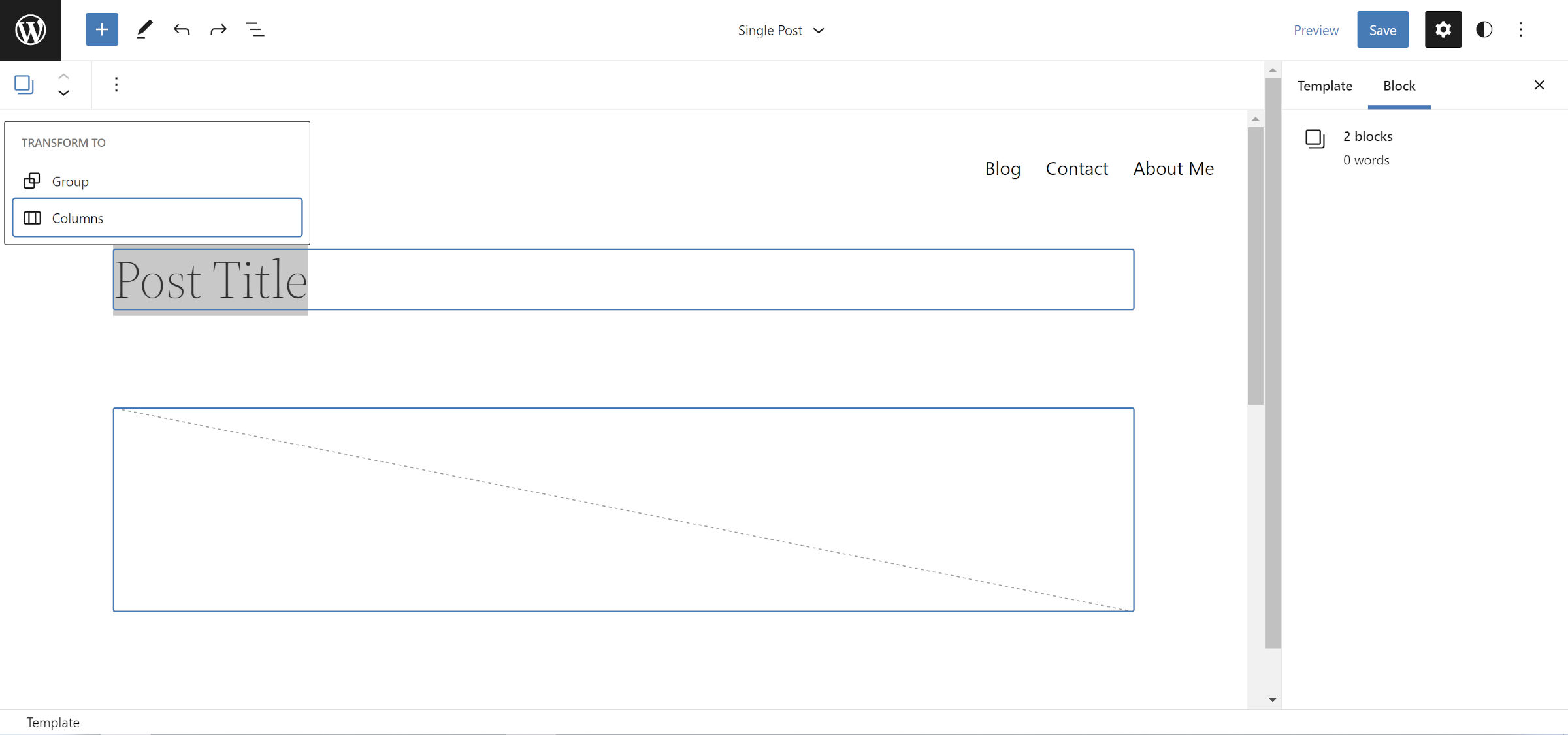
Because Twenty Twenty-Two already has the Post Title and Post Featured Image blocks grouped together, there is no need to start from scratch here. Select both with your mouse or keyboard, click the “Transform To” button in the toolbar, and choose the Columns option.
If working from a theme with a different layout, you can manually add a Columns block with a 50/50 setting and insert the Post Title and Post Featured Image blocks in the two columns.
Step 4: Designing Columns
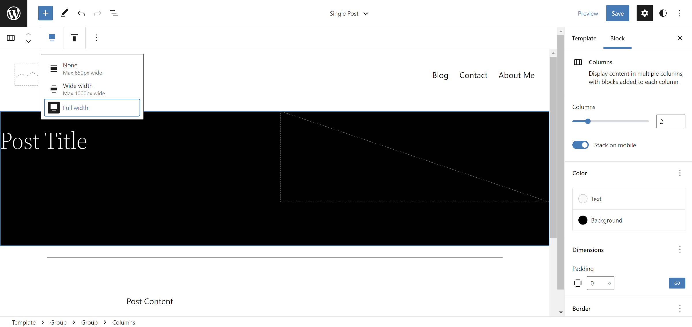
We have gotten some of the boring layout stuff out of the way. Now, you can start adding your own brand of artistry to this thing. I chose a black background and white text for the Columns block. However, feel free to add whatever colors you want. Maybe even try out the border options to mix it up.
Now, back to boring layout adjustments.
For this layout to work, there are two changes you should make to the Columns block. First, select the “Full width” alignment from the toolbar.
Then, change the “Padding” option in the block sidebar to 0. Zeroing this out allows the featured image to stretch to the edge. This is not a hard requirement if you want a little space around it.
Step 5: Title Group
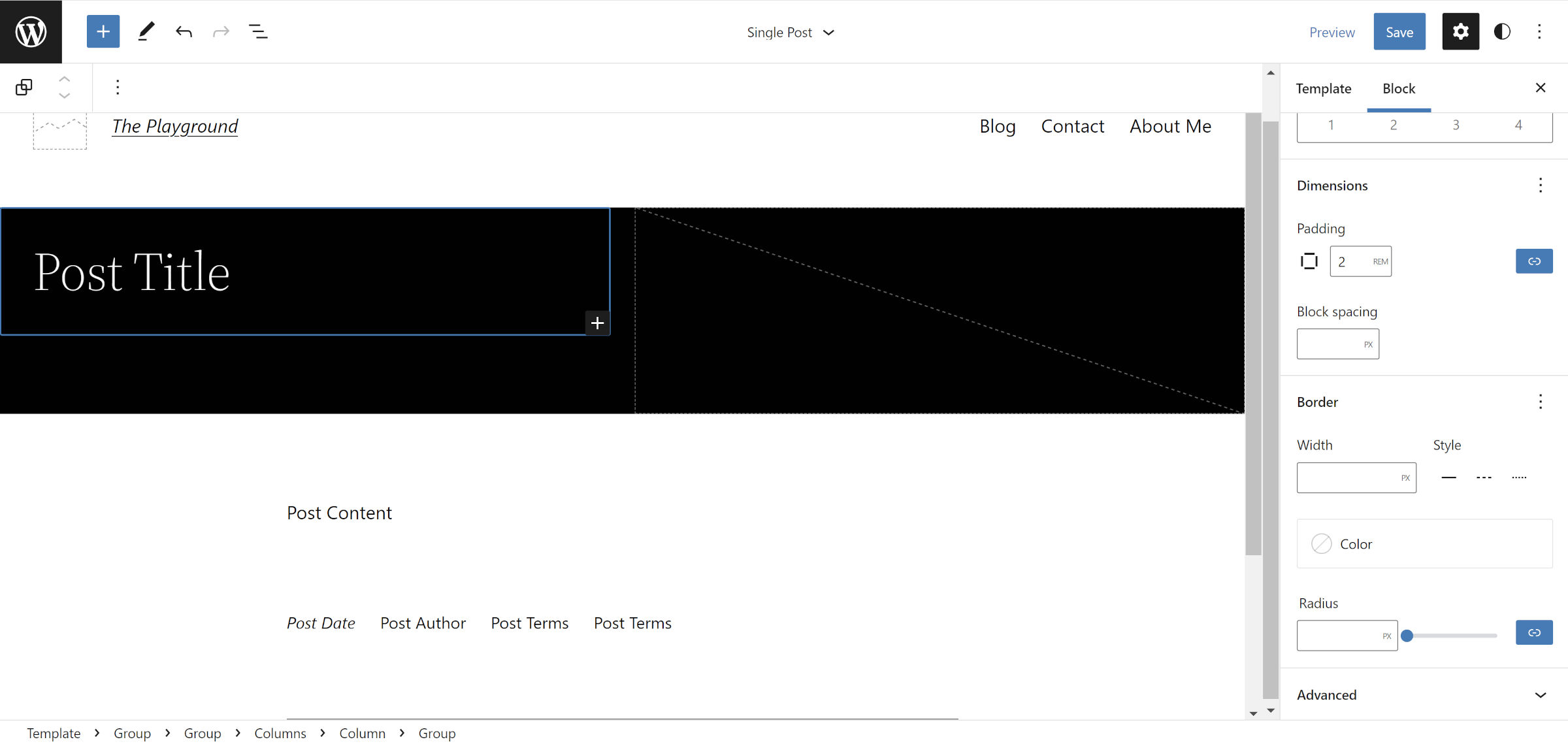
Because we zeroed out the padding in the previous step, the Post Title block will now butt against the side of the layout. Text always needs room to breathe in design, so we need to fix this problem we have created for ourselves.
There are two ways of going about this. The first is to simply add padding to the Column block that the Post Title is in. This should work fine, but WordPress does not handle this well (it does not use box-sizing: border-box for Column blocks). If you add padding here, it will make the left side wider than the right. Unfortunately, this is a little quirk that creates extra work.
The best option is to select the Post Title and transform it into a Group. Then, find the “Padding” control in the sidebar and change it to 2rem or your preferred value.
Some themes may correct the column-padding issue, so give the first option a shot if using something other than Twenty Twenty-Two.
Step 6: Adjusting Featured Image
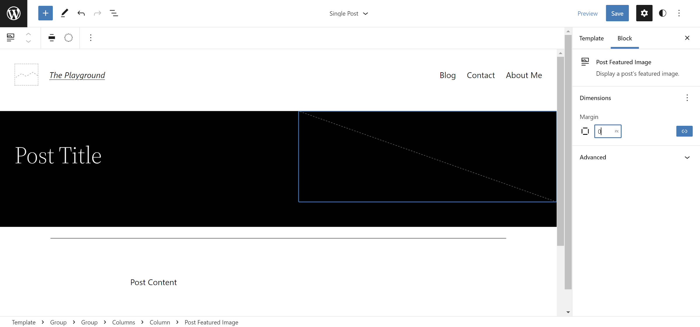
Neither WordPress nor Twenty Twenty-Two adds any default margin handling for the Post Featured Image block. The <figure> wrapping element will fall back to the browser’s default (browsers generally add some margin to the top and bottom).
To ensure that the image does not have extra spacing, select it in the editor, find the “Margin” setting in the sidebar, and set it to 0.
Step 7: Have Fun
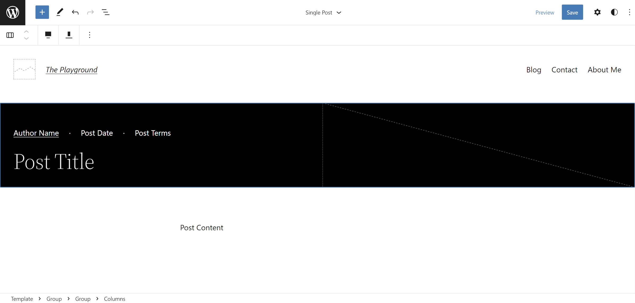
The foundation of the layout is in place now. Adjusting paddings, margins, and similar settings is the giant mountain you must conquer to do some of the really cool stuff that is possible. I do not want to limit folks with the rest of the design and would love for everyone to put their own spin on it.
I changed the vertical alignment on the Columns block to the “Align bottom” setting for my layout. Above the Post Title, I added a Row with the Post Author Name, Post Date, and Post Categories blocks. I also removed the Separator that Twenty Twenty-Two adds before the content.
Please share customizations you made in the comments if you followed along with this tutorial.
