Gutenberg 13.0 landed earlier today in the WordPress plugin directory. It is one of the heftier releases lately, containing the final features that should ship with WordPress 6.0.
The more prominent features include multi-block partial text selection, Cover blocks with featured images, a Stack variation for Groups, and pattern-based page creation. And there is much more to dig through.
I have covered many of the big-ticket items in this post. However, to understand the full scale of the release, check out the tickets linked in the Gutenberg 13.0 release announcement.
Other notable highlights include spacing support for the Column block, web fonts optimization, duotones for Site Logo and Post Featured Image placeholders, and vertical alignments for blocks with flex controls.
Partial Text Selection
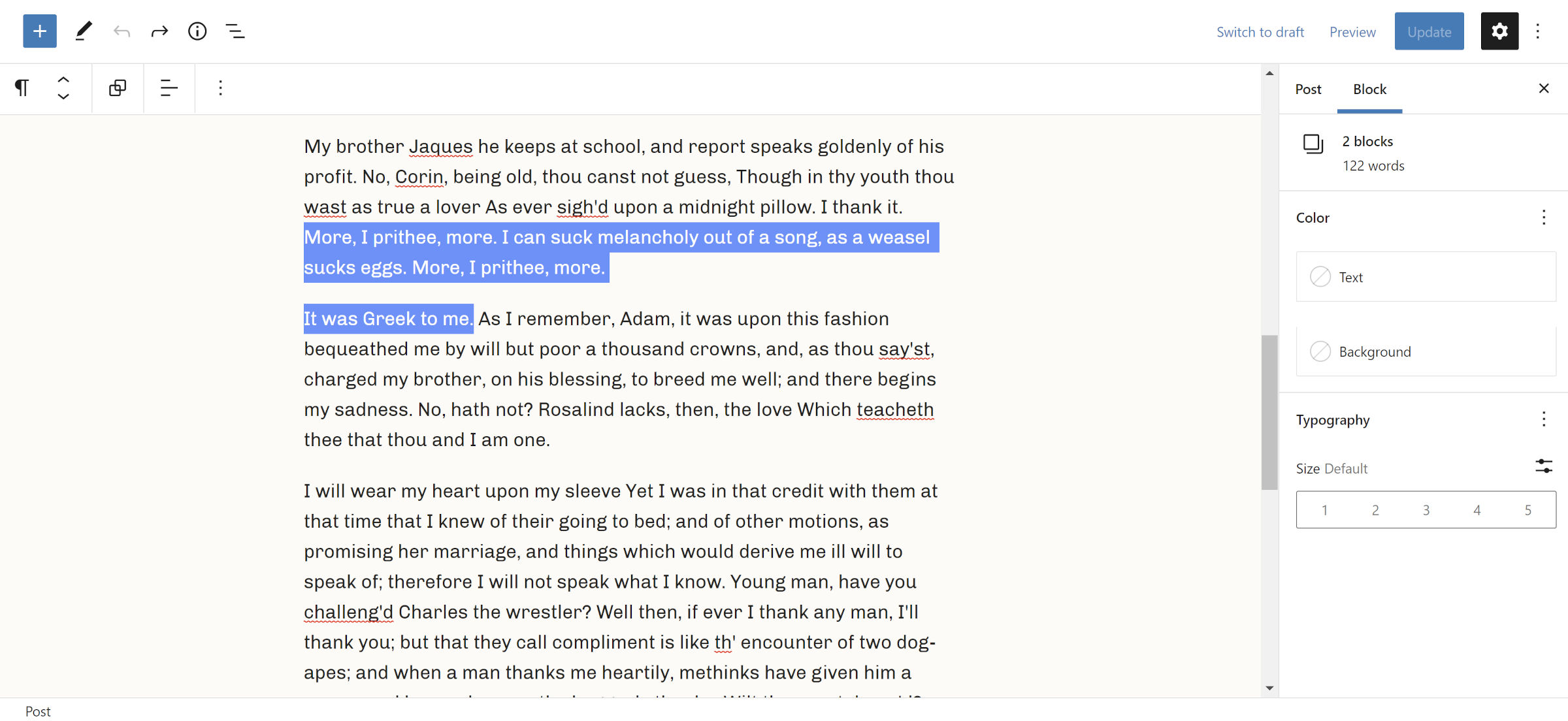
Users can now select text across multiple Rich Text blocks, such as Paragraph, Heading, List, and Quote. In the past, highlighting partial text would automatically create a multi-block selection, which is typically not desirable.
The change supports hitting the Enter key to delete selected text and create a new block, Backspace for removing and backward merging, and Del for removing and forward merging. Typing will replace the selected text with the new input.
I covered this new feature in an in-depth post last month.
Stack and Group Variations
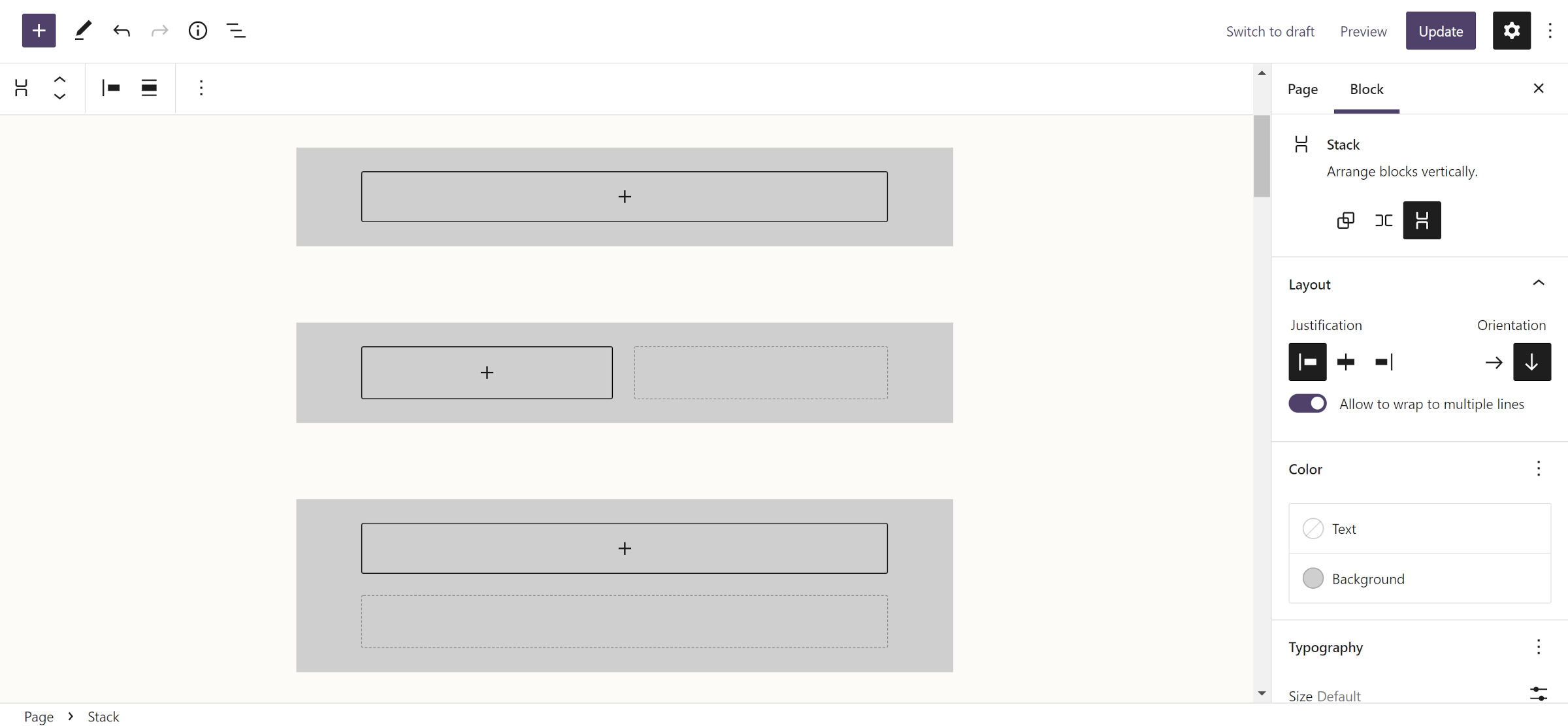
Gutenberg 13.0 introduces a new Stack variation for the Group block. The change creates three variations altogether, counting the default output and Row.
At first glance, Stack and the default Group block may not seem much different. After all, they are both containers for vertically-stacked content. However, the Stack variation is technically a flexbox rather than a flow layout. I am unsure how this will play out for end-users who may not immediately understand the distinction. However, this should be a welcome tool for building more advanced layouts in themes.
The Stack variation entirely encapsulates any nested blocks, disabling their alignment controls (e.g., align right, align wide, etc.). However, the Stack itself has justification controls for aligning content left, right, and center.
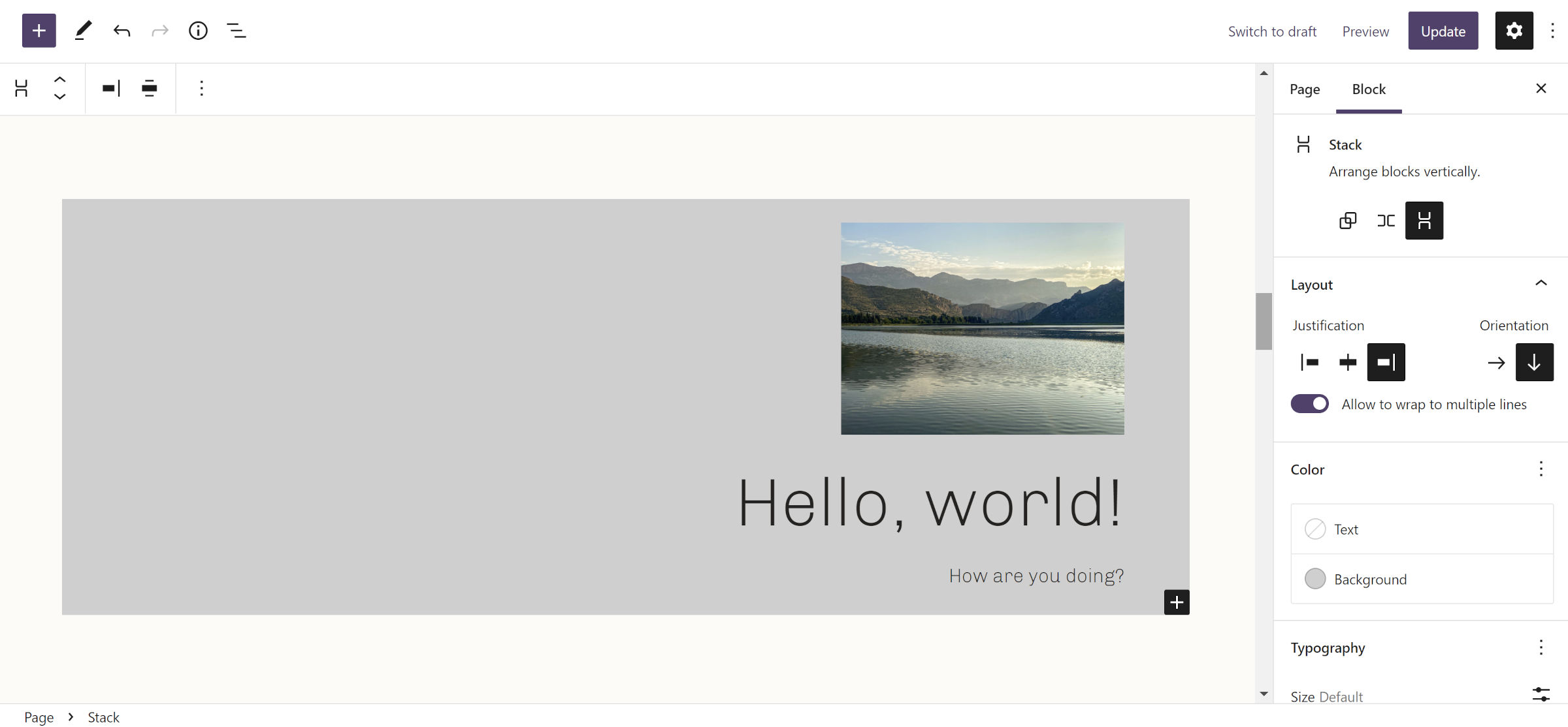
One setting that may seem unclear is the control labeled “Allow to wrap to multiple lines.” There is at least one potential use case for that. It is possible for a stacked layout to also be horizontal if there is a height set. However, no such height control is currently shown in the UI.
The Row variation is also much improved when first inserting it. There is now a clear indicator that newly inserted blocks are laid out horizontally.
Alongside partial text selection, users can quickly put the selected blocks into a Group, Row, or Stack via the toolbar.
Cover Block + Featured Image

There is now a new “Use featured image” toggle in the toolbar when inserting a Cover into the editor. Switching it on ties the image data to the block.
Sometimes it is hard to pick favorites when new features are landing as fast as one can test them. However, using featured images within Cover blocks is easily one of the things I am most excited about. I already have plenty of ideas rolling around in my head, a couple of which I shared when covering this feature last week.
I am eager to see what theme authors and users do with it. This opens up a whole new world of layout possibilities for block themes.
Global Style Variations
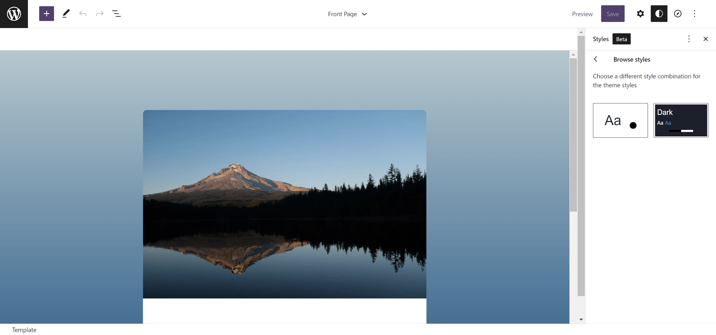
Work continues on fleshing out the global style variations feature. First launched with Gutenberg 12.5, it allows theme authors to ship multiple /styles/*.json files that users can switch between. Essentially, it is a “skins” selector specific to the theme.
The update supports a new title field in the JSON files for a human-friendly label. Otherwise, it falls back to the filename without the extension.
When a user hovers a style card in the UI, it flips it to reveal the title and more of the colors available for the variation. Unfortunately, the flipped version of the box pulls the first four colors defined by the theme. This can sometimes result in a nice-and-clean showcase of the variation. It can also be an eyesore that provides no useful information to the user about the style itself.
Theme authors can control this by maneuvering their color definitions into place in their *.json files. But, it is a hack, at best. Because this methodology is not official, there is no guarantee that it will work in the future. Plus, it is a fast way to create disorganized code for those who like to keep things tidy.
New Border Control Components
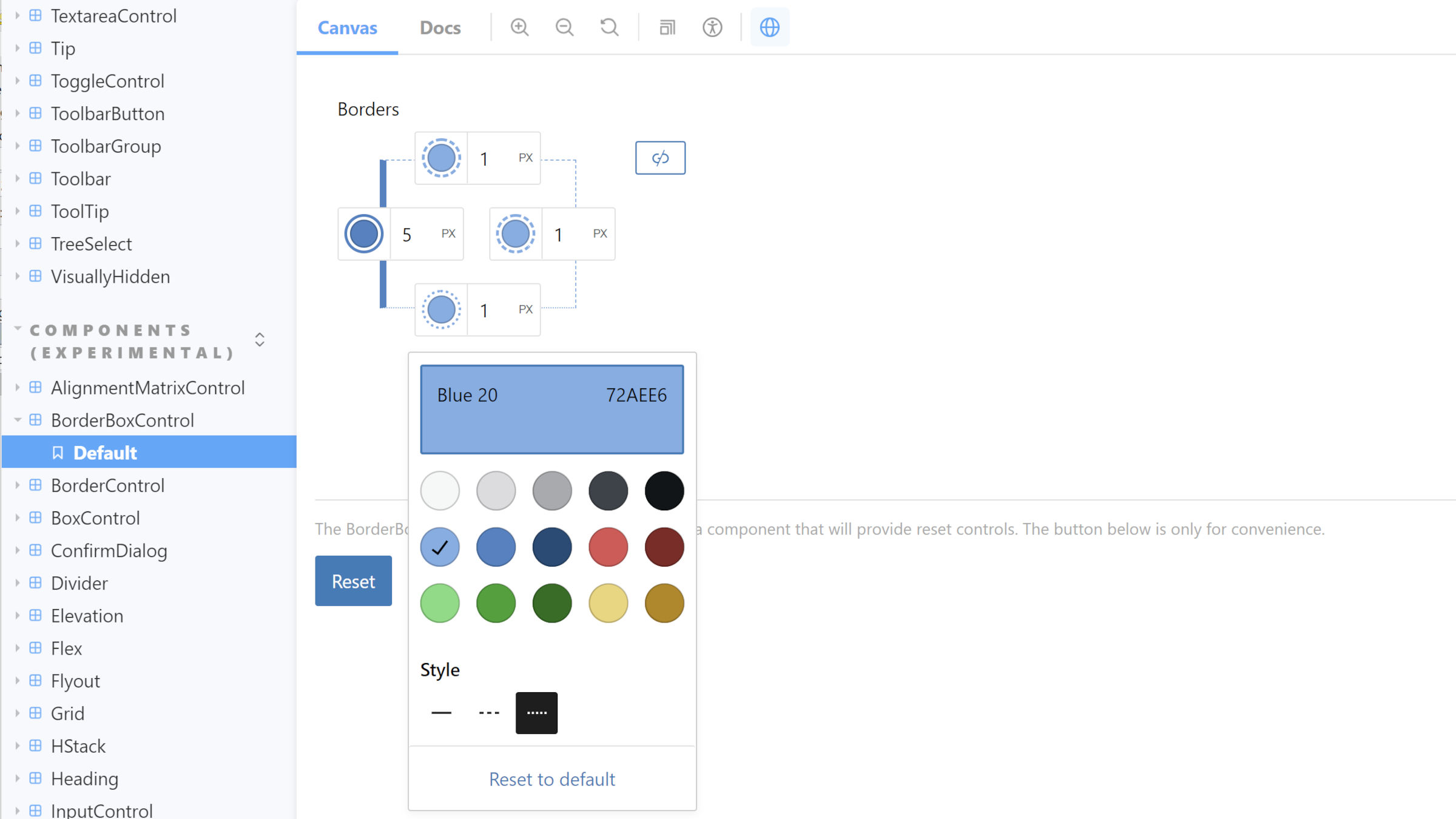
Gutenberg 13.0 introduced new BorderControl and BorderBoxControl components. This is an overhaul of the previous border design tool implementation. It will eventually allow users to define the border width, style, and color of all four sides for blocks that opt into border support. Plus, theme authors will have the same level of fine-grain control via theme.json.
While the new components are available now, block support is not slated until Gutenberg 13.1. Technically, it is already merged into the development version of the plugin.
Create New Pages With Patterns
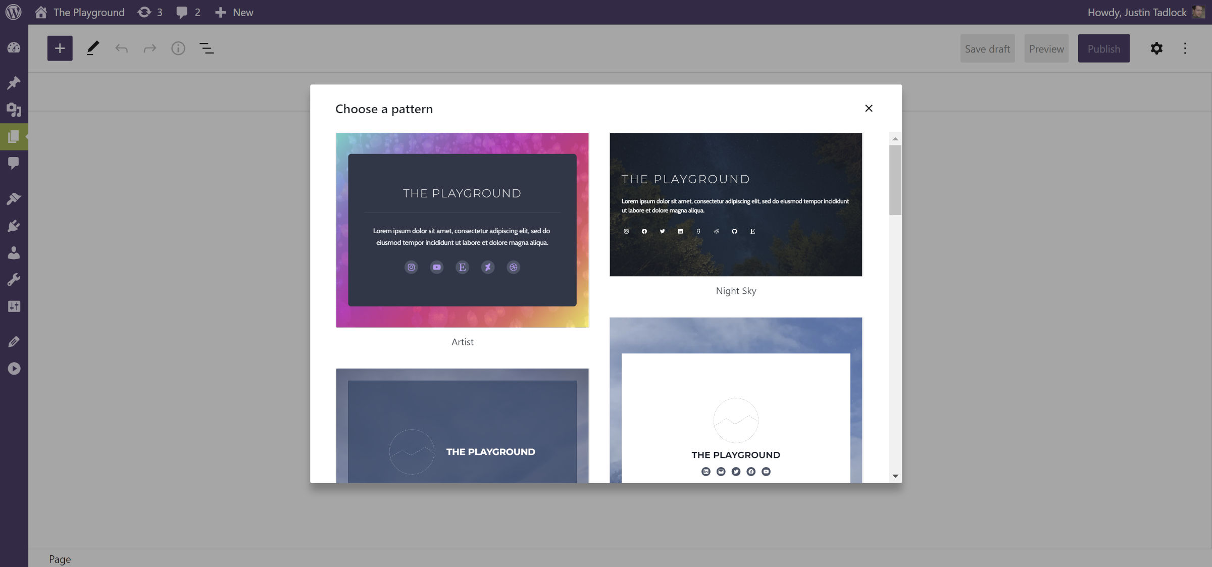
Creating complex page layouts has gotten simpler. When adding a new page, a modal pops up over the screen. It allows users to select from a list of “content” patterns to insert into the page. This can be as simple as a few blocks for creating an about/profile layout. Or, it can be a full-blown front-page design. From that point, users can customize the parts specific to their sites.
This feature hinges on theme authors registering custom patterns for the core/post-content block type. Otherwise, users will only see the default editor. Themers should start experimenting with how they can showcase this new feature as it lands alongside WordPress 6.0 next month.
Comments Query Loop Replaces Post Comments Block
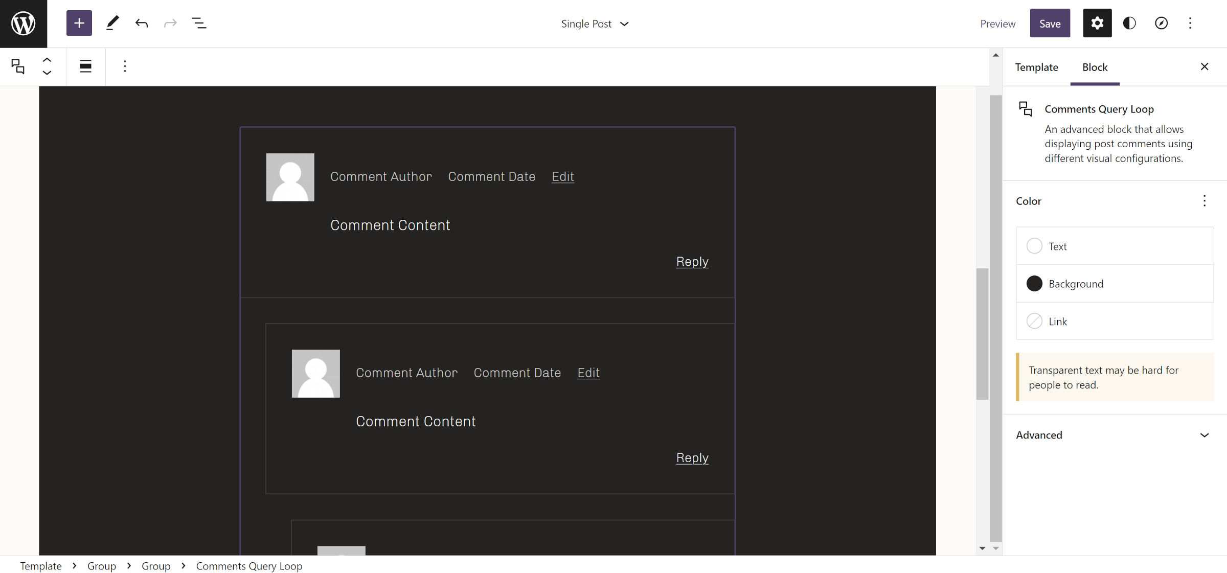
The existing Post Comments block has been deprecated in favor of the newer Comments Query Loop and associated blocks. It will still work, as with other deprecated blocks. However, it will not appear in the inserter.
Comments Query Loop offers a much better designer and user experience. However, it does not yet have feature parity with the solution it is replacing, at least in Gutenberg 13.0.
Some of the issues I noted in my earlier coverage, such as the missing comment ID and classes, have already been addressed in trunk. However, there is not yet a solution for the “X replies to Post” title. I expect this and the remaining wrinkles to be ironed out in the coming weeks. However, theme authors who build on the bleeding edge should be mindful of existing issues.
