I have been raving about the power of patterns for what feels like forever at this point. And, just when I start wondering what this feature will look like next, someone surprises me with a new idea. Often that person is Munir Kamal.
He mentioned that he would share a “little” page-generation app that ties into the WordPress patterns library earlier this week. Today, he publicly announced that it was live on Gutenberg Hub.
The app is still at a concept stage, but the current online version works well. Essentially, it is an interface that allows users to piece together patterns to build entire pages. Unlike the block editor itself, users cannot directly edit the content. Instead, they can mix and match patterns, copy the block code, and paste it into the editor on their WordPress install.
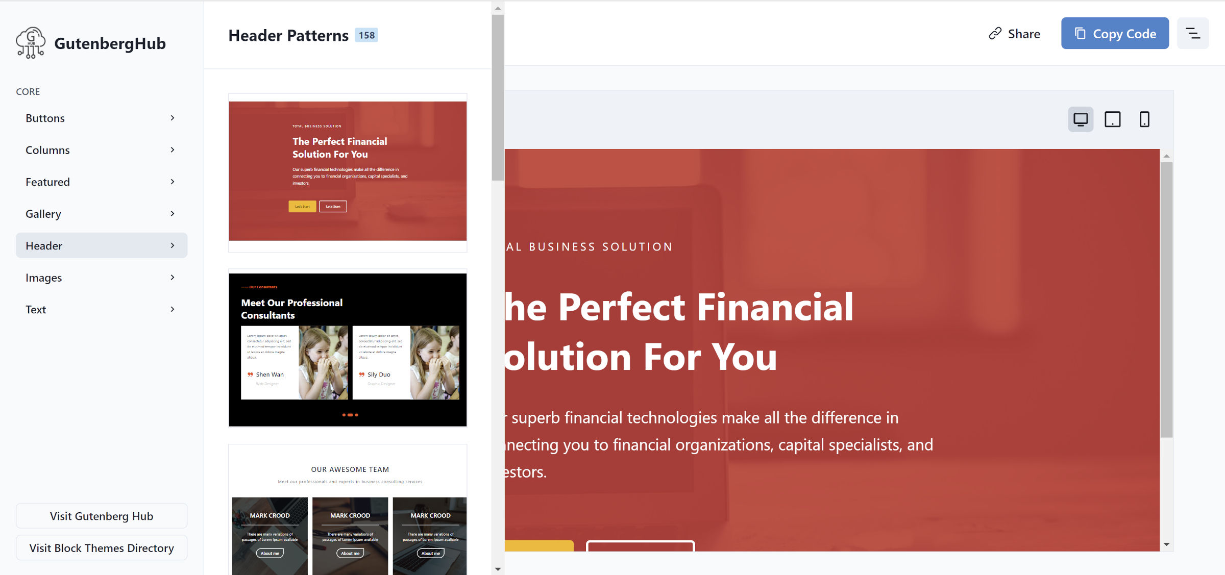
When first visiting the Builder sub-site on Gutenberg Hub, users will see an empty canvas with a list of core pattern categories in the left sidebar panel. Inserting a new pattern into the page is as simple as selecting a category, searching for a preferred design, and clicking on it:

Users do not need to stop after inserting a single pattern. The idea behind this project is to build an entire webpage from multiple patterns. Then, grab the resulting block code via the “Copy Code” button and paste it into the editor in WordPress. It is a convenient way to play around and try out new ideas.
By default, the patterns are presented for a desktop view. However, users can check how the design responds to tablet and mobile devices.
The Builder pulls all of its current patterns directly from the WordPress Pattern Directory. The API is public and allows others to build applications on top of it.
While Kamal made no indication that he would showcase patterns from outside the official directory, it is probably not out of the question. The Builder UI has a section labeled “Core” in the sidebar. I am merely speculating, but I assume he plans to extend this in the future.
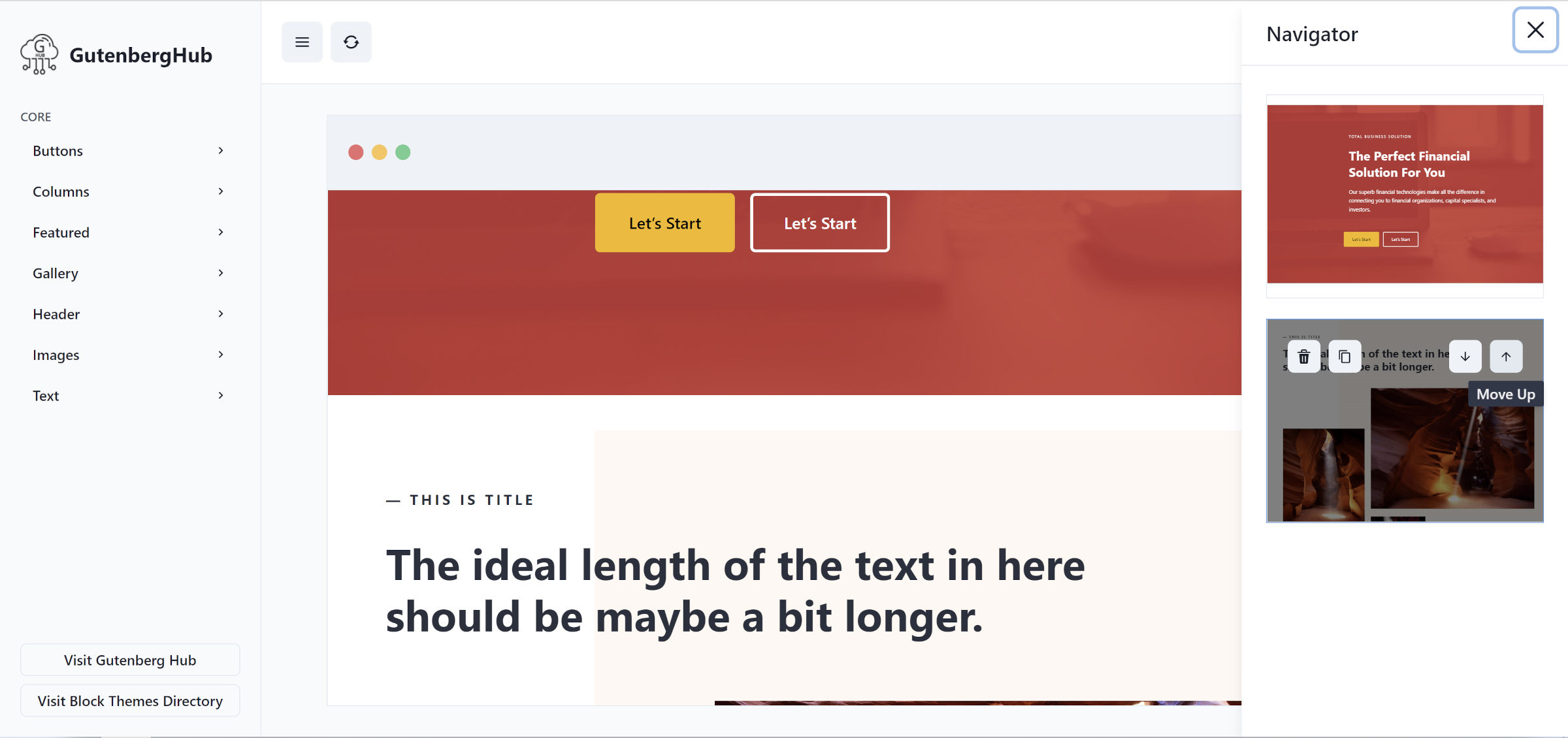
A menu button sits in the top right corner of the Builder interface. This opens the Navigator interface. It allows visitors to customize the page layout:

There are options for moving entire patterns up or down, trashing them, or duplicating them. Based on my experience thus far, this was an easier way to make adjustments than when attempting to select large groups of blocks in the WordPress editor.
The only feature I would request is a “back” button. It is easy enough to open the navigator and trash an inserted pattern, but it would be quicker to undo that action via a dedicated button in the toolbar area.
Gutenberg Hub’s Builder does not allow visitors to customize the content of the patterns. Its purpose leans more toward layout creation. The customization happens when users paste it all back into their own WordPress editor.
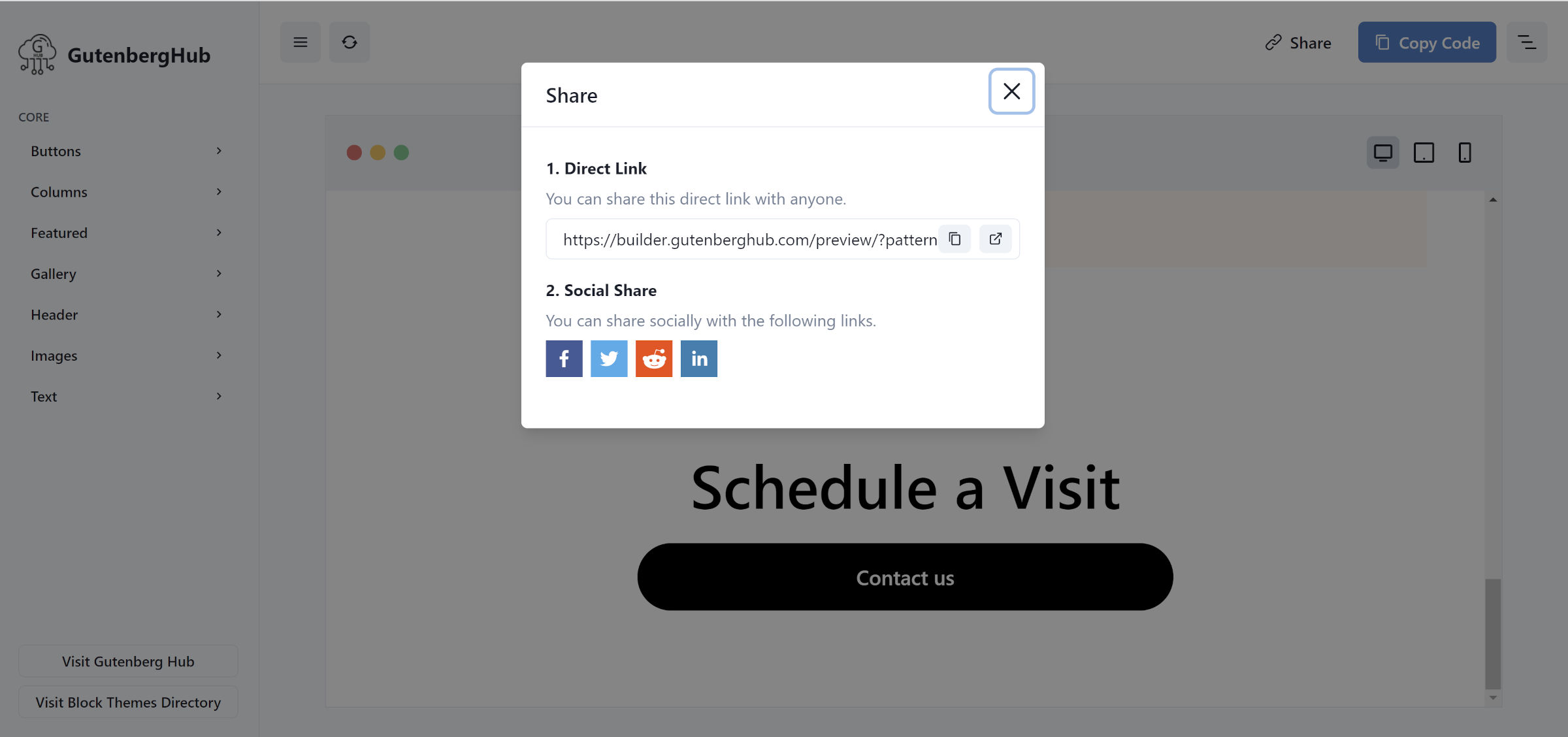
Perhaps my favorite feature of the app is that users can share their creations with others. The Builder creates a custom URL for each variation and makes it easy to share over social media:

The concept of sharing is almost built into WordPress’s block system. Because everything is built upon a well-rounded set of standards, the tools that others build on top of it make it easy to continue paying it forward.
While this project is still in the concept stage, I am eager to see where Kamal takes it in the future. He also shared a short YouTube clip of the plugin in action.
