And another theme shop hops on the block bandwagon. Catch Themes’ first block-based theme, Catch FSE, landed on WordPress.org over the weekend.
The company is one of the most prolific authors in the official WordPress theme directory, touting a total of 109 themes. There are only a few others with such an impressive body of work, at least in sheer numbers. Averaging over 10 new releases each year for the last decade is no small feat, and that just accounts for the company’s free themes.
At a time when WordPress is still in a transitioning phase between classic, PHP-based themes and those built entirely from blocks, the community needs leaders in the space pushing the project forward.
With WordPress 6.0’s slew of features, I expect we will see more and more authors join the ride.
When reviewing new themes, I typically install them a few days ahead of time and test them off and on. Then, I decide if they are worth sharing with the Tavern audience. However, in this case, I am going in blind. Well, not entirely blind. I am familiar enough with some of Catch Themes’ past work to know the company has produced some well-designed projects. Plus, I had quickly peeked at the demo.
My immediate reaction after installing and activating Catch FSE was disappointment. The homepage did not look like the theme’s screenshot or what was shown in the demo. Instead of the business-friendly layout I expected, I gazed upon a standard blog post listing.
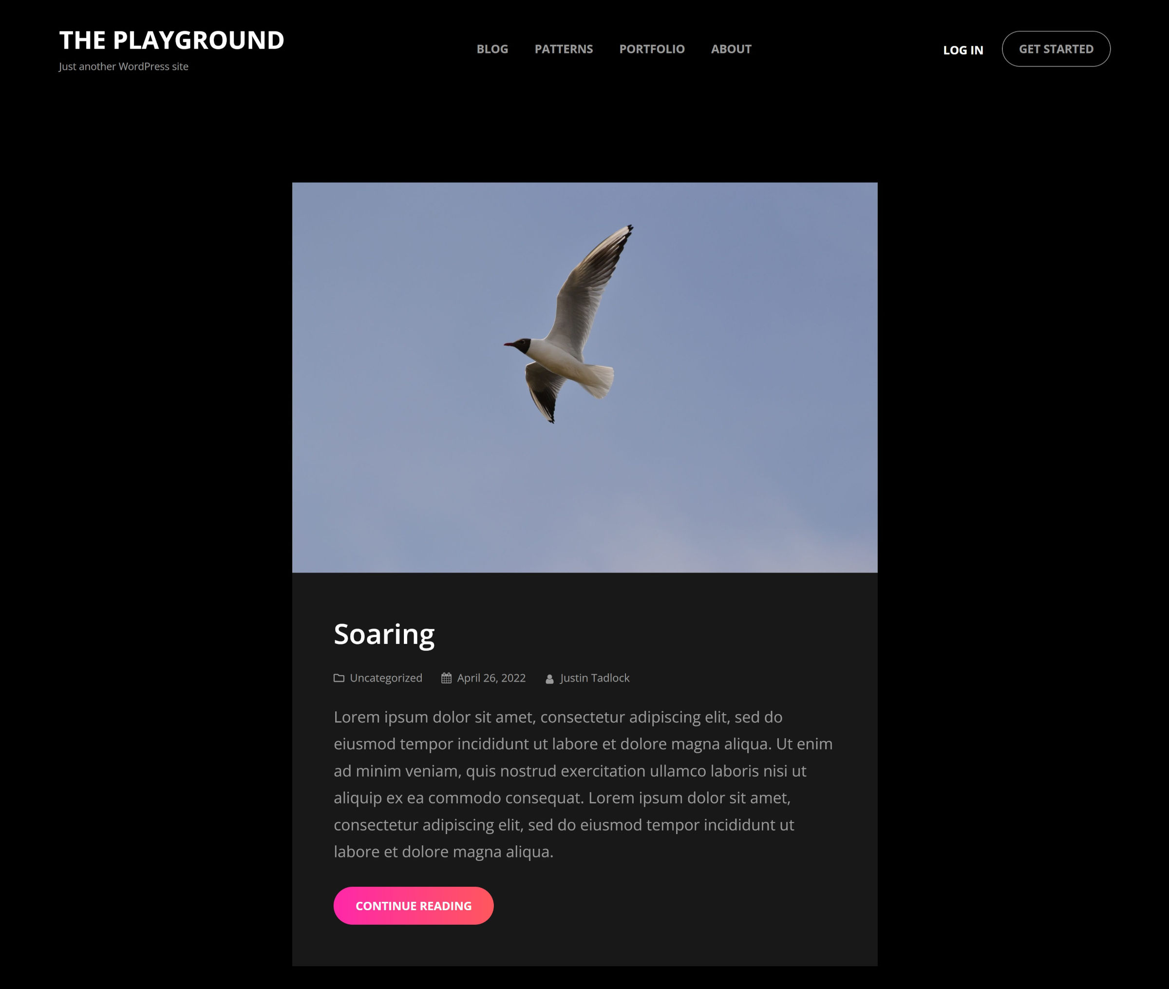
This should not be happening in the block themes era.
Theme authors are not entirely at fault for this problem. Those who have submitted their designs to WordPress.org have been conditioned over the years to do this. This was a necessity in the classic theme era because users did not have the same control as they do now over their homepages. The site editor gives them that freedom, and it also breaks the shackles that have been holding theme authors back for years.
Now is the time to be bold. Now is the time for theme authors to put their signature on their work, showcasing their design skills with those custom homepages they have always wanted to provide out of the box. Now is the time to break free of those draconian guidelines from an era that block-based themes are leaving behind.
Catch Themes, if you are reading this, I want to see a front-page.html template in version 2.0 that outputs the following:
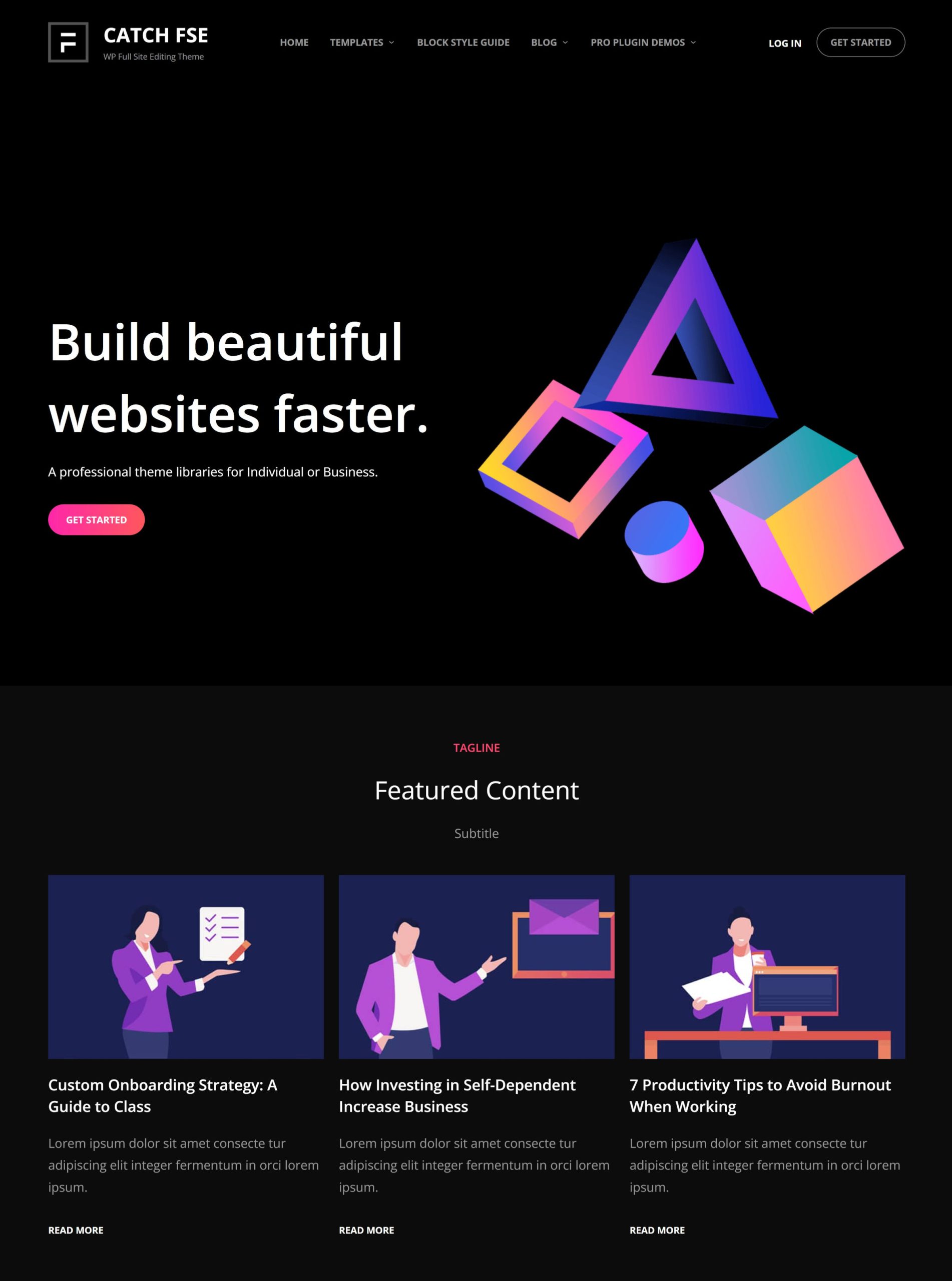
Give users an immediate solution instead of forcing them to create a new page, select a template, and move into the template editor to customize it.
A blog post listing is a perfectly acceptable default for a theme, and Catch FSE’s works well enough—those gradient “read more” buttons are also sweet. However, if the screenshot and demo showcase a custom homepage, that is what I expect to see upon activation. And, based on my somewhat educated guess, it is also what the average user will expect.
After tinkering around with the theme for a while longer, I realized how well-designed it was. The typography made for an enjoyable reading experience. Each template was well laid out. The footer “widgets” even felt right. Catch FSE was suddenly making a beeline toward the top of my favorite themes list this year.
And, I must take another moment to appreciate the gradient used for buttons in the theme, as shown in this screenshot of the About Us pattern:
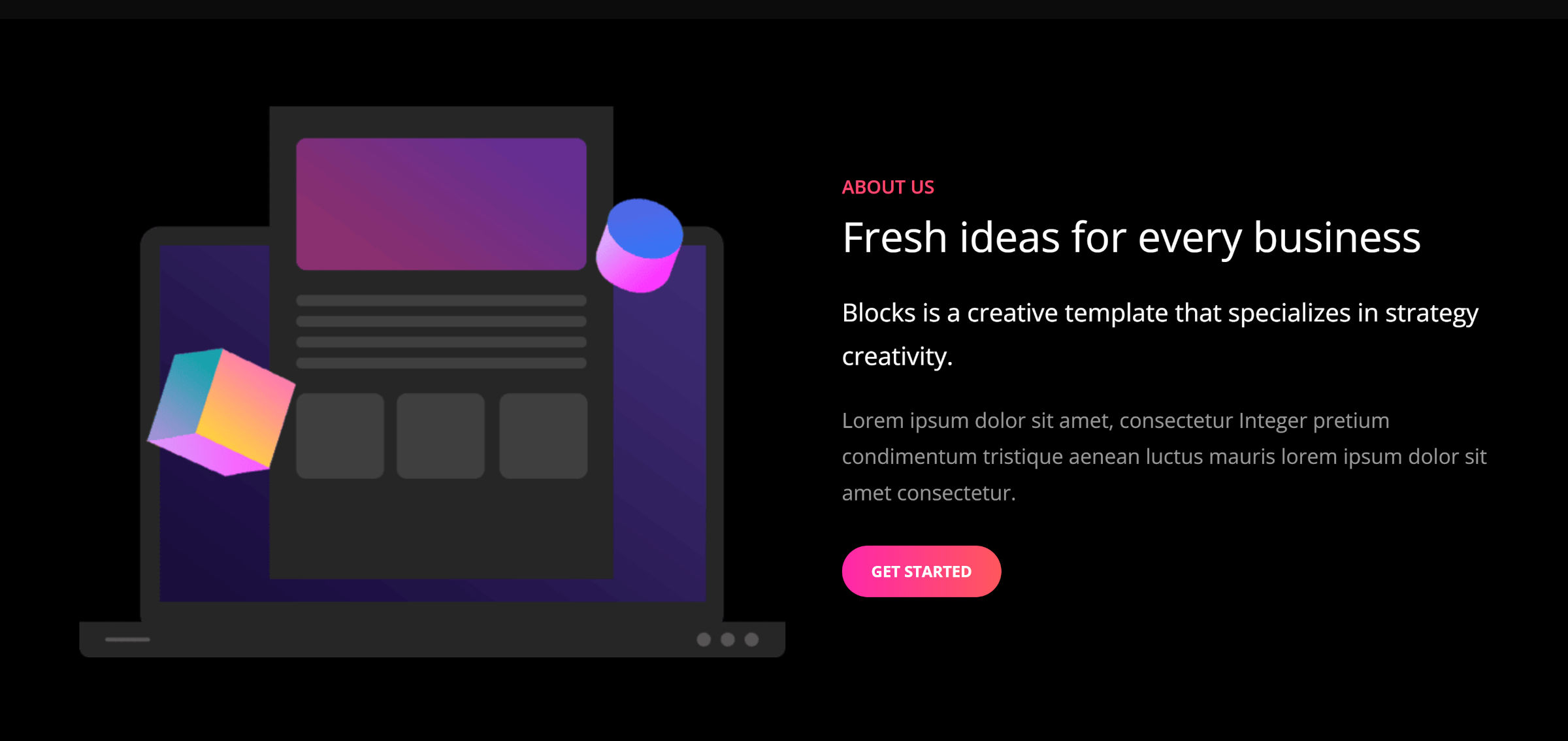
Those who have followed me long enough know that I often dislike dark designs. Automattic’s Livro made me rethink my position earlier this year. With Catch FSE, I am moving beyond merely tolerating such designs to enjoying them. Well, some of them. Let’s not get crazy.
What Catch FSE does as well as any theme is offer a well-designed set of block patterns. In total, it ships 15 that users can pick and choose from.
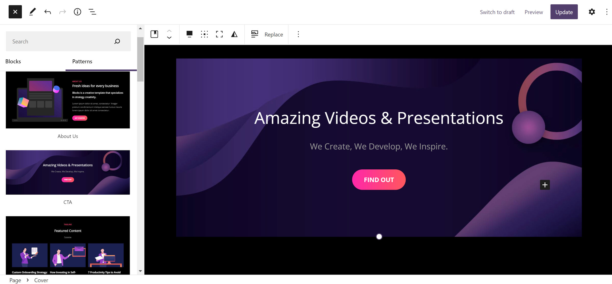
From a development perspective, other theme authors should take notes. Following the DRY principle, Catch FSE routinely reuses its own patterns in its templates and parts.
The theme registers 10 block styles, but it is impossible to know what most of them do without trying them out first. The user-facing label simply reads “Theme Style” for eight of them. What does that even mean? If it is the theme style, should it not be the default?
Most are generally design variations for the various blocks they are attached to. They might alter the typography, colors, or other styles, as shown in the following screenshot of the Blockquote block with the “Theme Style” assigned to it:
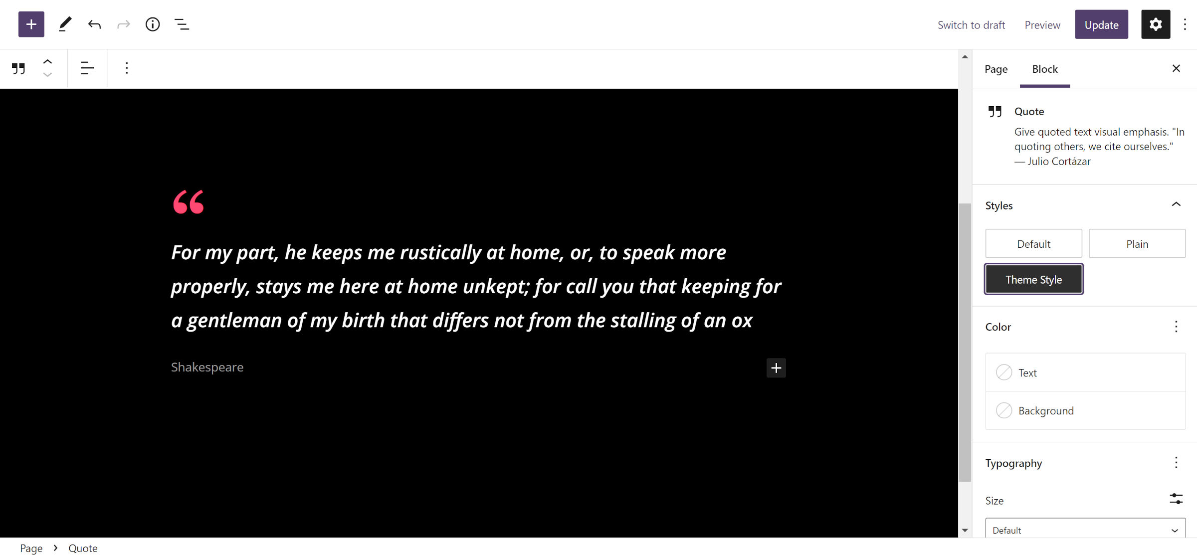
That is actually a well-designed Blockquote style, but I would have never known it was something I would want to use if I had not been digging. Custom block styles suffer from a bit of a discoverability problem by default, and cryptic names for them are doing users no favors.
Most of the issues I had with the theme were around the comments list design. However, it is not yet using the new Comments Query Loop block shipping with WordPress 6.0. In a future release, I would like to see the author put more time into bringing it up to par with the rest of the theme’s design. At the moment, it feels like a feature that was tacked on as an afterthought.
Catch FSE is a freemium theme with a commercial add-on plugin that offers three custom blocks and 10 patterns. I like seeing the upsells focused purely on value-adds.
I have often said that the next generation of freemium themes cannot be like the last. Developers will need to focus on enticing users with solutions to their problems instead of nickel-and-diming customers, locking necessary features behind a paywall. The block system is changing the game, and when most users can flesh out their site designs via the built-in WordPress site editor, the old-school upsells will not cut it.
Turnkey, plug-n-play solutions are needed. I may be so far off-base that I am not even in the ballpark, but I foresee block patterns being a central part of that. Once commercial theme authors figure out how to market and build with these new tools, we will see an explosion of growth in the block-based themes space.
Catch Themes’ 10 commercial patterns represent a start, but I imagine the company will need to continue pushing limits to see a worthwhile return on its premium upsell. Now is the time for experimentation while the field is wide open.
My biggest nit-pick? The name.
Attention all developers: Can we stop naming themes “Something FSE” and “Guten Something”? It is confusing and makes it tough to remember which project is which. Take some time to come up with something that stands out in the crowd.
Catch FSE is a bold and beautiful business-ready theme, but it needed a name to match its personality. I only hope folks remember it.
