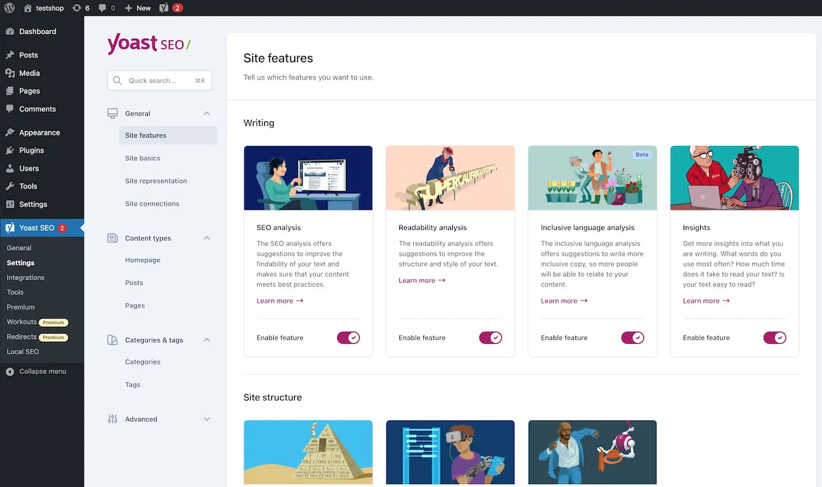
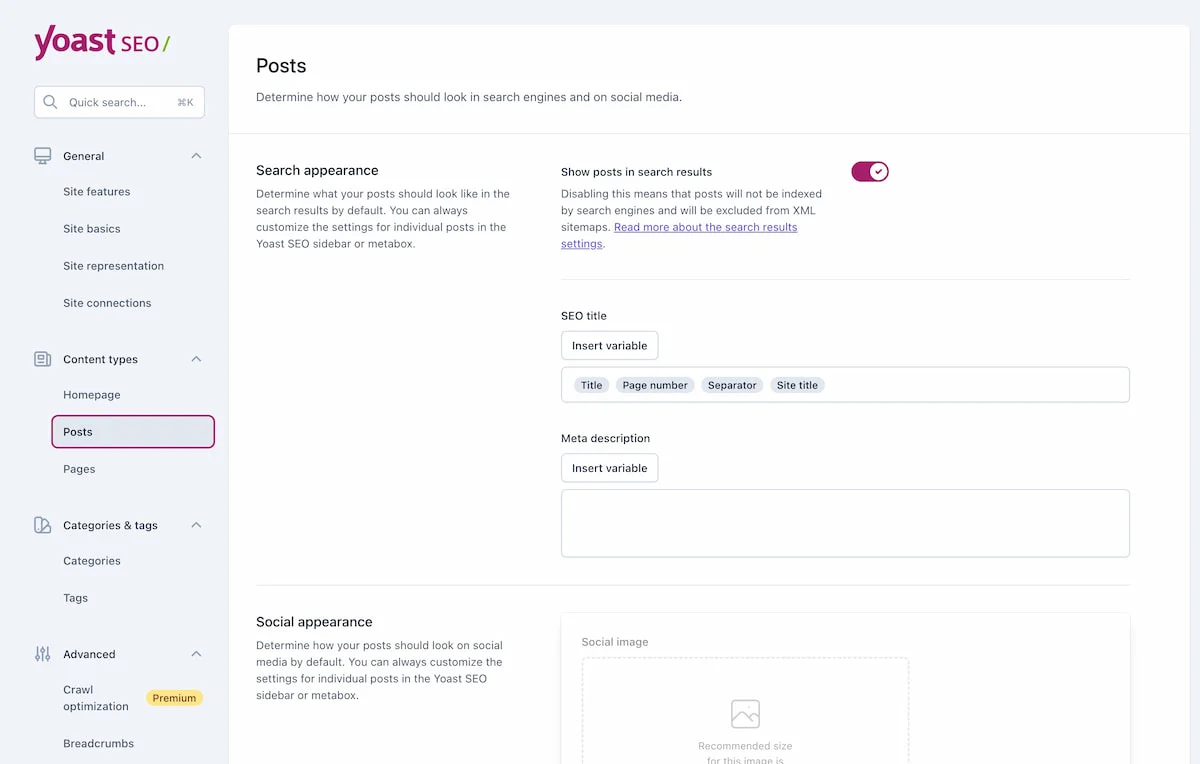
Yoast SEO version 20.0 was released today with a new admin settings interface that also reorganizes the menu to into four main sections: General, Content types, Categories and Tags, and Advanced.

In this update, the plugin did not add new features and settings but rather moved them to better match user workflows. The new sidebar menu should result in fewer clicks in accessing the most used settings.
The individual settings pages are also sporting the new design, which is lighter and brighter than the previous screens. With such a large number of settings to re-learn, Yoast SEO has also added a quick search to assist users in finding settings pages faster.

“We felt that the default WordPress admin design no longer suited us,” Yoast founder Joost de Valk said. “Our product team was itching to take our experience to the next level. WordPress’ interface was holding us back a bit, as the admin interface outside Gutenberg hasn’t progressed for years.”
Reaction to the new design was mostly positive, although some users are not keen on plugins building their own UI in the admin. If all plugins did this, the WordPress admin would become a wild buffet of disparate interfaces that add cognitive load to site management.
“It was… surprising so I’ll reserve real judgement until I use it a while,” WordPress developer Jon Brown said. “First impression though was ‘this needs an advanced mode that hides all the useless banner images and text and just goes back to a list with toggles.’ It’s pretty, but feels overwhelming.”
The Yoast SEO plugin and the new settings UI work with WordPress version 6.0 or higher. Users who are struggling to adapt to the new settings pages can reference Yoast SEO’s documentation, which has a video and guide to navigating the new interface.
