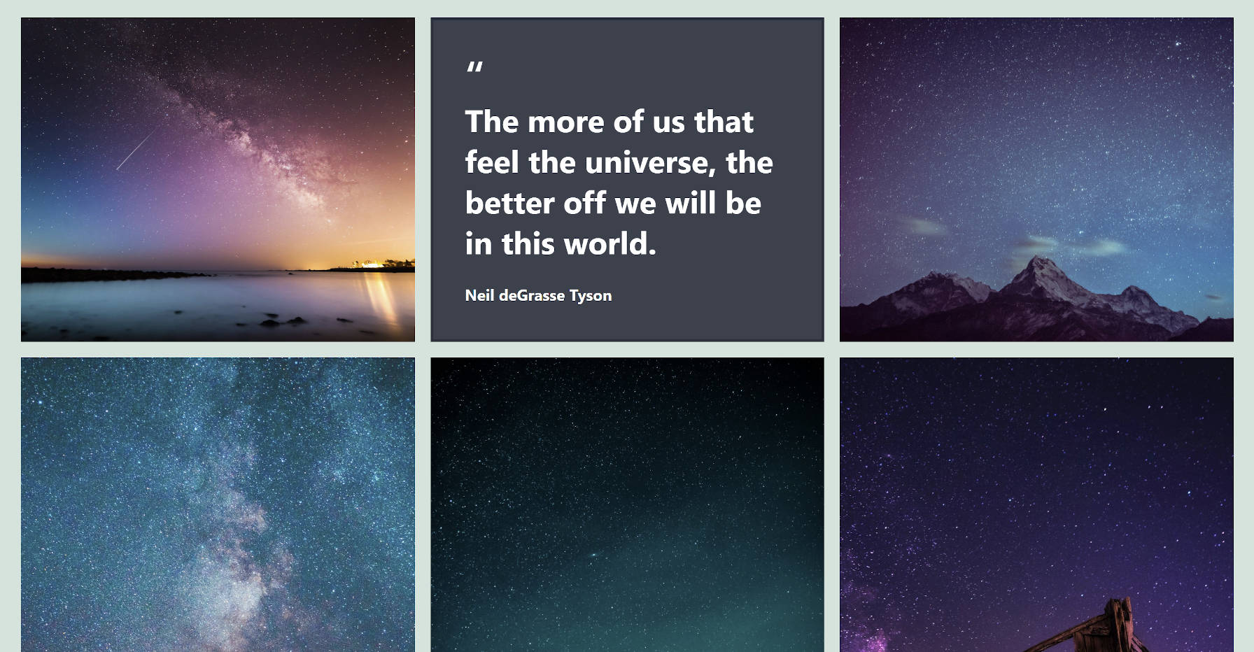
Like many others, I often have pinned tabs of all sorts of things in my browser. Some of them linger there for months. Others for years, I shamefully admit. Of the handful of Gutenberg-related browser tabs I have had pinned since late 2020, one of them finally had the sort of movement I have been waiting on. The Gallery block was finally getting the much-needed refactor it needed.
A gallery is essentially a container with nested images. The concept of nested blocks has existed and has been in use for a long while now. However, the core Gallery block does not make use of this capability. This means that users have no access to existing Image block features.
Want to customize the link for individual images? No can do with the Gallery block. Instead, users must use Columns and drop Image blocks in. It is such a fundamentally broken part of the user experience there is little wonder that users have looked outside of core WordPress for alternative solutions. And it has been a problem since the introduction of galleries via the shortcode system in WordPress 2.5.
Want to alternate styles for each image in the gallery? That has traditionally been impossible too. However, when each image is an Image block, users can alternate between square and round styles, for example.

Users can even use a plugin like Editor Plus with its extended Image block styles to create a Gallery of “image blobs” or animate them individually.

This change could open some layout possibilities where users control the positioning of each item in the grid. And, why stop with images? There is no reason that core could not open the block up to other types of nesting in the future, such as videos, quotes, and more.

The downside to this new feature is that it could require more work from developers who have already built on top of the Gallery block. That is why it is fundamental that they test this change now.
Testers can see the change by switching to the gallery refactor branch via GitHub or grab a ZIP file of the build. It adds a new “Gallery Refactor” option to Gutenberg’s Experimental setting screen, which must be enabled.
Only newly-added Gallery blocks will use the new format. Nothing changed about it at first glance. However, by selecting an individual image, users can use the typical Image block settings. The two exceptions are the align and resize options, removed because they would break the layout. New galleries also do not work in the site editor yet.
“While the expectation is nothing changes in terms of output, this is a pretty major change on a technical level for a very popular block, so it’d be a huge help to gather as much testing feedback as possible,” wrote Glen Davies in the announcement post.
This statement could be misleading. There are fundamental, backward-incompatible changes to the markup output with the new implementation.
In previous iterations of the gallery, it had a wrapper container (<div>) and an unordered list (<ul>) of images. The proposed change would remove the list entirely, dropping the Image blocks as direct children of the containing element. This will break custom theme styles and potentially plugin integration.
On a technical level, I do not see the need to change the outer markup galleries. It is only the image part of the equation that needs to change. If this is because of limitations with the InnerBlocks system (nested blocks feature), perhaps it is not robust enough to meet developers’ needs.
With continual breaking changes to markup and CSS in the core block system, coding the entirety of a site’s CSS from scratch is probably a thing of the past. This is not the first instance of such breakage and will undoubtedly be the last, a rarity in the pre-block era. The best course of action is for theme authors to leave core styles in place and extend them, even if it means some bloat for page loads. It is not a fool-proof plan, but it lightens the burden.
Overall, I welcome the Gallery block enhancement, even it breaks a few things. It potentially opens a world of possibilities and is necessary if the project ever wants to provide end-users with anything other than super basic functionality.

